At TechTide Solutions, we’ve learned a slightly uncomfortable truth about mobile ecommerce: the “storefront” isn’t your homepage, and it isn’t even your product page. In many journeys, the storefront is the customer’s lock screen, their browser tab switcher, their password manager prompt, their wallet sheet, and the tiny sliver of attention they can spare while walking, commuting, or juggling a dozen apps. Mobile commerce is less a place and more a moment.
Market signals keep reinforcing why teams can’t treat mobile as a responsive afterthought. Global mobile ecommerce sales reached $2.2 trillion in 2023, and we see that scale reflected in everyday behavior: shoppers buying groceries in-store while price-checking on a phone, fans pulling up tickets at the turnstile, and banking customers approving transfers with a biometric tap rather than a long password. In our own delivery work, we’ve watched “mobile-first” evolve from a UX preference into an operating model that changes how catalogs are structured, how APIs are cached, and how checkout risk is managed.
In this guide, we’ll define what mobile ecommerce includes, explain how it differs from desktop, and walk through practical UX and engineering patterns we use when building storefronts, apps, and payment flows. Along the way, we’ll be candid about trade-offs: speed versus personalization, frictionless checkout versus fraud controls, and app-only experiences versus the broad reach of the mobile web.
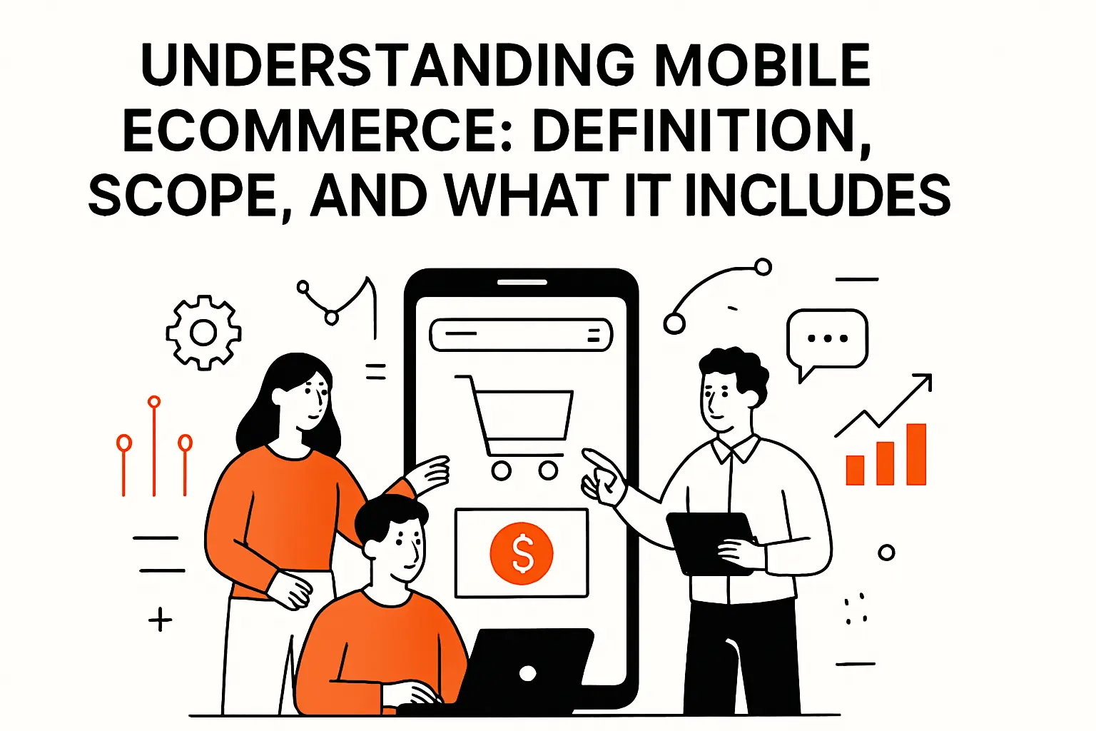
Understanding mobile ecommerce: definition, scope, and what it includes
1. Mobile ecommerce definition and core features designed for smaller screens
Mobile ecommerce is the buying (and selling) of goods or services through mobile devices, typically phones, using either a browser-based experience or an installed app. The key idea isn’t the device category alone; it’s the constraints and capabilities that come with it: touch input, smaller viewports, variable connectivity, and deep OS integrations like wallets, biometrics, and push notifications.
From a product standpoint, mobile ecommerce includes the full transaction loop: discovery, evaluation, cart building, checkout, post-purchase support, and account management. On mobile, we design those steps to be interruptible because real life interrupts them. A “good” mobile flow is one a customer can resume after a call, a low-signal elevator ride, or a notification detour.
Design Traits We Treat as Non-Negotiable
Thumb-friendly navigation, readable typography, and forgiving forms matter, but the deeper features are often invisible: resilient state management, fast perceived performance, and stable identity across sessions. In our builds, we prioritize “progress retention” (saving the cart, preserving filters, remembering the last viewed SKU) because the path back to a product is often longer than the path to abandoning it.
2. Mobile commerce vs ecommerce and how mCommerce fits as a subset
Ecommerce is the umbrella term for online transactions across devices, including desktop, mobile, tablets, and even non-screen channels like voice. Mobile commerce (often shortened to mCommerce) is a subset focused specifically on mobile device interactions.
That distinction seems academic until decisions get budgeted. When teams say “our ecommerce conversion rate,” they can accidentally hide the mobile funnel’s unique issues: slower pages, heavier images, more typing friction, and different payment preferences. In our experience, treating mobile commerce as a first-class subset makes analytics cleaner, UX decisions sharper, and performance work easier to justify because the problem space becomes visible instead of averaged away.
Where the Subset Boundary Shows Up in Architecture
Desktop-first stacks often assume stable network, larger screens, and longer sessions. Mobile-first stacks assume caching, partial rendering, and API designs that minimize round trips. Even if the backend is shared, we usually shape mobile APIs to be “screen-aware” (returning just enough data for the viewport) and “journey-aware” (optimized for top paths like search → PDP → wallet pay).
3. Common mobile commerce use cases retail shopping, banking, payments, ticketing, content, and information services
Retail shopping is the headline use case, but mobile commerce extends well beyond physical goods. Banking is a major category because mobile devices are now identity anchors: customers check balances, initiate transfers, and approve sensitive actions with biometrics. Payments also stand alone as a use case, especially when mobile wallets make the phone itself a payment instrument rather than just a shopping device.
Ticketing is another mobile-native behavior. A customer who buys an event ticket often expects the ticket to be retrievable offline, scannable quickly, and shareable without account gymnastics. Content and information services—news, courses, subscriptions, paid communities—have their own mobile patterns too: metered access, entitlement checks, and renewal flows that must be understandable on small screens.
In practice, most mature mobile commerce products blend multiple categories. A travel app might sell tickets, upsell insurance, store identity documents, and provide real-time alerts. From our perspective, that blend is the real definition of mobile commerce: commerce embedded into the customer’s day, not isolated on a “shop” page.
Recommended reading: Ecommerce Infrastructure: Components, Challenges, and Scaling Strategies
How mobile ecommerce differs from desktop ecommerce

1. Screen size and user interface constraints that shape mobile-first design
Mobile screens force prioritization. On desktop, we can show categories, filters, reviews, recommendations, and shipping details all at once. On mobile, that same density becomes visual noise and cognitive overload. As a result, mobile-first design is often less about making things smaller and more about deciding what must be immediate, what can be progressive, and what can be deferred until intent is proven.
Touch input changes everything. Buttons need larger hit targets, spacing needs to anticipate imperfect taps, and critical actions must avoid being placed where a thumb naturally rests when scrolling. We also design for one-handed usage, which is not a “nice-to-have” but a dominant posture in the wild.
Mobile UX Is a Queue, Not a Canvas
We like to say desktop is a canvas and mobile is a queue. On a phone, users consume information in a sequence: image, title, price, variant, delivery promise, trust cues, then action. Building for that queue means structuring product pages and checkout steps so each scroll reveals a sensible next decision rather than a random pile of details.
2. Conversion and purchase behavior differences including convenience and impulse purchases
Mobile purchases often happen in the margins of time. Convenience is a conversion driver, which is why saved carts, remembered sizes, and wallet payments matter so much. At the same time, impulse purchases can spike on mobile when discovery is driven by social feeds, creator links, or short-form video.
Desktop sessions still dominate certain “research-heavy” categories where comparison shopping is intense, such as higher-consideration electronics or complex B2B purchasing. Even there, mobile tends to participate in the journey as a second screen—reading reviews in bed, checking a spec on the train, or returning to a shortlist saved earlier.
For teams building mobile commerce, the business implication is clear: optimize for a smaller number of decisive actions, reduce uncertainty, and make the path from interest to purchase feel safe and reversible. In our builds, we prioritize return clarity and delivery promises because those answers often determine whether a mobile shopper keeps moving forward.
3. Performance expectations and the impact of load speed on abandonment
Performance on mobile is both more fragile and more important. Real networks fluctuate, devices vary widely in CPU and memory, and third-party scripts compete for the main thread. Meanwhile, user tolerance is lower because waiting on a phone feels longer, especially when the user is multitasking.
Google’s research notes that 40% of consumers will leave a page that takes longer than three seconds to load, and we see the same pattern in client analytics: the first slow interaction poisons trust for the entire session. When performance is treated as a product feature rather than a technical metric, teams make better decisions about image strategy, recommendation payloads, and what to load eagerly versus lazily.
Where We Usually Find “Hidden” Mobile Slowness
Most mobile performance issues don’t come from the backend alone. In audits, we commonly find oversized media, unbounded tracking tags, and overly chatty APIs that require multiple sequential calls before a page can stabilize. Fixing those issues often increases conversion without changing a single marketing campaign, which is why we treat speed work as revenue work.
Mobile ecommerce channels and architectures

1. Mobile-friendly websites and responsive web design foundations
A mobile-friendly website remains the broadest-reach channel. It supports discovery from search, social links, and ads without forcing installation. Responsive design is the baseline, but genuine mobile-first web work goes further: designing for touch-first components, simplifying navigation, and optimizing page weight.
Architecturally, mobile web commerce works best when paired with caching layers and a disciplined approach to third-party scripts. On the frontend, we aim for progressive rendering so customers see meaningful content early, even if secondary widgets (recommendations, reviews, trackers) arrive later. On the backend, we shape responses so each API returns enough data to render a complete “screen,” not just a fragment that forces additional requests.
Headless Commerce as a Mobile Enabler
When we use headless commerce patterns, we decouple the frontend experience from the commerce engine. That separation helps mobile teams move faster: UI changes become deployable without replatforming payments, taxes, or inventory. For businesses, the upside is agility; the cost is integration discipline and the need for strong observability across services.
2. Native apps for repeat engagement, personalization, and device capabilities
Native apps shine when repeat engagement is the goal. They offer smoother navigation, deeper personalization, and direct access to device capabilities such as biometrics, push notifications, camera scanning, and offline storage. For certain verticals—food ordering, banking, loyalty-heavy retail—apps become the primary commerce surface.
Still, native apps come with operational overhead: release cycles, app store policies, and the challenge of convincing customers to install. In our planning sessions, we rarely frame this as “web versus app.” Instead, we ask: what experiences truly require an app, and what should remain accessible through a link?
Device Capabilities We Commonly Productize
Camera scanning for gift cards or loyalty IDs, location-aware store inventory, and biometric sign-in can remove friction from frequent tasks. Each capability, however, adds testing complexity across OS versions and devices. Good app teams invest in automated testing and feature flagging so capability-driven features don’t become stability risks.
3. Progressive web apps and omnichannel continuity across devices
Progressive web apps (PWAs) aim to bring app-like behavior to the web: offline-friendly caching, install prompts, and push notifications in supported environments. The business appeal is reach with improved engagement, especially when customers arrive from a link but return repeatedly.
Real-world results can be meaningful. In a well-known case study, AliExpress reported conversion rates for new users increase by 104% after implementing its PWA approach. We don’t treat that as a universal guarantee; instead, we treat it as proof that performance, reliability, and re-engagement mechanics can directly shape outcomes when applied thoughtfully.
Omnichannel Continuity Is an Identity Problem
Cross-device continuity often fails not because of UI, but because identity is inconsistent. When a customer adds an item on mobile web and expects it in their app cart later, the handoff requires careful session design, resilient authentication, and server-side cart persistence. We typically implement “soft identity” (anonymous cart tokens) that can be upgraded to an account identity without losing state.
Mobile product discovery UX: navigation, search, and filtering

1. Navigation menus and category pages that guide users to relevant products faster
Navigation on mobile is a negotiation between clarity and space. Hamburger menus, bottom navigation bars, and hybrid patterns each have trade-offs. In retail, category hierarchies must be shallow enough to browse quickly, while still reflecting how customers think (by use case, by room, by style, or by need).
From our perspective, the best mobile category pages behave like guided shortcuts rather than endless shelves. Curated entry points—“shop by need,” seasonal collections, or top sellers—reduce decision fatigue. On the engineering side, we design category endpoints to deliver fast initial results with pagination or infinite scroll that doesn’t break back navigation.
Designing for the “Back Button Economy”
Mobile shoppers use back navigation constantly. When filtering state collapses or scroll position resets, conversion suffers quietly. We preserve state across navigation events, and we treat “return to results” as a first-class feature rather than a browser default.
2. On-site search and autocomplete to reduce time to product
On mobile, search often beats browsing because typing a few letters can be faster than drilling through categories. Autocomplete is not merely convenience; it’s error correction and intent discovery. When done well, it turns partial input into a confident next tap.
We usually design autocomplete to support multiple “targets” in a single UI: product suggestions, categories, popular queries, and sometimes content articles for high-support categories. On the backend, that requires search indexes that can respond quickly and tolerate typos, synonyms, and pluralization.
Search Relevance Is a Merchandising Lever
Search ranking can encode business priorities—margin, inventory availability, or seasonal pushes—without making the experience feel manipulative. The key is transparency: if boosted products appear, they still must match the query and meet the shopper’s expectations for quality and price.
3. Filtering and sorting interfaces that work well for touch interactions
Filtering on mobile is notoriously tricky because filters are dense by nature. The common failure mode is a filter drawer that feels like a spreadsheet, forcing too much scrolling and too many taps. We prefer filter designs that highlight the few facets that matter most (size, color, price range, availability) and tuck the rest behind progressive disclosure.
Touch-friendly sorting needs clarity about what changed. When a customer selects “price low to high,” the UI should confirm that the result set has been reordered and provide an easy way to revert. Small touches like sticky “apply” controls, visible selected filters, and a one-tap reset can prevent frustration.
Engineering Filters Without Making the API Chatty
Each filter change can trigger a network request, which adds latency and battery cost. We often batch changes locally and apply them in one request, especially when the user is selecting multiple facets. Caching common filter combinations also helps when shoppers iterate quickly.
Product pages and checkout that convert in mobile ecommerce

1. Product page layout, product variations, and trust-building info like shipping and returns
Mobile product pages succeed when they answer questions in the order shoppers ask them. The hero image and price get attention first, but uncertainty usually lives in variants, delivery timing, and return policy. If those answers are buried, the shopper hesitates, scrolls aimlessly, or leaves to search elsewhere.
Variant selection deserves special care. Size, color, and configuration controls must be obvious and forgiving, with clear error states when a selection is required. We also like variant UIs that show availability inline, since “out of stock” surprises late in the flow are conversion killers.
Trust Signals We Consider “Mobile Critical”
Concise shipping expectations, easy-to-scan return rules, and visible support options matter more on mobile than desktop because the customer has less screen space to investigate. For higher-risk purchases, we’ll add structured FAQs and short policy summaries that link to full details without overwhelming the page.
2. Cart design essentials including totals, fees, quantity controls, and save features
A mobile cart is not just a list; it’s a reconciliation screen where the customer checks fairness. Totals, shipping estimates, taxes (where applicable), and discounts need to be legible and stable. If fees appear late or change unexpectedly, trust erodes quickly.
Quantity controls should be thumb-friendly and resilient to slow network responses. We typically implement optimistic UI updates (the cart reflects the new quantity immediately) with server reconciliation behind the scenes. Save-for-later features also help, because many mobile shoppers are not ready to buy right away, yet still want a path back without re-discovering products.
Cart Persistence Is a Retention Feature
In our experience, cart persistence competes with push notifications as a retention driver because it creates a natural reason to return. When carts survive app reinstalls, session timeouts, and device switches, businesses recover “almost sales” that would otherwise vanish.
3. Checkout flow optimization with guest checkout, simplified forms, autofill, and clear progress indicators
Checkout is where mobile friction becomes painfully literal: typing, switching keyboards, correcting addresses, and re-entering card details on a small screen. Good mobile checkout removes steps, reduces typing, and makes each step feel safe. Guest checkout remains important because forcing account creation can be a dealbreaker for first-time buyers.
Form design is a craft. Autofill support, correct input types, and address lookup can cut effort dramatically. Clear progress indicators also help; customers should know where they are, what remains, and what they can fix if something fails.
Abandonment benchmarks underline how unforgiving this stage is. Baymard’s tracked average cart abandonment rate sits at 70.19%, and while not all of that is fixable, the portion caused by avoidable friction is where mobile-focused teams can win. In our audits, the fastest gains usually come from removing distractions, tightening error messaging, and enabling wallet-based payments that collapse entire form sections into a single confirmation action.
Mobile payments, security, and compliance

1. Payment method mix including mobile wallets, contactless payments, BNPL, cards, and carrier billing
Payment mix is both a conversion lever and a market-fit signal. Mobile wallets reduce typing and can increase trust because the user recognizes the wallet UI and expects strong security. Cards still matter, particularly for customers who prefer direct control or who don’t use wallets. Buy now, pay later options can shift affordability perception for certain categories, though they add complexity in refunds and customer support.
Carrier billing and bank-transfer methods can be relevant in specific markets, especially where card penetration is lower. From an implementation standpoint, we advise teams to start with the payment methods their customers already use, then expand method mix based on observed drop-off patterns and support tickets.
Worldpay’s research highlights how quickly wallets are becoming a default expectation: digital wallets are projected to account for 49% of all sales online and at POS combined by 2027. For merchants, that projection translates into a simple mandate: if wallets are common in your market and you don’t support them well, your checkout will feel outdated even if everything else looks modern.
Payment Orchestration as a Practical Pattern
As method mix grows, payment orchestration becomes useful: routing transactions to different processors, handling retries intelligently, and managing regional payment preferences without rebuilding checkout each time. We often implement an abstraction layer so the UI stays stable while payment providers evolve underneath.
2. Security best practices including encryption, strong authentication, and biometric protection
Mobile commerce security must protect data without breaking flow. Transport encryption is table stakes, yet application-level security matters too: secure session handling, careful token storage, and minimizing sensitive data exposure in logs and analytics. On mobile, biometric authentication can improve both safety and usability, especially for account access and high-risk actions.
Fraud controls should be adaptive. Instead of challenging every shopper with the same friction, better systems use risk signals—device reputation, velocity checks, behavioral patterns—to decide when to request additional verification. The goal is not to eliminate fraud at all costs, but to minimize total loss: fraud loss plus lost conversions plus customer support burden.
Why Security Is a Business Metric
Security incidents aren’t abstract. IBM reports the global average breach cost at USD 4.88 million, which is why we frame security work as brand protection and financial risk reduction, not just compliance. A secure mobile checkout preserves trust, and trust is compounding revenue.
3. Compliance checkpoints including PCI guidance, privacy policy clarity, and app store requirements
Compliance in mobile commerce spans payments, privacy, and platform rules. For card payments, PCI expectations influence how payment data is handled, whether tokens are used, and how third-party payment fields are embedded. Privacy rules shape consent flows, tracking disclosures, and data retention policies, especially when location or behavioral personalization is involved.
App store requirements add another layer for native apps: rules on subscriptions, digital goods, and data collection disclosures. In our delivery work, we treat compliance as a design input rather than a last-minute checklist. That approach prevents rework, avoids launch delays, and reduces the risk of building growth features that later become legally or platform-problematic.
Operationalizing Compliance
We recommend lightweight governance that actually ships: threat modeling during discovery, privacy reviews tied to analytics events, and release checklists that map to your payment and data flows. When teams can explain “what data we collect and why” in plain language, they’re usually on the right track.
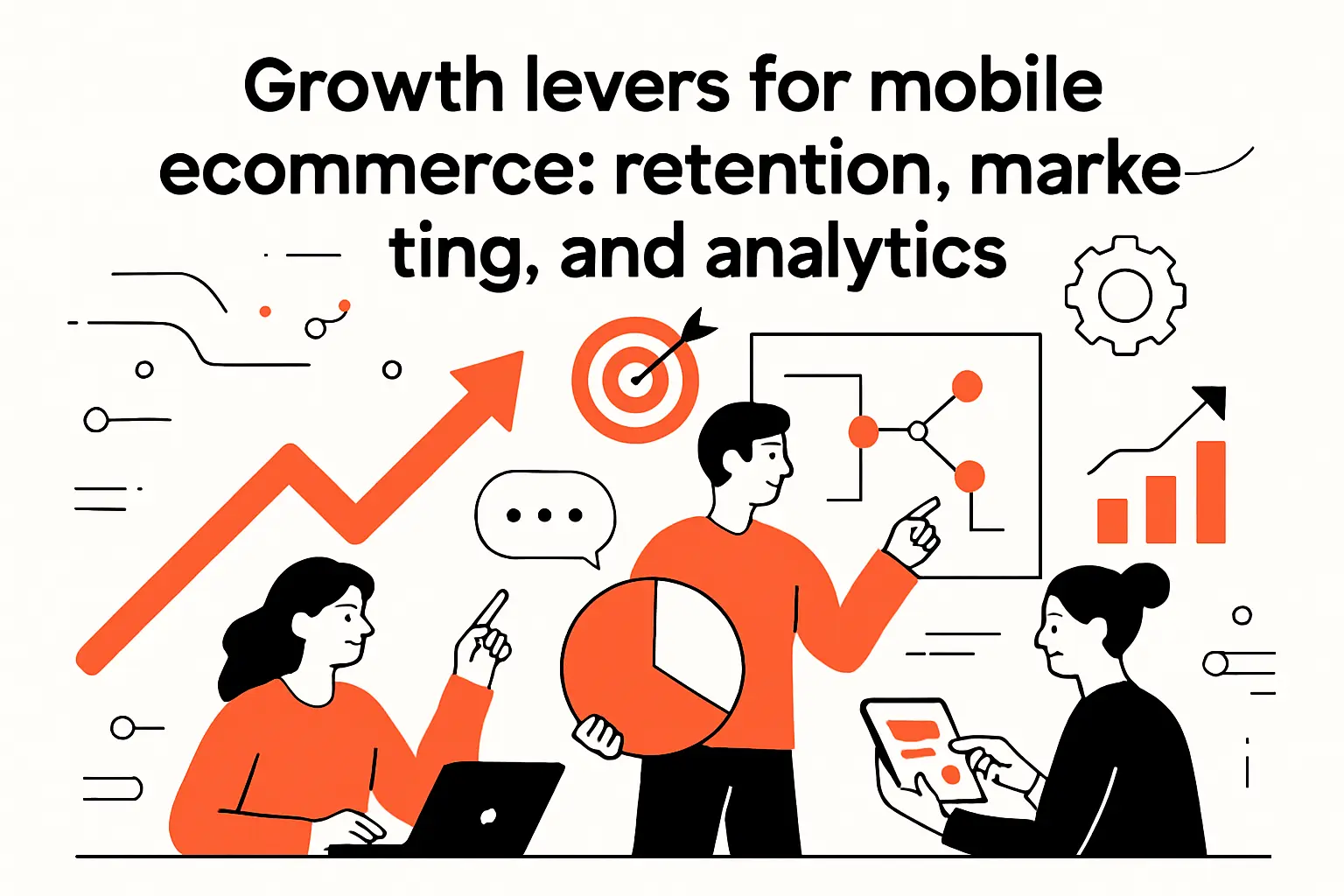
Growth levers for mobile ecommerce: retention, marketing, and analytics
1. Personalization and targeted promotions using behavioral and location data
Personalization on mobile works best when it feels like helpful memory, not surveillance. Recently viewed items, replenishment reminders, and size-aware recommendations can reduce friction and increase relevance. Location data can also be valuable when it’s clearly beneficial, such as showing nearby store inventory or local delivery windows.
From a technical standpoint, personalization requires careful data modeling: event pipelines that are reliable, identity resolution that respects privacy, and recommendation systems that don’t slow down the app. We often start with rules-based personalization because it’s understandable and testable, then evolve toward model-driven approaches as data maturity grows.
Personalization Without Page Weight Creep
A common trap is shipping personalization as extra scripts and extra API calls. We prefer server-driven composition for key screens, returning a single response that includes both base content and personalized modules. That pattern reduces latency and keeps the UI predictable.
2. Loyalty programs, mobile rewards, and repeat purchase experiences
Loyalty on mobile is powerful because the device is always present. Reward progress, stored offers, and member-only pricing can turn occasional buyers into repeat customers, especially when redemption is effortless. The best loyalty systems also reduce support load by making points, eligibility, and expiration rules transparent.
Implementation details matter here. Loyalty becomes a performance feature when balances update in real time, and it becomes a trust feature when rewards apply correctly at checkout. In our builds, we treat loyalty logic as core commerce logic, not a marketing add-on, because customers interpret mistakes as unfairness.
Repeat Purchase Is a UX Pattern
Reorder buttons, saved lists, and subscriptions are the practical mechanics of loyalty. When a repeat purchase takes only a few taps, the customer feels understood, and the business benefits from predictable revenue.
3. Conversational commerce with chatbots, in-app messaging, and customer support workflows
Conversational commerce isn’t about replacing humans with bots; it’s about shortening time-to-answer. Mobile shoppers often need quick clarity on sizing, delivery timing, returns, or order status. A lightweight chatbot can route common questions, while in-app messaging can keep context attached to the order.
Support workflows also shape conversion. If customers can’t easily resolve a checkout error or payment failure, they often abandon rather than troubleshoot. We integrate support entry points into the cart and checkout, then pass structured context—cart contents, error codes, device info—so support doesn’t start blind.
Designing for “Failure With Dignity”
Payment failures happen even in healthy systems. Great mobile commerce experiences provide clear next steps: try another method, retry safely, or contact support with a prefilled summary. That dignity in failure preserves trust.
4. Mobile SEO and app store optimization for discovery and downloads
Mobile web discovery still runs through search, and that means mobile SEO fundamentals: crawlable pages, clean metadata, structured content, and performance that supports good user signals. Category pages and product pages should be indexable where appropriate, and internal linking must help both crawlers and users.
For apps, app store optimization relies on clear value messaging, screenshots that reflect real flows, and descriptions that match user intent. Ratings and reviews are part of the funnel too, so we encourage teams to design review prompts around successful moments (order delivered, issue resolved) rather than interruptions.
One Brand, Many Entry Points
Customers might find you via a search result, a creator link, or an app store listing. We align content and design language across those entry points so users don’t feel like they’ve landed in different companies.
5. Measuring success with mobile KPIs conversion rate, revenue, traffic, engagement, and payment adoption
Mobile KPIs should reflect the actual journey. Conversion rate matters, but so do intermediate metrics that reveal friction: search usage, filter engagement, add-to-cart rate, checkout start rate, payment method selection, and error frequency. Engagement metrics (return visits, saved items, reorder usage) often predict revenue before revenue appears.
We also recommend measuring performance as a KPI, not merely as engineering telemetry. When teams correlate speed with conversion and retention, prioritization becomes easier because performance work stops feeling like maintenance and starts feeling like growth.
Instrumentation We Prefer
Event naming consistency, privacy-aware identity, and server-side confirmation events are the backbone. Without clean analytics, A/B tests become arguments instead of learning loops.
6. Mobile ecommerce examples and UI inspiration from leading apps, mobile-friendly sites, and design galleries
When we look for UI inspiration, we study real apps that handle scale and complexity: Amazon for fast discovery, Shopify-powered stores for checkout patterns, and large retailers like Walmart or Target for omnichannel expectations. In payments, Apple Pay and Google Pay flows are instructive because they compress complexity into a familiar confirmation sheet.
Design galleries can spark ideas, yet we caution teams not to copy patterns without context. A fashion brand’s visual-first PDP may not work for a hardware catalog where specs and compatibility are the real conversion drivers. In our process, inspiration is a starting point; usability testing and funnel data decide what stays.
How TechTide Solutions helps teams build custom mobile ecommerce solutions

1. Discovery and requirements workshops to align features with user needs and business goals
Discovery is where mobile commerce wins or loses before a line of code exists. In our workshops, we map customer journeys, define the real “moments that matter,” and identify operational constraints like fulfillment, returns handling, fraud exposure, and support capacity. That alignment prevents teams from building beautiful UX that the business can’t operationalize.
We also translate goals into measurable outcomes: which funnel steps must improve, what “fast enough” means for your audience, and how payment method strategy ties to conversion and risk. When discovery is done well, roadmaps become calmer because priorities have a defensible why.
Outputs We Aim to Produce
A clear scope, a decision log, initial information architecture, and a pragmatic release plan that ships value early. That foundation keeps mobile commerce projects from becoming endless redesigns.
2. Custom web app and mobile app development for storefronts, product discovery, carts, and checkout
Our development approach depends on channel strategy. For mobile web, we build responsive storefronts with performance-first rendering and scalable search and filtering. For native apps, we focus on repeatable components, offline-tolerant state, and deep integrations like wallets and biometrics.
Checkout receives special engineering attention because it combines security, compliance, and conversion. We design modular payment integrations, robust error handling, and observability so teams can see where failures occur in real time. On the frontend, we build touch-friendly forms, validate input progressively, and keep the user oriented with clear progress cues.
Engineering Principles We Hold Tight
Keep critical paths lightweight, design APIs for screens not tables, and ensure analytics are trustworthy. Those principles sound simple, yet they prevent the majority of mobile commerce pain we encounter during rescues and rebuilds.
3. Integrations, performance optimization, and post-launch iteration to support growth and retention
Mobile commerce rarely lives in isolation. Integrations typically include commerce engines, inventory systems, fulfillment providers, CRMs, analytics tools, and customer support platforms. We implement these with an eye toward resilience: retries, idempotency, and graceful degradation when third parties are slow or temporarily unavailable.
After launch, iteration is where growth compounds. We run performance audits, analyze funnels, and prioritize fixes that remove friction. Over time, we help teams build an experimentation rhythm—small releases, measurable hypotheses, and fast rollback paths—so mobile commerce evolves safely without freezing under the fear of breaking checkout.
Optimization as a Habit
When businesses treat mobile performance and UX as ongoing practices, not one-time projects, they tend to outperform competitors who only redesign every few years. The difference is rarely one big feature; it’s a hundred small frictions removed.
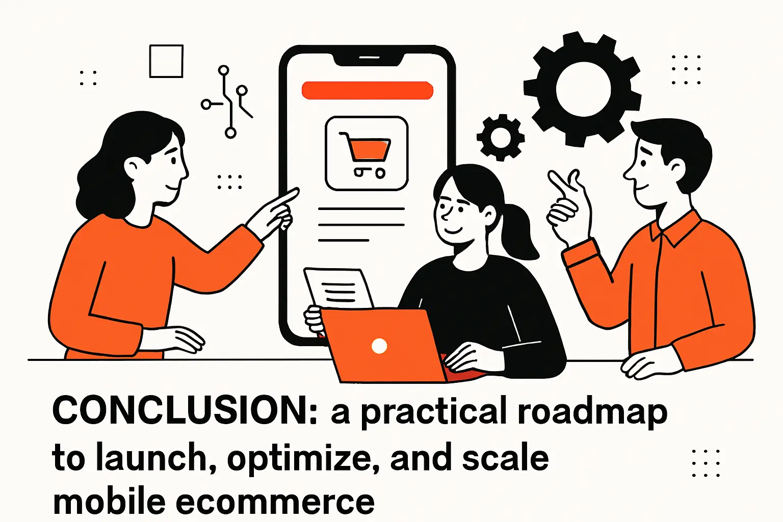
Conclusion: a practical roadmap to launch, optimize, and scale mobile ecommerce
1. Prioritize mobile-first UX, fast checkout, and trusted payment options
Mobile ecommerce succeeds when the experience respects the user’s context: limited time, limited screen space, and limited patience. Prioritizing mobile-first UX means building thumb-friendly navigation, readable product pages, and carts that feel fair and transparent. Fast checkout matters because it’s the moment where intent becomes revenue, and trusted payment options matter because they reduce both friction and fear.
In our work, the best results come when UX and engineering treat performance as part of design. A beautiful page that loads slowly is not beautiful in the only way that matters: in the customer’s lived experience.
2. Select channels and capabilities that match customer journey, operations, and compliance needs
Channel decisions should follow customer behavior, not internal tradition. Mobile web is unmatched for reach and link-based discovery, while native apps can deepen loyalty and enable device-specific convenience. PWAs can bridge the gap when implemented with care.
Operational readiness must also guide the roadmap. Faster checkout increases orders, yet it also increases fulfillment demand and support volume. Compliance and platform policies shape what is possible, and designing with those constraints early prevents last-minute rewrites.
3. Continuously improve with analytics, usability insights, and iterative optimization
Mobile commerce is never finished. Analytics reveal where users struggle, usability testing explains why, and iterative optimization turns that insight into sustained gains. When teams build a learning loop—measure, adjust, verify—they stop guessing and start compounding improvements.
If we had to leave you with one next step, it would be this: pick one critical mobile journey (search to PDP, PDP to cart, or cart to payment), instrument it deeply, and fix the biggest friction you can prove with data. Which journey in your mobile experience would we learn the most from if we audited it together?
