
In product work, dialogs aren’t decorative; they’re decision points. A well-built modal can prevent irreversible actions, collect critical data without forcing a route change, or “pause the world” long enough to resolve a blocking constraint (like missing permissions or expired sessions). From our side at TechTide Solutions, we treat dialogs as miniature workflows—small surfaces that carry disproportionate business risk when they’re rushed.
Why custom dialogs with Angular Material Dialog matter for real-world Angular apps

1. Common dialog use cases: confirmations, forms, notifications, and authentication flows
Across industries, the trigger is often the same: a user hits a moment of uncertainty. Confirmations reduce accidental destructive operations (deleting records, revoking access, discarding drafts). Form dialogs compress time-to-complete by keeping context visible in the dimmed background. Notifications and “heads-up” messages are the last line of defense for communicating system state, especially when asynchronous operations fail and the UI must reconcile optimistic updates with reality.
From a market lens, the motivation is hard to ignore: Gartner’s forecast that worldwide IT spending is expected to total $6.08 trillion in 2026 keeps pressure on engineering leaders to standardize patterns that ship reliably, and dialogs are one of the most repeated UI patterns in business applications.
Where we see dialogs earn their keep
- Confirmation modals that prevent “fat-finger” mistakes in admin consoles and internal tools.
- Inline edit dialogs for entities like addresses, contacts, billing profiles, and configuration flags.
- Session-related dialogs that communicate state (expired login, required consent, locked accounts) without confusing route transitions.
- Form dialogs that enable “create related item” flows without abandoning the current page.
2. Consistency in UI behavior and Material Design look-and-feel across the app
Consistency is one of those words that sounds like design nitpicking until a release goes sideways. Inconsistent dialog behaviors—different close buttons, mismatched spacing, unpredictable focus, random scroll locking—create a subtle tax on every user interaction. Over time, that tax becomes churn, support tickets, and training overhead, especially in enterprise environments where users spend hours per day inside the same product.
Material’s dialog primitives give teams a shared vocabulary: a title region that reads like a headline, a content region that scrolls correctly, and an action row that anchors decisions. In our delivery work, that matters because a dialog typically appears in the most sensitive moments: destructive operations, permissions changes, and data submissions. When the UI is recognizable, cognitive load goes down; when the UI is arbitrary, hesitation goes up.
In research on design as a business lever, McKinsey reports that top-quartile design performers achieved 32 percentage points higher revenue growth than industry counterparts. That statistic isn’t “about dialogs” specifically, yet it maps cleanly to our lived experience: the teams that systematize UI patterns (including modals) ship faster, break less, and earn trust with users who notice when things feel thoughtfully composed.
Our practical definition of dialog consistency
Rather than chasing pixel perfection, we define consistency as repeatable behavior: predictable focus entry, deterministic close semantics, stable spacing, accessible labels, and a reliable data contract between caller and modal. Once those are standardized, brand styling can evolve without rewriting every modal workflow.
3. Why flexibility in dialog behavior helps support changing product requirements
Product requirements rarely stand still. A “simple confirm” becomes “confirm plus reason,” then “confirm plus reason plus audit metadata,” and then suddenly compliance wants a forced acknowledgement that can’t be dismissed. Dialogs are where this change tends to land because it’s the easiest place to interpose friction—sometimes for good reasons, sometimes because it feels convenient.
When dialogs are built as one-off components with ad-hoc wiring, each requirement change turns into a brittle refactor. By contrast, when we build them as configurable components with explicit inputs and outputs, we can evolve the behavior without turning the calling code into a maze. The goal is not just reuse; the goal is controlled variation.
Bad experiences are expensive in aggregate, and experience failures often hide inside tiny interactions like modals that close unexpectedly or trap the user. Qualtrics has estimated $3 trillion in sales at risk due to poor customer experiences, which is why we treat dialog “edge cases” as first-class requirements instead of afterthoughts.
Flexibility we intentionally design for
- Different close rules: dismissible informational dialogs versus non-dismissible compliance acknowledgements.
- Different action models: single primary action, primary + secondary, or destructive actions that require explicit typing.
- Different layouts: compact confirmations versus form-heavy dialogs with scroll management.
- Different orchestration: dialogs that are opened by components, route guards, effects, or shared services.
Recommended reading: Hash Values SHA 1 in Git: How Commit SHAs Work, Why They Matter, and What Comes Next
Project setup for how to create a custom dialog by Angular Material Dialog

1. Enable animations and theming for Angular Material components
Animations and themes are not just extra polish for dialogs. They are part of how the component is meant to work. Without animations, the overlay can feel sudden, focus changes can look awkward, and state changes become harder to follow. If the theme is set up badly, the dialog can show strange contrast, wrong fonts, or uneven spacing compared with the rest of the app.
In Angular Material, turning on animations usually means adding the right animations module in the app’s main module. We also suggest deciding early whether to use Material’s built-in themes as your starting point or create a custom theme with your brand colors. Both options can work well in production, but that choice affects how you handle style changes later, especially when you start giving dialogs their own visual style.
In our experience, dialog theming matters most when product teams ask for “just one special modal.” Without a clear theme strategy, that one special modal quickly becomes the example everyone follows, and then more keep appearing. A careful approach lets teams try new design ideas without letting the UI turn into a mix of one-off components.
What we verify before building dialog components
- Animations are enabled and don’t conflict with app-level reduced-motion preferences.
- Typography and density settings are intentional, not accidental defaults.
- Theme tokens are available to dialogs opened from lazy-loaded feature areas.
2. Import MatDialogModule and declare the dialog body component
The dialog system uses the MatDialog service and a set of layout helpers that shape how the dialog looks. Getting started is simple: import MatDialogModule in the module that needs it, or in a shared UI module, then create a dialog content component just like any other Angular component.
In older versions, Angular needed entryComponents for components created at runtime, which made dialog setup more confusing and added extra code. Newer Angular versions handle this automatically, so the idea is much simpler: a dialog component is just a normal component that the dialog service creates, instead of a router outlet or a template.
In our projects, we still treat dialog components as important parts of the feature they support. We keep them close to that feature, define clear inputs and outputs through a data contract, and avoid giving them too many extra connections. Dialogs are easiest to maintain when they do not turn into small apps inside the main app.
Minimal wiring example
// feature.module.tsimport { NgModule } from '@angular/core';import { MatDialogModule } from '@angular/material/dialog';@NgModule({ imports: [ MatDialogModule ]})export class FeatureModule {}3. Prepare a dialog data model for predictable inputs and outputs
The most important dialog decision we make is not about CSS, titles, or button placement. Instead, we start by defining the dialog’s data contract: what the caller provides as input, and what the dialog returns as output. That contract becomes the backbone for reuse and prevents a dialog from turning into an implicit, side-effect-driven black box.
For confirmations, the input might include a title, a message, optional “danger” styling, and labels for actions. For form dialogs, inputs might include default values, allowed options, and contextual hints. Outputs should be similarly explicit: did the user cancel, confirm, or submit; what payload was submitted; and whether additional metadata is needed for audit trails.
Once we commit to a data model, we can test the dialog in isolation and validate it in integration tests without depending on application globals. This also makes it easier to swap a dialog implementation later (Material today, CDK tomorrow) while preserving the business-level API that callers use.
Contract-first interfaces
// dialog-contracts.tsexport type ConfirmDialogResult = 'confirm' | 'cancel';export interface ConfirmDialogData { title: string; message: string; confirmText?: string; cancelText?: string; isDestructive?: boolean;}Recommended reading: Git Concepts Architecture: How Git Stores Data, Tracks Changes, and Powers Modern Workflows
Opening dialogs: MatDialog service, MatDialogConfig, and a reusable openDialog pattern

1. Inject MatDialog and open a dialog from a feature component or shared service
Opening a dialog is conceptually simple: inject MatDialog, call open, pass the component class, and optionally pass configuration. The subtlety begins when you decide where that open call should live. In smaller apps, it can sit directly in the feature component; in larger apps, it’s often cleaner to centralize dialog orchestration in a shared service so that business workflows remain readable.
From our perspective, the decision is about coupling. If the dialog is purely presentational and tightly bound to one screen, opening it in the component is perfectly reasonable. When the dialog represents a cross-cutting workflow—like an authentication interruption, a permission request, or a “complete your profile” requirement—we prefer opening it from a coordinator service that’s triggered by events from many screens.
Either way, we aim to keep the caller’s code declarative: “open this dialog with this data, then handle the result.” That pattern scales far better than sprinkling dialog state flags across templates.
Open from a feature component
import { Component } from '@angular/core';import { MatDialog } from '@angular/material/dialog';import { ConfirmDialogComponent } from './confirm-dialog.component';import { ConfirmDialogData, ConfirmDialogResult } from './dialog-contracts';@Component({ selector: 'app-danger-zone'})export class DangerZoneComponent { constructor(private readonly dialog: MatDialog) {} async requestDelete(): Promise<void> { const data: ConfirmDialogData = { title: 'Delete record?', message: 'This action cannot be undone.', confirmText: 'Delete', cancelText: 'Cancel', isDestructive: true }; const ref = this.dialog.open<ConfirmDialogComponent, ConfirmDialogData, ConfirmDialogResult>( ConfirmDialogComponent, { data } ); const result = await ref.afterClosed().toPromise(); if (result === 'confirm') { // proceed with delete } }}2. Override default behaviors with MatDialogConfig such as disableClose and autoFocus
Defaults are helpful until they aren’t. MatDialogConfig is where you turn a generic modal into an experience aligned with your workflow: whether the user can dismiss it by clicking the backdrop, where focus should land, whether the dialog should restore focus to the trigger, and how the overlay should behave during navigation.
In our production builds, disableClose is the option we treat with the most respect. Blocking dismissal can be necessary—think legal acknowledgements or critical security interruptions—but it can also be abused. When teams overuse non-dismissible dialogs, users feel trapped, and trapped users do unpredictable things (refresh the tab, close the browser, abandon the task, complain loudly).
Auto focus is similarly nuanced. Allowing Material to focus the first focusable element can be great for forms. On the other hand, for informational dialogs we often prefer focusing the container or a close button to reduce surprise. The right answer depends on the dialog’s intent, not on developer convenience.
Configuring behavior without hard-coding layout numbers
this.dialog.open(ConfirmDialogComponent, { data, disableClose: true, autoFocus: 'first-tabbable', restoreFocus: true, role: 'dialog'});3. Single-dialog UX: detect an existing dialog and close it before opening a new one
Modal stacking is one of the fastest ways to create UX chaos. Once you allow dialogs to open other dialogs freely, you end up with nested backdrops, confusing escape-key behavior, broken focus traps, and users who can’t remember what they were trying to do in the first place.
In multi-feature Angular apps, stacking can happen accidentally. A session-expiration dialog might open while a “create entity” form dialog is already present. A global error handler might open a notification modal while an authentication dialog is mid-flow. Without coordination, these collisions are almost guaranteed.
Our preferred pattern is “single-dialog UX” for most products: before opening a new dialog, check if any are open and close them intentionally. When the business case truly requires layered modals, we treat it as a special workflow and test it aggressively, because keyboard navigation and focus restoration become far more delicate.
A reusable close-then-open helper
openSingle<C, D, R>(dialog: MatDialog, component: C, config: { data: D }) { if (dialog.openDialogs.length) { dialog.closeAll(); } return dialog.open(component as any, config as any);}Recommended reading: Computer Programming Languages: Types, Use Cases, and How to Choose
Build the dialog UI: structuring dialog content with Angular Material directives
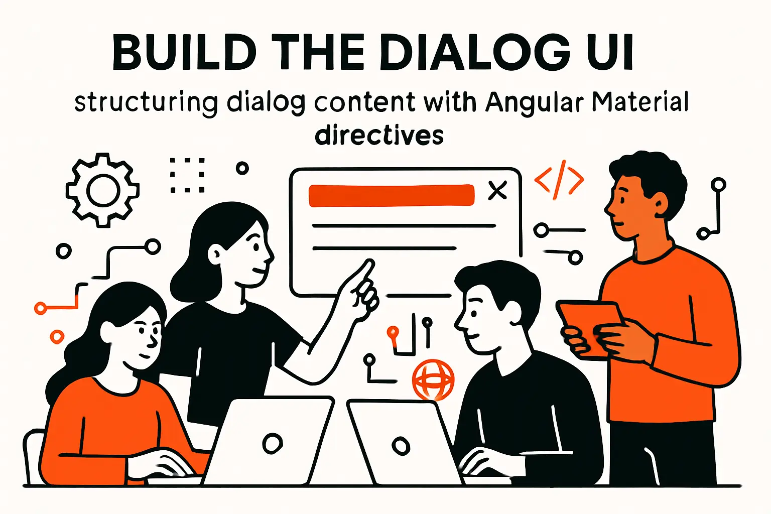
1. Keep the dialog body as a standard Angular component (no special inheritance required)
One reason we like Angular Material dialogs is that they don’t force a strange inheritance model. The dialog body is a standard Angular component with a template, styles, and normal dependency injection. That sounds obvious, yet it’s a meaningful productivity advantage: engineers don’t have to learn a new component lifecycle just to build a modal.
In practice, this means dialog components can use the same form patterns, i18n strategies, and state management approaches as the rest of the application. A dialog can have inputs (via injected data), internal state, and outputs (via MatDialogRef close results) without resorting to global stores or event buses.
From a maintainability standpoint, we try to keep dialog components “feature-pure.” If the dialog is used only in one feature, we keep it there and avoid premature generalization. When a dialog becomes reused across features, we promote it into a shared UI layer along with its contract types so callers remain decoupled from implementation details.
What “standard component” enables
- Normal unit tests around template behavior and validation rules.
- Normal dependency injection for translation, formatting, and API services.
- Normal refactors: rename fields, reorganize markup, split logic into helpers.
2. Use mat-dialog-title, mat-dialog-content, and mat-dialog-actions for layout
The structural directives for dialogs are deceptively simple. Titles should read like clear decisions (“Delete record?”) rather than vague labels (“Confirmation”). Content should contain the necessary context, not a wall of prose. Actions should use consistent placement and emphasis so users can predict where to click, even before they read every word.
When we audit dialog-heavy applications, the most common failure is action ambiguity. Buttons that say “OK” and “Cancel” without explaining what “OK” does invite mistakes. Another frequent failure is content overflow: long forms without clear sectioning, or content areas that scroll while action buttons disappear off-screen.
Material’s dialog structure helps by encouraging a layout that can handle scrolling content while keeping actions anchored. That guidance is valuable because it encodes battle-tested UI behavior into your component templates, reducing the need for every team to rediscover the same hard lessons.
Template skeleton
<h2 mat-dialog-title>{{ data.title }}</h2><div mat-dialog-content> <p>{{ data.message }}</p></div><div mat-dialog-actions align="end"> <button mat-button (click)="cancel()">{{ data.cancelText || 'Cancel' }}</button> <button mat-flat-button color="warn" (click)="confirm()">{{ data.confirmText || 'Confirm' }}</button></div>3. Design for form-based dialogs: focused fields, clear actions, and clean structure
Form dialogs are where modal design gets interesting. A confirmation dialog is essentially a question; a form dialog is a short-lived workspace. That changes what matters: field focus becomes critical, validation must be readable without overwhelming the layout, and submission should feel confident rather than risky.
In our builds, we typically choose one primary action (submit) and one secondary action (cancel). Beyond that, we’re cautious about adding tertiary actions because they dilute decision clarity. For destructive actions, we’ll often add a deliberate friction step—like requiring a typed acknowledgement—when the domain warrants it, but we only do so when the business impact justifies the additional interaction cost.
Clean structure is the hidden performance feature. A well-structured form dialog reduces cognitive load, which reduces time-to-complete, which reduces abandonment and support cases. If we can keep the user in flow—without route changes, without losing context—we’ve usually done our job.
Form dialog practices we repeatedly rely on
- Place the most likely field first and focus it intentionally.
- Keep helper text close to fields, not buried in a paragraph above the form.
- Disable submit until valid, but still explain why it’s disabled.
- Return a structured result payload rather than letting callers scrape state.
Recommended reading: Hardest Programing Language: How Difficulty Works and Which Languages Challenge Developers Most
Pass data into the dialog and return results to the caller

1. Provide input data via the MatDialogConfig data property
The data property is the cleanest way to pass inputs into a dialog. Instead of relying on shared services, globals, or mutable singletons, the caller provides a serializable object that represents the dialog’s context. That object becomes the “truth” for the dialog’s first render, which makes behavior easier to reason about and easier to test.
We prefer to keep dialog data small and intentional. Passing entire domain models can feel convenient, yet it increases coupling and makes it harder to evolve fields safely. A better pattern is to pass only what the dialog needs: display strings, IDs, flags, and default form values. When more data is needed, the dialog can load it explicitly, which clarifies responsibility and error handling.
In real workflows, the data property also becomes a place to encode product semantics. A confirmation modal doesn’t just ask “Are you sure?”; it asks “Are you sure you want to revoke this access?” and that specificity often lives in the data contract.
Caller-provided data as a stable API
const data: ConfirmDialogData = { title: 'Revoke access?', message: 'Revoking access will remove the user from this workspace.', confirmText: 'Revoke', cancelText: 'Keep access', isDestructive: true};this.dialog.open(ConfirmDialogComponent, { data });2. Read injected input via MAT_DIALOG_DATA inside the dialog component
Inside the dialog, MAT_DIALOG_DATA provides the input object through Angular dependency injection. That approach keeps templates clean and avoids awkward @Input wiring for a component that isn’t created through standard template composition. It also makes it explicit that the component is designed to be used as a dialog body.
We typically mark injected data as readonly and treat it as immutable. Mutating input objects inside dialogs creates confusing side effects because the caller and the dialog can end up sharing references. If the dialog needs working state, we create local state (for example, a form group or a view model) derived from the injected data.
From a security and correctness standpoint, MAT_DIALOG_DATA also encourages us to think about validation boundaries. The caller might supply malformed data, especially when dialogs are opened in edge cases like error recovery. Defensive programming here pays dividends.
Injecting dialog data
import { Component, Inject } from '@angular/core';import { MAT_DIALOG_DATA, MatDialogRef } from '@angular/material/dialog';import { ConfirmDialogData, ConfirmDialogResult } from './dialog-contracts';@Component({ selector: 'app-confirm-dialog', templateUrl: './confirm-dialog.component.html'})export class ConfirmDialogComponent { constructor( private readonly ref: MatDialogRef<ConfirmDialogComponent, ConfirmDialogResult>, @Inject(MAT_DIALOG_DATA) public readonly data: ConfirmDialogData ) {} cancel(): void { this.ref.close('cancel'); } confirm(): void { this.ref.close('confirm'); }}3. Close the dialog with MatDialogRef and capture output via afterClosed
A dialog’s output should be as deliberate as its input. MatDialogRef.close is where the dialog returns a result payload to the caller. That payload might be as simple as “confirm” versus “cancel,” or as rich as a form submission object. Either way, closing becomes the moment where UI intent is translated into application behavior.
afterClosed is the caller’s hook to process that intent. We often treat it like a promise boundary: once the dialog closes, the caller decides what to do next—call an API, update state, navigate, or show a follow-up message. Keeping that responsibility outside the dialog prevents the modal from becoming a miniature orchestrator that’s hard to reuse.
In complex flows, we also handle the “dismissed” case explicitly. Backdrop clicks, escape-key closes, and navigation-triggered closes can all produce undefined results. Treating those cases intentionally reduces production surprises and improves analytics accuracy when teams track user decisions.
Capturing output without overcomplicating the caller
const ref = this.dialog.open(ConfirmDialogComponent, { data });ref.afterClosed().subscribe((result) => { if (result === 'confirm') { // execute action }});Angular Material Dialog configuration options to control behavior and layout
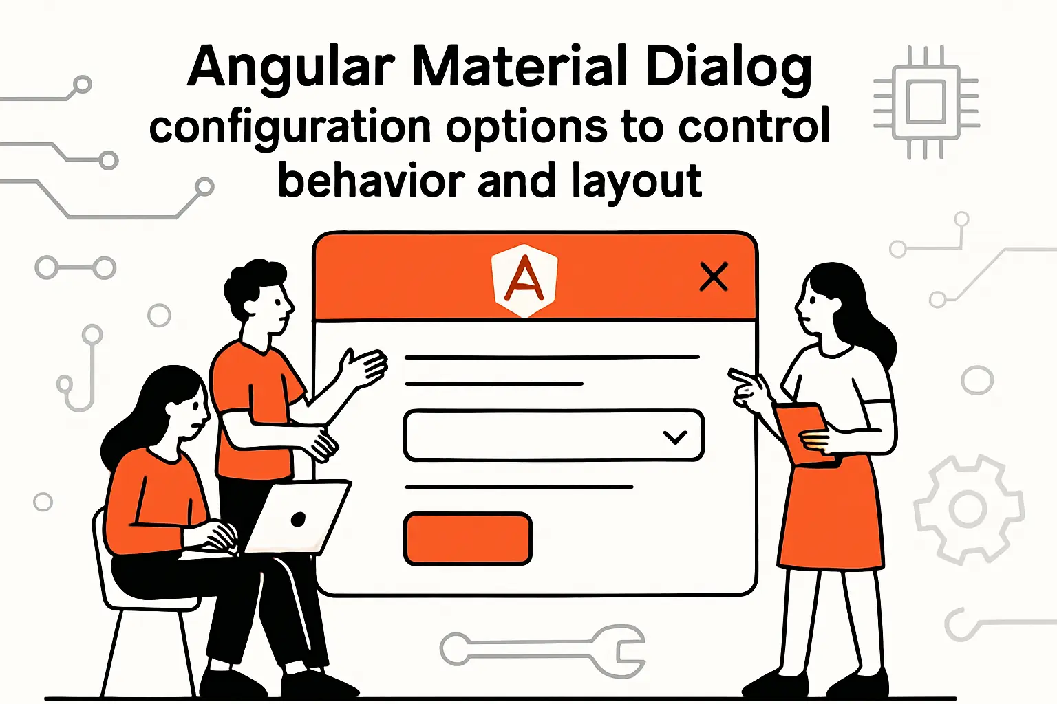
1. Backdrop and interaction: hasBackdrop, backdropClass, and disableClose
The backdrop is more than a dim overlay; it’s an interaction policy. When a dialog opens, the UI is saying: “this is the current task, and everything else is secondary.” That is powerful, which is why we treat backdrop configuration as part of product semantics rather than mere styling.
hasBackdrop controls whether the dialog behaves like a true modal or more like a floating panel. For many enterprise workflows, a modal is appropriate because it prevents accidental interactions with the underlying screen while a critical decision is pending. In other scenarios—like lightweight help panels—removing the backdrop can reduce perceived friction.
backdropClass is the stylistic complement: it allows the overlay to communicate severity. A destructive confirmation can subtly darken the background more than a harmless informational dialog, while still keeping the UI coherent. Meanwhile, disableClose is the strictest lever; we use it sparingly and pair it with exceptionally clear instructions when we must block dismissal.
Interaction choices we discuss with product teams
- Should a user be able to dismiss this without choosing an action?
- Is dismissal equivalent to cancel, or does it mean “no decision recorded”?
- Does the dialog represent a warning, a form, or a required checkpoint?
2. Navigation and UX flow: closeOnNavigation and automatic focus handling
Dialogs don’t exist in a vacuum; they sit on top of a routing system and a focus system. When navigation happens—either user-driven or programmatic—you need a consistent policy for what happens to open overlays. closeOnNavigation can prevent odd states where the route changes but a dialog from the previous context remains visible like a ghost from another screen.
Automatic focus handling is equally important, and it’s where accessibility and usability intersect. A dialog should trap focus so keyboard users don’t tab into the hidden background, and focus should land somewhere sensible so users can immediately understand what’s expected. For form dialogs, focusing the first field is often ideal. For informational dialogs, focusing the close affordance or the container can be less surprising.
On our team, we also watch for focus restoration. When a dialog closes, returning focus to the element that triggered it helps keyboard users maintain orientation. When restoration is wrong, users can “lose their place” and feel like the interface is unpredictable even if the business logic is correct.
A practical rule we use
Whenever a dialog interrupts a workflow, we ensure the close behavior and focus behavior are aligned with the user’s mental model of what “going back” means. That alignment prevents the subtle frustration that users struggle to articulate yet always remember.
3. Layout and placement: position, direction, and width/height min/max sizing
Layout configuration is where many teams accidentally bake in brittle assumptions. A dialog that looks perfect on a developer’s monitor can overflow on smaller screens, break in translated languages, or become unusable when the content grows. Because dialogs are constrained spaces, layout resilience matters more here than in typical page layouts.
Position is useful when you want a dialog to behave like a contextual panel rather than a centered modal. Direction matters for right-to-left languages and for products that have global reach. Size constraints—minimums and maximums—become essential when form content can expand due to validation messages, helper text, or dynamic fields.
In our implementations, we prefer using flexible sizing rules and letting content drive height with scrolling inside the content region. Hard-coding fixed dimensions can work for a single dialog, yet it tends to fail when the dialog is reused across use cases or when product evolves. A resilient dialog layout is one that degrades gracefully, even when requirements are messy.
Layout decisions we validate in QA
- Long titles and long translated strings still wrap without breaking the header.
- Content scrolls inside the dialog rather than pushing actions off-screen.
- Keyboard navigation remains stable when the content area is scrollable.
- The dialog feels centered and intentional across common viewport sizes.
Custom styling for MatDialog: panelClass, mat-dialog-container, and scoped CSS strategies
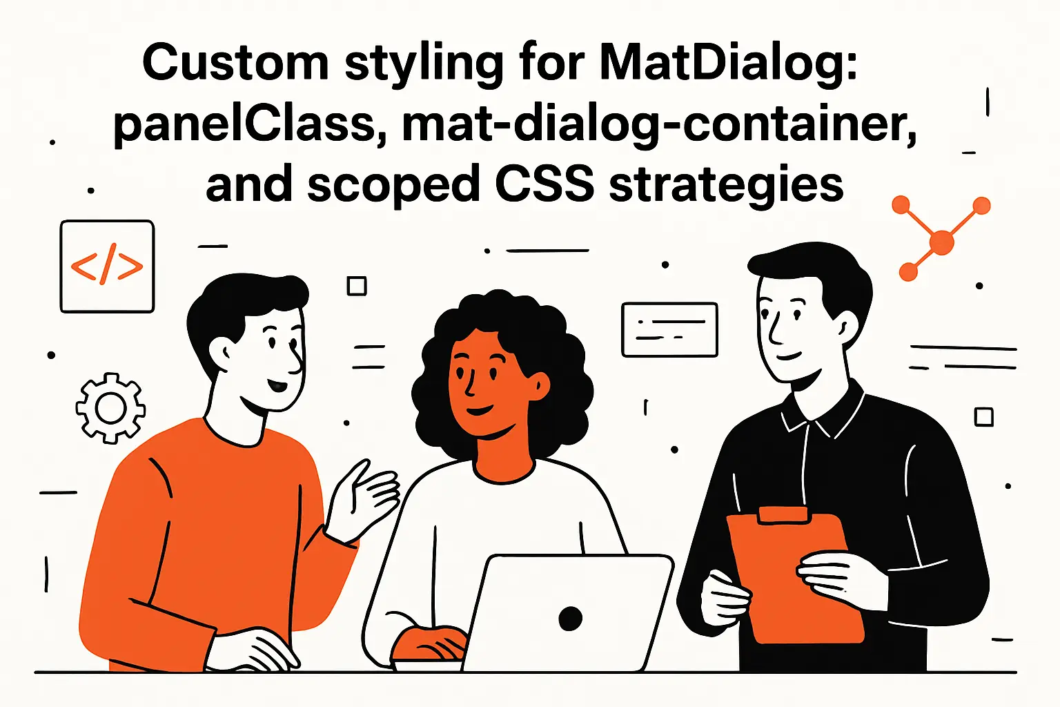
1. Scope styles per dialog instance using panelClass
Dialog styling is where teams often fall into a trap: they either style nothing and accept awkward defaults, or they apply global overrides that accidentally change every dialog in the product. panelClass is the escape hatch that lets you target a specific dialog instance (or a family of dialogs) without turning your CSS into a minefield.
From our standpoint, panelClass is not just a styling hook; it’s a maintainability strategy. By assigning semantic classes—like “confirm-dialog,” “form-dialog,” or “auth-dialog”—we encode intent into the overlay layer. That makes it easier to reason about later when a designer asks for a more compact confirmation modal or when accessibility reviews require different spacing rules for form-heavy dialogs.
When a dialog becomes critical to business workflows, we typically give it a dedicated panelClass even if we don’t immediately customize it. That small decision creates a safe extension point for future requests, and future requests always arrive.
panelClass in action
this.dialog.open(ConfirmDialogComponent, { data, panelClass: ['tt-dialog', 'tt-dialog--confirm']});2. Target mat-dialog-container padding and spacing without unintentionally affecting every dialog
mat-dialog-container is the element that wraps the dialog content, and it’s the natural place to adjust padding, border radius, shadows, and typography tweaks. The danger is scope: if you target mat-dialog-container globally, you might fix one dialog while subtly breaking another that relied on the original spacing.
Our approach is to scope container overrides beneath a panelClass selector. That way, container-level adjustments apply only when a dialog is opened with the corresponding class. This is especially helpful when different dialog categories require different density: confirmations often want compact spacing, while form dialogs need room for labels, hints, and errors.
Another nuance involves how Angular view encapsulation interacts with overlay content. Because the dialog container lives in the overlay, component-scoped styles might not apply the way teams expect. Planning for that reality early prevents “why doesn’t my CSS work?” churn during delivery.
Scoped container styling pattern
/* styles.scss (or a shared global stylesheet) */.tt-dialog--confirm .mat-mdc-dialog-container { /* scoped spacing tweaks live here */}3. Global styling approaches and deep styling considerations when component styles don’t apply
Sometimes component styles don’t apply because the dialog is rendered outside the component’s DOM subtree. In those situations, teams typically reach for deep selectors. That can be necessary, but it should be treated like a sharp tool: useful, occasionally unavoidable, and capable of causing long-term pain if used casually.
In our codebases, we prefer a layered strategy. Global styles define baseline dialog consistency: typography, spacing defaults, and common action alignment. panelClass then provides scoped variation for special cases. Only after those options are exhausted do we consider deep styling, and even then we keep the selector narrow and tied to a semantic class so refactors don’t silently break visuals across the application.
When teams invest in a thoughtful styling strategy, dialogs become easier to evolve. Instead of rewriting templates to change spacing or borders, we can adjust CSS in one place, test a small set of dialog categories, and ship confidently. That’s not just aesthetic; it’s delivery velocity.
How we keep global overrides from becoming global problems
- Prefer semantic panel classes over targeting generic container selectors.
- Write overrides that are resilient to minor DOM structure changes.
- Document the intent: why the override exists and what it should not affect.
TechTide Solutions: Building custom dialog experiences and tailored Angular solutions
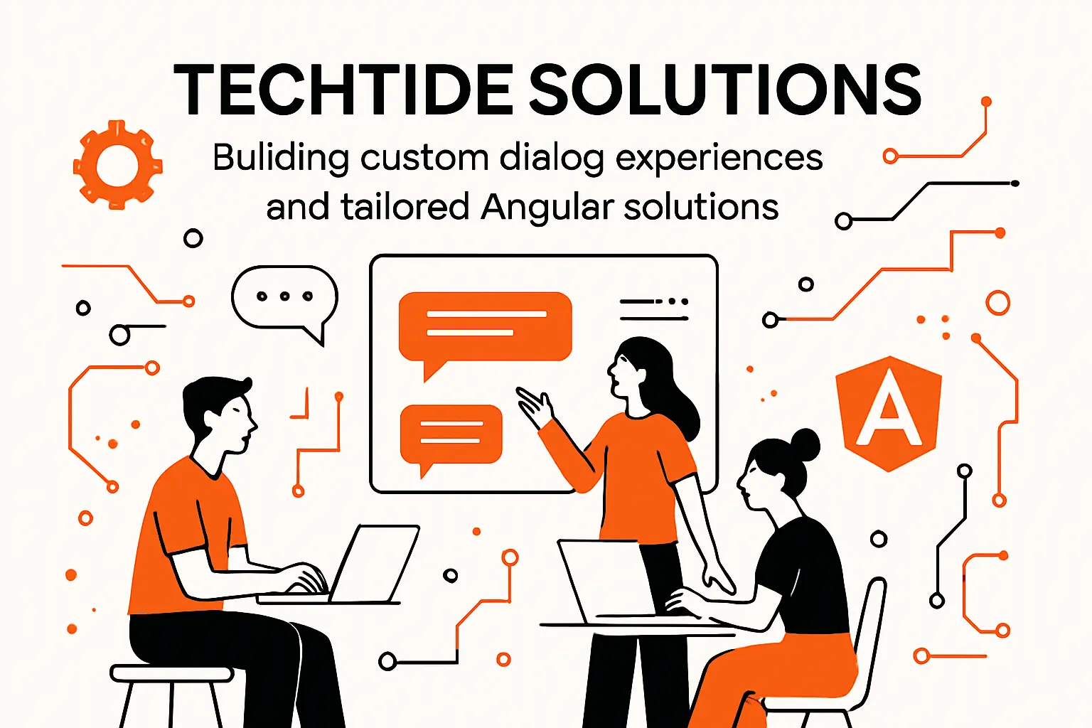
1. Custom web app development with Angular and reusable dialog components built for your product
At TechTide Solutions, we don’t treat dialogs as “just UI.” Instead, we treat them as workflow surfaces that deserve architecture. That mindset changes how we build: we start from the data contract, define behavior policies, design for accessibility, and only then polish the visuals.
In custom web app development, reusable dialog components become a force multiplier. Once a team has a well-tested confirmation dialog, a form dialog shell, and a consistent styling strategy, feature delivery accelerates. Product teams can request new modals without triggering a redesign of focus behavior, action placement, or close semantics each time.
When clients bring us mature products, we often find a scattered dialog ecosystem: different modal libraries, different button orders, different validation patterns, and inconsistent close behavior. Consolidating onto Angular Material Dialog (or at least consolidating patterns) becomes one of the fastest ways to raise baseline UX quality without rewriting the entire application.
Dialog components we frequently standardize
- Confirm and destructive confirm dialogs with consistent copy patterns.
- Form dialog shells that handle scroll, actions, and focus predictably.
- Notification dialogs for system errors that need explicit acknowledgement.
- Authentication and permission dialogs that coordinate with routing and guards.
2. Custom solutions tailored to customer needs: dialog data contracts, UI consistency, and workflow automation
Tailoring is where dialog work becomes strategic. A generic modal pattern is useful, but a product-specific modal pattern is transformative. For example, a compliance-driven product might require auditable acknowledgements; a marketplace might require identity verification prompts; an internal tool might require frictionless bulk-edit confirmations. Each domain has its own “modal grammar.”
In our approach, dialog data contracts are the key. When contracts are explicit, they become a lingua franca between product, design, and engineering. The contract states what the dialog needs to render and what it will return, which forces clarity: are we asking for a decision, collecting data, or enforcing a checkpoint?
Workflow automation is often the hidden benefit. Once dialog results are standardized, calling code becomes composable: callers can chain user decisions into effects, route transitions, or API calls with far less glue code. The result is not only cleaner architecture, but also faster iteration when business workflows change.
What “tailored” looks like in real delivery
- Dialog contracts that map to domain language instead of generic labels.
- Consistent action semantics so analytics can interpret “cancel” meaningfully.
- Shared UX rules for focus and dismissal aligned with accessibility expectations.
3. Production-ready delivery: integrating dialogs into end-to-end features, releases, and long-term maintenance
Production readiness is where many dialog implementations stumble. A modal can look perfect in isolation and still fail in the real app due to routing transitions, global error handlers, concurrent API calls, or state resets. That’s why we integrate dialogs into end-to-end feature testing, not just component snapshots.
During release planning, we also consider how dialogs behave under failure. What happens if the API call triggered by a dialog submission fails? Does the dialog close optimistically and then reopen with an error? Does it keep the user in place and show inline feedback? Each choice has implications for trust and perceived reliability.
For long-term maintenance, we document dialog conventions so teams don’t reinvent patterns in every feature. Over time, that shared knowledge becomes a quiet advantage: fewer regressions, fewer “mystery close” bugs, and less styling drift. In our view, dialog quality is a proxy for product maturity because it reveals whether a team sweats the details that users feel most intensely.
Release checks we apply to dialog-heavy features
- Keyboard-only navigation works reliably, including focus restoration.
- Dialogs behave predictably under slow networks and API failures.
- Global error handling doesn’t stack modals or interrupt critical flows.
- UX copy is specific enough to prevent accidental destructive actions.
Conclusion: choosing between Angular Material Dialog, Angular CDK dialogs, and native HTML dialogs

1. When Angular Material Dialog is the right fit for rapid, consistent UI delivery
Angular Material Dialog is the right fit when consistency and speed matter more than perfect stylistic freedom. The component gives you a strong baseline: accessible modal behavior, established layout primitives, and configuration options that cover most enterprise needs. For teams shipping complex workflows, that baseline removes risk and shortens the path from prototype to production.
In our practice, Material Dialog shines when multiple teams contribute to the same app. Shared primitives reduce debates about button order, spacing, or focus handling because the defaults are already aligned with a coherent design system. That alignment leaves teams free to focus on domain complexity rather than UI mechanics.
For organizations that care about maintainability, Material Dialog also provides a stable abstraction. When the UI layer is standardized, refactors are less scary, onboarding is faster, and feature teams can reuse patterns without “copy-paste inheritance” that silently diverges over time.
Our litmus test
If your product needs a dependable modal pattern across many features, Material Dialog is usually the pragmatic choice, especially when delivery velocity is a hard constraint.
2. When to consider an unstyled, fully brandable approach with Angular CDK dialog patterns
Sometimes Material is not the right abstraction. Brand-heavy products, highly customized interaction models, or applications with a non-Material design language may find themselves fighting the defaults more than benefiting from them. In those cases, Angular CDK dialog patterns can be a better foundation because they provide the overlay mechanics without imposing a specific visual system.
From our viewpoint, CDK-based dialogs are best when you want full control over markup and styling while still relying on robust overlay behavior. That extra control comes with responsibility: your team must implement consistent layout, focus management, and accessibility practices that Material normally gives you out of the box.
When we build CDK dialog systems, we usually bring the same contract-first mindset: explicit data models, explicit result types, and strict policies on dismissal behavior. The goal is to keep the UX predictable even when the visuals are bespoke.
Trade-off we state plainly
CDK gives freedom, but freedom is expensive unless a team is ready to enforce standards with the same discipline a design system would normally provide.
3. When a native HTML dialog element can be enough for a simple modal requirement
Not every modal needs a full framework abstraction. For simple requirements—especially in smaller applications or in isolated admin tools—the native HTML dialog element can be “enough” if your needs are modest and your accessibility strategy is sound. That option can reduce dependencies and complexity when the modal’s behavior is straightforward.
Even then, we recommend caution. Native dialogs still require thoughtful integration with focus, validation, and routing, and they may behave differently across browsers in ways that surprise teams accustomed to framework-level consistency. If your product has complex workflows, many modal variants, or heavy reuse needs, a native approach can become inconsistent unless you build additional conventions around it.
Before choosing, we ask a simple question: do we want to spend our engineering effort on product logic, or on re-creating modal infrastructure? If your next step is to audit your current dialog patterns for inconsistency, where would we start—data contracts, dismissal rules, or styling scope?