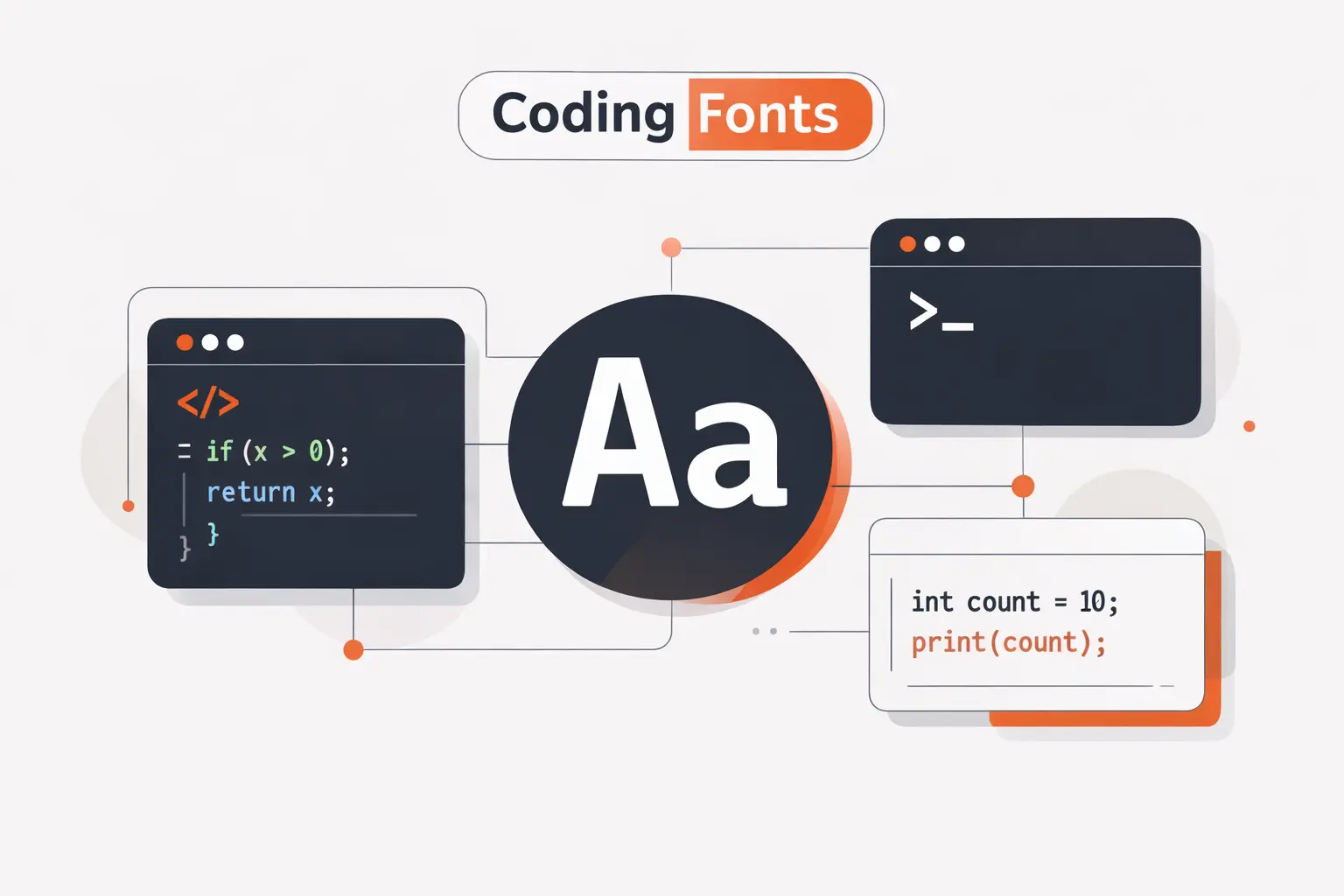
At TechTide Solutions, we treat the best font for coding as a working tool, not a style choice. A good coding font reduces hesitation. You spot a stray bracket faster, parse logs with less effort, and stay calmer during long review sessions. JetBrains ships its own coding font, and Microsoft built Cascadia alongside Windows Terminal. We think that is the right mindset.
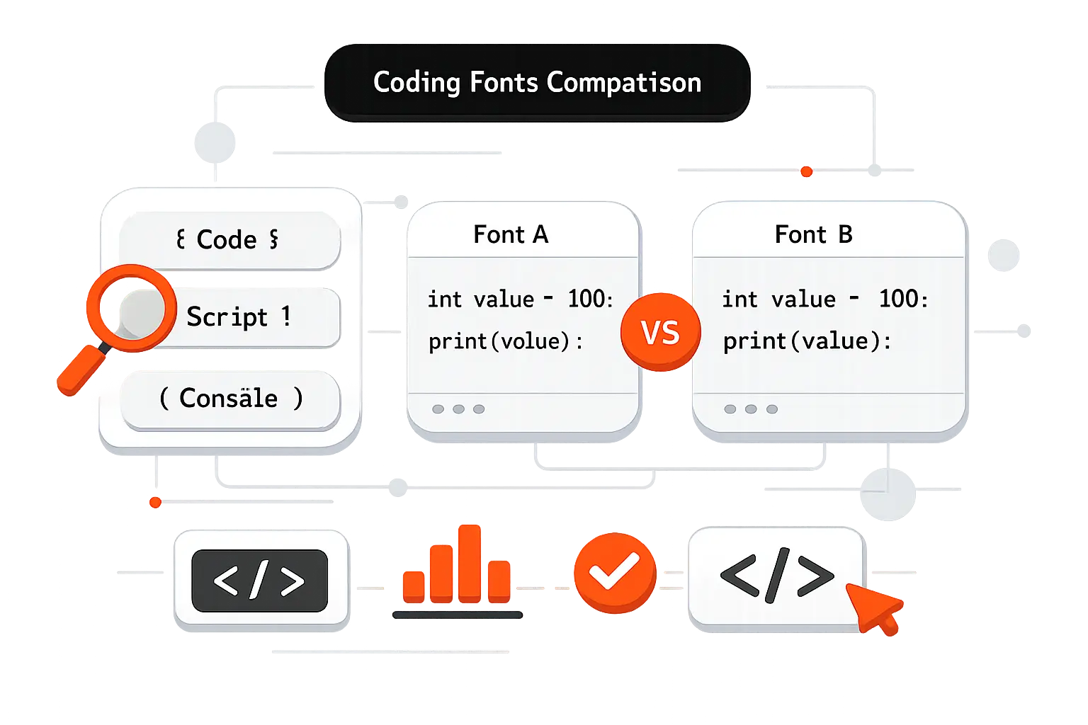
Quick Comparison of Best Font for Coding
That matters because software environments are now core workplaces. Gartner expects worldwide IT spending to reach $5.43 trillion in 2025, so tiny improvements in the daily developer setup are worth taking seriously.
We put the fastest short list first. These ten picks cover most teams and show the trade-offs you will feel on day one.
| Tool | Best for | From price | Trial/Free | Key limits |
|---|---|---|---|---|
| JetBrains Mono | Everyday IDE use | $0 | Free | Not the densest |
| Fira Code | Ligature-heavy coding | $0 | Free | Ligatures split opinion |
| Source Code Pro | Neutral team standard | $0 | Free | No code-specific flair |
| Input Mono | Fine-tuned widths | $40 | Testing license | Paid, many choices |
| Hack | Linux and terminals | $0 | Free | Only 4 core styles |
| Cascadia Code | Windows terminal stack | $0 | Free | Need right variant |
| Iosevka | Dense screens | $0 | Free | Tuning gets fiddly |
| Julia Mono | Scientific symbols | $0 | Free | Overkill for simple code |
| Consolas | Windows familiarity | Included | Bundled | Proprietary, older feature set |
| DejaVu Sans Mono | Safe Linux fallback | $0 | Free | Older look, no ligatures |
Recommended reading: Top 20 Best Tech Blogs for Developers, Founders, and Curious Readers
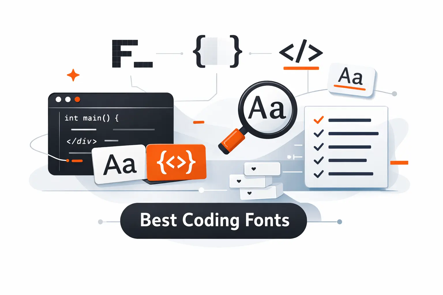
Top 20 Best Font for Coding Options for Developers
Statista projects a global developer population of 28.7 million in 2024, and major toolmakers already act like typography is part of product design. Below, we review all 20 options in the outline. We are weighing everyday readability first, then density, feature control, licensing, and how quickly most developers adapt. If you want the shortest answer, start with JetBrains Mono, then branch out based on your screen, terminal use, and feelings about ligatures.
1. JetBrains Mono
JetBrains built JetBrains Mono inside its developer tools ecosystem, and that origin shows. The font feels like it was tested by people who spend all day in IDEs, code reviews, and debugger panes. We like its balance. It has personality, but not so much that it hijacks the screen.
Best for: general software developers and JetBrains IDE users who want a safe default.
- Large lowercase shapes and clear punctuation → keep 12px to 14px code readable without bumping size.
- Built-in ligatures and broad editor support → save 2 to 3 setup steps compared with patched community fonts.
- Works especially well in IntelliJ-based tools → time to first value is about 1 minute if you already use the JetBrains stack.
Pricing & limits: From $0. No trial is needed. It is free and open source, so there is no normal seat cap for day-to-day desktop use.
Honest drawbacks: It is not the densest font in this list, so terminal maximalists may still prefer Iosevka or PragmataPro. The ligatures are restrained, which some Fira Code fans will find too tame.
Verdict: If you want one font that most teams can adopt without drama, this helps you settle into cleaner reading in a single afternoon.
2. Fira Code
Fira Code comes from Nikita Prokopov’s long-running project, and it remains one of the most recognized names in coding fonts for a reason. The team focus is obvious. This font was built around operators, visual rhythm, and real editor use, not just specimen posters.
Best for: ligature fans and developers who work in modern IDEs all day.
- Large ligature library → turns noisy operator clusters into faster-to-scan tokens in symbol-heavy languages.
- Powerline, box drawing, and console-friendly glyphs → cut out 2 to 4 patching and fallback steps in terminal-heavy setups.
- Strong editor compatibility → time to first value is usually under 5 minutes in VS Code, JetBrains IDEs, and most modern editors.
Pricing & limits: From $0. No trial is needed. It is free and open source, so there are no typical seat limits for standard use.
Honest drawbacks: If you dislike transformed operators, Fira Code can feel clever in the wrong way. Some terminals still expose OpenType features unevenly, so results can vary outside editors.
Verdict: If you want ligatures that genuinely change how operator-heavy code feels, this helps you read dense syntax faster within a few sessions.
3. Source Code Pro
Adobe’s type team built Source Code Pro as the monospace companion to Source Sans Pro, and it still feels like one of the cleanest neutral options on the market. We often recommend it when a team wants less debate and more consistency. It is calm, familiar, and low-risk.
Best for: engineering teams that want a neutral standard and developers who dislike flashy letterforms.
- Clean humanist shapes → keep long files readable without drawing attention to the font itself.
- Broad availability across design and code tools → save 2 to 3 rollout steps when teams use editors, docs, and screenshots together.
- Predictable weights and italics → time to first value is about 3 minutes because almost no tuning is required.
Pricing & limits: From $0. No trial is needed. It is open source, so normal desktop and team use does not run into seat caps.
Honest drawbacks: It lacks the code-specific feel of JetBrains Mono or the operator magic of Fira Code. Some developers also find it a little plain after using more expressive fonts.
Verdict: If you want a steady house standard that fades into the background, this helps you make that switch almost immediately.
4. Input Mono
Input Mono comes from David Jonathan Ross and Font Bureau, and it feels more like a full type system than a single font pick. That is both its strength and its trap. We reach for it when a developer also cares about width, tone, and how code snippets look beside product copy.
Best for: frontend engineers and design-minded developers who want fine control over width and texture.
- Multiple widths and style options → let you fit more columns or create a roomier reading feel without changing families.
- Mono, sans, and serif companions → remove several design handoff steps when code, docs, and UI need to feel related.
- Customizable family structure → time to first value is about 10 minutes, though finding your favorite variant can take longer.
Pricing & limits: From $40 for a 14-style Input Mono width set, $100 for the full 56-style Input Mono family, or $5 for an individual style. There is a $0 testing license, and paid licenses scale by desktop, web, and app use.
Honest drawbacks: Choice overload is real here. Teams that just want one simple default may find Input exhausting, and the commercial license makes it harder to roll out casually.
Verdict: If you want a coding font you can tune to your exact taste, this helps you get there after one careful setup session.
5. Hack
Hack comes from Source Foundry, and it still earns respect because it solves practical problems without fuss. The team built it for screens first, and that shows in the sturdy shapes, generous symbol support, and no-nonsense feel. We still like it for Linux-heavy environments.
Best for: Linux users and terminal-first developers who want an open-source workhorse.
- Screen-first letterforms with clear punctuation → keep shell output and dense config files readable on ordinary monitors.
- Built-in Powerline support → remove patched-font steps and clean up prompt rendering fast.
- Simple four-face family → time to first value is usually under 3 minutes because there is little to configure.
Pricing & limits: From $0. No trial is needed. The font is free and open source, so there are no standard seat caps.
Honest drawbacks: Hack is more practical than elegant. If you want lots of weights, deep alternates, or strong ligature behavior, it will feel limited. It also looks wider than some dense-screen favorites.
Verdict: If you want a dependable open-source font for terminals, logs, and daily coding, this helps you get comfortable almost right away.
6. Cascadia Code
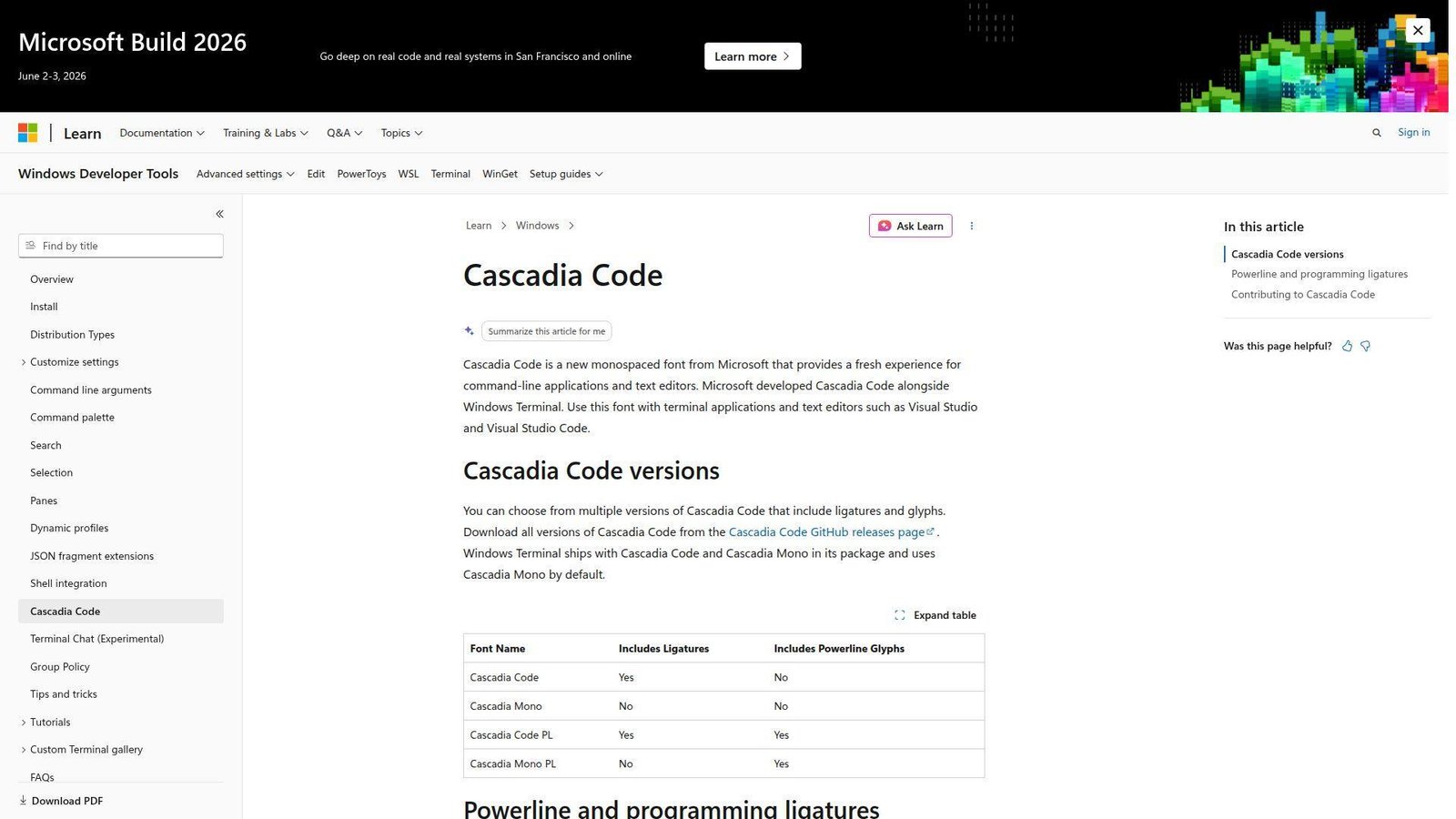
Cascadia Code came from Microsoft’s Windows Terminal work, and that product context matters. This is not a decorative side project. It was built to behave well in terminals and text editors, with clear versioning for ligatures and Powerline needs. We think it is one of the easiest wins for Windows users.
Best for: Windows developers and terminal users who want modern features without extra patching.
- Code, Mono, and Powerline variants → let you match ligature preference and prompt needs without switching families.
- Tight terminal integration → save 2 to 4 setup steps compared with older Windows font workflows.
- Clean editor and terminal behavior → time to first value is immediate in Windows Terminal and a few minutes elsewhere.
Pricing & limits: From $0. No trial is needed. It is open source and easy to deploy across standard team setups.
Honest drawbacks: It feels most natural inside Microsoft-centric workflows. If you hate ligatures, you need to choose the Mono variant on purpose, and the family personality is not as neutral as Source Code Pro.
Verdict: If you want the fastest modern upgrade for Windows terminals and editors, this helps you improve readability on the same day.
7. Iosevka
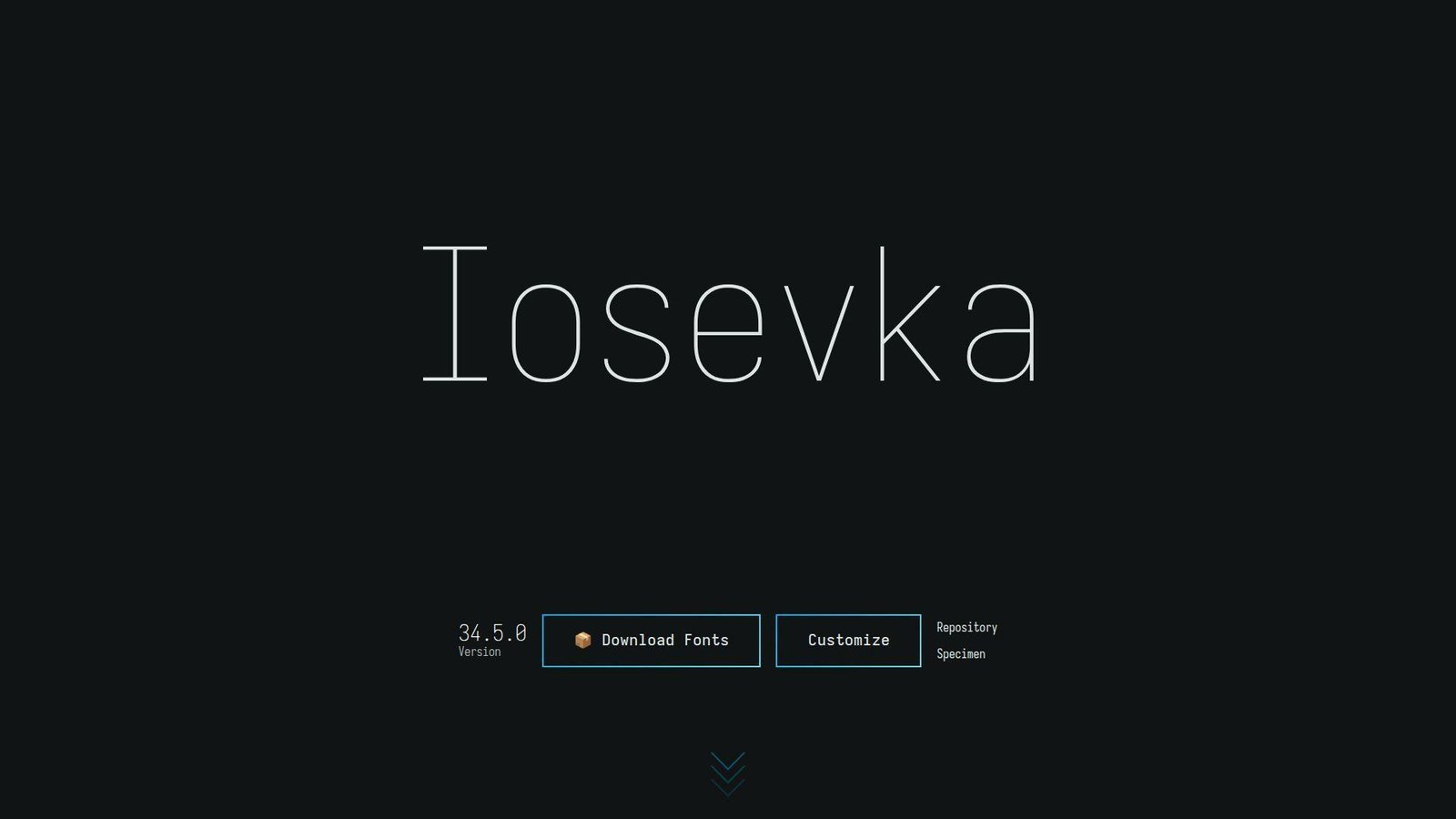
Iosevka is an independent open-source project, and it feels more like a precision toolkit than a typical font release. That is exactly why power users love it. We see it chosen by developers who care about density, alternates, and getting every shape exactly right for their eyes.
Best for: terminal power users and developers who want tight density with deep customization.
- Narrow default width with optional extended width → fit more columns on screen without dropping to tiny point sizes.
- Huge alternate and ligation controls → save repeated font hopping because you can tune one family instead of replacing it.
- Good defaults with optional custom builds → time to first value is 2 minutes on defaults or 15 to 20 minutes if you go deep.
Pricing & limits: From $0. No trial is needed. It is open source, so standard desktop use does not carry a normal seat cap.
Honest drawbacks: Iosevka can feel too narrow or too technical for general teams. The customization rabbit hole is real, and some developers spend more time tuning it than coding with it.
Verdict: If you want maximum density and shape control, this helps you tailor your editor to your preferences within one setup session.
8. Julia Mono
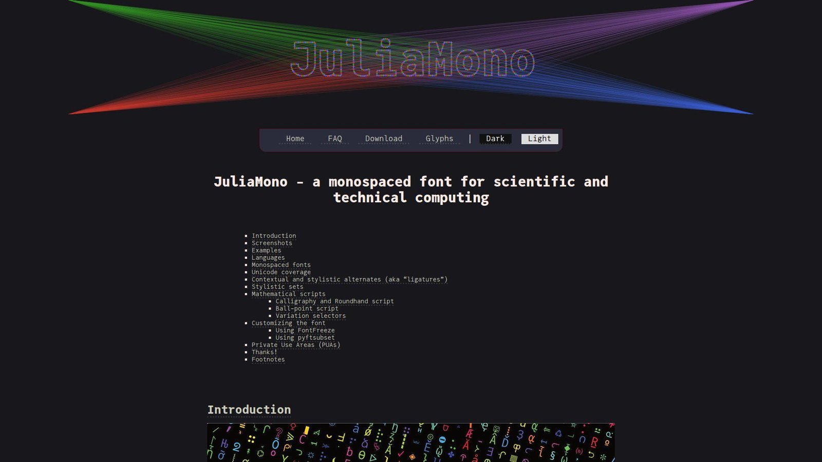
Julia Mono is an independent project by Cormullion, and it was built with scientific and technical computing in mind. That gives it a very different flavor from a general-purpose coding font. We like it most when code sits beside math symbols, Greek letters, or specialized technical text.
Best for: data scientists and developers who work with technical Unicode all day.
- Wide specialist symbol coverage → reduce fallback-font surprises in notebooks, equations, and research code.
- OpenType alternates and technical glyph support → save copy-paste cleanup and screenshot fixing in symbol-heavy workflows.
- Friendly install across common editors → time to first value is about 5 minutes, though feature tuning can take longer.
Pricing & limits: From $0. No trial is needed. It uses a liberal license and does not impose normal seat caps for common use.
Honest drawbacks: Many web and app developers simply do not need this much Unicode depth. Terminal support for advanced OpenType behavior also varies more than editor support does.
Verdict: If you mix programming with equations or technical symbols, this helps you keep one readable font across that work almost immediately.
9. Consolas
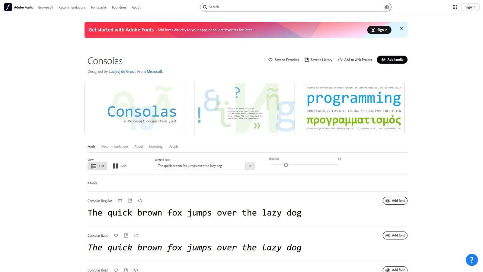
Consolas is Microsoft’s classic answer to readable programming text, designed by Luc(as) de Groot. We still respect it because it solved real screen-readability problems for a huge generation of Windows developers. It is old, but it is not irrelevant.
Best for: Windows-first teams and developers who prefer familiar, low-drama defaults.
- Humanist proportions and distinct similar characters → make long code and plain text easier to read than older typewriter-like monospace fonts.
- Bundled presence in Microsoft ecosystems → save several install and approval steps in locked-down corporate setups.
- Zero learning curve for many Windows users → time to first value is basically instant on machines that already include it.
Pricing & limits: From included. There is no trial because it comes with applicable Microsoft products and services. Availability is tied to that ecosystem rather than a separate open license.
Honest drawbacks: Consolas feels dated next to Cascadia Code or JetBrains Mono, and it lacks the modern ligature and Powerline culture many developers now expect. It is also proprietary.
Verdict: If you want a familiar Windows coding font that still holds up, this helps you stay productive with no setup time at all.
10. DejaVu Sans Mono
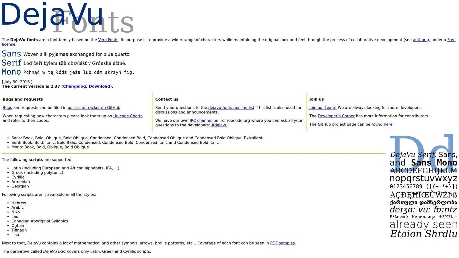
DejaVu Sans Mono is part of a collaborative open-source family based on Vera, and it has earned its reputation as a dependable Linux staple. It is not fashionable, but it is sturdy. We keep seeing it as a fallback that quietly does its job.
Best for: Linux users and teams that value broad character coverage over fancy extras.
- Conservative shapes with broad coverage → cut down missing-glyph problems in mixed-language code and documentation.
- Common presence on Linux systems → save packaging and install steps in remote servers, containers, and shared desktops.
- Low-surprise behavior across apps → time to first value is often immediate because the font is already there.
Pricing & limits: From $0. No trial is needed. The free license means common team use does not run into usual seat limits.
Honest drawbacks: It looks older and heavier than newer options, and it does not offer modern ligature behavior. If aesthetics matter to your team, it can feel like a safety pick rather than a favorite.
Verdict: If you need a reliable, broad-coverage fallback for Linux-heavy work, this helps you standardize fast without paying anything.
11. Ubuntu Mono
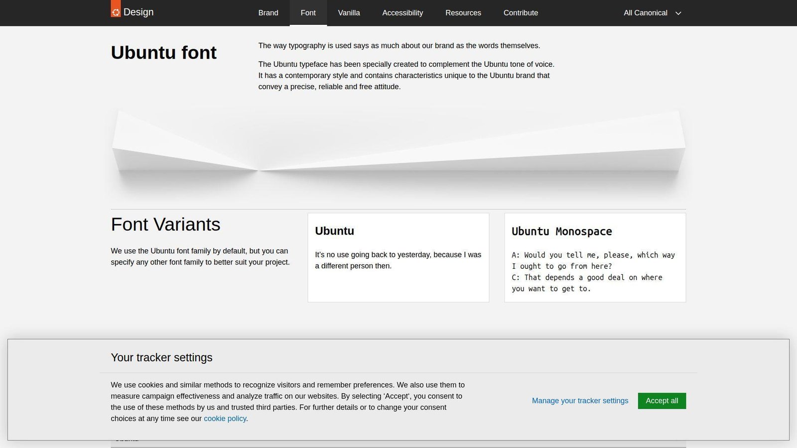
Ubuntu Mono grew out of Canonical’s broader Ubuntu type family, with technical design work by Dalton Maag. That background gives it more brand personality than many coding fonts, but also a friendlier tone than the colder terminal classics. We like it most on Linux desktops.
Best for: Ubuntu users and developers who want a warmer open-source monospace.
- Screen-focused hinting and approachable shapes → keep editor text comfortable on everyday laptops and external monitors.
- Good Linux packaging and family consistency → save rollout time when teams already use Ubuntu-based environments.
- Familiar installation path on Linux → time to first value is usually under 3 minutes on Ubuntu systems.
Pricing & limits: From $0. No trial is needed. The open license removes normal seat limits for typical desktop use.
Honest drawbacks: Ubuntu Mono has stronger personality than IBM Plex Mono or Source Code Pro, which can be a downside for teams that want neutrality. Some character shapes also feel quirky if you are used to stricter enterprise fonts.
Verdict: If you want an open-source coding font with more warmth than the usual Linux defaults, this helps your editor feel friendlier within a day.
12. Anonymous Pro
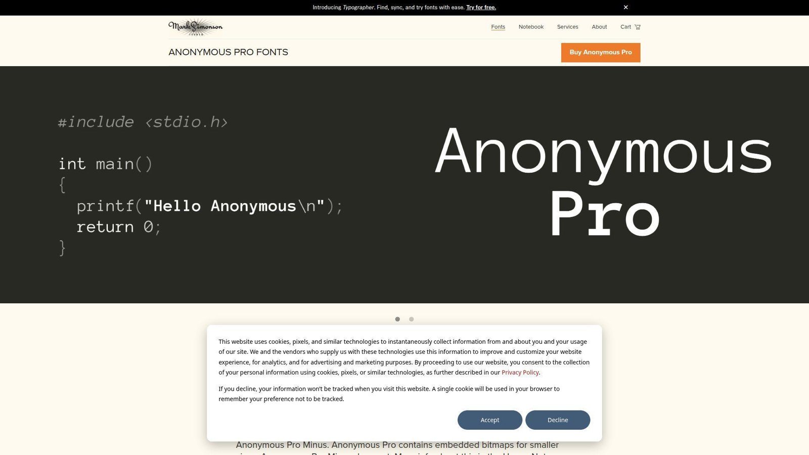
Anonymous Pro comes from Mark Simonson’s studio and was designed with coding in mind from the start. It carries some old-school typewriter DNA, but it does not feel careless or rough. We think it works best for developers who want character without turning code into performance art.
Best for: classic-font fans and developers who spend a lot of time reading comments and prose-like code.
- Fixed-width design with softer texture → make long text blocks and comments feel less sterile than harder-edged monospace fonts.
- Keyboard symbols and box-drawing support → save patching and fallback steps in older terminal workflows.
- Simple four-style family → time to first value is around 2 minutes because there is almost nothing to tune.
Pricing & limits: From $0. No trial is needed. The OFL license means standard desktop use is not boxed in by seat caps.
Honest drawbacks: The family is small by modern standards, and some developers will find it too retro for dense IDE use. If you want many weights or rich ligature control, look elsewhere.
Verdict: If you want a readable coding font with a softer, classic feel, this helps you change the mood of your editor in one short install.
13. IBM Plex Mono
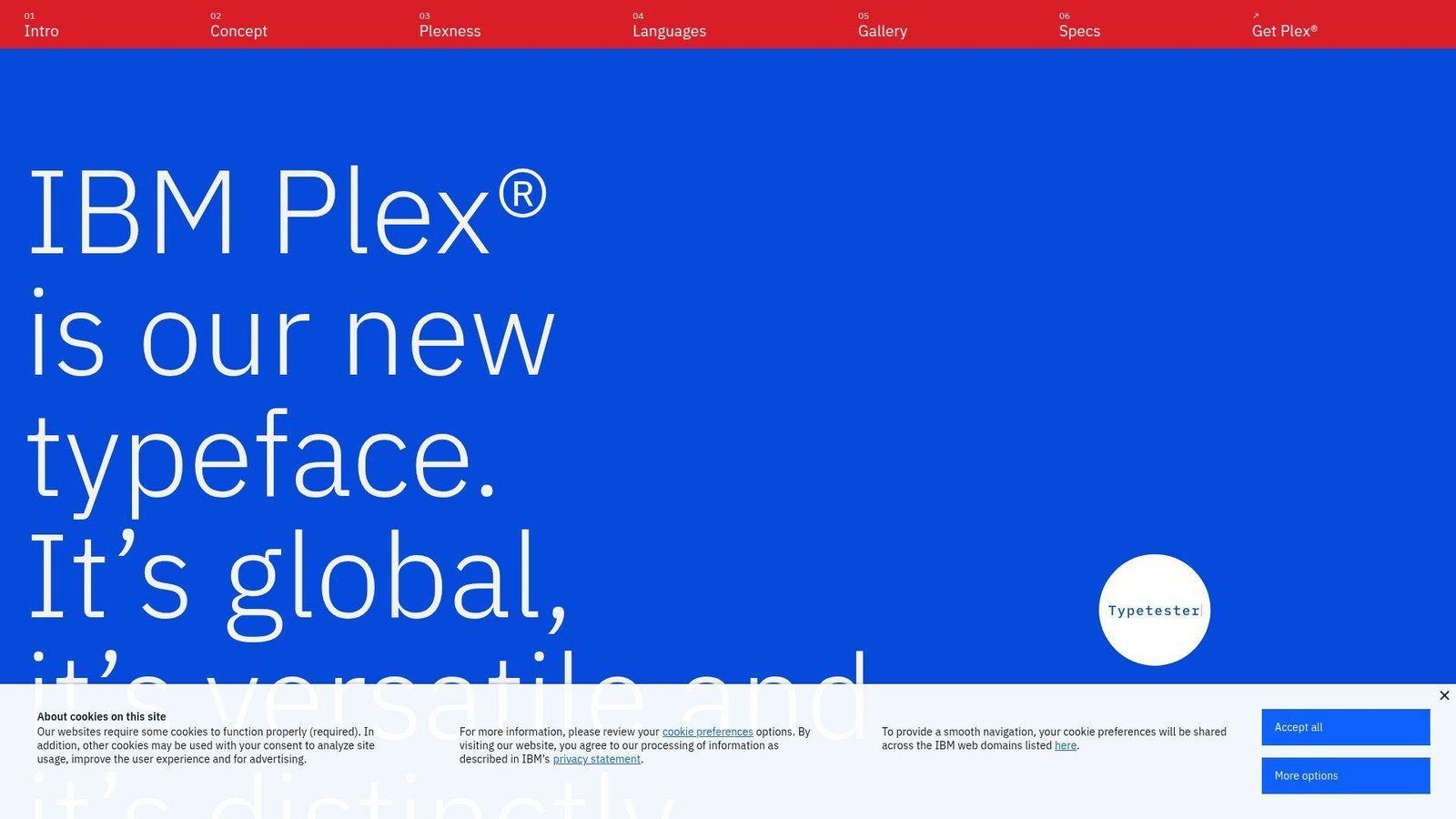
IBM Plex Mono is part of IBM’s broader Plex system, built by a global type design team rather than a lone hobby project. That matters for teams that care about consistency across product UI, docs, and code snippets. We often recommend it when engineering and design want one visual language.
Best for: enterprise product teams and developers who want a polished neutral standard.
- Balanced 600-unit mono structure → keep code snippets, tables, and technical text stable across tools and screens.
- Works well beside the wider IBM Plex family → remove several design-system decisions when code and UI need to match.
- Easy rollout through common font channels → time to first value is about 5 minutes across most team setups.
Pricing & limits: From $0. No trial is needed. The open license keeps standard team use simple and free of typical seat restrictions.
Honest drawbacks: It is more restrained than MonoLisa or Gintronic, so some developers will call it boring. If you want dense columns or dramatic ligatures, it is not trying to be that font.
Verdict: If you need one coding font that also behaves well in product systems and docs, this helps you standardize with minimal pushback.
14. Monoid
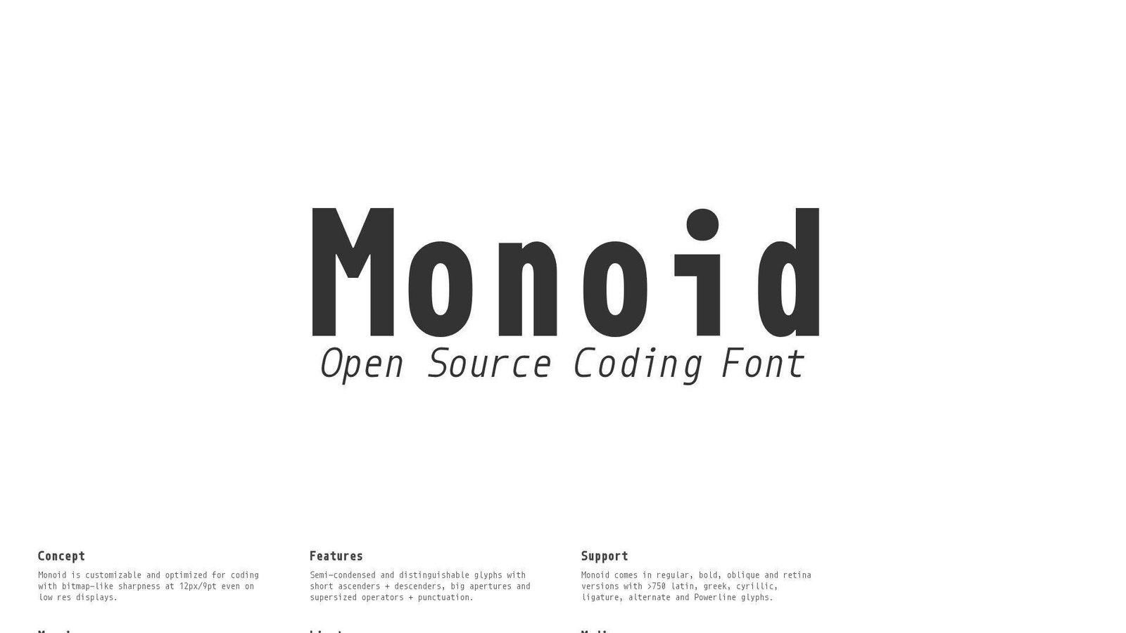
Monoid is an independent open-source project from Larsenwork, and it was clearly built by people who care about code at tiny sizes. We think of it as a sharp instrument, not a broad crowd-pleaser. On the right screen, it can feel impressively efficient.
Best for: developers using dense layouts and anyone coding at small editor sizes.
- Bitmap-like sharpness at small sizes → keep 12px text crisp where blurrier fonts start to smear.
- Alternates, ligatures, and Powerline-friendly extras → save multiple patching and customization steps in dense terminal setups.
- Fast default install with optional tweaks → time to first value is about 5 minutes if you do not over-customize it.
Pricing & limits: From $0. No trial is needed. It is open source, so normal team use does not face typical seat caps.
Honest drawbacks: Monoid can look cold and narrow in prose-like code, and the project feels less mainstream than JetBrains Mono or Cascadia Code. Some developers will love that. Others will never warm up to it.
Verdict: If you want a compact font that stays crisp at small sizes, this helps you reclaim screen space almost immediately.
15. MonoLisa
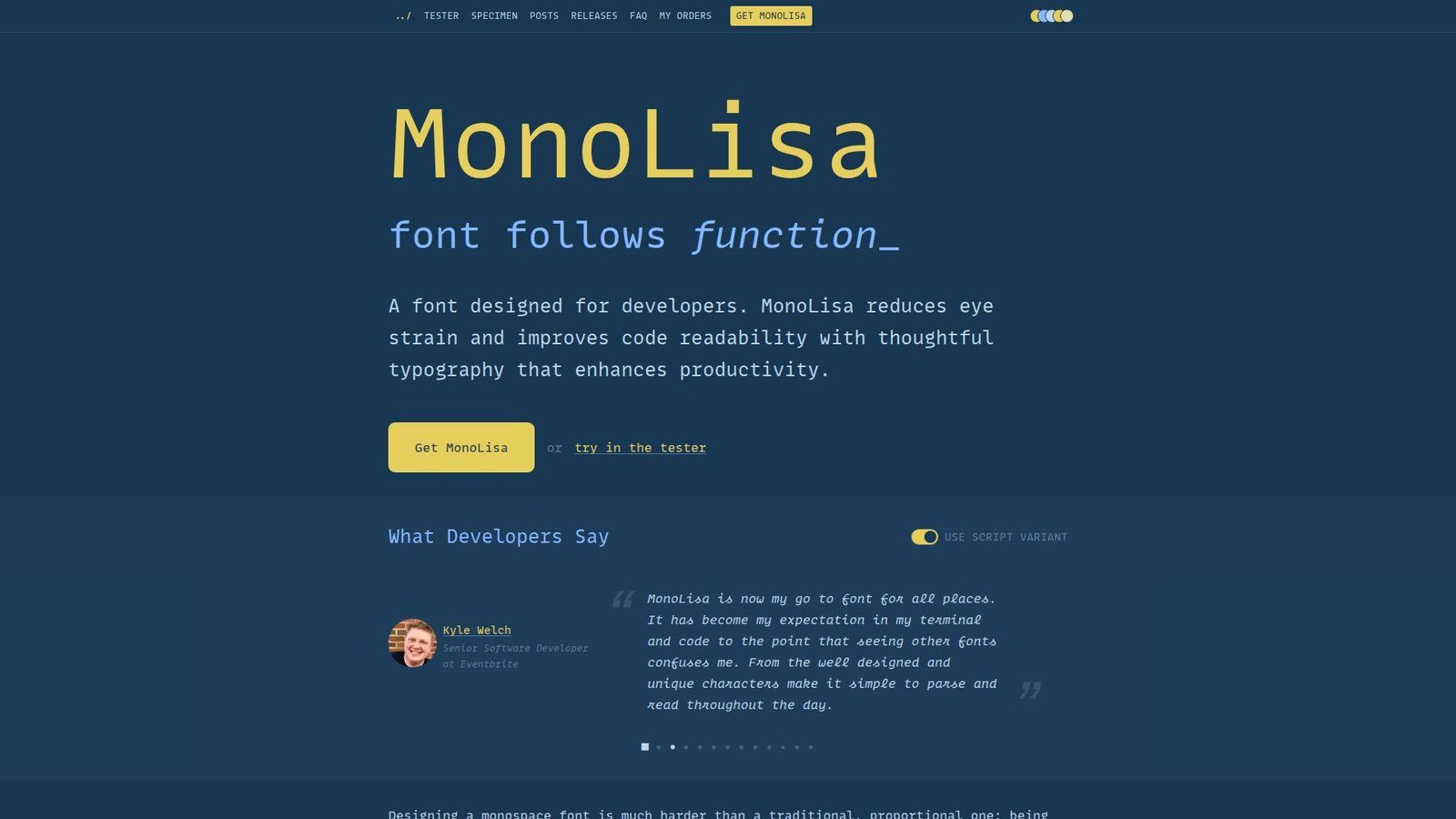
MonoLisa comes from FaceType, designed by Marcus Sterz with developer input from Andrey Okonetchnikov and Juho Vepsäläinen. That designer-plus-developer mix is a big part of its appeal. This is a premium font, but it was clearly shaped by people who care about both typography and daily coding comfort.
Best for: developers in long coding sessions and design-aware engineers who are willing to pay for comfort.
- Open shapes, careful spacing, and script italics → make comments, identifiers, and long files easier to scan over extended sessions.
- Rich ligatures, symbols, and feature customization → save extra patching and feature hunting across modern editors and terminals.
- Free limited trial with clear tuning controls → time to first value is about 10 minutes because most people will tweak a few stylistic sets.
Pricing & limits: Premium pricing is shown on the current checkout flow rather than clearly on the main landing page. A free limited trial is available. Indie licensing covers 1 user or domain, 100,000 page views, and 10 print or app uses, with larger plans above that.
Honest drawbacks: The cost rules it out for many teams, and the slightly wider rhythm needs a real adjustment period. Some editors also expose only part of what makes MonoLisa special.
Verdict: If you want a premium font built for comfort and polish, this helps you feel the upgrade within a week of daily use.
16. Hasklig
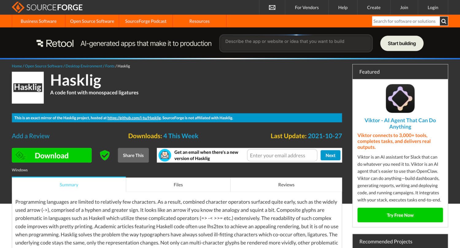
Hasklig started with Ian Tuomi’s idea of extending Source Code Pro with monospaced ligatures, and the project still has a clear niche. It was built for real operator-heavy code, especially in Haskell-like languages where symbol clusters are not rare edge cases but daily reality.
Best for: Haskell developers and functional programmers who want prettier operators without leaving Source Code Pro behind.
- Monospaced ligatures for complex operators → make arrows, bind chains, and symbolic code easier to parse at a glance.
- Source Code Pro foundation → save retraining time because the underlying shapes stay familiar to many developers.
- Lightweight install footprint → time to first value is under 5 minutes in editors that already handle ligatures well.
Pricing & limits: From $0. No trial is needed. The OFL license removes ordinary seat caps for normal use.
Honest drawbacks: Hasklig feels quieter and older than Fira Code or Cascadia Code, and the project is less active than many newer alternatives. If you want a bigger ecosystem, you may outgrow it.
Verdict: If you already like Source Code Pro but want symbolic code to read better, this helps you get that upgrade almost immediately.
17. Gintronic
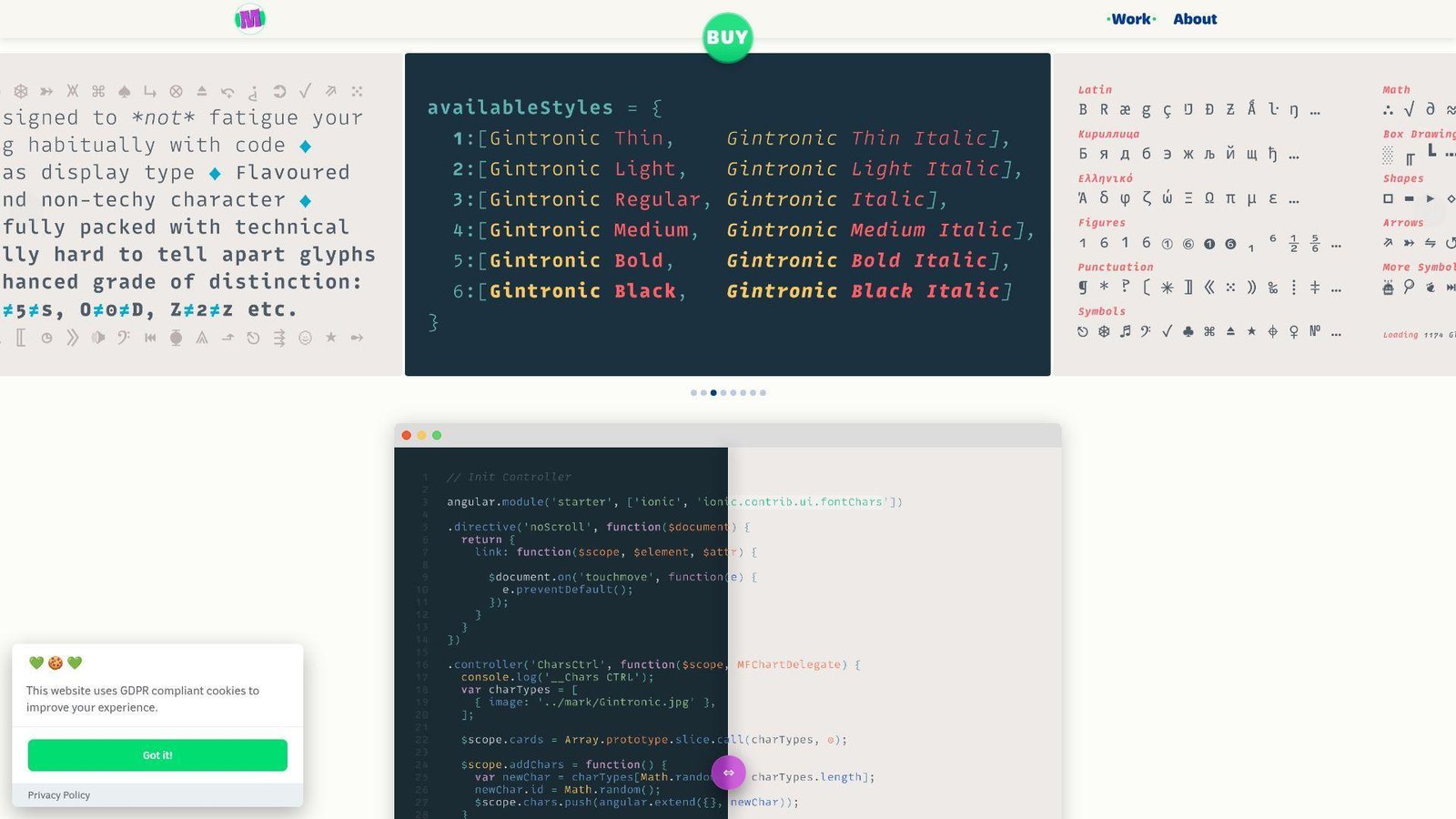
Gintronic comes from Mark Frömberg and Hypertype, and it is one of the most distinctive premium fonts in this list. The whole project pushes against the cold, mechanical feel many coding fonts fall into. We admire that, even if it will not suit every team.
Best for: creative coders and developers who want an ergonomic font with stronger personality.
- Gentler shapes and a broad weight range → make long reading sessions feel less harsh than stricter monospace families.
- Technical symbols, box drawing, and stylistic alternatives → save fallback cleanup and help teams soften the oddest glyphs if needed.
- Deliberate weight choices across the family → time to first value is about 5 minutes, though picking the right weight matters more than usual.
Pricing & limits: From €50 for a single style, €100 for Roman or Italic bundles, and €150 for the full family. License sizes run from S for up to 3 users through XL for up to 50 users, with custom terms above that. No public trial is highlighted on the main page.
Honest drawbacks: Gintronic is divisive. Some developers will love its warmth. Others will find the shapes distracting after years of plainer fonts. Team-wide rollout can be a hard sell at this price.
Verdict: If you want a premium coding font with real character, this helps you change the feel of your editor after a few focused sessions.
18. PragmataPro
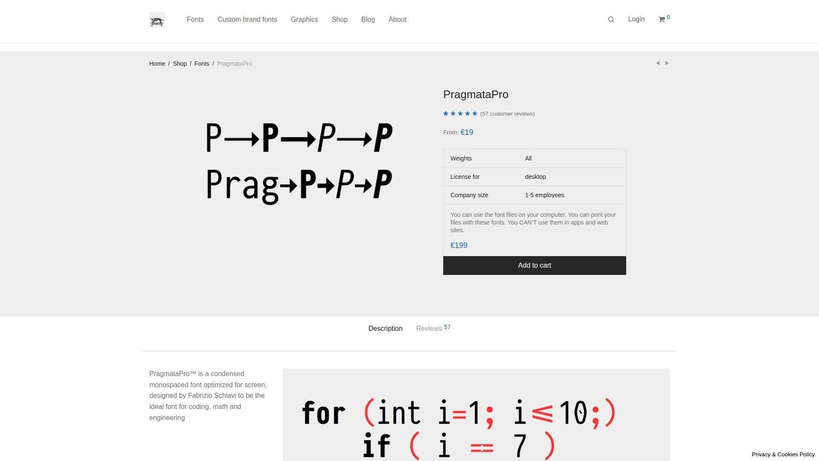
PragmataPro is Fabrizio Schiavi’s long-running premium coding font, and it has a strong following among developers who care about density and technical symbols. We do not think it is a universal pick. We do think it is a serious tool for the right workflow.
Best for: terminal-heavy engineers and developers working with dense, symbol-rich languages.
- Compact width and information-dense texture → fit more code on screen without immediately shrinking font size to the floor.
- Strong symbol culture and advanced glyph support → save fallback-font headaches in technical and operator-heavy codebases.
- Quick install with meaningful payoff → time to first value is about 10 minutes once line height and size are dialed in.
Pricing & limits: From €19 on the current shop page. There is no obvious public trial. Licensing varies by desktop, website, or app use and by company size, starting with the 1 to 5 employee tier.
Honest drawbacks: PragmataPro is narrow and opinionated. That is the point, but it also means many developers reject it fast. The full setup can also get expensive if you scale it across a company.
Verdict: If you want maximum density from a premium font, this helps you see more code on screen within your first serious test session.
19. Terminus TTF
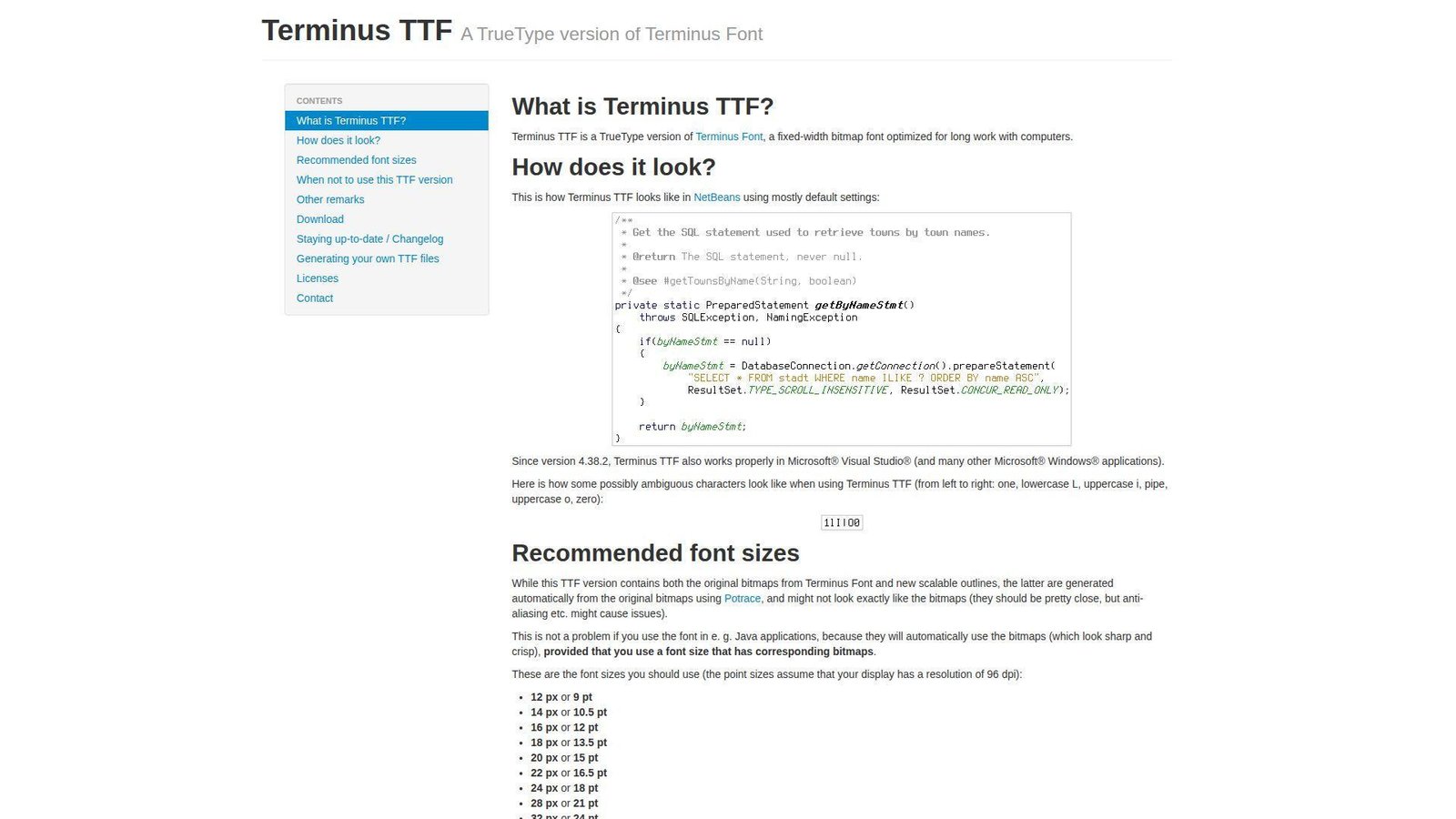
Terminus TTF is an updated TrueType take on the classic Terminus bitmap font, and it keeps that old terminal-first attitude. We do not recommend it to everyone. We do recommend it strongly to people who live in logs, prompts, and text-heavy terminals.
Best for: SREs, terminal users, and developers who value hard-edged pixel clarity.
- Bitmap-rooted character shapes → make logs, hex dumps, and command output easier to distinguish at a glance.
- Predictable behavior at recommended sizes → save repeated font switching once you hit the right pixel sweet spot.
- Very fast setup for terminal workflows → time to first value is about 3 minutes if your display and app fit its strengths.
Pricing & limits: From $0. No trial is needed. Common desktop use is effectively unrestricted for the typical open-source workflow.
Honest drawbacks: Terminus TTF is picky about DPI and size. Outside its sweet spot, it can look wrong fast. In glossy modern IDEs, it may feel too rigid and utilitarian.
Verdict: If you spend more time reading terminal output than editing polished UI code, this helps you read dense text almost immediately.
20. 0xProto
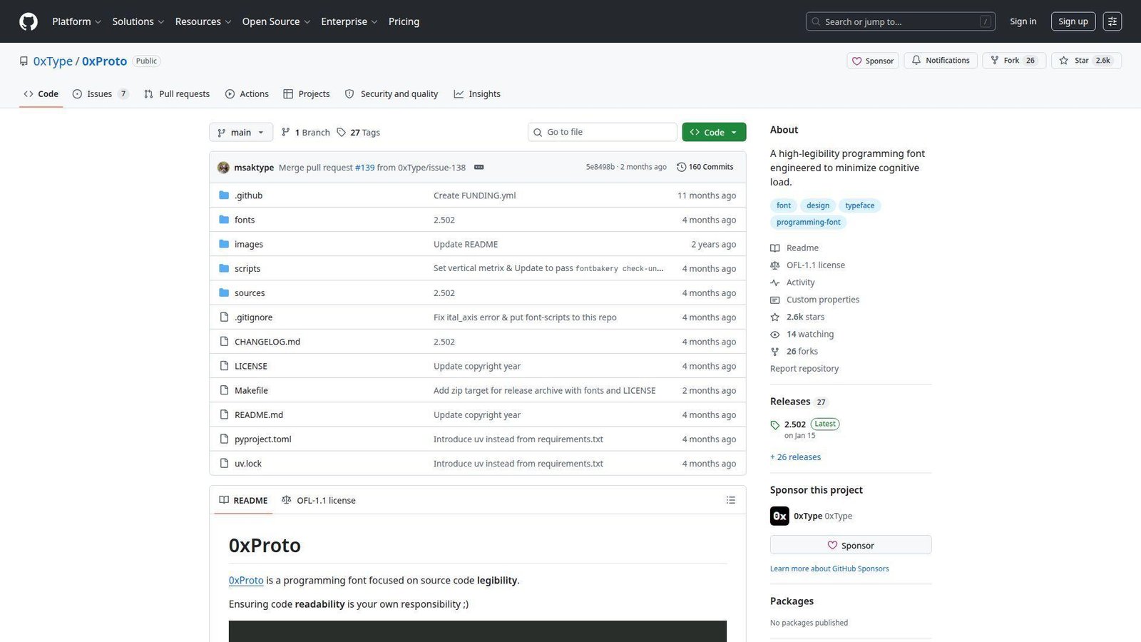
0xProto comes from 0xType, and the whole pitch is source-code legibility without the visual overreach some modern fonts fall into. We like that restraint. It feels like a font made by someone who reads operators literally and wants them to stay honest.
Best for: ligature skeptics and developers who care most about clear character differentiation.
- No meaning-changing ligatures → keep operators readable while you edit them, not just after the line is finished.
- Selective OpenType personality instead of flashy transformation → save cleanup time and reduce surprise across different editors.
- Simple installation with quick payoff → time to first value is under 5 minutes in editors that expose font features well.
Pricing & limits: From $0. No trial is needed. The OFL license means no normal seat cap for standard personal or team use.
Honest drawbacks: This is a younger project with a smaller ecosystem than JetBrains Mono or Fira Code. If you actively want dramatic ligatures, it is aiming at the opposite preference.
Verdict: If you want a coding font that favors restraint and clarity over spectacle, this helps you settle in fast with very little adjustment.
Recommended reading: Top 20 Web Developer Portfolio Examples to Inspire Your Next Site
How to Choose the Best Font for Coding
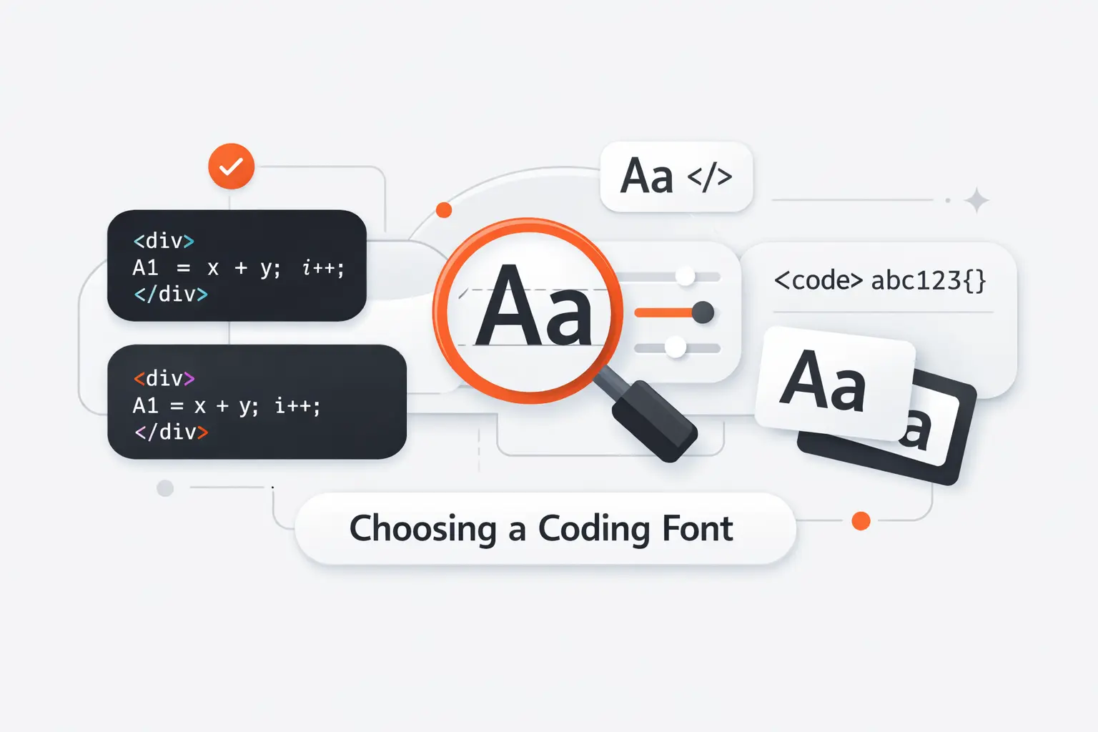
Picking the best font for coding gets easier when we stop asking which font is coolest and start asking which one removes friction. We usually test fonts against real repositories, real terminal output, and the exact display setup our team uses every day.
1. Prioritize Character Differentiation
Start with the troublemakers. Compare 0 and O. Then check 1, I, and l. After that, inspect commas, periods, colons, semicolons, slashes, quotes, and backticks. If those shapes blur together at your normal editor size, keep moving.
We think this matters more than ligatures, branding, or fashion. A font can look great in a sample sentence and still fail inside a stack trace or config file where one tiny symbol changes everything.
2. Compare X-Height, Width, and Spacing
X-height, which is the height of lowercase letters like x, changes how large a font feels without changing its point size. JetBrains Mono and MonoLisa feel generous at the same size. Iosevka and PragmataPro feel tighter and fit more code across the screen.
Spacing matters just as much. Dense fonts help in split panes, terminals, and dashboards. Roomier fonts help during long reviews and pair programming. We usually pick roomy defaults for mixed teams and denser fonts for developers who live in terminals.
3. Decide Whether Ligatures Improve or Hurt Readability
Ligatures are optional. Some developers find them calming because operators look more like single logical units. Others feel those same joins hide the literal characters they are typing. That split is why we never treat ligatures as an automatic upgrade.
Fira Code is a free monospaced font with programming ligatures, and it proves the idea can work. Still, if you spend more time in JSON, logs, shell scripts, or quick diffs than in symbol-heavy languages, plain shapes often win.
4. Match the Font to Your Screen, Editor, and Daily Workflow
A 14-inch laptop, a 32-inch 4K monitor, and an old 1080p side screen will not reward the same font. JetBrains Mono and IBM Plex Mono forgive mediocre displays. Iosevka and PragmataPro shine when space is tight. Terminus TTF only makes sense if you respect its pixel-size sweet spot.
Small tooling choices add up. In McKinsey lab work with more than 40 developers, even modest interface changes affected task flow. Fonts are a smaller lever, but they still shape how fast we scan, compare, and correct code.
Recommended reading: Top 20 Trending Apps to Watch Across Major Platforms
Key Features That Make a Coding Font Easier to Read
Once we narrow the list, we judge the details that keep a font usable after the honeymoon period. The right shapes let us read code faster without needing heroic zoom levels or heavy line spacing.
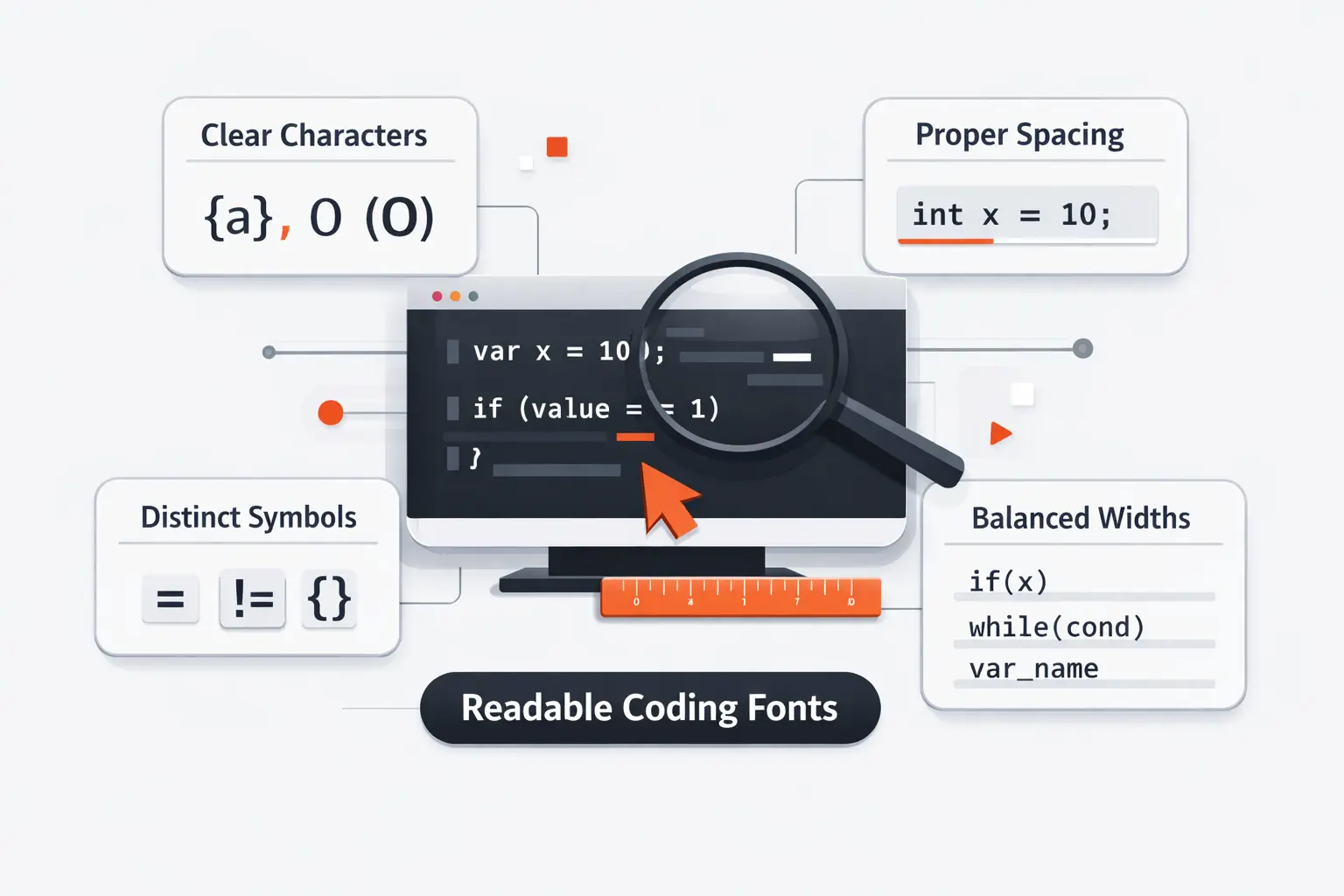
1. Clear Distinction Between 0, O, 1, I, and l
A coding font has to separate visually similar characters at a glance. Slash-zero or dotted zero helps. So do clear lowercase ell, uppercase i, and numeral one forms. We also want brackets and braces that do not collapse into mush at 12px.
This sounds picky until you read environment variables, hashes, stack traces, and diff noise for a living. Then it stops being picky and starts being basic risk management.
2. Monospacing, Line Height, and Symbol Clarity
True monospacing still matters because code alignment is semantic. Tables, comments, indentation, and diffs all depend on predictable width. Even if proportional code experiments look interesting, they are still niche for active editing.
Line height and symbol clarity finish the job. A good font keeps semicolons, colons, pipes, slashes, and braces easy to spot. Terminal users should care even more because logs and shell output punish muddy punctuation.
3. Weights, Italics, and Language Coverage
Weights do more work in code than people think. Comments, strings, errors, and diff views rely on contrast. If the bold is muddy or the italic is just a lazy slant, syntax highlighting loses value fast.
Adobe launched Source Code Pro with six weights of Source Code Pro, which is one reason it still feels dependable in editors, docs, and screenshots.
Coverage matters too. IBM says Plex supports over 100 languages, and that is the kind of reach we want when teams mix English code, localized comments, and technical docs.
4. Powerline Support, Unicode Coverage, and Technical Glyphs
If you use terminal prompts, patched icons, or CLI dashboards, glyph support matters. Cascadia Code PL, Hack, Monoid, and MonoLisa save time because they already carry the symbols many terminal setups need.
For scientific or multilingual work, Unicode coverage matters even more. Julia Mono and PragmataPro stand out here because they cut down font fallback and keep technical text inside one visual system.
Recommended reading: Top 30 Weird Links to the Internet’s Strangest Websites in 2026
Common Fonts Used in Code Editors, Terminals, and Code Blocks
Even the best coding font lives inside a broader system. Editors, terminals, browsers, and documentation sites all fall back differently, so it helps to know which monospace faces are already shaping what your team sees.
1. Why System Monospace Stacks Still Matter
A system monospace stack is still the safest choice for websites, internal docs, and apps that render code on many devices. It respects what users already have installed, and it usually loads faster than a custom webfont.
We still like custom fonts in editors. Yet for public code blocks, humble fallback stacks often win because they are fast, stable, and familiar across operating systems.
2. Classic Choices Like Consolas, Monaco, and Lucida Console
Consolas, Monaco, and Lucida Console still show up everywhere because old tools have long lives. You will see them in tutorials, remote desktops, enterprise environments, and archived screenshots that keep influencing what developers think readable code looks like.
We would not call them the best font for coding anymore, but they still define the baseline. If a newer font does not beat these classics clearly, we do not keep it on the shortlist for long.
3. Modern Defaults Like Cascadia Code and JetBrains Mono
Modern defaults prove the category matured. JetBrains Mono and Cascadia Code were built for actual editors and terminals, not for nostalgia. That alone changes how they handle punctuation, similar characters, and the overall reading rhythm.
Defaults shape taste, too. Teams that start from modern fonts usually need less persuasion to care about letter clarity, operator behavior, and real-world readability instead of just the vibe of a specimen image.
4. How Browser and Operating System Fallbacks Affect What You See
Your editor font and your browser code font may not match. A blog post can fall back to Menlo, Consolas, DejaVu Sans Mono, or another system face even when the author composed it using Fira Code or JetBrains Mono.
That mismatch matters when you judge documentation or screenshot readability. If your product shows code snippets, test them on Windows, macOS, and Linux before declaring the typography solved.
Best Font for Coding by Use Case
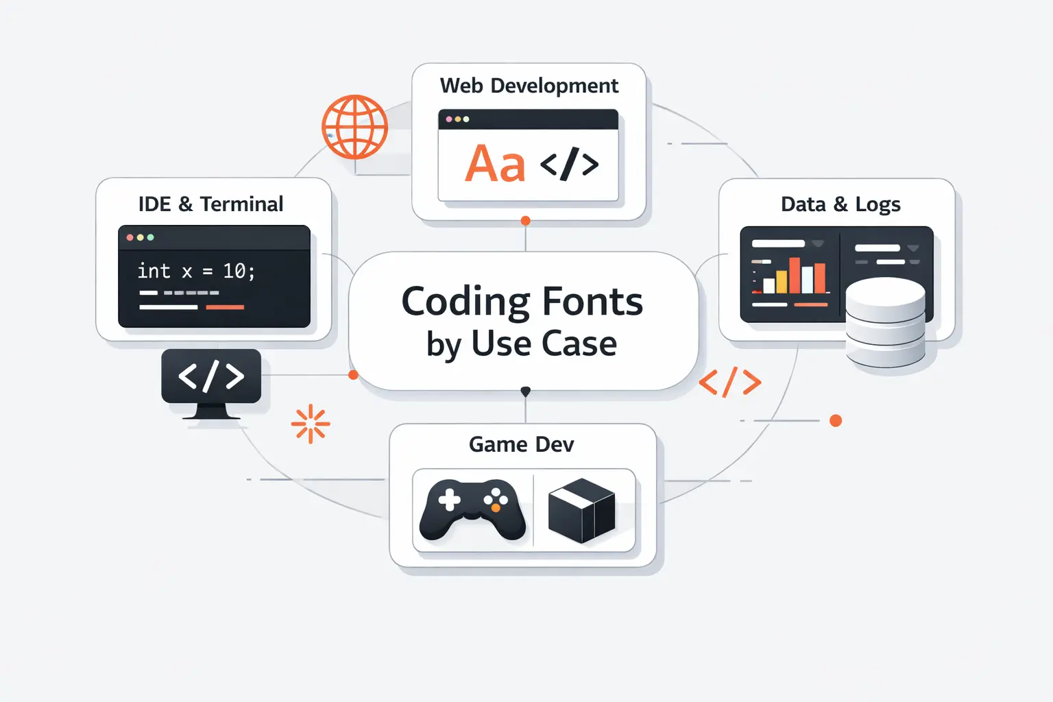
There is no single winner for every developer. We would rather match the font to the job than crown one universal champion and call it a day.
1. Best Picks for General Software Development
For general software work, we would start with JetBrains Mono. It balances readability, character distinction, and easy adoption better than anything else on this list. Source Code Pro is our neutral runner-up for teams that dislike strong personality. IBM Plex Mono makes sense when code, docs, and product UI need to feel related.
If you are a solo developer, taste can lead more of the decision. If you manage a mixed team, consensus matters more. That is why we rarely push a highly distinctive font as the default on day one.
2. Best Options for Terminals, Logs, and Dense Screens
For narrow split panes and terminal work, Iosevka, Monoid, PragmataPro, and Terminus TTF deserve a hard look. They win by fitting more columns or keeping tiny text crisp when ordinary fonts start to smear.
We usually reach for Terminus TTF or Monoid on log-heavy screens, and Iosevka or PragmataPro when a developer wants more code visible at once. Density is only a win if you still read the text comfortably.
3. Best Choices for Ligatures and Modern IDEs
Fira Code remains the clean public favorite for ligatures. Cascadia Code is the practical Windows choice. MonoLisa is the premium comfort pick if the license fits. Hasklig stays relevant for functional languages and developers who already like Source Code Pro.
Our rule is simple. If ligatures reduce mental stitching, keep them. If they make you wonder what literal characters sit underneath, turn them off.
4. Best Fonts for Long Sessions and Reduced Eye Strain
We see the best results from fonts with open forms, clean punctuation, and reasonable width. JetBrains Mono, IBM Plex Mono, MonoLisa, and Hack are strong here. They do not all look the same, but they share a calm reading texture.
That said, eye strain is not just a font problem. Screen brightness, contrast, room lighting, line height, and break habits matter more than many developers admit. A good font helps, but it cannot rescue a bad setup.
How to Test the Best Font for Coding Before Switching
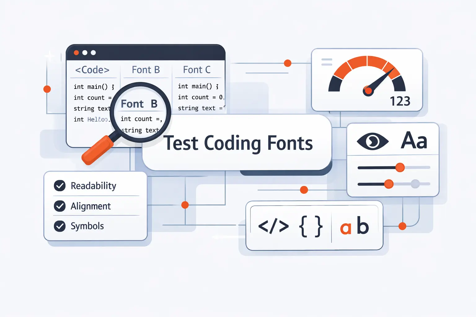
We never switch a font because a specimen page looked nice. A short side-by-side test inside your own editor tells you much more than a gallery full of polished screenshots.
1. Compare the Same Code Snippet Across Multiple Fonts
Take one real file and keep size, theme, and line height fixed. Compare font after font on the same screen. Use a file with comments, strings, operators, arrays, nested braces, and enough repetition to expose the pattern of the text.
We also recommend a second file that matches your actual stack. JSX, SQL, YAML, shell scripts, and data notebooks stress fonts in very different ways.
2. Review Italics, Bold Weights, and Punctuation Carefully
Do not judge only the regular style. Comments often use italics. Errors and headings use bold. Regex, punctuation, and quotes reveal weak design much faster than a line of ordinary English words does.
We zoom in on commas, periods, colons, semicolons, backticks, pipes, underscores, and slashes. Those tiny marks do a lot of work in real code.
3. Test Small Sizes, Extended Characters, and Terminal Output
Many fonts look fine at 16px and fall apart at 12px. That is why we test small sizes on the actual monitor, not only on a sharp laptop display. A side monitor can expose problems that a modern MacBook hides.
If you use terminals or multilingual text, add box drawing, arrows, Greek letters, accented characters, and odd symbols to the sample. A missing or muddy glyph now becomes a slow headache later.
4. Fine-Tune Alternates, Ligatures, and Line Gap Settings
Modern coding fonts often hide useful switches. You can turn ligatures on or off, choose alternate zero forms, swap letter variants, or reduce line gap. These small changes can matter more than switching families.
Do not over-tune. We usually change at most three things: ligatures, zero style, and line height. If you need a full afternoon of adjustments to tolerate a font, it probably is not your font.
Frequently Asked Questions About the Best Font for Coding
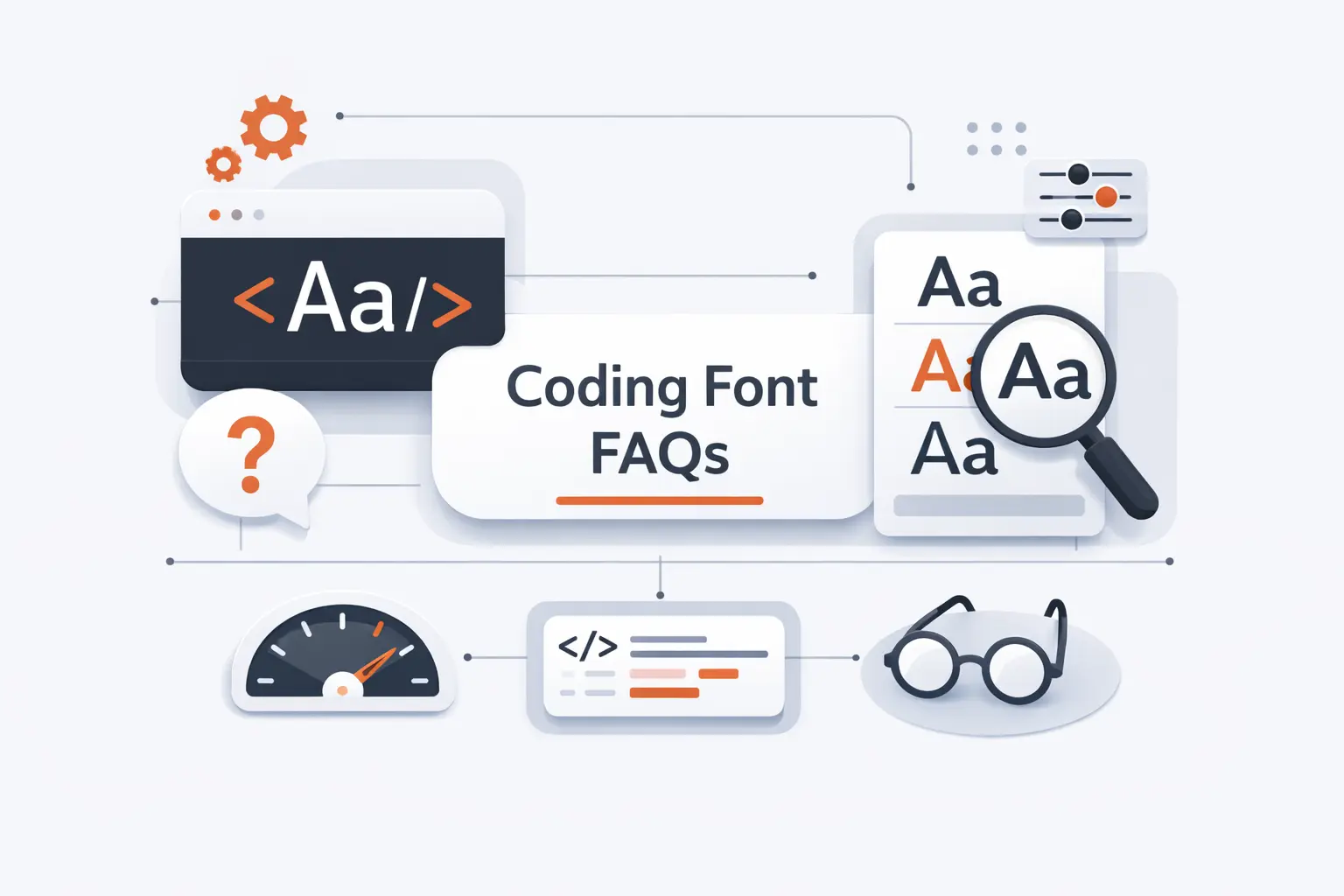
These are the questions we hear most from developers, tech leads, and founders who want a better default without starting an office debate about taste.
1. What Is the Best Font for Coding Overall?
We give JetBrains Mono the nod overall. It is free, easy to install, clear at common sizes, and balanced enough for most editors and most teams. It is the font we would recommend first to the largest number of developers.
If you want a more neutral house standard, Source Code Pro and IBM Plex Mono are safer. If your top priority is screen density, Iosevka can beat all of them.
2. What Is the Best Coding Font for Your Eyes?
There is no single best font for everyone’s eyes. Screen quality, brightness, size, contrast, and break habits matter a lot. That said, we find JetBrains Mono, IBM Plex Mono, MonoLisa, and Hack easier to live with during long sessions because the shapes stay open and the punctuation stays clear.
Test them at your real working size, not at a flattering size on a specimen page. That is where the truth shows up.
3. What Is the Classic Font for Coding?
On Windows, Consolas is the classic modern answer. Older Mac developers often think of Monaco, and older Windows setups still bring up Lucida Console. Those fonts remain useful reference points because so much legacy software and documentation was built around them.
We still respect them, but we would not stop there if you are choosing a fresh daily font in 2026.
4. Which Fonts Are Most Commonly Used in Code Editors and Code Blocks?
Today we most often see JetBrains Mono, Cascadia Code, Consolas, Source Code Pro, and IBM Plex Mono in active editor setups. In browser code blocks, system stacks are still common, so users may actually see SF Mono, Menlo, Consolas, DejaVu Sans Mono, or Liberation Mono.
That is why a font can feel popular in social screenshots and still not be what most readers see on the web.
5. Should You Use Ligatures in a Coding Font?
Use them if they help you, not because the screenshots look smart. We like ligatures in some languages with dense operators. We often disable them in logs, JSON, shell work, or mixed teams where literal characters matter more than visual compression.
Our advice is simple. Try them for a week with real work, then decide. If you keep noticing the font, it may be the wrong setting.
6. Do Monospaced Fonts Always Work Better for Coding?
For active code editing, almost always yes. Monospacing keeps alignment predictable and makes indentation, tables, and diff noise easier to judge. That is still the safest choice for editors and terminals.
For docs, blogs, or product marketing pages with short snippets, proportional companions can still work around the code. We just would not make them the default for editing.
How TechTide Solutions Helps Teams Build Custom Software Solutions

Our view on coding fonts comes from building products for teams that live inside dense interfaces. When we design custom platforms, we pay attention to the same small details developers notice in editors, terminals, dashboards, and internal tools.
1. Build Web and Mobile Products Around Real Developer Workflows
At TechTide Solutions, we build around how teams actually inspect data, review states, edit configuration, and debug problems. That means keyboard access, readable dense tables, code blocks that do not collapse into visual noise, and mobile views that still respect technical text.
We care about the boring details because those are the details teams touch hundreds of times a week.
2. Create Custom Tools, Platforms, and Internal Systems Tailored to Your Team
We build internal portals, partner platforms, ops dashboards, admin systems, and workflow tools that match the way a team already works. If a product needs log viewers, code-like data displays, JSON editors, or documentation surfaces, we design those parts intentionally instead of treating them as leftovers.
That is one reason typography matters to us. Dense technical interfaces fail faster when small readability choices are ignored.
3. Align Engineering Standards, Usability, and Long-Term Scalability
We also think beyond launch day. Good software needs maintainable components, accessible interfaces, clear design rules, and an upgrade path that does not punish the next team inheriting the product.
So whether we are shaping an internal system or a customer-facing platform, we try to align engineering standards with everyday usability. That includes the seemingly small things that make work feel easier instead of heavier.
Final Thoughts on the Best Font for Coding
Our short version is simple. JetBrains Mono is the safest overall pick. Fira Code and Cascadia Code are better if ligatures genuinely help you. Iosevka, PragmataPro, and Monoid win when screen density matters most. IBM Plex Mono and Source Code Pro are the clean team standards. MonoLisa is the premium comfort choice if the license fits.
Before you switch, shortlist three fonts, load the same repo, and use each for half a day at the same size and line height. Which one lets you read the ugliest diff or busiest terminal pane with the least hesitation? That is usually your answer.
