At Techtide Solutions, we’ve learned to treat UI/UX paradigms less like “design trends” and more like the operating system of a product organization: they define what people expect, what teams can ship reliably, and which interactions feel effortless versus exhausting. A paradigm is the quiet agreement between builders and users about how work gets done—where the controls live, what feedback means, and how the interface “keeps its promises” under stress.
Because those agreements evolve, interface work is never “done.” New devices arrive, new input methods become normal, and new compute models—especially AI—change what an interface even is. When we zoom out, UI/UX paradigms are the reason a banking app and a ride-sharing app can feel familiar even when their brands, industries, and flows are different. Under the hood, they share interaction grammar.
Business leaders often ask us why design deserves sustained investment when roadmaps are full of features. Our answer is pragmatic: paradigms reduce friction, and friction is compound interest in reverse. It shows up as abandoned onboarding, higher support costs, slower sales cycles, and “shadow workflows” where users export data to spreadsheets because the product doesn’t meet them halfway.
Market context reinforces why the stakes keep rising. Gartner forecasts worldwide IT spending will total $6.08 trillion in 2026, and we see that spend turning into a blunt expectation: software should feel intuitive on day one, adaptable on day two, and trustworthy on day three.
This guide is how we think about modern paradigm shifts in practice—less theory for theory’s sake, and more the patterns we rely on when we design, build, test, and iterate real products for real users.
What UI UX Paradigms Are and Why They Matter in Product Design

1. UI/UX paradigms as standards that instruct how interfaces and experiences are designed
A UI/UX paradigm is a shared set of interface expectations: what a “button” implies, how navigation behaves, and what “success” looks like after an action. Unlike a single pattern (say, a modal), a paradigm is a broader worldview—touch-first mobile paradigms, web-first information paradigms, or AI-first conversational paradigms.
In our delivery work, paradigms become standards whether we formalize them or not. If a product treats “Back” inconsistently, users interpret the inconsistency as unreliability. If a system uses a spinner sometimes and a skeleton loader other times, people start guessing whether the app is broken or just slow. Standards reduce guessing, and reduced guessing is measurable productivity.
From a team perspective, paradigms also function as “decision compression.” When the paradigm is explicit, designers and engineers stop re-litigating basics and can focus on the hard parts: edge cases, performance, content clarity, and the integrity of business rules.
2. User-centered design, usability, aesthetics, accessibility, consistency, and efficiency as core focus areas
User-centered design is not just empathy; it is operational discipline. In our practice, it means treating user intent as the primary input to architecture decisions: information structure, permissions, content strategy, error handling, and even data modeling. When the model matches how users think, the UI becomes simpler without “dumbing down” the capability.
Usability is the friction budget: how much mental and physical effort a product demands per unit of value delivered. Aesthetics matter because they shape perceived effort—clean spacing, readable typography, and stable layout make complex tasks feel less risky. Consistency matters because it turns learning into reusable skill.
Accessibility is the most honest stress test for UX. When we design for inclusive interaction, we end up with clearer focus states, stronger semantics, and better keyboard flows, which benefits power users, mobile users, and anyone working quickly under pressure.
3. Why evolving technology keeps reshaping UI/UX paradigms over time
Paradigms shift whenever the constraints shift. Touchscreens didn’t just add tapping; they changed the ergonomics of reach, the cost of precision, and the importance of motion feedback. High-density displays didn’t just sharpen UI; they made thin dividers, subtle shadows, and microtypography viable.
Platform ecosystems also shape expectations. A user who lives inside modern productivity suites expects fast search, keyboard shortcuts, and forgiving undo behavior. Meanwhile, a user who lives inside consumer apps expects personalization, rich media, and gentle onboarding that teaches through use rather than documentation.
AI accelerates paradigm change because it moves the “center of gravity” from static screens to adaptive systems. In that world, the interface is no longer only what we render; it’s also what the system infers, what it recommends, and how it explains itself when it’s wrong.
Design Principles, UX Laws, and UI Patterns That Reinforce Great Interfaces
1. Seven essential UI design principles: hierarchy, progressive disclosure, consistency, contrast, accessibility, proximity, and alignment
Hierarchy is how we tell the truth about importance. In practice, we use typographic scale, spacing, and visual weight to say, “Start here, then go there.” Progressive disclosure is how we avoid overwhelming users while still supporting expert workflows: show the essentials, reveal advanced controls when intent is clear.
Consistency is the cheapest UX improvement available, and it is also the hardest to sustain without systems. Contrast is not only about color; it’s about distinguishability of states—enabled versus disabled, active versus inactive, selected versus unselected. Proximity and alignment sound basic, yet they control scanning speed, error rates, and the perceived quality of a product.
How We Operationalize These Principles
Inside Techtide Solutions, we operationalize the principles through design tokens, component contracts, and acceptance criteria that describe behavior—not just visuals. When a principle is encoded into reusable UI, product velocity rises because quality is “built-in,” not bolted on.
2. Laws of UX for decision-making and cognition: Hick’s Law, Miller’s Law, Cognitive Load, and Selective Attention
Hick’s Law reminds us that choices have cost. When a UI presents too many options at once, it taxes decision-making even if the options are all “useful.” Miller’s Law warns that memory is limited, which is why long forms fail when they force users to remember details across screens.
Cognitive Load is the invisible tax in enterprise software. The most common failure mode we see in internal tools is not “missing features,” but “too many concepts per screen.” Selective Attention is why notification fatigue happens: if everything is urgent, nothing is trusted.
From an engineering angle, these laws become requirements for how we structure flows. Good UX is often the result of disciplined information architecture, not a clever visual flourish.
3. Familiarity and expectations: Jakob’s Law and Mental Models
Jakob’s Law is a reminder that users bring habits with them. If your “search” behaves unlike every other search they’ve used, your product inherits a learning curve it didn’t need. Mental models are the maps people carry: folders, timelines, inboxes, carts, tabs, and dashboards are metaphors that compress complexity.
In our work, “innovation” rarely means inventing a brand-new interaction. Instead, it usually means pairing a familiar model with a new capability. Consider how modern finance tools make complex workflows approachable by leaning on spreadsheet-like grids, predictable filters, and clear drill-down navigation.
When we do introduce novelty, we treat it like a change-management project: we add signposting, progressive onboarding, and guardrails that keep users from losing work.
4. Common UI pattern libraries for predictable behavior: getting input, navigation, onboarding, and dealing with data
Pattern libraries exist because predictability is a feature. For getting input, the basics still win: clear labels, inline validation, helpful defaults, and error messages that point to recovery. For navigation, users want stable landmarks—primary sections, local navigation, breadcrumbs when hierarchy matters, and search when structure fails.
Onboarding works best when it is task-based rather than tour-based. Instead of teaching every feature, effective onboarding gets the user to an early win, then expands capability as confidence grows.
Dealing with data is where enterprise UX either shines or collapses. Tables, filters, sort, export, and drill-down must behave consistently. When they don’t, analytics workflows turn into mistrust workflows, and that mistrust becomes a support ticket factory.
Visual UI UX Paradigms: Minimalism, Dark Mode, and Microinteractions

1. The rise of minimalism to remove distractions and spotlight essential functionality
Minimalism is often misunderstood as “less UI.” In our view, it is “less cognitive noise.” A minimalist paradigm doesn’t remove capability; it clarifies it through hierarchy, whitespace, and deliberate restraint. Great minimalist products still have complexity, but they reveal it in layers.
When we redesign dashboards, minimalism usually shows up as fewer simultaneous chart types, more intentional grouping, and more whitespace around the most decision-relevant signals. The payoff is scanning speed. Leaders can glance and decide, rather than hunt and interpret.
Minimalism also nudges better content. If UI cannot hide behind decoration, labels and microcopy must carry meaning, and empty states must explain what “good” looks like.
2. Dark mode as an ergonomics-driven paradigm for low-light comfort and OLED battery benefits
Dark mode is a paradigm because it changes assumptions about contrast, depth, imagery, and brand color usage. From a product standpoint, it’s also a forced audit of design decisions: shadows behave differently, borders become more important, and images need careful treatment to avoid glare.
Ergonomics is a key driver. Users working at night, in operations centers, or in battery-constrained environments often prefer darker surfaces. Power savings are real but context-dependent; Purdue research suggests typical savings can be modest, with observed averages around 3%–9% power in common conditions.
From our engineering lens, “supporting dark mode” means more than swapping colors. It requires tokenized theming, semantic color roles, and visual regression testing that catches edge cases like charts, icons, and embedded third-party widgets.
3. Microinteractions as subtle animations that add feedback, delight, and brand memorability without distraction
Microinteractions are the smallest units of interface trust. A button press that visibly registers, a saved state that confirms success, or a gentle transition that preserves spatial context can make a product feel “solid” even when the underlying workflow is complex.
In our experience, the best microinteractions are not decorative. They are informational: they confirm what happened, where the user is, and what the system is doing next. That includes loading states, optimistic updates, inline success messaging, and subtle emphasis when a field needs attention.
Brand memorability is a side effect of coherent motion, not random animation. When microinteractions share timing and style, they become part of a product’s voice—recognizable, consistent, and quietly reassuring.
Beyond Touchscreens: Voice UI, Gestures, and Biometrics as Interaction Paradigms
1. Voice user interfaces for more natural interaction, customer service, voice search, and accessibility support
Voice UI is not “a chatbot with a microphone.” It is a different interaction contract with different failure modes. Speech is fast, but ambiguity is expensive. Accents, background noise, and domain-specific vocabulary turn voice into a probabilistic input stream that must be validated through confirmation patterns.
In customer service contexts, voice shines when it reduces navigation: checking order status, rescheduling, verifying account details, or routing a user to the right human specialist. For accessibility, voice can be transformational when paired with clear system prompts and predictable, interruptible flows.
From a build standpoint, voice UI requires careful intent modeling, fallback strategies, and telemetry that distinguishes “the user changed their mind” from “the system misunderstood.”
2. Multimodal UX combining voice, vision, gesture, haptics, and visual cues with clear feedback loops
Multimodal UX is the antidote to single-channel fragility. When users can speak, tap, and visually confirm, success rates increase because each modality can compensate for another’s weakness. A voice command can initiate an action, while the screen confirms details and offers correction.
Gesture-based interaction becomes powerful in contexts where hands are occupied or precision is limited: warehouses, medical environments, field work, or immersive devices. Haptics add a physical confirmation loop that improves confidence, especially when users cannot stare at the screen.
The Core Rule: Feedback Must Be Redundant, Not Repetitive
In our practice, redundant feedback means the system confirms action through more than one channel without nagging. A subtle vibration paired with a visible state change is different from three pop-ups that all say the same thing.
3. Biometric authentication to balance security with speed and convenience
Biometrics are an interaction paradigm because they change the “login moment” from a barrier into a near-invisible step. That invisibility is a competitive advantage in consumer products and a productivity advantage in enterprise tools, where repeated authentication interrupts task flow.
Security still matters, and credibility comes from transparency about risk. Apple notes the probability of a random person unlocking a device with Face ID can be less than 1 in 1,000,000, and that type of published guidance helps teams reason about when biometrics are appropriate versus when step-up authentication is needed.
Implementation details shape trust. Good biometric UX includes clear fallbacks, respectful consent, and thoughtful handling of edge cases like gloves, masks, or accessibility needs.
Immersive Interfaces: AR and VR as a UI/UX Paradigm for Engagement
1. AR/VR experiences that enable immersion, interactive exploration, and novel engagement models
AR/VR isn’t just “a new screen.” It changes the geometry of interaction: spatial placement replaces layout grids, depth replaces z-index tricks, and embodied movement replaces scrolling. That shift forces new paradigms for navigation, selection, and comfort.
Immersive UX works best when it respects human limits. Motion sickness, fatigue, and attention overload are not edge cases; they are design constraints. The best experiences anchor users with stable references, predictable locomotion options, and clear system boundaries.
From our engineering viewpoint, immersive interfaces demand rigorous performance discipline. Latency, tracking stability, and consistent frame delivery are not “nice to have” because the user’s body is part of the feedback loop.
2. Use cases that reshape expectations: virtual product try-ons and interactive 3D advertising
Virtual try-ons reshape expectations because they reduce the gap between intent and confidence. When users can see how something looks in context, the decision feels less risky. That is true for eyewear, furniture, cosmetics, and even industrial equipment sizing.
Interactive 3D advertising is persuasive when it behaves like a product, not a gimmick. Users want to rotate, inspect, and compare. They also want the experience to degrade gracefully: if a device can’t render full 3D, the flow should still provide value through images, video, or guided configuration.
In projects where we prototype these experiences, success depends on clear value definition. “Immersive” is not the goal; reducing uncertainty is the goal.
3. Industry impact across contexts such as e-commerce and education
E-commerce benefits when AR reduces returns and improves buyer confidence, especially for high-consideration purchases. Education benefits when spatial exploration clarifies complex concepts: anatomy, mechanical systems, architecture, or historical reconstructions.
Adoption, however, hinges on integration. Immersive modules must plug into existing identity, content, analytics, and device management systems. Otherwise, they become isolated demos that never reach operational maturity.
Spending signals that immersive tech remains strategically relevant. IDC forecasts worldwide AR/VR spending could grow to $50.9 billion, which aligns with what we see: pilots are evolving into platforms, and stakeholders increasingly expect measurable outcomes rather than novelty.
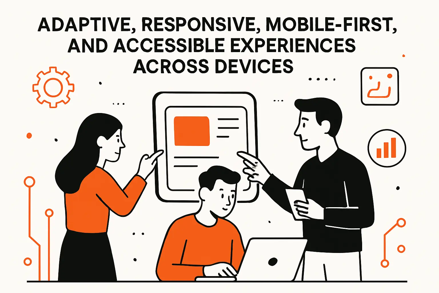
Adaptive, Responsive, Mobile-First, and Accessible Experiences Across Devices
1. Adaptive and responsive design for diverse screen sizes including foldables and wearables
Responsive design is no longer about “phone versus desktop.” Real products face a spectrum: compact phones, large phones, tablets, foldables, ultrawide monitors, and wearables. Each form factor pressures different parts of the UI: navigation density, touch target sizing, layout stability, and information prioritization.
Adaptive design goes further by tailoring patterns to context. A foldable device might shift from single-column reading to dual-pane master-detail. A wearable might shift from full workflows to glanceable status and quick actions.
In our build process, we treat responsiveness as a first-class architecture concern. Component constraints, container queries, and content-driven layouts prevent “breakpoint chaos” where every new screen size becomes a redesign tax.
2. Responsive patterns for data-dense UI: prioritized key values, scrollable or condensed tabs, and full-screen calendar event details
Data-dense UI is where responsive design becomes a business differentiator. The failure mode is familiar: a desktop-grade table shrunk onto a phone becomes unreadable, and users either abandon the task or export data elsewhere.
Patterns that work in practice include prioritizing key values first, then allowing drill-down for secondary details. Tabs often need responsive behavior too: horizontal tab bars can become scrollable, or they can collapse into a dropdown that preserves discoverability.
Calendar and scheduling experiences benefit from mobile-specific paradigms. Full-screen event details, bottom sheets for quick edits, and clear time-block affordances can make complex scheduling workable without forcing pinching and zooming.
3. Mobile-first design for touch gestures, fast load times, and mobile compatibility testing
Mobile-first is not a slogan; it’s a constraint strategy. Designing for small screens forces prioritization, and that prioritization tends to improve every other form factor. Touch gestures also push clearer affordances: swipe must be optional, not mandatory, and destructive gestures must be reversible.
Performance is inseparable from mobile UX because mobile networks and devices amplify delays. Google observed that 53% of visits are likely to be abandoned if pages take longer than 3 seconds to load, and that reality shows up in every funnel we instrument: speed isn’t polish, it’s conversion protection.
Testing cannot be theoretical. In our practice, compatibility testing includes real-device checks, throttled network simulations, and interaction audits for touch targets, keyboard behavior, and dynamic type scaling.
4. Accessibility as a primary paradigm aligned with WCAG and inclusive interaction goals
Accessibility becomes a paradigm when it shapes default decisions: semantic structure, focus management, color contrast, captions, input alternatives, and clear error recovery. Treating accessibility as “later” usually guarantees expensive rework, because accessibility touches architecture as much as UI.
Inclusive design is also simply good business. The World Health Organization estimates 1.3 billion people experience significant disability, and that reality means accessibility is not a niche concern—it is a mainstream product requirement across consumer and enterprise contexts.
From a production standpoint, accessible UX demands partnership between design and engineering. Semantic HTML, ARIA used responsibly, robust keyboard support, and screen-reader testing must be part of the definition of done, not an afterthought.
AI-Driven UI UX Paradigms and the Post-Mobile Shift to Human–AI Systems
1. AI and machine learning in UI/UX: chatbots, personalized content, predictive algorithms, and analytics-driven adaptation
AI in UX is no longer limited to “support chat.” It shows up as personalization, ranking, recommendation, summarization, anomaly detection, and predictive assistance that reduces manual work. In the strongest implementations, AI is not an extra feature; it is a layer that makes the existing product feel more responsive to intent.
Adoption trends underline why teams must design for AI as a core capability. McKinsey reports AI adoption has jumped to 72 percent, and we interpret that as a design mandate: users will increasingly expect software to “meet them in the middle,” proactively helping rather than waiting for perfect input.
Analytics-driven adaptation, however, must be handled with care. Personalization without explanation feels creepy, and prediction without reversibility feels unsafe.
2. From command-based interaction to intent-based outcome specification and outcome-based UX
Classic UI is command-based: click this, fill that, confirm. Intent-based UX shifts the burden from the user to the system: the user describes the goal, and the product orchestrates the steps. That sounds simple, yet it changes everything about interface design.
Outcome-based UX must be explicit about what will happen, what data will be used, and what success looks like. In a command UI, the user can see each step. In an intent UI, the system compresses steps, so trust must be earned through previews, confirmations, and transparent state changes.
From our engineering viewpoint, intent-based systems also need robust domain models. Without clear business rules and permissions, AI “helpfulness” becomes a liability.
3. Non-deterministic experiences and continuous adaptation with guardrails for reliability, consent, and trust
AI introduces non-determinism: the same prompt can yield different results, and the system’s confidence can vary with context. Designing for that reality means designing for fallibility. Users must be able to inspect, correct, and revert.
Guardrails start with consent and data boundaries. The UI must communicate what is stored, what is ephemeral, and what is used for training or personalization. Reliability also needs visible structure: citations where appropriate, policy-based refusals that are understandable, and escalation paths to human review.
Continuous adaptation is powerful, but it can feel destabilizing if the interface changes too often. In our practice, we prefer “adaptive assistance” over “adaptive layout,” because shifting navigation erodes muscle memory.
4. Agentic experience and ecosystem thinking: designing for humans and AI agents with protocols, transparency, and credibility
Agentic UX is where AI doesn’t just answer; it acts. That action requires new paradigms: task delegation, approvals, audit trails, and explainable outcomes. An agent that schedules meetings, modifies records, or triggers workflows must be treated like a junior operator with strict permissions and supervision.
Ecosystem thinking matters because agents rarely live in a single product. They touch calendars, CRMs, ticketing systems, and document stores. Protocols and integration contracts become part of UX, because a broken integration feels like a broken promise.
Credibility is the north star. At Techtide Solutions, we design agentic systems with transparent “what changed” views, clear rollback mechanics, and human override as a first-class interaction, not a hidden escape hatch.
TechTide Solutions: Building Custom Software Around UI UX Paradigms

1. Custom web and mobile app development that operationalizes responsive, mobile-first, and accessible UI/UX
Our job is to turn paradigms into production behavior. That means responsive layouts that don’t fracture under real data, mobile-first flows that don’t collapse into desktop-only thinking, and accessibility that is verified through real assistive tech—not assumed.
In practice, we build with component contracts that encode interaction: focus states, error states, loading states, empty states, and permission-aware states. When those states are consistent, the product feels coherent even as features expand.
Delivery also includes the unglamorous work that users notice immediately: performance budgets, resilient caching, offline-aware behavior where appropriate, and graceful degradation when third-party services fail.
2. AI-enabled product experiences: personalization, chat-driven workflows, and outcome-based task completion
AI-enabled UX succeeds when it reduces busywork without removing control. We implement personalization cautiously, prioritizing user benefit and reversibility. Chat-driven workflows can be powerful when paired with UI “anchors”: forms, previews, and structured actions that keep users oriented.
Outcome-based task completion is where we see the biggest returns. Instead of asking users to navigate five screens to complete a routine workflow, the product can guide them through a goal: “Create a report,” “Resolve an invoice mismatch,” or “Draft a client update,” while still exposing the underlying details for review.
From a systems standpoint, we treat AI as part of the architecture. Observability, evaluation, and policy enforcement live alongside UI components, because experience quality depends on model behavior as much as layout.
3. From principles to production: design systems, prototype-to-build collaboration, and iterative UX validation
Principles only matter when they survive contact with production constraints. Our process connects design and engineering through shared artifacts: design systems, token libraries, component inventories, and prototypes that test interaction—not just visuals.
Prototype-to-build collaboration prevents “handoff drift.” Designers stay close to implementation, engineers contribute to interaction decisions early, and QA validates not only correctness but also clarity. Iterative UX validation is how we keep paradigms grounded: usability testing, funnel instrumentation, session replay reviews, and support-ticket analysis all feed the roadmap.
Over time, this approach creates a compounding advantage. Instead of redesigning from scratch, teams evolve a coherent system where every new feature inherits quality.
Conclusion: Choosing UI UX Paradigms That Fit Your Users, Contexts, and Product Roadmap

UI/UX paradigms are not academic abstractions; they are the practical rules that decide whether a product feels obvious or exhausting. Minimalism, dark mode, microinteractions, multimodal input, immersive interfaces, responsive layouts, accessibility-first thinking, and human–AI collaboration are all parts of the modern paradigm landscape, yet no product needs to adopt every paradigm at once.
Strategy starts with context. User skill level, device mix, regulatory environment, risk tolerance, and business model all shape which paradigms are “must-have” versus “nice-to-have.” Execution then requires discipline: explicit standards, reusable systems, measurable outcomes, and a willingness to iterate when reality contradicts assumptions.
At Techtide Solutions, we like to end planning workshops with a single grounding prompt: if your users could only describe your product in one sentence, would they describe an outcome (“it helps me finish the job”) or an interface (“it has lots of features”)? Which paradigm shift would move that sentence in the direction you want next?