
At TechTide Solutions, we’ve learned that the fastest way to derail a promising product is to let language drift. The drift is rarely dramatic; it’s quiet. Someone says “UX,” another person hears “UI refresh,” a stakeholder expects “research,” and engineering receives “pixel-perfect screens” with no interaction rules. By the time anyone notices, the team is already paying interest on ambiguity.
Across modern software organizations, that ambiguity is expensive because the surface area of a “simple” feature has expanded. A single flow can touch analytics, accessibility, design systems, content strategy, API shape, privacy, and release management. In that context, a shared glossary isn’t academic—it’s operational safety.
From a market perspective, the stakes are unmistakable: Gartner forecasts worldwide IT spending will total $6.08 trillion in 2026. When budgets are that large, small misunderstandings compound into real delivery risk, and teams that communicate crisply win attention, trust, and repeat work.
Below, we share a practical glossary—less “dictionary definition,” more “how teams actually use the term.” Along the way, we’ll call out the miscommunications we see most often and the concrete artifacts that turn fuzzy terms into shipped software.
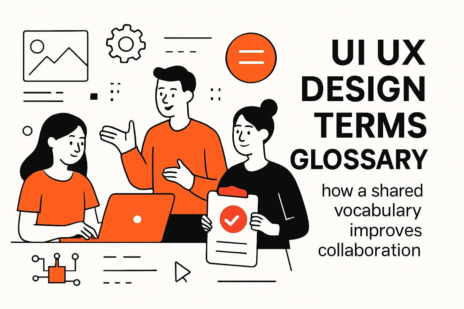
UI UX design terms glossary: how a shared vocabulary improves collaboration
1. Speaking the language across designers, developers, and stakeholders
In our delivery work, vocabulary functions like an API contract between disciplines: it sets expectations, shapes handoffs, and reduces “interpretation layers” that create defects. Designers use terms to express intent, developers translate intent into behavior, and stakeholders validate whether the behavior matches business outcomes. Without shared language, each group invents its own meanings, and the product becomes a game of telephone.
Instead of treating the glossary as a static document, we treat it as a living onboarding tool. During kickoff, we align on what “done” means for UX and UI, what evidence counts as “validated,” and what artifact resolves disputes. Once those definitions exist, debates get healthier because the team argues about choices, not about words.
2. Separating UX terms and UI terms to reduce scope confusion
Most scope confusion begins with a well-intended phrase like “make it more user-friendly.” UX and UI both contribute to “friendly,” but they do it differently. UX focuses on the structure of tasks, the clarity of decisions, and the emotional arc of use. UI focuses on the interface’s presentation—controls, layout, hierarchy, and visual feedback.
When those domains blur, teams mis-price work and mis-sequence effort. A “UI update” that quietly includes rethinking navigation, rewriting content, changing validation rules, and redesigning empty states isn’t a UI update—it’s a product redesign. Once we separate UX terms from UI terms, we can still ship the same outcome, but we ship it with honest estimates and fewer surprise dependencies.
3. Using consistent terminology to clarify requirements and deliverables
Clear terminology turns subjective requests into testable deliverables. “Improve onboarding” becomes a defined flow, with success criteria, edge cases, and analytics events. “Add a tooltip” becomes a specific component, with trigger rules, dismissal rules, and accessibility behavior.
On healthy teams, each term maps to an artifact: research outputs map to insights and opportunities; IA maps to navigation models; UI terms map to components and tokens; testing terms map to protocols and metrics. That mapping is how we prevent “design” from being a vibe and make it a production-ready specification that engineering can implement without heroic guesswork.
Foundational UI and UX definitions

1. User experience UX and the overall experience of using a product
UX (user experience) is the felt reality of using a product over time: how people discover it, learn it, trust it, recover from mistakes, and decide whether it’s worth returning to. Functionally, UX is a system outcome that emerges from many parts—workflows, information clarity, performance, content, support, and even billing or policy choices.
Because UX is holistic, we avoid defining it as “the screens.” Screens are a delivery mechanism; the experience is the result. In practice, strong UX usually looks boring in the best way: fewer surprises, fewer dead ends, and fewer moments when users have to stop and “solve the interface” instead of solving their problem.
2. User interface UI and the visual components people interact with
UI (user interface) is the visible and interactive layer: typography, color, layout, spacing, controls, states, and feedback. For developers, UI also includes the interaction rules that determine how components behave—disabled states, focus states, error states, loading states, and responsiveness.
Great UI is not decoration. A well-constructed interface encodes meaning through hierarchy and constraint, helping users predict outcomes before they click. When UI is inconsistent, cognitive load rises, error rates climb, and teams start “fixing bugs” that are really design-system gaps.
3. Customer experience CX and end-to-end touchpoints beyond the interface
CX (customer experience) expands the lens beyond product use into the full relationship: marketing, sales promises, onboarding, support interactions, service reliability, account management, and offboarding. In subscription products, CX often determines retention more than any single feature because it governs how safe the customer feels.
From our perspective, UX is a subset of CX, and UI is a subset of UX. That hierarchy matters because teams sometimes try to “UI their way out” of a CX problem. A clearer dashboard cannot compensate for confusing pricing, delayed support, or inconsistent operational processes that erode trust.
4. User-centered design, UX strategy, and design thinking as guiding frameworks
User-centered design is the discipline of building around user needs rather than internal convenience. UX strategy connects those needs to business goals, ensuring research insights translate into product decisions, not just interesting observations. Design thinking, at its best, is a structured way to explore problem spaces before committing to solutions.
In real projects, these frameworks prevent two costly behaviors: shipping what’s easy to build instead of what’s valuable, and over-optimizing for edge-case opinions without understanding broader patterns. When teams use the frameworks well, the work becomes both more creative and more grounded, because constraints are explicit rather than implied.
5. Accessibility as a baseline for usable experiences
Accessibility is the practice of making products usable by people with diverse abilities, devices, environments, and assistive technologies. Ethically, it’s the right thing to do; commercially, it widens reach and reduces support load because accessible patterns are usually clearer for everyone.
Scale alone makes it non-negotiable: the World Health Organization estimates 1.3 billion people experience significant disability. For our teams, that statistic lands as a design requirement: keyboard access, readable contrast, semantic structure, descriptive labels, and predictable focus behavior are not “nice-to-haves,” they are shipping criteria.
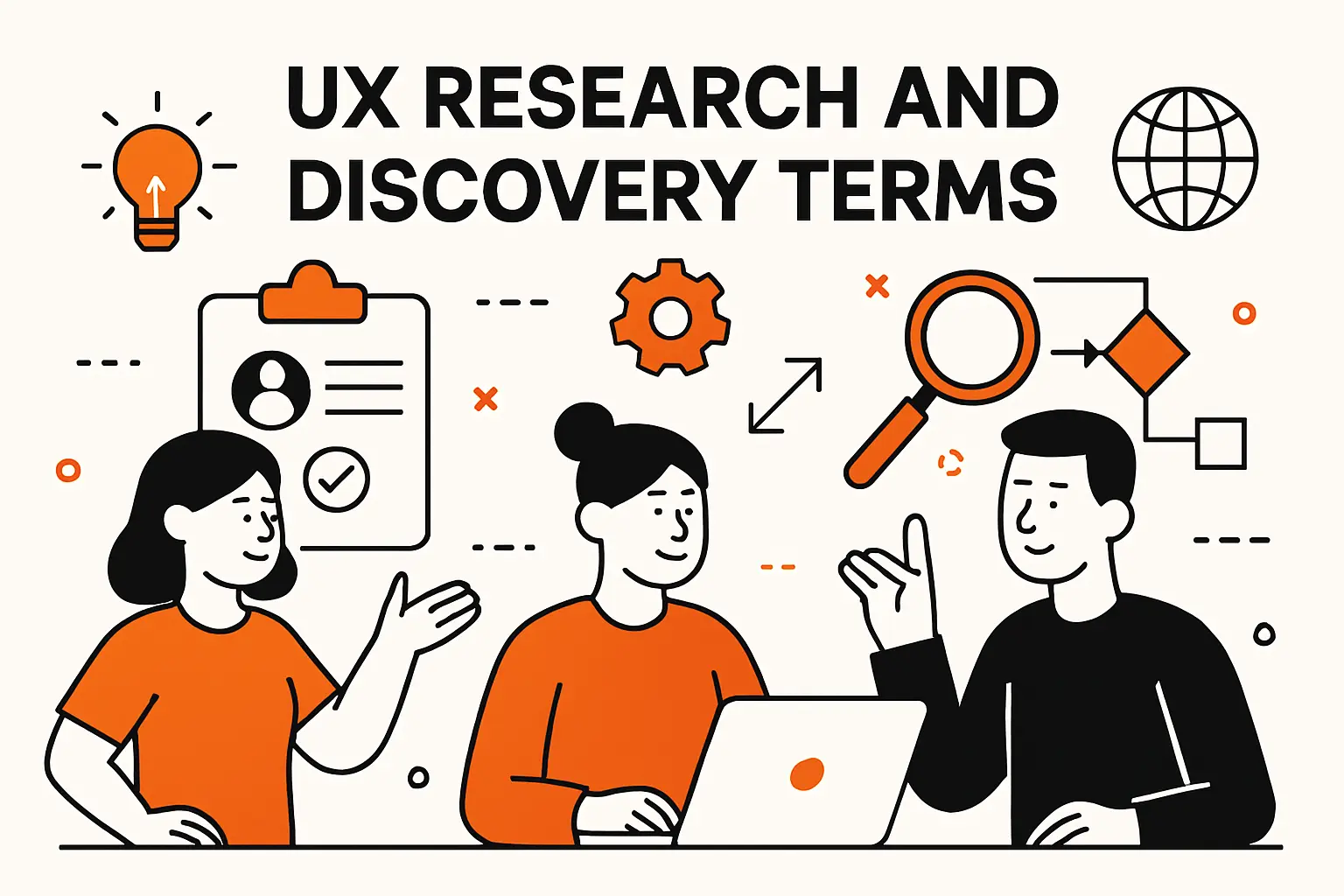
UX research and discovery terms
1. Research methods and inputs: diary studies, contextual enquiry, and user feedback
Diary studies capture behavior over time, usually by asking participants to record experiences, frustrations, and workarounds as they happen. Contextual enquiry places the researcher in the user’s environment to observe real workflows, constraints, and “invisible tools” like spreadsheets or sticky notes. User feedback is broader and noisier—support tickets, reviews, surveys, and in-product comments.
When we choose methods, we match the tool to the question. Longitudinal problems benefit from diary-style capture, while workflow redesigns benefit from context. Feedback is invaluable for prioritization, yet it needs triangulation because the loudest voices are not always the most representative.
2. Defining target users: personas, end users, and empathy maps
Personas are lightweight archetypes that represent meaningful clusters of needs, motivations, and constraints. End users are the actual people who operate the product, distinct from buyers or administrators who may purchase or configure it. Empathy maps help teams externalize what users say, think, do, and feel, giving language to emotions that otherwise get dismissed as “soft.”
In product teams, personas fail when they become fictional biographies. Our preference is to keep personas anchored to behaviors and decision contexts: what triggers a task, what “done” looks like, what risks matter, and what forces users to abandon. That structure keeps personas actionable in design reviews and sprint planning.
3. Synthesizing qualitative findings: affinity maps and thematic analysis
Affinity mapping is the practice of clustering observations—quotes, behaviors, pain points—into groups that reveal patterns. Thematic analysis is the more formal step of naming those patterns, validating them against evidence, and documenting how they connect to product opportunities.
Good synthesis is not merely grouping sticky notes. During synthesis, we trace each theme back to raw data so the team can audit conclusions. Once themes are stable, we translate them into design principles and opportunity statements, which become constraints for solution design rather than “interesting insights” that disappear after the workshop.
4. Behavior analysis signals: heat maps, clickstream analysis, and eye tracking
Heat maps visualize aggregate interaction density, which can reveal whether users notice key elements or get “stuck” in non-clickable areas. Clickstream analysis traces sequences of actions across sessions, helping teams see where people loop, abandon, or detour. Eye tracking provides deeper visibility into attention, especially when visual hierarchy is in question.
Behavior signals are powerful, yet they are easy to misuse. A click spike can mean interest, confusion, or accidental taps; a long dwell time can signal engagement or friction. For that reason, we treat these signals as prompts for hypotheses, then confirm them with interviews or task-based testing before we redesign flows.
Information architecture and navigation UI UX design terms
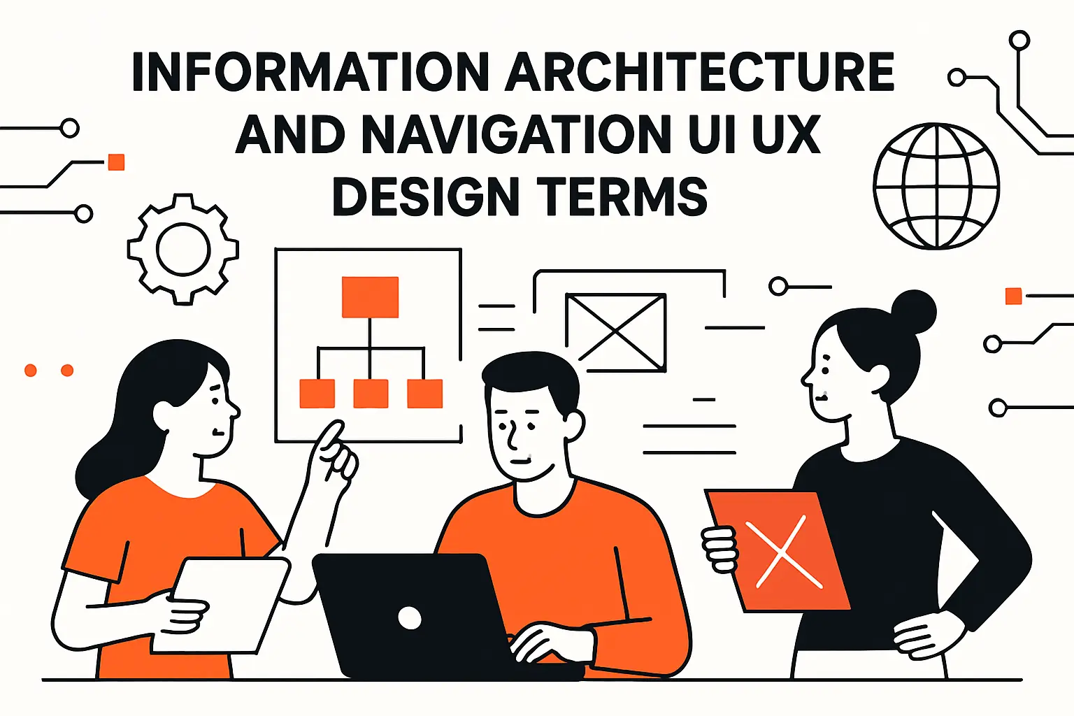
1. Information architecture IA: arranging and labeling content so it is findable
Information architecture (IA) is the structure beneath the interface: how content and features are grouped, labeled, and connected so users can find what they need with minimal effort. Strong IA reduces the need for training because the product “teaches itself” through predictable organization.
In enterprise software, IA is where teams most often confuse internal org charts with user mental models. A finance user doesn’t care which department owns a feature; they care where to accomplish a task. When we align IA to user intent, navigation becomes simpler, search becomes more effective, and feature adoption rises without extra prompting.
2. Card sorting for structuring categories and menus around user expectations
Card sorting is a method for learning how users group concepts. Participants organize “cards” (features, topics, labels) into categories that make sense to them, producing insights into naming, grouping, and hierarchy. Open sorts reveal natural structures, while closed sorts test a proposed structure.
On real products, card sorting shines when labels are contested or when a navigation redesign threatens to reorganize entire sections. We use it as a reality check: if users consistently group two concepts together, splitting them across distant menus will create friction no matter how elegant the UI looks.
3. Sitemaps, breadcrumbs, and hierarchical navigation patterns
Sitemaps are structural diagrams showing pages, relationships, and flow entry points. Breadcrumbs display a user’s position within a hierarchy, offering a way to move upward without relying on back buttons or memory. Hierarchical patterns create predictable levels, which matters most when products scale beyond a handful of screens.
In practice, hierarchy is a trade-off: deeper trees reduce menu clutter but increase traversal cost. When we architect navigation, we balance breadth, depth, and frequency, then validate by watching whether people can confidently predict where a feature “should live” before they search or ask for help.
4. Navigation components: navigation bars, navigation menus, drawer menus, and dropdown menus
Navigation bars (often top-level) provide stable anchors for primary destinations. The navigation menus (including sidebars) expose second-level options and support scanning. Drawer menus hide navigation behind a toggle, often used on mobile to preserve screen real estate. Dropdown menus present choices on demand, useful for compact secondary actions.
Component choice is less about fashion and more about workload. High-frequency tasks deserve visibility; rare tasks can be tucked away. We also consider motor accessibility and cognitive load: hidden menus reduce clutter, yet they can conceal critical pathways, so the decision must be validated against user goals rather than personal preference.
5. Progressive disclosure for revealing detail when needed
Progressive disclosure is the technique of revealing complexity gradually. Instead of overwhelming users with every option up front, the interface surfaces essentials first and provides deeper controls when context makes them relevant. Good disclosure reduces intimidation without removing power.
Our favorite use cases involve advanced filters, permission-heavy admin panels, and complex configuration screens. With progressive disclosure, the default path stays clean, while expert users still reach depth efficiently. When implemented poorly, though, it becomes a scavenger hunt, so we pair it with clear cues, sensible defaults, and predictable “more options” patterns.
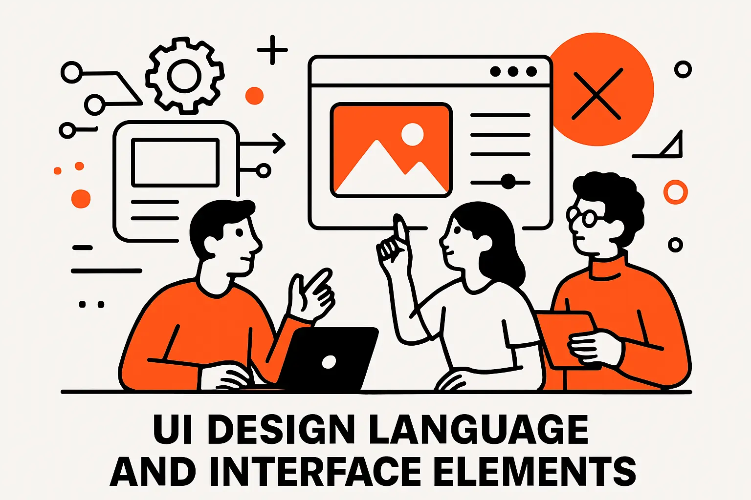
UI design language and interface elements
1. Visual design foundations: grid systems, typography, and color theory
Grid systems create consistent alignment and spacing, which helps users scan and compare information. Typography governs readability, hierarchy, and tone, especially in data-heavy products where text is the primary interface. Color theory, used responsibly, guides attention and communicates state without turning every screen into a warning sign.
In production software, foundations matter because they influence implementation cost. A coherent grid reduces one-off layout hacks. Strong typographic rules prevent “mystery styles” in CSS. Thoughtful color usage limits accessibility failures and keeps status communication consistent across pages, modals, and notifications.
2. Layout and responsiveness: responsive design and effective use of white space
Responsive design adapts layouts to different screen sizes and input modes, preserving usability across devices. White space (or negative space) isn’t emptiness; it’s structure. Proper spacing clarifies groups, reduces visual noise, and makes interactive targets easier to hit.
From an engineering standpoint, responsiveness is where design meets constraint. Components must reflow predictably, text must wrap without breaking layouts, and tables must degrade gracefully. When teams define responsive behavior early—rather than after implementation—QA time drops because fewer “works on my laptop” bugs slip into release candidates.
3. Consistency tools: style guides, design systems, and reusable UI patterns
A style guide documents visual rules: colors, typography, spacing, icon usage, and tone. A design system goes further by providing reusable components, interaction patterns, accessibility guidance, and code implementations. Reusable UI patterns capture proven solutions to recurring problems, like pagination, filtering, empty states, and confirmation flows.
We treat design systems as shared infrastructure. Once components exist as code, design decisions become repeatable, and teams ship faster without drifting into inconsistency. Over time, that consistency becomes a trust signal: users feel safer because the product behaves predictably, even when new features arrive.
4. Core UI elements: buttons, input controls, text fields, checkboxes, and radio buttons
Buttons trigger actions and must communicate priority, risk, and availability through label, hierarchy, and state. Input controls collect data and must support validation, formatting, and error recovery without shaming the user. Text fields require careful attention to labels, placeholders, helper text, and keyboard behavior. Checkboxes and radio buttons handle selection, where clarity about “one choice” versus “multiple choices” prevents costly submission errors.
On complex apps, these primitives become the building blocks of trust. A mislabeled button can cause irreversible mistakes. A poorly validated field can pollute downstream data. That’s why we standardize these elements early and treat their behaviors as product requirements, not implementation trivia.
5. Overlays and feedback: dialogs, tooltips, progress indicators, spinners, skeleton screens, and badges
Dialogs interrupt flows and should be reserved for confirmations, critical decisions, or focused tasks. Tooltips provide contextual help, yet they must remain accessible and non-essential for core understanding. Progress indicators communicate that work is happening and set expectations. Spinners signal activity but can feel vague, while skeleton screens reassure users by previewing structure. Badges communicate status, counts, or novelty when used sparingly.
Feedback patterns are where UI earns credibility. If the system is slow, users need acknowledgment. If an action succeeds, the interface should confirm it in a way that’s easy to perceive and hard to misinterpret. When feedback is missing, support requests rise because users cannot distinguish “failed,” “processing,” and “completed.”
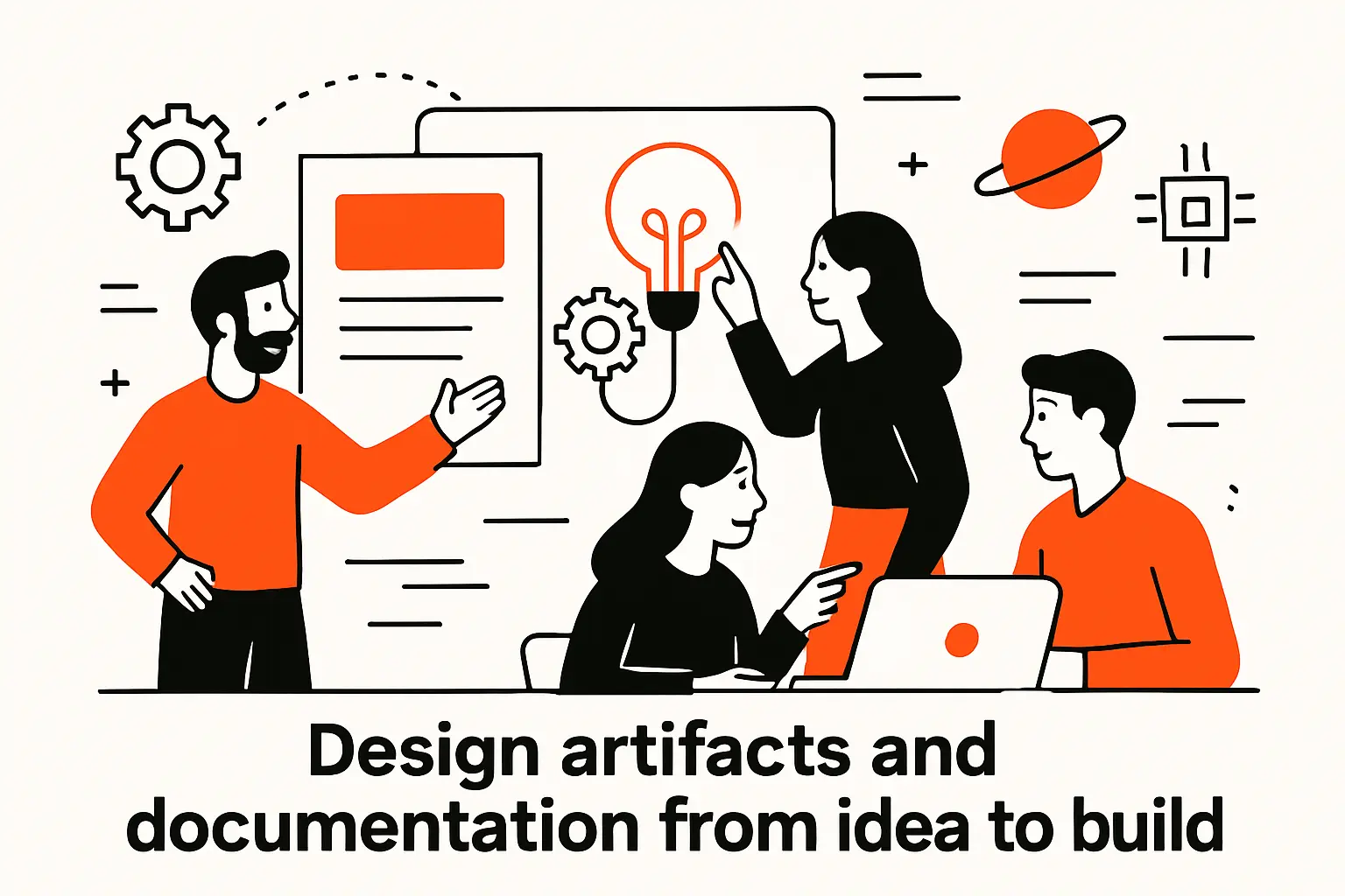
Design artifacts and documentation from idea to build
1. Wireframes as early blueprints for layout, content, and functionality
Wireframes are early, low-detail representations of layout and structure. Their value is speed: they let teams validate flow logic, content placement, and information hierarchy without getting stuck debating visual polish. In discovery, wireframes are also a tool for conversation, especially when stakeholders need something tangible to react to.
In our process, wireframes become useful when they specify intent clearly: what’s primary, what’s secondary, what actions are available, and what information must be visible to make a decision. Once those decisions are stable, higher-fidelity design can focus on refinement rather than re-architecture.
2. Mockups as static representations of what a product will look like
Mockups are static, visual designs that represent how a screen should appear, including typography, spacing, and branding. They help teams align on visual direction, ensure stakeholders understand aesthetic impact, and provide a clearer reference for implementation than wireframes alone.
Static does not mean simple, though. A mockup still needs annotations: component states, long-text behavior, error handling, and responsive rules. When mockups omit those details, engineers fill gaps in inconsistent ways, and the UI becomes a patchwork of “reasonable guesses” instead of a cohesive system.
3. Prototypes and fidelity levels: low, mid, and high fidelity
Prototypes simulate interaction and flow, letting teams test behavior before code exists. Low-fidelity prototypes prioritize speed and structure. Mid-fidelity prototypes add clearer hierarchy and some component realism. High-fidelity prototypes can feel close to a real product, which helps stakeholders and users evaluate nuance—but also risks premature commitment to visuals.
Choosing fidelity is a strategic decision. When flow uncertainty is high, lower fidelity prevents teams from mistaking polish for correctness. When interaction nuance matters—like multi-step approvals or complex filters—higher fidelity can reveal timing, transitions, and error recovery issues that static designs conceal.
4. Storyboards, user scenarios, and task analysis to capture real context
Storyboards visualize a user’s journey in context, often including environment, constraints, and emotional moments. User scenarios narrate what the user is trying to accomplish and why, grounding features in intent rather than internal politics. Task analysis breaks work into steps, decisions, and dependencies, revealing where cognitive load spikes and where automation can help.
These tools matter because software is rarely used in isolation. A warehouse manager might be on a noisy floor. A clinician might be interrupted mid-task. By documenting context, we design for reality: clearer defaults, safer recovery, and fewer fragile flows that only work in perfect conditions.
5. Agile UX, design sprints, and MVP thinking for iterative delivery
Agile UX integrates design with iterative development, keeping research, prototyping, and validation in step with engineering. Design sprints compress exploration into a structured, time-boxed cycle to align on a direction quickly. MVP thinking focuses on the smallest viable product that delivers value and enables learning without overbuilding.
From our perspective, iteration is less about moving fast and more about creating controlled feedback loops. A small release that teaches the team something is often more valuable than a large release that ships assumptions. When agile UX is healthy, designers and developers share a cadence, and discovery doesn’t become a separate universe from delivery.
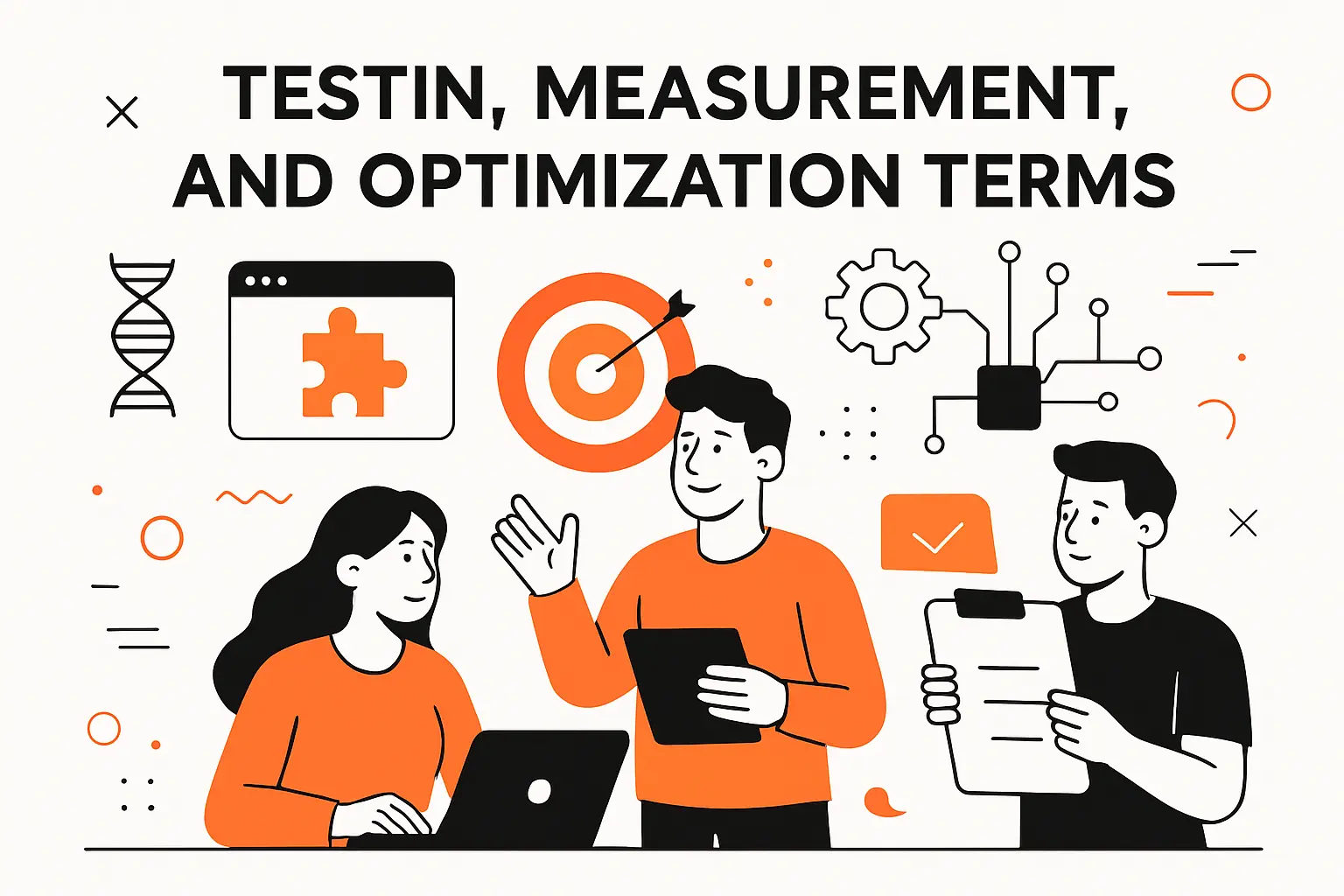
Testing, measurement, and optimization terms
1. Usability testing with representative users to evaluate ease of use
Usability testing observes users attempting real tasks while the team watches where they hesitate, misinterpret, or fail. Representative users matter because internal teams are experts by default; familiarity hides friction. In moderated sessions, facilitators probe reasoning and capture language that later improves labels and microcopy.
What we love about usability testing is its humility. A flow that seems obvious in a design review can collapse in front of real users for reasons that nobody predicted. When teams treat these moments as information rather than embarrassment, product quality improves rapidly, and debates become evidence-based instead of opinion-based.
2. A B testing to compare design variations by changing one element at a time
A B testing compares two variations to determine which performs better against a defined outcome. The discipline is in isolation: the more variables you change at once, the less you can attribute performance differences to a specific choice. Good experiments also define guardrails so a “winner” doesn’t improve one metric while harming trust or accessibility.
In practice, experiments are only as good as instrumentation and interpretation. A measured uplift can reflect novelty, segment effects, or external seasonality. For that reason, we pair A B results with qualitative signals and product intuition, aiming to learn why a change worked rather than merely celebrating that it did.
3. Cognitive walkthroughs to uncover usability pain points in task flows
A cognitive walkthrough is an expert evaluation method where reviewers step through tasks and ask whether a user would know what to do at each point. The technique surfaces gaps in discoverability, labeling, and feedback, especially when users are new or stressed. Compared with usability testing, walkthroughs are faster and easier to run repeatedly during design and development.
We use walkthroughs to catch “obvious to us” problems early, then reserve user sessions for validating assumptions that experts cannot reliably predict. When combined, the two methods create a practical rhythm: frequent internal evaluation, periodic external verification, and continuous refinement.
4. Website KPIs: conversion rate, time on page, and bounce rate
Conversion rate measures whether users complete a desired action, such as signing up, purchasing, or submitting a form. Time on page can indicate engagement, but it can also signal confusion if users linger because they cannot find what they need. Bounce rate shows how often users leave after viewing a single page, which may indicate mismatch between expectation and content.
Metrics become meaningful only when tied to intent. A lower time on page can be positive if users find answers faster. A higher bounce rate can be acceptable when the page satisfies the need immediately. For that reason, we frame KPIs as hypotheses about user behavior, then validate interpretation through observation and segmented analysis.
5. UX audits, beta testing, and Lean UX learning loops: build, learn, measure
A UX audit is a structured evaluation of a product’s usability, accessibility, consistency, and alignment with best practices. Beta testing exposes near-finished software to real usage contexts, revealing reliability issues and edge cases that internal environments miss. Lean UX emphasizes learning loops—building small, learning quickly, and measuring outcomes to guide the next iteration.
Operationally, these practices create a culture where shipping is not the end. Audits identify systematic gaps, beta feedback reveals lived reality, and learning loops keep teams honest about whether changes improve outcomes. When organizations adopt this mindset, product quality becomes cumulative rather than cyclical.
TechTide Solutions: turning UI UX design terms into shipped custom software
1. Discovery and planning that translate UX terminology into clear product requirements
In discovery, we convert vocabulary into commitments: which personas matter, which scenarios define success, what IA model supports findability, and what accessibility standards are mandatory. Requirements become clearer when every term has a corresponding artifact—research notes, journey maps, wireframes, and acceptance criteria that engineering can test.
Our viewpoint is blunt: design maturity is correlated with business performance. McKinsey’s research reports 32 percentage points higher revenue growth for top-quartile design performers, and that sort of outperformance rarely comes from aesthetics alone—it comes from clear intent, shared language, and disciplined execution.
2. Custom web and mobile development that implements design systems and consistent UI components
During build, our engineers treat UI terminology as implementation constraints, not suggestions. A “button” is not a rectangle with text; it is a component with states, accessibility semantics, analytics hooks, and consistent behavior across platforms. A “form” is not a page; it is a data contract with validation, error recovery, and predictable submission outcomes.
Design systems make this work scalable. When tokens, components, and patterns are shared, teams avoid reinventing interaction rules per screen. Over time, that consistency reduces regression risk because changes can be made centrally, and QA can validate behavior at the component level instead of chasing one-off CSS and JavaScript variations.
3. Iterative prototyping, testing, and optimization to match real customer needs
Iteration is where terms turn into truth. Prototypes let us test assumptions before code hardens, and usability sessions reveal where mental models diverge from what the team expected. After release, measurement shows whether improvements are real or merely cosmetic, and customer feedback exposes the difference between “works” and “works in context.”
Evidence keeps teams aligned when opinions collide. McKinsey also found 56 percentage points higher TRS growth among top design performers, which reinforces our belief that learning loops are not overhead—they are a competitive advantage when they’re baked into how software gets shipped and improved.
Conclusion: build confidence by mastering ui ux design terms
1. Create a team glossary and standardize language across projects
A glossary works only when it is used in meetings, tickets, and reviews. As a practical step, we recommend publishing a shared vocabulary in the same place engineers track decisions and requirements, then revisiting it during onboarding and sprint rituals. Consistency reduces rework because team members stop translating between personal interpretations.
Governance matters as much as writing. Someone must own the glossary, accept change requests, and resolve conflicting definitions before the conflict hits production. Once that ownership exists, language becomes stable enough to support parallel work across research, design, engineering, and QA.
2. Connect terms to outputs: research insights, IA, UI components, and prototypes
Terms become useful when they map to outputs that can be reviewed and tested. A research term should yield a research artifact. An IA term should yield a navigation model. A UI term should yield a coded component or a design-system specification. A testing term should yield a protocol and a decision rule for what happens when evidence contradicts assumptions.
That mapping prevents “design theater.” Instead of admiring polished decks, teams evaluate tangible deliverables: flows that can be walked through, components that can be inspected, and acceptance criteria that can be validated. When outputs are explicit, collaboration becomes calmer because expectations are visible.
3. Revisit terminology as products evolve through measurement and iteration
Language needs maintenance because products evolve. New features introduce new concepts, and teams acquire new stakeholders who bring different interpretations. Over time, the glossary should absorb learnings from support, analytics, and user research, keeping definitions aligned with how the product is actually used.
Next step: if we at TechTide Solutions helped your team draft a glossary workshop agenda, which term would you want to eliminate first—the one that causes the most confusion, or the one that causes the most rework?