At TechTide Solutions, we see UI UX paradigms as the operating assumptions behind a digital product. They decide whether a tool feels like a dashboard, a guided workflow, a chat assistant, or an immersive space. That choice shapes trust, speed, and mental effort long before colors and icons enter the room.
From a market view, this shift is real. Gartner forecasts worldwide AI spending will total $2.52 trillion in 2026, which helps explain why software is moving from fixed screens toward adaptive behavior. We are no longer designing only pages. We are designing systems that sense, respond, explain, and sometimes act.
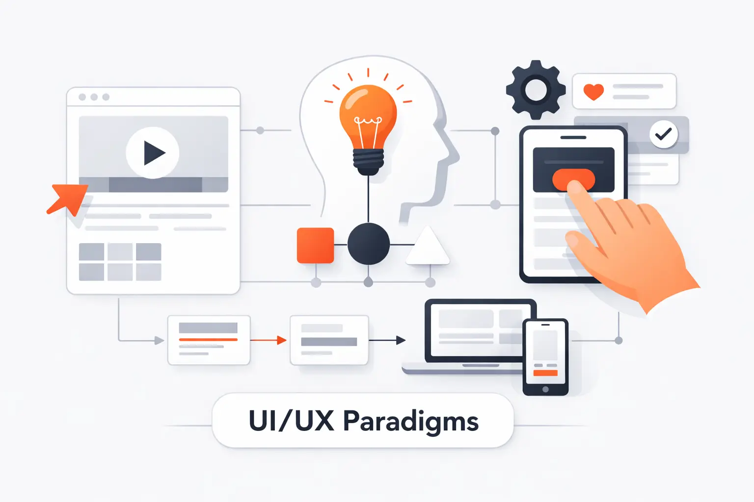
What Are UI UX Paradigms?

Before we can choose the right model, we need clean language. Teams often use “paradigm” to mean layout, style, or trend. We think that shortcut leads to weak product decisions.
1. How a Paradigm Shapes Interface Behavior and User Experience
A paradigm is the broad interaction model that tells users how a product behaves. A wizard leads step by step. A dashboard surfaces status and choices. A conversational assistant accepts intent, asks follow-up questions, and returns a result. The same feature can feel simple or exhausting depending on which model frames it.
2. How UI UX Paradigms Differ From Design Patterns and UX Principles
Design patterns and UX principles sit at different levels. A paradigm is the overall behavior model. A design pattern is a repeatable solution, like tabs, search, or inline validation. A principle is a rule that guides judgment, like clarity or user control. We often explain it this way: the paradigm sets the game, patterns define the moves, and principles keep the game fair.
3. Why UI UX Paradigms Matter for Product Design and Usability
UI UX paradigms matter because users learn by prediction. Why does that matter? Because people move faster when a product behaves the way they expect. When the model is wrong, even polished screens feel awkward. We have seen internal tools dressed like social feeds and enterprise workflows forced into chat windows. Both looked modern. Neither felt right.
Recommended reading: UI UX Design Terms: A Practical Glossary for UX, UI, Research, and Product Teams
The Core UX Principles Behind Effective UI UX Paradigms

Good paradigms are built on old truths. People still need clarity, orientation, and control. New tech does not cancel basic usability. It raises the cost of ignoring it.
1. User-Centricity, Context, and Real User Needs
User-centered design starts with work, not widgets. We ask what users are trying to finish, where they are, how often they do it, and what happens if they fail. Voice works well when hands are busy. It works poorly when privacy matters or commands must be exact. Context decides which model earns its keep.
2. Consistency, Hierarchy, and Easy Navigation
Consistency and hierarchy make a product learnable. Primary actions should look primary. Labels should not change from screen to screen. Navigation should tell people where they are and what comes next. We like interfaces that reveal depth gradually. They do not dump every option on the first screen and hope for the best.
3. User Control, Accessibility, and Usability
User control also depends on accessibility. WCAG gives teams a single shared standard for web content, and that matters more than many teams admit. When design, engineering, QA, and compliance aim at the same bar, keyboard access, visible focus, readable contrast, captions, and recovery states stop feeling optional. They become part of the product’s grammar.
Foundational UI UX Paradigms Still Shaping Digital Products
Some UI UX paradigms feel ordinary because they have been absorbed into everyday software. That does not make them outdated. It makes them foundational.
1. Minimalism That Reduces Distraction and Simplifies Tasks
Minimalism is not empty space for its own sake. It is the discipline of removing weak choices, weak copy, and weak decoration. Good minimalism lets one primary action win. It helps people focus on the next step. Bad minimalism hides useful tools and calls the confusion elegance. We prefer the first kind.
2. Dark Mode for Comfort, Readability, and User Preference
Dark mode survives because it respects situation and preference. It can feel calmer at night and less glaring in low light. But it is not a free accessibility win. Low-contrast gray text on black backgrounds can be harder to read than teams expect. A good dark theme needs a deliberate color system, careful contrast, and testing in real conditions.
3. Mobile-First, Adaptive, and Responsive Design Across Devices
Mobile-first still matters, but only if it starts with priorities instead of screen-size myths. Android’s own guidance says layouts should change based on available display space, not on a simple phone-versus-tablet label. We agree. A split-screen tablet can offer less useful room than a phone. Good responsive work starts with content, then adapts structure as space expands.
UI UX Paradigms Expanding Beyond the Traditional Screen
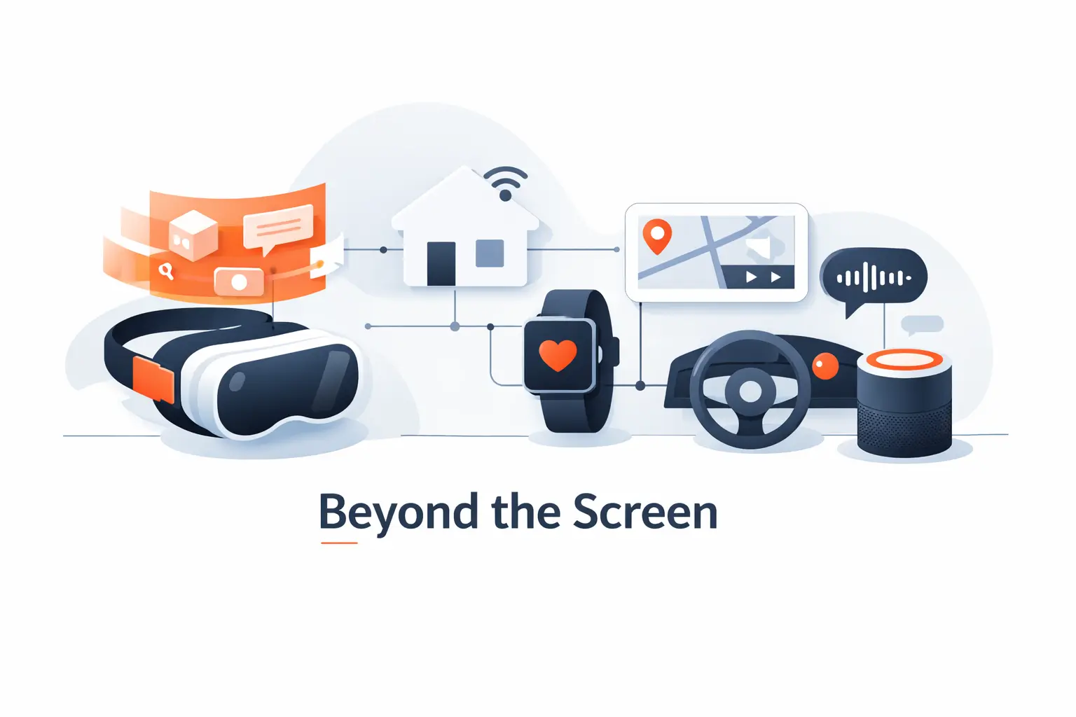
Digital products now live beyond the rectangle. Microphones, cameras, sensors, and physical space have become part of the interaction layer. That changes how we think about feedback, effort, and trust.
1. Voice User Interfaces and More Natural Interactions
Voice user interfaces work best when intent is short and the user’s eyes or hands are busy. Even Amazon’s in-vehicle Alexa guidance includes multimodal best practices, and we think the lesson travels well. Good voice experiences rarely stay voice-only for long. They pair speech with visual confirmation, clear fallback controls, and short repair loops when recognition fails.
2. Biometric Authentication for Secure and Frictionless Access
Biometric login changed user expectations because it removed a boring step without hiding the stakes. Apple says Face ID has a false-match probability of less than 1 in 1,000,000 with a single enrolled appearance. The broader lesson, in our view, matters more than the number. Security feels better when it is fast, contextual, and backed by an obvious fallback path.
3. AR and VR Experiences That Increase Immersion and Engagement
AR and VR demand a different mental model because the interface shares space with the body. Apple describes spatial interaction as using eyes, hands, and voice, and that captures the design shift well. Depth, reach, fatigue, comfort, and physical awareness all matter. A flat menu copied into 3D is usually the fastest path to a clumsy experience.
AI-Driven UI UX Paradigms Redefining Product Design
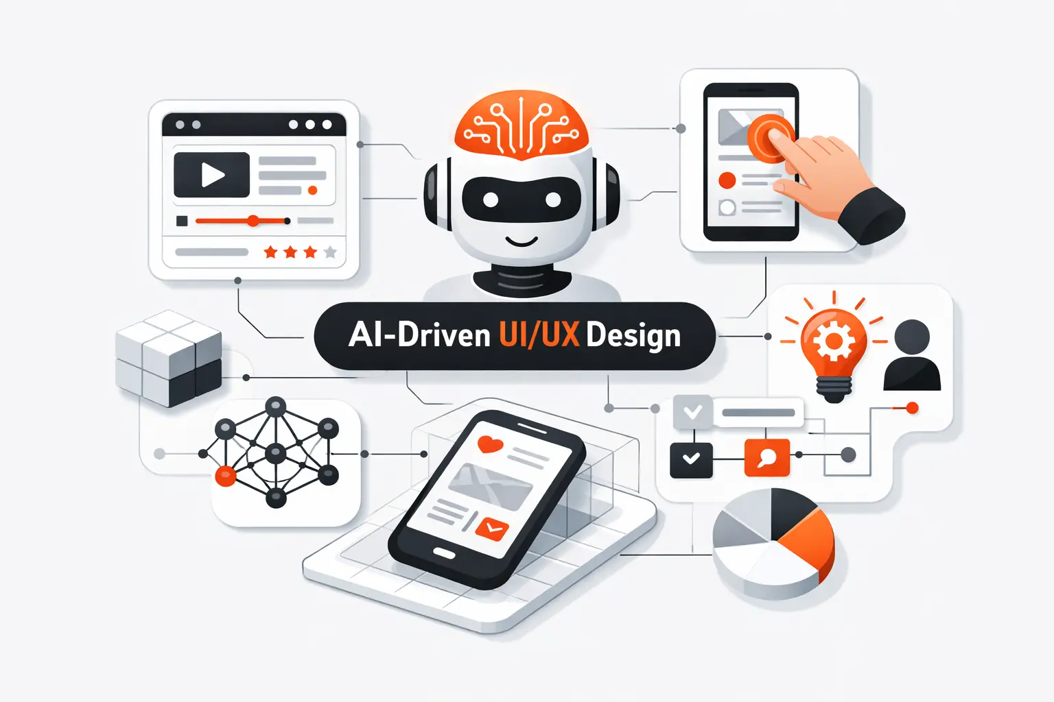
This is where the ground really moves. AI changes the contract between product and user because the system can generate, rank, explain, summarize, and act. That sounds powerful, and it is. It also makes design harder.
1. Non-Deterministic Experiences and Visible Guardrails
AI outputs vary, so the interface has to carry uncertainty openly. We value guidance that tells systems to express uncertainty when consequences are real or confidence is shaky. Users need to know when the system is guessing, when it is confident, and when it should stop and ask. Visible guardrails can take many forms, like confirmation steps, editable drafts, source views, and reversible actions.
2. Continuous Adaptation and Ultra-Personalized Interfaces
Continuous adaptation can make a product feel helpful or creepy. Personalized recommendations, dynamic home screens, and AI-written summaries can reduce noise. But hidden adaptation breaks trust fast. If the system changes layout, rank order, or wording, users should understand why. We prefer products that explain the shift and let people reset or tune it.
3. Outcome-Based UX and Intent-Driven Interaction
Outcome-based UX starts with intention, not menu structure. Instead of forcing users to find the right feature first, the product asks what they want done. That can be powerful for drafting, planning, support, and analysis. Still, we do not think buttons are going away. Users need checkpoints, scope controls, and visible structure once the system turns intent into steps.
Multimodal and Agentic Experiences in the Next Wave of UX

The next wave of UI UX paradigms mixes multiple inputs and degrees of autonomy. Users will talk, type, scan, tap, review, and approve inside one flow. Some of the work will happen in the background.
1. Designing Across Voice, Vision, Text, and Touch
Multimodal design works when each mode plays a clear role. Voice is fast for command entry. Text is better for precision and auditability. Visual surfaces are better for comparison and verification. Touch is great for confirmation. The mistake is making every mode say the same thing. Good products choreograph the handoff between modes instead.
2. AI-Augmented Workflows That Expand What Users Can Do
AI-augmented workflows expand what users can do, but they should not bury the raw material. A support agent needs the drafted reply and the original ticket side by side. An analyst needs generated insights and the data source nearby. A developer needs suggested code and room to inspect it. When the AI layer is editable and transparent, it feels like assistance, not theater.
3. Agentic Experiences for Hybrid Human and AI Systems
Agentic systems can take multi-step actions, which means the interface needs clear scope, approval, and visibility. We want users to know what the system can touch, what it has done, and what it plans to do next. The same modern AI guidance around scope of autonomy and bad surprises is useful well beyond chatbots. For high-stakes tasks, we still favor a human in the loop. A good agent view needs logs, pause controls, and easy reversal.
How Design Patterns Support Modern UI UX Paradigms
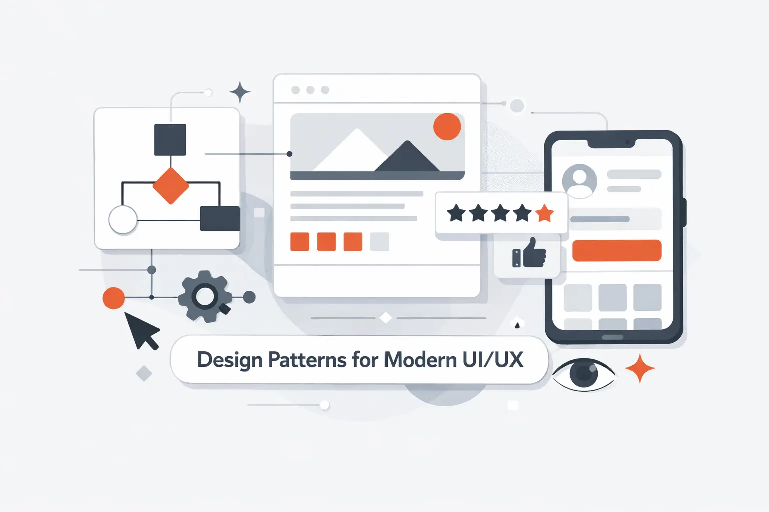
Paradigms set the direction. Patterns make that direction usable in daily product work. They let teams solve common interaction problems without reinventing the wheel every sprint.
1. Why Reusable Patterns Save Time and Reduce Reinvention
Reusable patterns save time because they reduce debate on solved problems. Teams do not need a fresh theory for every modal, empty state, filter, or confirmation flow. Users benefit too. Familiar structures lower learning cost. In our projects, design systems matter most when they stop small decisions from stealing energy from the core problem.
2. Common Patterns for Onboarding, Purchasing, Date Pickers, Chat, and Uploads
Some patterns keep showing up because the jobs keep showing up. Onboarding should get users to first value quickly. Purchasing flows need visible progress and low-anxiety review steps. Date pickers must respect locale, touch, and time zones. Chat interfaces need clear turn-taking and status states. Upload flows need progress, retry, and plain-language errors. None of that is glamorous. All of it matters.
3. Studying Real Product Flows to Strengthen UX Decisions
We learn a lot from studying real product flows, but we try not to copy surface details. A checkout flow, a booking flow, and a document upload flow each solve different risks. The right question is not, “Can we make ours look like that?” It is, “What problem did that flow solve, and do we share it?” That mindset usually produces better decisions.
Responsive UI UX Paradigms for Complex Screens and Mobile Contexts

Responsive work is not just about shrinking layouts. It is about deciding what matters most when attention, space, and bandwidth are limited. That is where many products either become clear or collapse into clutter.
1. Prioritizing Key Data in Dense Interfaces
Dense interfaces should lead with signals, not every possible detail. We like a strong top layer with the few metrics, alerts, or statuses that answer the first question fast. Filters, drill-downs, and secondary panels can follow. If users must scan ten zones to know whether action is needed, the hierarchy is not working.
2. Handling Tabs and Navigation on Small Screens
Tabs work well when destinations are stable and few. They fail when teams use them to hide messy structure. On small screens, primary navigation should stay obvious and limited. Secondary actions can live in overflow menus or context panels. We do not mind a hamburger menu for rare tasks. We do mind it being the only map for the whole product.
3. Improving Calendars and Events for Touch Interaction
Calendars often fail on touch devices because the cells are too small and the interaction is too precise. Good mobile calendar design favors forgiving tap targets, quick event creation, obvious time ranges, and list views when detail matters more than grid density. If scheduling is central to the product, the calendar cannot be an afterthought. It is the workflow.
Microinteractions That Improve Clarity and Delight

Microinteractions are small, but they carry meaning. They confirm intent, show progress, and keep the product feeling responsive without shouting for attention. Done well, they help people think less and trust more.
1. Using Subtle Motion to Support Feedback and Engagement
Subtle motion can explain what changed. A card expanding from where the user tapped makes more sense than a hard scene cut. A short success animation can confirm an action without extra text. We like motion when it supports orientation or feedback. If it only exists to decorate, it usually wears out its welcome.
2. Keeping Animations Consistent Across the Interface
Animation needs its own grammar. Similar actions should move in similar ways. Sheets should not slide on one screen and pop on another without reason. Timing should feel related across the product. Consistency helps users build a bodily memory of the interface, which is often faster than conscious reading.
3. Knowing When Visual Feedback Starts to Distract Users
There is a line where feedback becomes noise. Too many loading skeletons, bouncing icons, shimmer effects, and celebratory toasts can make a serious product feel unserious. We try to protect attention, especially in business software. Respect for reduced motion settings is part of that discipline. Delight is welcome. Distraction is not.
How to Choose the Right UI UX Paradigms for Your Product

Choosing the right UI UX paradigms is less about trends and more about fit. We have seen older models win because they matched the work. We have also seen flashy new models fail because they fought the context.
1. Aligning the Paradigm With User Goals and Real Contexts
Start with what users are trying to finish, how often they do it, and what failure costs. Repeated expert work often rewards speed, shortcuts, and information density. Infrequent high-stakes tasks usually need guidance and confirmation. If the work happens in the field, offline behavior may matter more than aesthetic polish. The right paradigm follows the job.
2. Combining New Interaction Models With Familiar Patterns
New interaction models land better when they borrow familiar anchors. A conversational assistant still benefits from attachments, history, undo, and review steps. A spatial app still needs orientation and stable controls. A command interface still needs discoverability. We like novelty when it expands capability, not when it forces users to relearn common sense.
3. Validating Ideas Through Research, Testing, and Iteration
Research and testing keep paradigm debates honest. Early wireframes, clickable prototypes, and role-play sessions can expose confusion before a team spends months building the wrong model. After launch, logs, search queries, abandoned steps, and support tickets tell the next part of the story. Good paradigm choices are usually iterated into place, not announced into place.
Frequently Asked Questions About UI UX Paradigms

These are the questions we hear most when teams try to connect UI UX paradigms with real product decisions. They sound simple on the surface, but each one shapes architecture, workflow, and user trust.
1. What Is a UX Paradigm?
A UX paradigm is the high-level model behind how a product behaves. It defines the relationship between user and system. Direct manipulation, step-by-step workflows, conversations, and spatial environments are all paradigms. They are bigger than components and more durable than visual trends.
2. What Is the Difference Between UI UX Paradigms and Design Patterns?
UI UX paradigms describe the overall interaction model. Design patterns are reusable solutions inside that model. A chat paradigm can use patterns like message threads, typing indicators, and attachment chips. A dashboard paradigm can use cards, filters, and side panels. Patterns are building blocks. Paradigms are the blueprint.
3. What Are the Seven Core UX Design Principles?
There is no single official list that every team uses. In our work, we keep coming back to seven basics: user-centeredness, clarity, hierarchy, consistency, feedback, control, and accessibility. When a screen fails, the problem usually traces back to one of those. That is why the fundamentals still matter so much.
4. How Is AI Changing UI UX Paradigms?
AI shifts products from fixed flows toward adaptive systems. Interfaces now need explanations, guardrails, editable outputs, and approval moments. Search boxes can become intent inputs. Result screens can become collaborators. The challenge is not only capability. It is making that capability understandable and safe to use.
5. Why Do Accessibility and Mobile-First Design Still Matter?
Because people still use products in messy, constrained conditions. They are on phones, in glare, on weak connections, under time pressure, or using assistive technology. Accessibility and mobile-first thinking force better prioritization. They keep new ideas grounded in real use.
How TechTide Solutions Builds Custom Software Around Modern UI UX Paradigms
Our own approach at TechTide Solutions follows the same logic. We do not start by picking shiny patterns. We start by asking what the software must help people finish, trust, and control.
1. Translating User Needs Into Custom Web and Mobile Products
We begin with user roles, core tasks, exceptions, and moments of risk. From there, we choose whether the product should feel like a workspace, a guided process, a self-service portal, a conversational assistant, or a blend. That early call shapes navigation, permissions, content structure, and even backend decisions. It is not window dressing. It is architecture in user-facing form.
2. Designing Responsive, Accessible, and AI-Ready Experiences
We design responsive and accessible flows from the start because retrofits are expensive and usually incomplete. If AI is part of the product, we add room for clarifying questions, editable drafts, source visibility, fallback states, and audit trails. In our view, an AI-ready experience is not one with the most automation. It is one that explains itself and recovers well when things go sideways.
3. Developing Tailored Solutions for Complex Business Workflows
Complex business software lives or dies on workflow clarity. Approval chains, document states, exception handling, and integration points shape the experience as much as UI polish does. We spend real time mapping those states before we build. Fancy visuals cannot rescue a muddled operational model. Clear paradigms can.
Conclusion: Building Better Products With the Right UI UX Paradigms
The best products are not defined by trend words. They are defined by fit. The right UI UX paradigms make behavior feel predictable, effort feel lower, and trust feel earned. The wrong ones turn even strong features into friction.
At TechTide Solutions, we believe modern product design works best when timeless principles and newer models meet in the middle. Choose the paradigm that matches the work. Support it with proven patterns. Test it with real users. That is how better digital products stop being clever concepts and start becoming tools people actually want to use.
