At TechTide Solutions, we’ve learned that “building an e-learning website” is rarely a single build—it’s the birth of a product, a content operation, and a trust relationship, all at once. Plenty of teams obsess over the LMS choice, but the real winners obsess over the learning promise: who the learner is, what they’ll be able to do afterward, and why your platform is the fastest, safest path to that outcome.
Market momentum is not the hard part; execution is. In Statista’s market forecast, revenue in the Online Education market is projected to reach US$203.81bn in 2025, and that kind of tailwind explains why new course platforms appear every week. Competitive pressure, however, cuts both ways: learners now expect smooth onboarding, reliable video, responsive pages, and “remember where I left off” progress tracking as table stakes.
From our vantage point, the best e-learning sites feel less like “content repositories” and more like guided experiences. Coursera makes multi-course journeys feel coherent through sequences and credentials, while Duolingo turns practice into habit with friendly friction, reminders, and clear progress. Behind both examples is a shared product truth: learning UX is behavior design, not decoration.
So we’re going to treat this roadmap like we do in real delivery: validate the niche, define the minimum lovable platform, ship a safe and fast first version, then iterate with instrumentation. Along the way, we’ll call out where businesses accidentally overbuild, where security and performance sneak up on budgets, and how to make the tech serve the pedagogy instead of the other way around.
How to make e learning website planning and niche validation
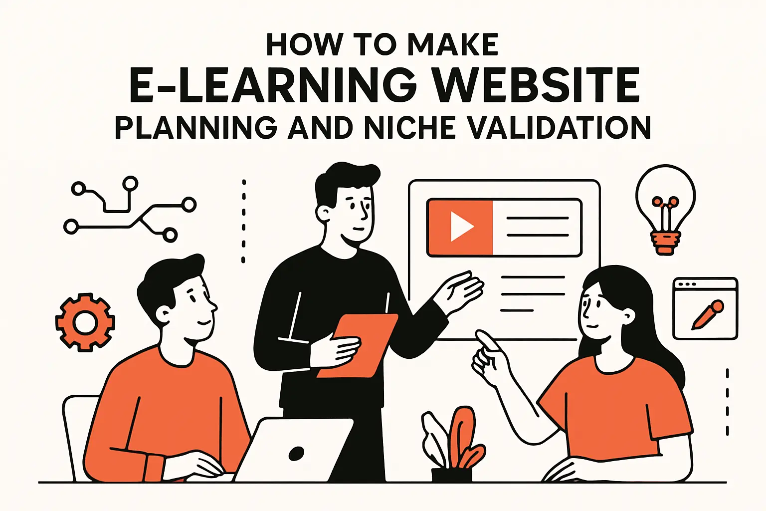
1. Define a specific niche and target learners
Clarity beats scale in the early days. A niche is not just a topic (“project management”); it’s a specific learner with a specific constraint (“newly promoted managers who need scripts for difficult conversations”). From our perspective, the easiest way to validate is to write the landing page first—headline, outcomes, objections, and a simple call to action—and then see whether real people lean in or politely nod.
Instead of chasing “everyone,” we map three anchors: the learner’s job-to-be-done, the stakes if they fail, and the context where they’ll actually study (commute, lunch break, late-night quiet). Once those anchors are explicit, your platform decisions become simpler because you’re building for a scenario, not an abstract audience.
2. Map platform requirements for a nimble and scalable learning experience
Requirements are where e-learning projects either get disciplined or drift into expensive ambiguity. On the functional side, we document content types, assessments, progress rules, certificates, search, roles, and support workflows. On the non-functional side, we focus on what quietly determines trust: page speed, uptime expectations, security posture, privacy needs, and editorial governance for course updates.
Operationally, we also ask, “Who publishes content, and how?” A nimble platform has a low-friction publishing pipeline, staging versus production separation, and rollback paths when a lesson update breaks something. If you can’t update a course without fear, growth turns into technical debt disguised as momentum.
3. Outline course structure using modules, lessons, and activities
Course structure is the skeleton that makes content feel inevitable rather than overwhelming. We like to start with learning objectives stated as behaviors (“draft a usable policy,” “ship a working prototype,” “pass an internal audit”), then map modules as capability clusters, and lessons as the smallest “meaningful step” the learner can complete without losing context.
Activities deserve equal weight to content. Quizzes, reflections, templates, peer discussion prompts, and small projects create retrieval practice and application—the moments when learning becomes durable. When we design platforms, we treat activities as first-class objects because they affect data models, progress logic, and UX patterns across the entire site.
4. Choose a business model one time purchase subscription bundles or tiered access
Business model is not a pricing checkbox; it changes architecture. One-time purchases emphasize clean checkout and perpetual access rules, while subscriptions demand proration handling, renewals, churn reduction tools, and content cadence. Bundles and tiered access add complexity around entitlements—what the learner can see, when, and under which conditions.
From a product standpoint, each model also changes how you market. A one-time purchase often sells “a destination,” whereas a subscription sells “a relationship.” Our bias at TechTide Solutions is to pick the simplest model that matches your content cadence, then add complexity only after you have evidence that learners want it.
5. How to make e learning website roadmap and MVP phases for limited resources
Limited resources are not a blocker; they are a forcing function for focus. We usually shape an MVP around one flagship course, one payment path, one support channel, and one analytics layer—then we ship. That first launch is not about perfection; it’s about verifying learner activation, completion behavior, and refund-driving friction points.
Iteration should be planned, not improvised. A lightweight roadmap that sequences content expansion, performance tuning, automation, and retention features keeps you from rebuilding fundamentals midstream. When budgets are tight, the smartest move is to avoid “platform sprawl” and instead build one clean core that can host many learning experiences later.
Recommended reading: Custom Web Applications: Definition, Benefits, and Development Guide for 2026
Platform options for building an online learning platform
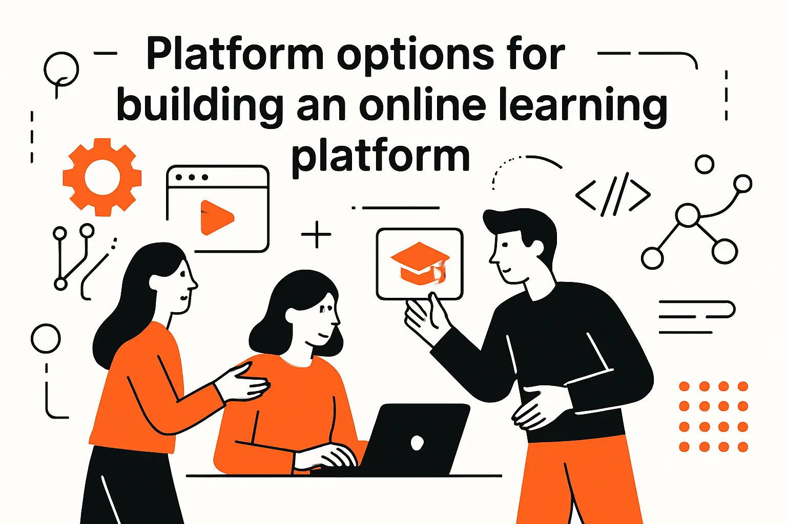
1. Marketplace vs self hosted platforms and what you own
Marketplaces help you start fast, but they also define your ceiling. Listing on a marketplace can bring discovery and built-in payments, yet you typically trade away brand control, data depth, and pricing flexibility. Self-hosted platforms give you ownership of UX, analytics, and customer relationships, but they require operational maturity around updates, security, and support.
Ownership matters most in two places: learner data and distribution. If you can’t export meaningful progress and behavior data, your ability to improve instruction becomes guesswork. Likewise, if your entire funnel lives inside someone else’s algorithm, your business inherits platform risk that you can’t control or hedge.
2. WordPress and CMS based builds for getting started fast
CMS-first builds are popular for a reason: they reduce time-to-launch and offer a vast ecosystem of themes, plugins, and integrations. WordPress paired with a solid LMS plugin can be a pragmatic choice when your differentiator is content quality rather than bespoke product mechanics. In our experience, the strongest CMS builds treat WordPress like a platform, not a pile of plugins.
Governance is the hidden requirement. A CMS site needs rules for plugin selection, update cadence, performance budgets, and staging workflows. When teams ignore governance, they end up with “just one more plugin” until the site becomes fragile, slow, and difficult to secure.
3. When building from scratch makes sense for advanced customization and long term growth
Custom builds pay off when your learning experience is the product, not just the container. Cohort-based programs, adaptive paths, complex certification rules, multi-tenant training for client organizations, or deep integrations with internal systems often outgrow off-the-shelf LMS assumptions. Building from scratch also helps when you need to control every pixel of the learner journey for conversion, retention, or accessibility reasons.
Architecture choices should match growth intent. A modular backend with clean domain boundaries (users, courses, billing, analytics) keeps your platform evolvable. At TechTide Solutions, we push for a design that lets you change course formats and pricing without rewriting the core every time strategy shifts.
4. Low resource alternatives like intranets or password protected subdomains
Not every learning need warrants a full public platform. Internal training for a small team might be better served by an intranet, a private knowledge base, or a password-protected learning hub that skips ecommerce entirely. For client enablement, a gated subdomain can deliver curated onboarding content without the overhead of a full LMS.
These “lighter” approaches still benefit from good UX and tracking. Even a private hub should have clear navigation, searchable content, and a simple way to capture completion signals. When you later upgrade to a full platform, the lessons learned from a lean setup become your real requirements document.
Recommended reading: Choosing Web App Development Services: A Practical Guide to Selecting the Right Partner
Domain and hosting setup for speed security and scalability
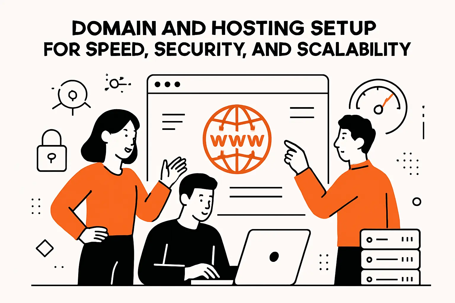
1. Register a memorable domain name to improve credibility
A domain is your first trust signal, especially for paid education. Clean spelling, intuitive pronunciation, and brand alignment matter more than cleverness, because learners will type it, say it, and search it. We also recommend picking a name that can expand with your catalog, so you’re not boxed into one topic as your business evolves.
Operationally, domain hygiene means controlling DNS, enabling domain privacy where appropriate, and documenting access. If a contractor registers your domain under their own account, you’ve created a future hostage situation. Long-term credibility is built through small, boring choices done correctly.
2. Choose hosting that matches your stage shared hosting vs managed WordPress vs cloud hosting
Hosting is a business decision disguised as a technical one. Shared hosting can be fine for early validation, managed WordPress hosting reduces operational drag for CMS-based platforms, and cloud hosting becomes compelling when you need elasticity, separation of services, and infrastructure automation. In practical terms, your hosting choice determines how confidently you can run launches, promotions, and media-heavy lessons.
Budget conversations get easier when we connect the dots to macro trends. Gartner forecasted worldwide end-user spending on public cloud services to total US$723.4 billion in 2025, and we interpret that as an industry-wide signal: reliability and scalability are increasingly purchased as managed capability, not handcrafted from scratch.
3. Hosting checklist speed security SSL firewall malware scanning and automatic backups
Checklists sound mundane, yet they prevent expensive surprises. We treat hosting readiness as a layered defense: HTTPS everywhere, a web application firewall, malware scanning, secure admin access, backups with tested restores, and least-privilege permissions for your team. Credential hygiene matters because admin panels are attractive targets, and education sites hold payment metadata, personal data, and sometimes employer-related identity details.
Security also has a human dimension. Verizon’s DBIR preview reports that 68% of breaches involved a non-malicious human element, which is why we build processes that assume mistakes will happen. For threat modeling and secure coding priorities, we regularly align work with the OWASP Top 10 so the team speaks a common security language across design, development, and QA.
4. Plan for large media and video delivery to avoid buffering and slow lessons
Video is where many e-learning platforms quietly fail. Learners don’t blame “bitrate” or “origin latency”; they blame you, then they churn. Our usual approach is to separate concerns: store raw media safely, transcode for web playback, deliver through a CDN, and embed players that behave well on mobile networks and corporate firewalls.
Content protection intersects with performance here. Using mechanisms like signed URLs can help reduce casual link sharing while still letting legitimate learners watch smoothly. Even without heavy DRM, thoughtful delivery architecture keeps lessons fast, secure, and less likely to melt your hosting bill during a launch.
Recommended reading: Web App Ideas: Trending Concepts, Profitable Niches, and Beginner Projects to Build in 2026
Select your LMS and core toolkit for course delivery
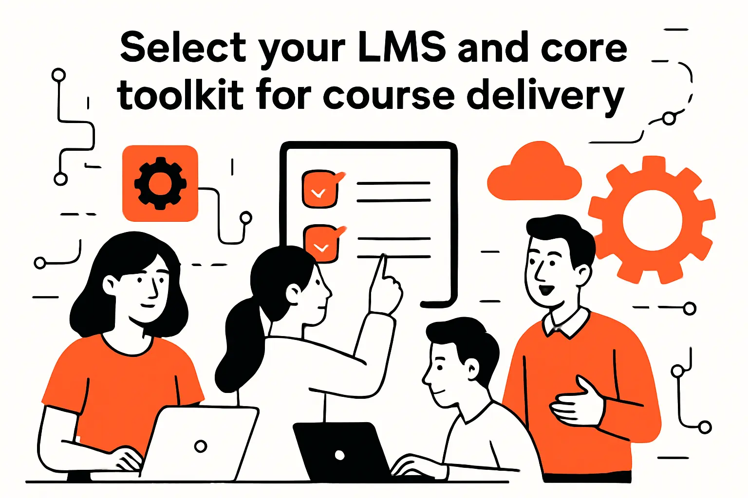
1. Core LMS capabilities course building content uploads quizzes assignments progress and certificates
An LMS earns its keep by turning content into an experience that can be tracked, supported, and improved. Core capabilities usually include course authoring, structured lessons, file and video embedding, quizzes, assignments, graded or ungraded activities, progress tracking, completion rules, certificates, and reporting. From our standpoint, the “reporting” part is where platforms separate into hobby projects versus businesses.
Equally important is how the LMS handles roles and workflows. Instructors, reviewers, admins, support staff, and learners all need different permissions, and those roles affect your operational cost over time. A good LMS also plays nicely with marketing tools, email automation, and analytics so you can connect learning outcomes to business outcomes.
2. Comparing WordPress LMS plugins LearnDash LifterLMS and Tutor LMS
WordPress LMS plugins can work well, yet each brings its own philosophy. LearnDash is often chosen for structured courses and mature ecosystems; LifterLMS tends to appeal to teams who want coaching-style features and memberships; Tutor LMS is popular for a quicker start and a friendlier UI for many creators. Our take is to evaluate less on feature lists and more on how the plugin models progress, access rules, and reporting.
Integration friction is the silent cost. Payment gateways, membership plugins, page builders, caching, and email systems can either fit cleanly or fight each other. During selection, we like to prototype one end-to-end flow—purchase to enrollment to lesson completion to certificate—because that flow reveals the real complexity faster than any demo.
3. LMS and membership focused options like Moodle MemberPress Thrive Apprentice and MemberMouse
Moodle remains a strong choice when you need an education-first LMS with deep pedagogical features and institutional patterns. MemberPress, Thrive Apprentice, and MemberMouse lean toward membership business mechanics, which can be ideal when your core job is controlling access, billing rules, and subscriber experiences. Choosing between them is less about “best” and more about whether your center of gravity is academic learning design or digital product monetization.
From a scalability lens, we also ask who will maintain the system. Open-source solutions can be powerful, but they demand responsible patching and hosting discipline. Membership-first stacks can be simpler operationally, though they may require additional tooling for assessments, reporting, and credentialing if your learners expect more formal outcomes.
4. Choose themes and plugins that support customization flexibility and scalability
The theme and plugin layer is your UX engine, but it can also become your bottleneck. We prefer lightweight themes that prioritize performance and accessibility, plus a minimal plugin set with clear ownership and update cadence. Compatibility matters because e-learning sites evolve: a new course format, a new pricing tier, or a new community feature should not require ripping out your foundation.
Governance is our practical safeguard. Before adding anything, we define acceptance criteria: security track record, update frequency, support responsiveness, performance impact, and how easily it can be removed later. In healthy platforms, every plugin must justify its existence like a new employee—by reducing real workload or increasing real value.
Recommended reading: Web App Deployment Best Practices: An Actionable, Zero‑Downtime Guide
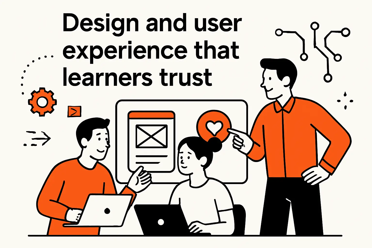
Design and user experience that learners trust
1. Build core pages that answer learner questions homepage course pages about contact FAQs and pricing
Trust is built with clarity, not hype. A homepage should state who the learning is for, what outcomes to expect, and how learners will experience the material. Course pages need a crisp curriculum view, sample lessons or previews, prerequisites, and a realistic time/effort expectation described in plain language rather than vague promises.
Support pages are part of conversion. Clear contact paths, FAQs that address refunds and access, and pricing pages that reduce ambiguity all lower the psychological cost of clicking “buy.” From our experience, the fastest way to lose a learner is to make them feel tricked or confused before they even start.
2. Layout and visual hierarchy that make learning feel effortless
Learning is cognitive work, so layout should conserve mental energy. We design pages with strong hierarchy: a single dominant next action, consistent lesson structure, and predictable placement of progress indicators. When learners have to “re-learn the interface,” they burn attention that should have gone to the content itself.
Micro-interactions matter more than most teams expect. A clear “continue” pattern, a visible completion state, and immediate feedback after quizzes make the experience feel guided. In our builds, we treat layout as an instructional tool—one that quietly tells the learner where to focus and what to do next.
3. Navigation course categorization and search to help learners find the right content
Navigation is your curriculum’s table of contents at scale. Categories should mirror how learners think, not how your internal team organizes files. We like to use a simple taxonomy with room to grow: topic, skill level, and goal are often enough, while overly granular categories tend to confuse more than they help.
Search is the safety net. Even when navigation is excellent, learners arrive with partial memories (“the lesson about customer interviews”) and want quick retrieval. If you add search, tune it for course titles, lesson titles, transcripts, and downloadable resources so the platform behaves like a helpful library rather than a static website.
4. Brand visuals colors and typography for readability across devices
Brand design in e-learning has a job: legibility, credibility, and comfort across long sessions. We recommend typography that reads well on small screens, generous line spacing, and color choices that maintain contrast without eye fatigue. Learners who squint will not persist, no matter how brilliant the curriculum is.
Consistency is the underrated differentiator. Buttons, callouts, warnings, and success states should look and behave the same across lessons and pages. When visual language is coherent, the platform feels “serious,” and seriousness is a form of trust when money, careers, or compliance are on the line.
5. User centric onboarding and guided discovery to reduce decision fatigue
Onboarding should function like a good instructor: orient first, then nudge. A welcome flow that recommends a starting point, explains progress rules, and shows where to get help reduces anxiety and decision fatigue. We often add lightweight guidance such as “start here” tracks or short diagnostic questions that map learners to the right course.
Discovery is where personalization can be subtle. Rather than building complex recommendation engines too early, we use curated paths, featured modules, and clear “next best action” prompts. In our view, the goal is to prevent the learner from wandering; wandering is the polite cousin of dropping out.
6. Accessibility and mobile first experience design
Accessibility is both ethical and commercial. The World Health Organization estimates 1.3 billion people experience significant disability, and that reality should change how we design navigation, contrast, keyboard support, captions, and error states. When accessibility is ignored, platforms exclude learners and create reputational risk for the business behind them.
Mobile-first is the practical companion to accessibility. Responsive layouts, touch-friendly controls, readable typography, and media that adapts to network conditions make learning possible in real life. At TechTide Solutions, we treat accessibility and mobile UX as core quality attributes, not “nice-to-have” polish.
Recommended reading: The Web App Development Process: Steps, Architecture, Testing, and Best Practices
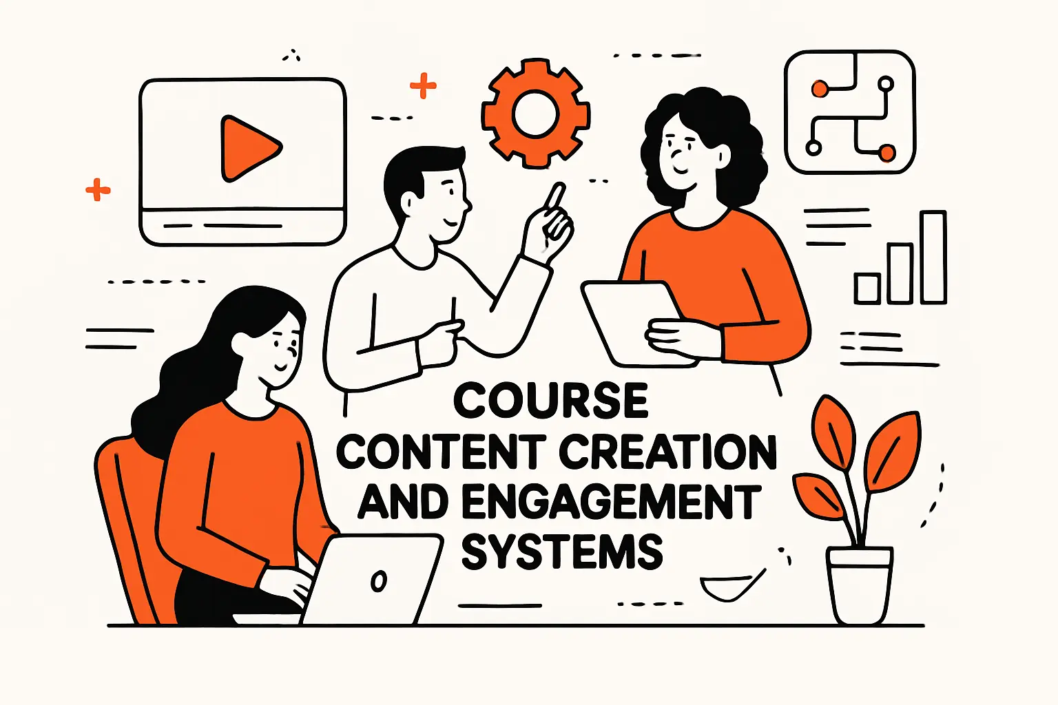
Course content creation and engagement systems
1. Choose authoring tools with responsive HTML5 output cloud collaboration and LMS ready publishing
Authoring tooling determines how fast you can iterate on pedagogy. Tools that publish responsive web content—especially HTML5-based output—help lessons run consistently across browsers and devices, while cloud collaboration reduces friction between subject matter experts, editors, and reviewers. For many teams, the difference between “we shipped updates” and “we debated updates” is whether the toolchain supports fast review cycles.
Publishing formats also matter for portability. When your content can be exported cleanly, you avoid lock-in and protect your ability to move platforms later. Our recommendation is to pick an authoring approach that matches your instructional style: slide-like interactivity, scroll-based lessons, scenario simulations, or project-driven templates.
2. Use multimedia lessons videos PDFs worksheets and interactive assessments
Multimedia is not about novelty; it’s about matching the medium to the task. Video can demonstrate processes and tone, PDFs can serve as reference, worksheets can structure practice, and interactive assessments can create feedback loops. The trick is to keep every asset purposeful: if a PDF repeats the video transcript without adding utility, it becomes clutter.
From a platform design angle, multimedia has downstream implications: storage, streaming, permissions, and download controls. We like to treat assets as reusable components tied to lessons, so you can update a worksheet once and have it propagate everywhere it’s referenced across your catalog.
3. Keep learners engaged with storytelling interaction creative formats and emotional hooks
Engagement is a design choice, not a personality trait of the instructor. Storytelling gives context, conflict, and resolution—exactly the structure our brains use to remember. Interaction then turns passive exposure into active rehearsal, which is where confidence begins to form.
We also believe in “creative constraint.” Short challenges, scenario forks, role-play scripts, and reflection prompts can make even technical subjects feel human. When learners feel seen, they persist; when they feel lectured at, they skim, postpone, and eventually disappear.
4. Structured learning paths prerequisites milestones and completion focused course design
Learning paths prevent the “random walk” problem where learners hop between lessons and never integrate the material. Prerequisites should be explicit, and milestones should be visible so progress feels real. In our builds, we frequently add lightweight “checkpoint” moments where learners must apply a concept before unlocking the next segment, even if the gate is gentle rather than punitive.
Completion-focused design is also about endings. A strong course concludes with a capstone artifact—something the learner can use at work, share in a portfolio, or apply immediately. That artifact becomes marketing fuel for you and self-efficacy fuel for them.
5. Content dripping schedules to improve pacing and retention
Drip schedules can create pacing that matches how people actually learn. Releasing content over time reduces binge-and-forget patterns, encourages practice between lessons, and gives you touchpoints for community prompts and email nudges. From a business lens, drip can also support subscriptions by aligning content cadence with billing cycles.
Nevertheless, dripping should respect learner autonomy. For professional learners under deadline pressure, hard gates can feel infantilizing. Our preference is to offer an intentional default pace while still allowing motivated learners to move ahead through optional unlock rules or “challenge tracks” that reward readiness.
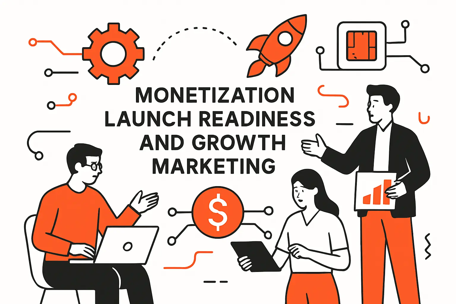
Monetization launch readiness and growth marketing
1. Set up access plans memberships bundles and recurring pricing
Monetization is where many platforms accidentally create support debt. Access plans need clear names, clear boundaries, and clear upgrade paths so learners don’t feel trapped. Memberships and bundles also require precise entitlement logic: which courses, which resources, which communities, and which certificates are included.
From our perspective, simplicity is a retention strategy. If learners can’t understand what they bought, they will doubt your integrity even when you did nothing wrong. A clean pricing matrix, plain-language descriptions, and predictable renewal behavior turn billing into a non-event, which is exactly what you want.
2. Simplify registration and checkout with clear pricing and trusted payment gateways
Checkout is a trust ceremony. Reduce friction by minimizing steps, showing total cost clearly, and confirming what happens after purchase. Payment gateways are part of perceived legitimacy; learners feel safer when they recognize the flow and see strong security cues.
Security posture isn’t just marketing copy, either. Stripe notes that it is certified to PCI Service Provider Level 1, and we like using gateways with mature compliance and tooling because it reduces the chance that your learning business becomes an accidental payments security project. Cleaner integration typically also means cleaner failure modes when cards are declined or accounts are flagged.
3. Connect courses to products for enrollment automation and purchase to course access flow
Automation is the bridge between revenue and learning. After purchase, learners should be enrolled immediately, receive a clear welcome message, and land in the correct starting lesson without hunting. When teams wire this manually, support tickets multiply and learner excitement evaporates in back-and-forth emails.
We also advocate for “state-based” logic rather than one-off hacks. Instead of hardcoding special cases, define states like “trial,” “active,” “past due,” and “canceled,” then let the platform consistently grant or revoke access. That consistency protects your time and your brand, especially when you add more products later.
4. Pre launch checklist test user flow performance optimization transactional email delivery and analytics
Pre-launch is where professionals separate from hobbyists. We run through learner flows end-to-end: visit, browse, purchase, enroll, start, resume, complete, and request help. Performance tuning focuses on the pages that matter most—course landing pages, lesson playback, and checkout—because those pages drive conversion and retention.
Transactional email is part of the product. Password resets, receipts, enrollment confirmations, and progress nudges must reliably land in inboxes and display well on mobile. Analytics should be installed with intent: track where learners drop off, which lessons cause replays, and what content correlates with completion, then use that insight to improve the curriculum.
5. Protect course content with login gating and video protections
Content protection is a balancing act: protect value without punishing legitimate customers. Login gating, expiring links, and controlled downloads can deter casual sharing. On the video side, embedding through a platform that supports access control, tokenized playback, and domain restrictions helps reduce “copy the link and share it” leakage.
Still, we’re candid about tradeoffs. No system fully prevents screen recording, and heavy-handed restrictions can frustrate honest learners. Our approach is to pick protections that address your real risk model—corporate training libraries need stronger gating than a free lead-magnet course—then keep the UX smooth enough that paying learners feel respected.
6. Post launch growth with content marketing SEO YouTube previews student community and social proof
Growth after launch is mostly about trust compounding over time. Content marketing and SEO work when your articles, previews, and templates genuinely help the learner before they pay. YouTube previews can showcase teaching style and clarity, while email sequences can nurture hesitant buyers with real value rather than relentless urgency.
Community can become a moat if it is moderated and purposeful. Learners who share wins, templates, and project outcomes generate social proof that ads can’t replicate. As Techtide Solutions, we recommend building a feedback loop where testimonials, case studies, and learner outcomes flow back into your course pages, so the platform improves its own conversion story as it teaches.
TechTide Solutions custom e-learning website development
1. Discovery and requirements to design a custom learning platform that fits your audience
Discovery is where we earn our keep. We run workshops that translate learning goals into product behaviors: how learners enroll, how instructors publish, how admins report results, and how support resolves issues. Good discovery also identifies constraints—compliance requirements, internal IT policies, branding rules, or data residency needs—before they become expensive rework.
Our viewpoint is simple: requirements should be testable. If we can’t describe how to verify a feature in acceptance testing, the requirement is probably too vague. Once requirements are crisp, we can select a build approach that’s pragmatic, scalable, and aligned with your business model.
2. Custom web app development integrations and scalable architecture for unique workflows
Custom development shines when your workflows are your differentiator. Integrations with CRMs, marketing automation, HR systems, analytics stacks, or credentialing providers can transform a course site into an operational engine. We design APIs and data models so that courses, enrollments, certificates, and entitlements can evolve without fragile migrations every time you expand.
Architecture is also how we buy speed later. A clean separation between content management, learning delivery, and billing logic makes it easier to add new course formats, cohort features, or enterprise client portals. When the platform is designed for change, your roadmap becomes a set of product choices rather than a series of technical rescues.
3. Ongoing maintenance security performance monitoring and continuous feature improvements
Launch is a milestone, not the finish line. Maintenance includes patching dependencies, monitoring performance, rotating credentials, auditing access, and reviewing backups with real restore drills. When you treat maintenance as optional, issues arrive as emergencies, and emergencies are the most expensive way to operate software.
Continuous improvement should be guided by learner behavior and business outcomes. Support tickets, analytics signals, and qualitative feedback often point to the same bottlenecks: confusing navigation, unclear prerequisites, broken emails, or slow media playback. Our preferred rhythm is to ship small improvements steadily, keeping the learning experience fresh without destabilizing the platform.
Conclusion and next steps
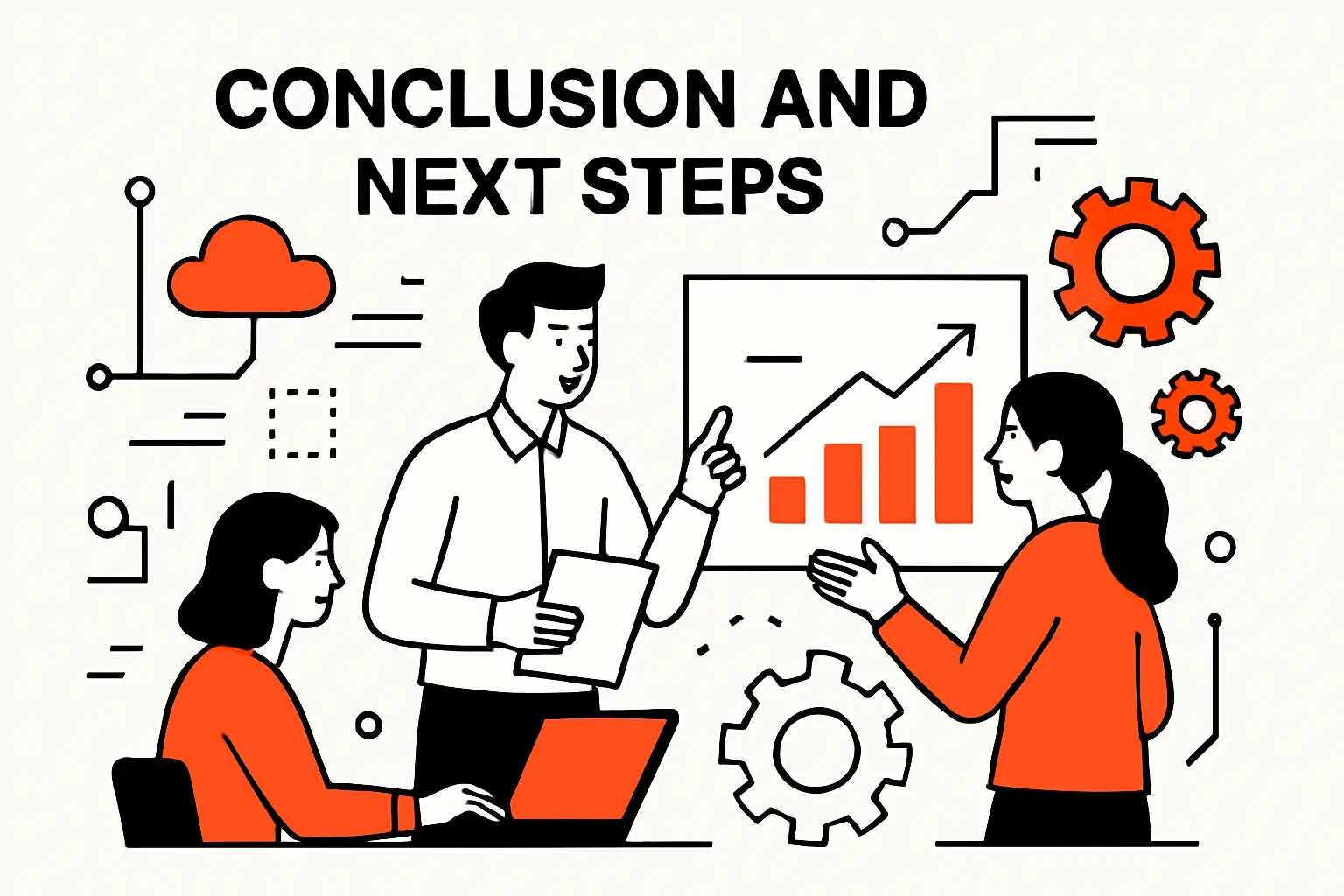
1. Launch iterate from learner feedback and expand your course catalog over time
A successful e-learning website is built in public, with humility. Early cohorts will tell you where the course is unclear, where the platform feels clunky, and what outcomes matter most in the learner’s real world. Those insights should drive iteration: refine lessons, simplify flows, strengthen onboarding, and expand your catalog in the directions learners are already pulling you.
From our side at TechTide Solutions, the next best step is to pick one niche, define one flagship outcome, and design the smallest trustworthy platform that delivers it end-to-end—then measure, learn, and build forward. If you had to ship a first version in a short window, which single learner transformation would you bet your platform on?
