At TechTide Solutions, we’ve learned to treat RAG status as a precision instrument, not a cosmetic label. The moment a delivery organization grows beyond a single team, “How are we doing?” becomes a question with real consequences: capital allocation, customer commitments, regulatory exposure, brand trust, and team morale. A RAG color can either compress complexity into a decision-ready signal, or it can hide a slow-motion failure behind a comforting green. Market scale is part of the story. Gartner expects worldwide IT spending to total $6.08 trillion in 2026, and that kind of spend magnifies both the cost of delivery mistakes and the value of fast, honest reporting inside portfolios.
RAG Status in Project Management: Definition and Why Teams Use It
Yet the deeper reason RAG still matters is cultural: status reporting is often where organizations either practice operational truth—or rehearse denial. PMI reports that 11.4 percent of investment is wasted due to poor project performance, which makes the “simple” act of calling something red or amber far more than a weekly ritual. In this article, we’ll explain how we define RAG so it stays objective, how we operationalize it so it remains current, and how we improve it so it drives action instead of theatre.

1. Traffic-light reporting for fast, visual project health checks
RAG status is a compact way to express delivery health using the cultural shorthand of traffic lights: green for acceptable, amber for warning, red for critical. In practice, the value isn’t the color itself; the value is the reduction in cognitive load. Instead of forcing every stakeholder to parse a dense narrative, the team publishes a single, consistent “health marker” that invites the right kind of conversation.
Across the programs we’ve delivered, the best RAG implementations behave like an information radiator: visible, frequently refreshed, and difficult to ignore. Teams benefit because ambiguity drops. Sponsors benefit because decision latency drops. Even better, risk becomes discussable earlier, when mitigation still has leverage.
Praxis describes RAG as a form of report where measurable information is classified by colour and each colour has a pre-determined action, and we agree with the emphasis on “measurable” plus “action.” Without both, the traffic light becomes decoration rather than governance.
2. Who relies on RAG reporting: project managers, PMOs, executives, and stakeholders
Project managers rely on RAG to frame trade-offs and drive escalation without turning every update into a debate about fundamentals. PMOs rely on it to normalize portfolio reporting so that leadership can compare initiatives without learning a new dialect each time.
Executives and steering groups use RAG differently. For them, the color is a trigger for attention allocation: “Where do we need to intervene, unblock, approve, or stop?” Stakeholders outside the delivery chain—finance, legal, compliance, customer success—often use RAG as an early signal to prepare their own downstream work.
In our experience, the healthiest organizations avoid turning RAG into a performance grade. Instead, the color becomes a shared language for uncertainty, risk, and corrective action—especially when the message is uncomfortable but necessary.
Related Posts
- Hybrid Project Management: A Fit-for-Purpose Guide to Blending Agile and Waterfall
- Best Practices in Software Project Management: A Practical Framework for Delivering Successful IT Projects
- Agile Mindset: How to Build a Culture of Learning, Collaboration, and Continuous Improvement
- Project Risk Management: A Practical Guide to Identify, Analyze, and Control Risks
- Agile Sprint Cycle: Definition, Stages, and Best Practices
RAG Colors and Meanings: Red, Amber, Green and When Blue or Gray Apply
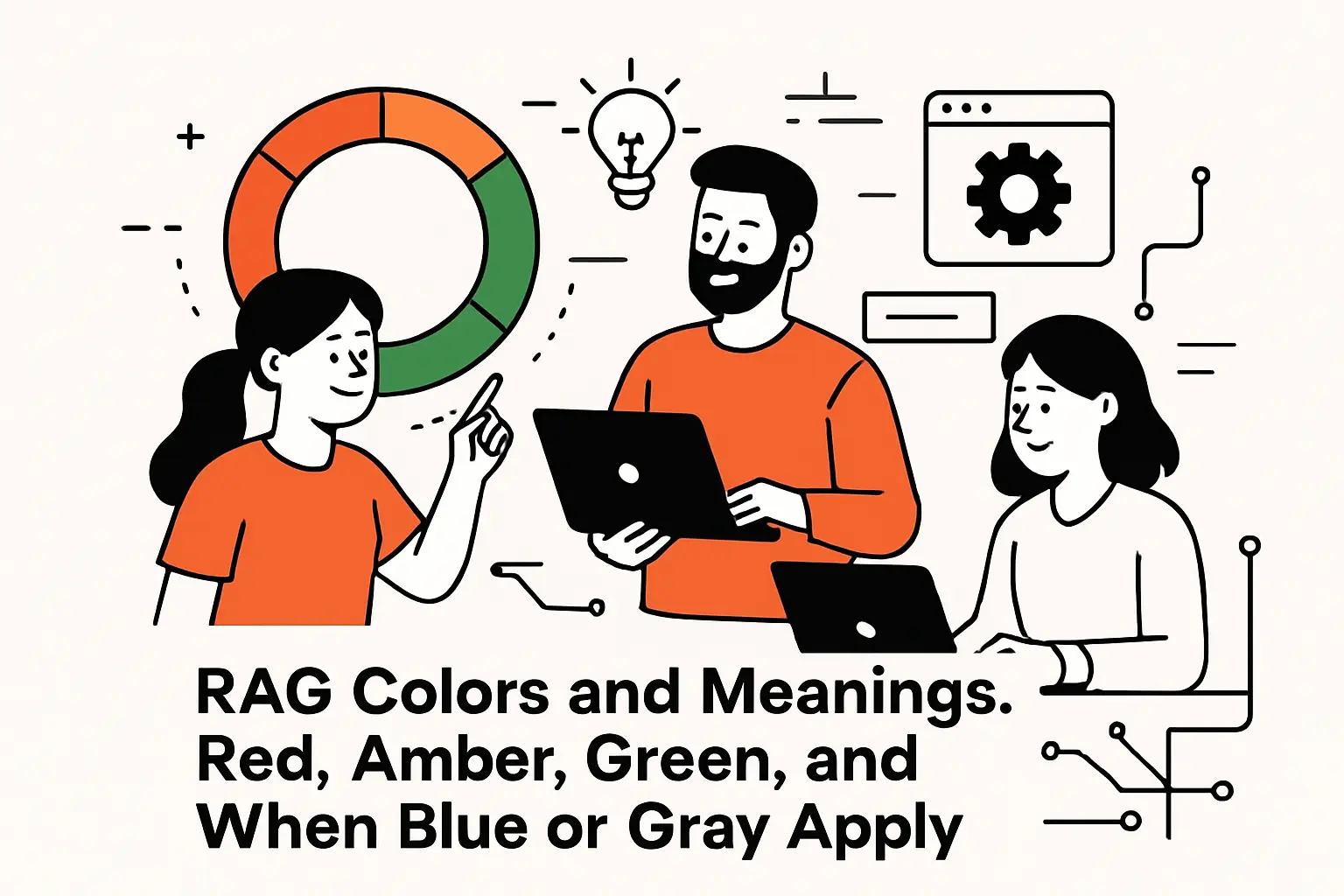
1. Red status: urgent issues that threaten time, budget, or scope
Red should mean “we are no longer confident in successful delivery without material change.” That change might be additional funding, a scope reset, a date renegotiation, a staffing intervention, or a technical redesign. What red must not mean is “the team is bad.” Red is a condition of the work system, not a moral verdict on the people doing it.
We see red emerge from patterns more than from single events: vendor slippage that compounds, architecture decisions that create rework, dependencies that never stabilize, or stakeholder alignment that remains unresolved. In software delivery, a classic red trigger is discovering late that the system’s constraints (performance, data model, security posture) contradict the initial plan.
When red is used properly, it creates a forcing function: leadership must either supply support or accept a new plan. When red is suppressed, teams quietly burn credibility until the delivery date arrives and reality wins anyway.
2. Amber status: moderate risk and early warning requiring attention
Amber is the most misused color because it’s emotionally convenient. Done well, amber means “delivery is still feasible, but drift is visible and intervention is prudent.” In other words, amber is not a softer red; it is a structured early warning that buys time for mitigation.
In the engagements we run, amber often reflects one of three states: a dependency is uncertain, a key assumption is unproven, or leading indicators are trending negative. For example, a sprint burn-up can look healthy while defect escape rates and on-call interrupts quietly predict a quality cliff. Amber is where those signals should surface, before the cliff arrives.
We like amber because it encourages mature behavior: curiosity, attention, and timely sponsorship. When leaders respond to amber with blame, teams learn to keep problems invisible until they become undeniable—at which point everything turns red at once.
3. Green status: on track within approved tolerances and still needs monitoring
Green means “we are within agreed tolerances and the current plan remains credible.” That’s it. Green does not mean “nothing is wrong,” and it certainly doesn’t mean “stop paying attention.” Delivery systems are dynamic; a green plan can become amber quickly when requirements change, usage spikes, or a dependency shifts.
From a technical perspective, green should be supported by evidence: current plan vs. baseline, earned progress, quality trends, and risk posture. A green status that has no underlying measurement is merely optimism in a colored wrapper.
In product-heavy organizations, we also treat green as permission to invest in resilience: performance budgets, observability, operational readiness, and documentation. Without those, teams can ship “on time” and still create a support crisis that undermines business value.
4. Optional statuses: blue and gray, plus why color definitions vary by organization
Many organizations add additional colors (or non-color states) to express “not applicable,” “not started,” “on hold,” or “closed.” We generally support the intent—clarity beats forced categorization—but we’re cautious about expanding the palette without clear governance, because too many statuses degrade comparability across a portfolio.
Blue is often used to represent work that is active but not yet measurable, or to indicate a special governance state such as “awaiting approval.” Gray is often used for “not in play,” which is useful when a dashboard mixes active projects with parked initiatives.
Accessibility matters here as well. The Web Accessibility Initiative guidance warns that color is not the only way of distinguishing information, so we recommend pairing colors with labels (R, A, G), icons, or text tags. That small decision can prevent confusion in meetings, printouts, and environments where color cues are unreliable.
Setting RAG Thresholds: Objective Criteria, Tolerances, and KPI Targets
1. Baseline tolerance ranges for KPI RAG statuses and why they are only a starting point
Thresholds are where RAG becomes real. Without explicit thresholds, every status update becomes subjective—and subjectivity is where politics sneaks in. A strong baseline starts with the project’s approved plan: scope boundaries, schedule milestones, budget guardrails, and quality expectations.
Still, baselines are only a starting point because projects are not identical. A stable enhancement to an existing system can tolerate more variance than a compliance deadline with immovable consequences. A customer-facing migration may require stricter tolerance than an internal tool, because reputational risk changes the cost curve of delay.
Our approach is to establish a default tolerance model at the PMO level, then force a conscious decision when exceptions are needed. That “exception discipline” is what prevents each team from quietly redefining green to match their comfort level.
2. Adjust tolerances by predictability, criticality, and the need for rapid action
Predictability matters because not all work is equally forecastable. Discovery-heavy initiatives (new domains, uncertain data, novel integrations) should be tracked with RAG criteria that emphasize learning progress and risk retirement, not just delivery output.
Criticality matters because some failure modes are existential. When an initiative touches security posture, regulated data, payments, or operational continuity, the organization must prefer earlier escalation over later explanation. In those environments, amber should appear sooner, because the goal is to trigger attention while remediation is cheap.
Rapid action matters because governance is ultimately about response time. If a steering group meets infrequently, thresholds should be tuned to provide earlier warning; otherwise, by the time leadership sees red, there is no calendar left to fix the problem without drastic measures.
3. Quantifiable benchmarks for schedule, budget, scope, quality, and risk
Quantifiable benchmarks do not require complex math, but they do require consistent definitions. For schedule, we like measurable indicators such as milestone variance, throughput stability, and the health of the critical dependency chain. For budget, cost variance and burn-rate predictability typically matter more than raw spend, especially when staffing changes midstream.
Scope needs its own measurement discipline, because scope creep often masquerades as “small additions.” We track scope through a controlled change mechanism: what changed, why it changed, who approved it, and how the change impacts the plan. When scope is not measured, schedule and budget become scapegoats for what is fundamentally a requirements problem.
Quality and risk are leading indicators of future pain. In modern software delivery, we treat defect trends, operational incidents, security findings, and unresolved high-impact risks as first-class inputs to RAG—not afterthoughts relegated to a footnote.
4. Practical setup: adding RAG status in Excel with conditional formatting rules
Spreadsheet-based reporting remains common, particularly for PMOs that aggregate across multiple tools. When teams ask us for a pragmatic starting point, we often begin with Excel because it lowers the barrier to adoption while stakeholders align on definitions.
How We Implement RAG in a Spreadsheet Without Overengineering It
Start by standardizing input columns so the workbook captures the same few facts for each initiative: baseline, current forecast, and a short narrative.
Next, define a dedicated “status logic” column that translates variance fields into a color label, rather than letting authors hand-pick colors.
Then apply formatting so the visual cue follows the label automatically; Microsoft describes how you create rules that determine the format of cells based on their values, and that concept is exactly what RAG needs.
Finally, keep a “definitions” tab in the same file so reviewers can see the threshold model without hunting for a separate policy document.
Once the spreadsheet stabilizes, migrating the same logic into a dashboard or data warehouse becomes much easier, because the organization has already agreed on the semantics of red, amber, and green.
Choosing What to Rate: From Overall Health to Sub-RAG Indicators
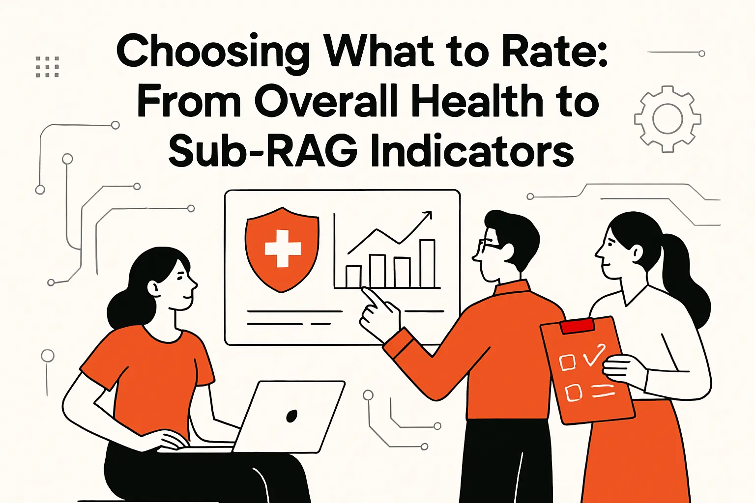
1. Overall project RAG vs multiple sub-RAGs to expose root causes
An overall RAG is useful for portfolio scanning, but it can be dangerously compressive. When a project is labeled amber, leaders immediately ask, “Amber because of what?” If the team cannot answer that in a single sentence, the RAG system is not doing its job.
Sub-RAG indicators solve this by separating symptoms from causes. A project can be green on budget yet amber on schedule because a dependency is late. Another initiative can be green on schedule but amber on quality due to a backlog of unresolved issues that threatens operational readiness.
We tend to recommend a two-layer model: an overall health color plus a small set of sub-RAGs that match the organization’s governance priorities. The secret is restraint; too many sub-RAGs turn the dashboard into a rainbow spreadsheet that nobody trusts.
2. Common sub-RAG areas: progress, cost, scope, risks, issues, stakeholders, quality, and value
Progress is the obvious category, yet “progress” is often poorly defined. We prefer progress measures tied to acceptance and deployability, not merely tasks completed. Cost is similarly tricky: cost health should reflect forecast-to-complete and funding risk, not only spending to date.
Scope deserves its own indicator because scope volatility is a silent schedule killer. Risks and issues should be separated as well: risks are uncertain future events; issues are current constraints needing action. Stakeholder health is often overlooked, but misalignment can break an otherwise sound plan—especially when product, security, and operations disagree on what “done” means.
Quality and value round out the picture. Quality health should reflect readiness for real users. Value health should reflect benefits realization signals, such as adoption readiness and the likelihood that the delivered capability will actually be used as intended.
3. When a red RAG can be helpful: escalation that enables timely support and decisions
Red is painful, but it is also clarifying. A red status gives leaders permission to intervene without guessing whether the team is merely anxious or genuinely blocked. In that sense, red can be a form of organizational honesty that protects everyone: delivery teams, sponsors, and customers.
The Association for Project Management warns that RAG status is treated as a weapon and not a tool, and we’ve seen that dynamic firsthand. When leadership uses red to punish, teams respond by delaying bad news. When leadership uses red to mobilize support, teams surface issues earlier and the portfolio gets healthier over time.
From our viewpoint, a red report is not a failure of reporting; it is a success of governance. The true failure is pretending everything is green until a deadline makes the truth unavoidable.
RAG Dashboards and Reports: Making Status Visible and Actionable

1. Where to include RAG: dashboards, risk reports, portfolio reports, and periodic status reports
RAG belongs anywhere decisions are made. That includes a project’s routine status report, a program-level rollup, and a portfolio dashboard that executives actually read. Risk and issue registers also benefit from RAG, especially when a PMO needs to highlight which risks require sponsorship rather than team-level mitigation.
In our client work, we also embed RAG into operational artifacts: release readiness reviews, change advisory workflows, and support transition checklists. That approach prevents the classic failure mode where a project is “green” in a PM report while operations quietly expects a rough rollout.
Distribution matters as much as design. A perfect dashboard that arrives late—or gets ignored—has less value than a simpler signal that reliably reaches the people who can act on it.
2. Project health dashboards: key metrics, real-time updates, and clear visualization
A good dashboard is not a wall of widgets; it is an argument. The argument should be: “Here is the current health, here is why, and here is what we intend to do.” RAG is the headline, but the supporting evidence is what builds trust over time.
We usually architect health dashboards around a small set of metrics that are hard to game: forecast stability, dependency readiness, risk posture, and quality indicators tied to real outcomes. Then we layer visualization that makes change over time obvious, because trend is often more predictive than a single snapshot.
Real-time updates are helpful only if the underlying data is reliable. In integrated toolchains, the hardest part is often data semantics: reconciling what “complete,” “blocked,” or “accepted” means across systems so the dashboard reflects reality rather than tool noise.
3. Always add context: the narrative behind the color, impact, and planned corrective actions
Color without context invites misunderstanding. A red status could mean “we need an executive decision,” or it could mean “we found a defect cluster and are fixing it.” Without a narrative, stakeholders fill the void with assumptions, and assumptions are rarely kind.
In every RAG report we help clients implement, we insist on a short narrative structure: what changed, what it impacts, and what the next action is. Impact should be specific to the business: customer commitments, compliance posture, operational load, or revenue risk.
Corrective actions should be concrete and owned. A statement like “we are working on it” is not a plan; it is a hope. A better pattern is: “We will do X by Y, and we need Z from the sponsor.” When leadership sees that level of clarity, RAG becomes a coordination mechanism rather than a status ritual.
4. Using the RAG scale beyond reporting: prioritization, on-hold work, and OKR-style check-ins
RAG can be more than a reporting artifact. In mature organizations, RAG becomes a prioritization language: green work can proceed with routine oversight, amber work earns targeted attention, and red work triggers re-planning or escalation.
We also use RAG to manage “on-hold” work without pretending it is active. A gray or paused state can be valuable in portfolio views, because it prevents leaders from assuming capacity is being applied when it is not. The key is to treat paused items as deliberate decisions with a revisit trigger, not as forgotten backlog.
For OKR-style check-ins, RAG can reduce emotional friction. Instead of debating whether progress “feels good,” teams can discuss whether the confidence level is improving or declining—and what evidence supports that claim. In that framing, the color becomes a neutral indicator of confidence rather than a judgment of effort.
Responding to Red, Amber, and Green: How to Create a Road to Green

1. Red response: diagnose the data, communicate honestly, and build a recovery plan
When something turns red, the worst move is to argue about the label while the underlying problem grows. Our preferred response starts with diagnosis: confirm whether the issue is real, isolate whether it is local or systemic, and identify which constraints are binding (time, budget, scope, dependency, or quality).
Honest communication is the next step, and it needs to happen in both directions. Delivery teams owe leadership clarity about impact and options. Leadership owes delivery teams psychological safety to tell the truth without being punished for it.
A recovery plan should be explicit about trade-offs. In software projects, common recovery levers include scope reduction, phased delivery, dependency renegotiation, architecture simplification, or increased investment in automation to reduce cycle time. Red is where a plan must stop being implicit and become governable.
2. Amber response: tighter monitoring, sponsor involvement, and proactive mitigation
Amber is the time to become more disciplined, not more frantic. Monitoring should tighten, but the objective is insight, not surveillance. We often introduce more frequent checkpoints, stronger dependency tracking, and clearer criteria for what would trigger escalation.
Sponsor involvement matters in amber because many amber conditions are not solvable purely within the team. Cross-functional conflicts, funding constraints, vendor issues, and business priority changes require leadership participation. A sponsor who only shows up at red is a sponsor who arrives after options have narrowed.
Mitigation should be proactive and testable. Rather than writing “mitigate risk,” we prefer specific actions such as validating an assumption, running a spike to de-risk an integration, or implementing a fallback path. Amber is where disciplined learning prevents expensive rework.
3. Green response: validate status with evidence and avoid hiding issues
Green still requires rigor. A green status should be validated through evidence, including stable forecasts, controlled scope, and quality indicators that demonstrate readiness. In our delivery practice, we often review green projects for “quiet risks” such as rising operational load, accumulating technical debt, or reliance on a single expert.
Avoiding hidden issues is both technical and cultural. On the technical side, weak observability can mask performance or reliability problems until real users find them. On the cultural side, teams sometimes avoid raising concerns because they fear “spoiling the green.”
We prefer a culture where green can coexist with transparent notes: “Green, with watch items.” That stance keeps attention on reality while still communicating that the project is within tolerance.
4. Road to Green governance: track corrective actions and review progress in steering forums
“Road to Green” is not a slogan; it is a governance mechanism. Corrective actions should be tracked like any other deliverable: owned, dated, and reviewed. Without that structure, red and amber become permanent states that everyone normalizes.
In steering forums, we recommend reviewing corrective actions before revisiting the color debate. If actions are not progressing, the color is unlikely to improve. If actions are progressing and leading indicators are improving, then a path back to green becomes credible.
Governance also needs memory. Teams rotate, leaders change, and initiatives span long periods. A Road to Green log becomes a narrative record of what was tried, what worked, and what failed—knowledge that is invaluable when the organization encounters similar problems again.
Improving RAG Status in Project Management: Reliability, Pitfalls, and Better Governance

1. Prevent subjectivity with documented thresholds, stakeholder input, and consistent reporting
Subjectivity is the enemy of trust. When different teams label similar conditions with different colors, executives stop believing the dashboard and start relying on hallway conversations. The fix is documentation: explicit thresholds, clear measurement definitions, and shared agreement on what actions follow each color.
Stakeholder input is essential because RAG is not purely a delivery concept; it is a business risk concept. Finance cares about forecast integrity. Security cares about exposure. Product cares about customer impact. When those groups help define thresholds, RAG becomes a portfolio language rather than a PM-only artifact.
Consistency is also operational. If reporting cadence is irregular, RAG becomes stale. If “green” is routinely granted without evidence, RAG becomes performative. Improving reliability requires treating reporting as a system, not a slide.
2. Avoid oversimplification: pair colors with trend views, detailed metrics, and deeper analysis
RAG is a summary, not an explanation. Oversimplification happens when leadership treats the color as the entire truth rather than as a headline. The antidote is pairing RAG with trend: is the situation improving, stable, or deteriorating?
Detailed metrics should be available on demand. A sponsor should be able to click from “amber” to the underlying drivers: dependency state, scope volatility, defect trends, or staffing constraints. That drill-down capability makes conversations more technical and less emotional, which is exactly what high-stakes delivery needs.
Deeper analysis should also have a home. When a project is repeatedly amber or red, a retrospective is warranted: root cause analysis, governance review, and a plan to prevent recurrence. Without that loop, the organization repeats the same failure patterns under different project names.
3. Reporting lag and delayed issue discovery: keep cadence tight and data current
Reporting lag is a subtle killer. If RAG is updated long after the underlying data changes, leaders are steering with a rearview mirror. In fast-moving environments, that delay can turn manageable risks into late-stage crises.
Cadence should match volatility. A stable internal project may only need periodic updates, while a customer-facing migration with many dependencies may require more frequent refresh. The goal is not to create reporting overhead; the goal is to ensure governance sees reality quickly enough to respond.
Data currency also depends on toolchain hygiene. When teams don’t update tickets, when forecasts live in private documents, or when risk registers are neglected, the RAG system becomes a fantasy generator. Fixing lag often means fixing workflow, not building prettier dashboards.
4. Too many RAG colors and intermediary statuses: why simplicity reduces confusion
Organizations often try to solve ambiguity by adding more colors. The result is usually the opposite: stakeholders can’t remember what each shade means, and teams start negotiating semantics instead of addressing problems.
Simplicity reduces confusion because it forces clarity in the narrative. If a project cannot decide whether it is amber or red, the underlying issue is often that the organization has not agreed on what “unachievable” means, or on which levers are available for recovery.
We typically recommend keeping the palette tight and using text qualifiers for nuance. That approach preserves comparability across the portfolio while still allowing teams to communicate real complexity in the supporting narrative.
5. Permanent green as a red flag: culture pressure, blind spots, and hidden risks
A portfolio that is always green is not healthy; it is silent. Permanent green usually indicates culture pressure, weak measurement, or systematic avoidance of escalation. In those organizations, bad news surfaces through incidents, resignations, customer churn, or missed deadlines—never through status reporting.
Blind spots can be structural. If quality is not measured, green may hide a rising defect backlog. If risk is treated as optional paperwork, green may hide dependency uncertainty. And stakeholders are not engaged, green may hide misalignment that explodes late.
Changing this pattern requires leadership behavior, not just process. When executives reward transparency and treat red as a call for support, reporting becomes honest. When executives punish red, the organization learns to paint problems green until reality forces a reckoning.
How TechTide Solutions Helps Teams Operationalize RAG Reporting
1. Custom dashboards and web apps that translate KPIs into clear RAG views
At TechTide Solutions, we build RAG systems the way we build software: with explicit logic, auditability, and a bias toward action. In practice, that often means a lightweight web app or dashboard layer that pulls delivery KPIs from source systems, applies agreed thresholds, and publishes a portfolio view that stakeholders can trust.
Our focus is translation. Raw KPIs are rarely decision-ready because they require context: which baseline applies, which milestones matter, which risk model is in force, and which dependencies are binding. A good RAG view encodes that context so leaders can act without re-deriving the meaning during every meeting.
When teams outgrow spreadsheets, we also help define data contracts that keep reporting consistent across products, programs, and portfolios—without forcing every team into a single tool.
2. Automations and integrations that keep RAG data accurate, timely, and consistent
Automation is what keeps RAG honest at scale. Manual updates drift, especially when teams are busy and incentives are misaligned. Our approach is to integrate with systems that already contain the truth: issue trackers, delivery pipelines, incident tools, and planning platforms.
Atlassian notes that RAG notation is widely used when reporting the status of projects, initiatives or other complex and long-running activities, and we frequently implement that concept by connecting Jira, Azure DevOps, and portfolio tools into a single reporting layer.
Consistency comes from shared semantics. We invest time in mapping statuses, normalizing definitions, and validating data quality so that “green” means the same thing across teams. Without that groundwork, integrations merely move confusion faster.
3. Tailored software solutions that fit your PMO rules, governance workflow, and stakeholders
Every PMO has rules: escalation paths, steering cadence, approval gates, and tolerance models. Off-the-shelf dashboards often fail because they assume generic governance. Our work is to tailor solutions so RAG fits your actual decision structure, not an idealized template.
We also treat stakeholder needs as a first-class design input. A delivery lead wants diagnostic detail. An executive wants decision triggers. A compliance partner wants evidence and traceability. Building a single view that satisfies everyone is rarely possible, so we design layered experiences: summary for scanning, drill-down for analysis, and narrative for accountability.
Ultimately, operationalizing RAG is a change management effort disguised as reporting. Software helps, but governance behaviors make it stick. That’s where our technical delivery and our process perspective meet: we build the system, and we help teams adopt it in a way that survives beyond the initial rollout.
Conclusion: Making RAG Reporting Clear, Consistent, and Focused on Action
RAG status is deceptively simple. Under the hood, it is a contract between delivery teams and leadership about how truth travels through an organization. When definitions are explicit, data is current, and actions are tied to colors, RAG becomes a powerful coordination tool that prevents small risks from becoming portfolio-level failures.
In our view at TechTide Solutions, the best RAG systems share a few traits: they are objective enough to be trusted, lightweight enough to be maintained, and disciplined enough to trigger decisions rather than debates. Color alone is never the answer; color plus evidence plus a recovery path is where reporting turns into governance.
If your portfolio dashboard is full of green but leadership still feels surprised by delivery outcomes, what would change if you treated your RAG definitions as a product—measured, iterated, and improved until they consistently drive timely action?


