At Techtide Solutions, we design for the web the way civil engineers design bridges: with aesthetics, physics, and human behavior at the forefront—while anticipating tomorrow’s load. The market’s center of gravity has already shifted to small screens; mobile devices generated 62.54 percent of global website traffic in Q2 2025, a sober reminder that “web” now means “anywhere a browser runs,” and that design choices ripple through acquisition, engagement, and revenue in every industry. We approach web design as both craft and system, blending visual language, UX research, content strategy, and production engineering into one purposeful whole.
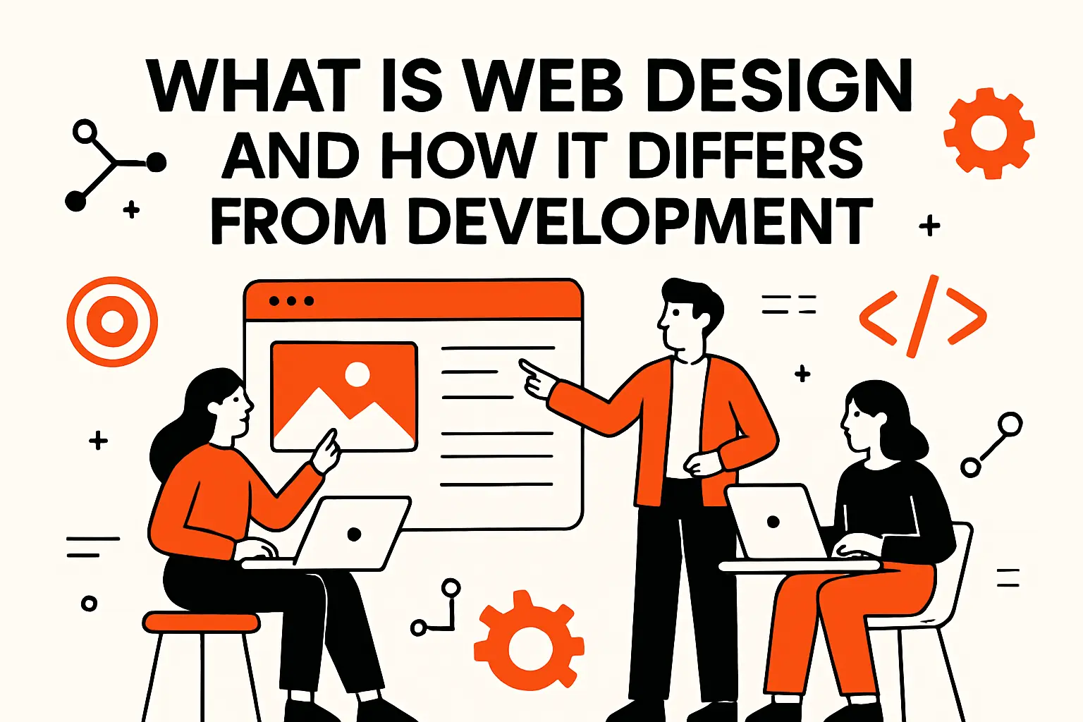
What is web design and how it differs from development
Market overview: rigorous evidence connects design quality to business outcomes. In a multi-year management study, top-quartile design performers achieved 32 percentage points higher revenue growth than industry peers, which tracks with what we see when teams commit to UX research, consistent systems, and measurable iteration. We treat that linkage as a practical mandate: design is not a coat of paint—it’s the operating model for value creation.
1. Definition and scope: UX-focused design of appearance, layout and content
When we say “web design,” we mean an end-to-end practice that frames the problem space, decides how information should speak, and orchestrates the interface so that users get what they came for with minimal friction. Our scope spans discovery interviews, journey mapping, information architecture, tone-of-voice guidelines, and interaction patterns that teach themselves. It is a discipline of decisions: what to prioritize on a first visit, how to cue interactivity, where to place a nudge versus a clear call to action, and when to remove options altogether.
We often describe design as a conversation among three voices: the brand (what you promise), the user (what they need right now), and the medium (what the browser can do efficiently today). If any voice dominates, the experience becomes brittle. A visually loud brand that doesn’t respect cognitive load will confuse; a sparse, “minimal” interface without signposting will feel cold; a technically clever layout without editorial sense can degrade trust. Our internal checklists force us to test each voice—does the interface say “who we are,” does the copy answer “why this matters,” and does the page structure hand off gracefully to the next task?
2. Web design vs website development: visual and experiential vs building and maintenance with HTML, CSS and JavaScript
Design defines the target; development manufactures the arrow. Designers shape interaction models, component states, and content cadence; developers operationalize those decisions in semantic markup, styles, and scripts. We view the seam not as a handoff but as a handshake: the reality of layout engines, rendering pipelines, and bundlers constrains what is feasible; the spirit of UX pushes those constraints so that the browser can feel like a living space rather than a filing cabinet.
In practice, we embed engineers in discovery sessions and designers in code reviews. A designer who sketches a pattern library without an understanding of component composition can corner the team into rework; an engineer who ships a widget without an understanding of affordances can torpedo adoption. This is why our prototypes are instrumented early and why our design tokens travel with the codebase. We prefer a “design API” mindset: visual decisions are exported as named tokens and states; developers consume them directly, avoiding translation loss.
3. Evolution from desktop-first to mobile-first
Mobile-first isn’t a slogan; it’s an editorial position. The small screen forces prioritization, which reveals the heart of the product. When we refactor legacy desktop-first sites, we begin not by compressing layouts but by re-writing the story: what is the one thing a first-time visitor should see, read, and do? Then we grow that flow outward to support repeat use and deeper exploration. This approach replaces “responsive shrinkage” with purposeful adaptation.
The shift also changed interaction norms. Hover hints gave way to explicit cues; inline validation displaced post-submit error dumps; and patterns such as sticky affordances, reachable thumbs zones, and gesture-friendly controls reshaped layout logic. With device capabilities diversifying, we now think beyond breakpoints: motion preferences, reduced data modes, and OS-level theme settings are all part of an experience contract. Design’s job is to negotiate that contract with empathy.
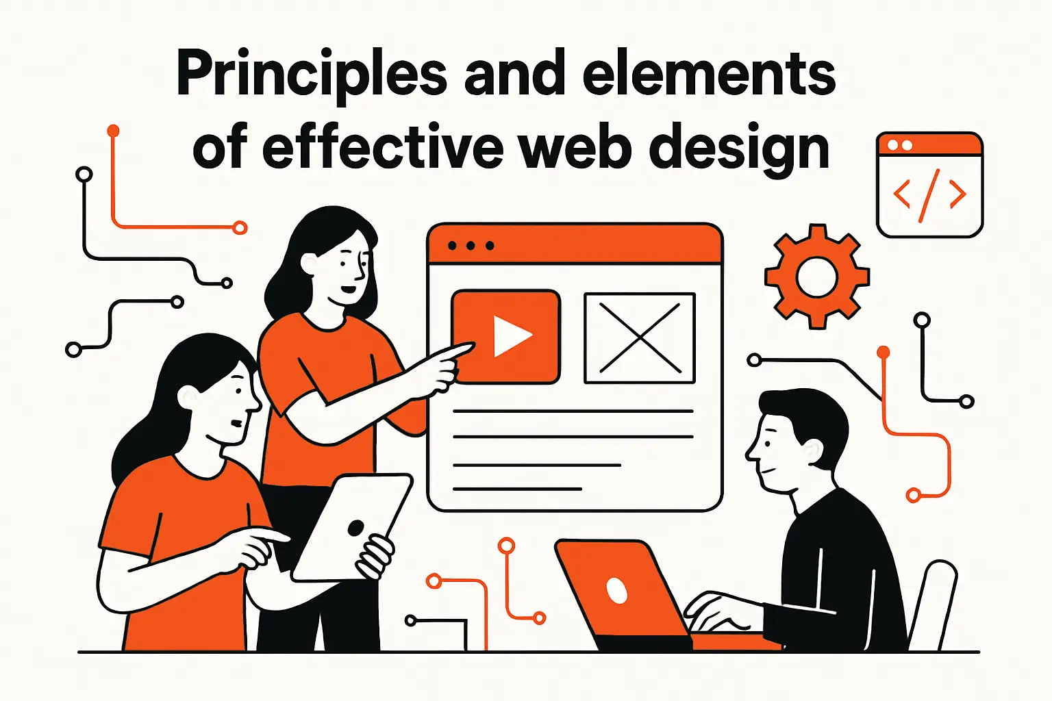
Principles and elements of effective web design
Market overview: design maturity is increasingly treated as an operating advantage by leadership teams, a view reinforced by large-scale management research that ties structured design practices to superior performance. We interpret that as fuel for governance and iteration—principles aren’t wallpaper; they’re how teams make faster, better choices together.
1. Design principles applied to websites: balance, contrast, hierarchy, white space, unity
Every pixel carries a job description. Balance prevents fatigue; contrast steers attention; hierarchy sets the promise of what comes next; white space gives breath to cognition; unity binds disparate elements into one trustworthy voice. When in doubt, we ask the page to “speak aloud”—would a human describe this section as a question, a reassurance, or a command? If the answer is muddy, the layout probably is too.
Balance and contrast
Balance is not symmetry. It’s the equilibrium between density and calm, imagery and text, loudness and whisper. We often pair a bold opener with a short, quiet sentence that grounds ambition in utility. Contrast derives from motion, shape, tone, and meaning—not just color. When color contrast must carry heavy weight, we confirm that it also survives grayscale, then test in bright ambient light and dark UI settings to ensure legibility doesn’t collapse outside lab conditions.
Hierarchy and white space
Hierarchy is the rhythm section of the page: consistent typographic steps, predictable spacing, and aligned interaction cues let a visitor predict the next measure. White space is not “empty”; it is compositional logic that sets pace and reduces cognitive switching costs. We pressure-test hierarchy by stripping styles and reading the DOM outline like a table of contents; if the story holds without decoration, you have a resilient structure.
Unity and brand coherence
Unity emerges when the interface speaks the same dialect everywhere. A button’s tone should mirror the microcopy on the adjacent form; illustrations and iconography should share a visual grammar; empty states should teach as they comfort. We encode unity in design tokens and content guidelines so that every part of the surface—landing pages, dashboards, help centers—feels cut from one cloth.
2. Visual elements: color, typography, images and UI components
The raw materials of web design create mood and convey meaning before a word is read. Color can establish hierarchy without shouting, but it must be tested against various backgrounds and modes. Typography guides reading speed and lends authority—or playfulness. Imagery should do one of two things: accelerate comprehension or deepen emotional resonance. Components, finally, are the verbs of the interface; their states tell users what’s possible.
Color systems for humans
We build palettes with semantic roles rather than brand hues alone. Success, warning, and informative tones gain independence from marketing colors so that UI messaging remains legible across contexts. Our internal linters flag combinations that might be fashionable but fail for legibility or cultural appropriateness. Where brand expression needs latitude, we reserve decorative accents for illustrations and headers, keeping core UI roles orthogonal.
Typography with a task
We select typefaces like we select tools: for their task-specific ergonomics. Editorial surfaces benefit from generous counters and predictable letterforms; data-dense surfaces want numerals that align cleanly and fonts that hold up under varied rendering engines. We proof on real devices—older laptops, budget phones—because that’s where subpixel rendering quirks surface.
Components as contracts
Buttons, tabs, toasts, accordions, cards—each comes with states and promises. We model their behavior with brief “user stories” (“when focus lands, announce purpose succinctly; when disabled, look inert without vanishing”) and codify those rules in our libraries. In our experience, most usability misses are not in the first state but in states two through five—hover, focus, pressed, error, success. Components earn trust by being predictable there.
3. Functional components: navigation, buttons and forms
Navigation structures attention. Buttons negotiate commitment. Forms establish a contract: “we’ll be clear about what we need and why.” Productive friction beats mystery meat interactions. For primary nav, we favor language that mirrors the mental model of the user, not the org chart of the business. Secondary nav should feel like a natural continuation, not a detour.
Buttons thrive on specificity. The best label completes the sentence “I want to…”; the worst label asks the user to guess. Forms work when they show their work: progressive disclosure to keep focus, inline guidance that teaches in context, and error messages that suggest a fix rather than scolding. We replace blank-slate blocks with starters and examples; most people don’t fear forms—they fear failing them.
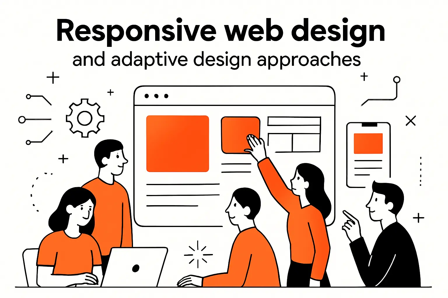
Responsive web design and adaptive design approaches
Market overview: commerce confirms the stakes for small screens. In retail, smartphones accounted for nearly 80 percent of retail website visits in 2025, a signal that layout decisions, image strategies, and interaction patterns must begin with handheld contexts and scale up thoughtfully. We therefore treat responsiveness as a content and modeling exercise, not just a CSS exercise.
1. Responsive web design: fluid grids, images and SVGs with viewport breakpoints
Responsive design starts with a flexible mental model: content that can breathe, components that can reflow, and images that are selected for meaning, not just pixels. We set constraints for text measure, avoid brittle fixed heights, and prefer scalable formats for vector art. Rather than chasing arbitrary breakpoints, we let the content define where the layout asks for a shift in structure.
Performance-aware images
Images and video are emotion engines—and the heaviest assets on a page. Our default is to choose the smallest asset that accomplishes the job, and to tailor density and art direction by context. We author source sets consciously, test decoding strategy, and ensure alt text carries intent, not decoration. When a hero image does heavy lifting for comprehension, we complement it with a caption that does the same job in words for anyone who can’t see it.
Scalable vectors for crisp UI
We lean on vector formats for icons, charts, and simple illustrations to maintain clarity across zoom levels and displays. Semantic titles and accessible fallbacks ensure these assets contribute to understanding, not just style. The simplification discipline—using only the detail necessary—is a gift to users and to your performance budget.
2. Adaptive web design: context-aware experiences by device, bandwidth and screen
Adaptive techniques complement responsiveness by acknowledging that not every user arrives with the same capabilities or constraints. We conditionally load enhancements where they help, respect user preferences for motion and contrast, and deliver formats that suit the environment. On slower connections, we shorten journeys and lighten assets. On richer ones, we can afford more helpful micro-interactions that teach affordances or celebrate success without distracting.
Context as first-class input
We think of environment signals as inputs on par with clicks and taps. When the system knows the user prefers reduced motion, we default to calmer transitions. If dark mode is enabled, we ensure brand color semantics still make sense. Device posture affects layout choices for controls, especially in tools used on the move; the reach and precision available in one context may collapse in another, so critical actions must remain easy to hit and hard to mis-hit.
3. Mobile-first strategy and content prioritization using progressive disclosure and navigation
Mobile-first design liberates content from the assumption that everything must be visible at once. We prioritize one job per screen, and we use progressive disclosure to unfold detail only when it adds value to the current task. This need not hide power; it simply stages it. In our projects for complex catalogs or multi-step workflows, mobile-first thinking has reduced support tickets not because features disappeared, but because the path to them became narratable.
Navigation choices then follow naturally. Primary routes should align to user intents; secondary routes should be visible at decision points rather than stuffed into catch-all menus. When we see users “pogo sticking” between pages, it’s often a symptom of navigation that mirrors system structure rather than human goals. The fix is usually editorial: rename, regroup, and reorder around the way people think.
Accessibility and usability foundations in web design
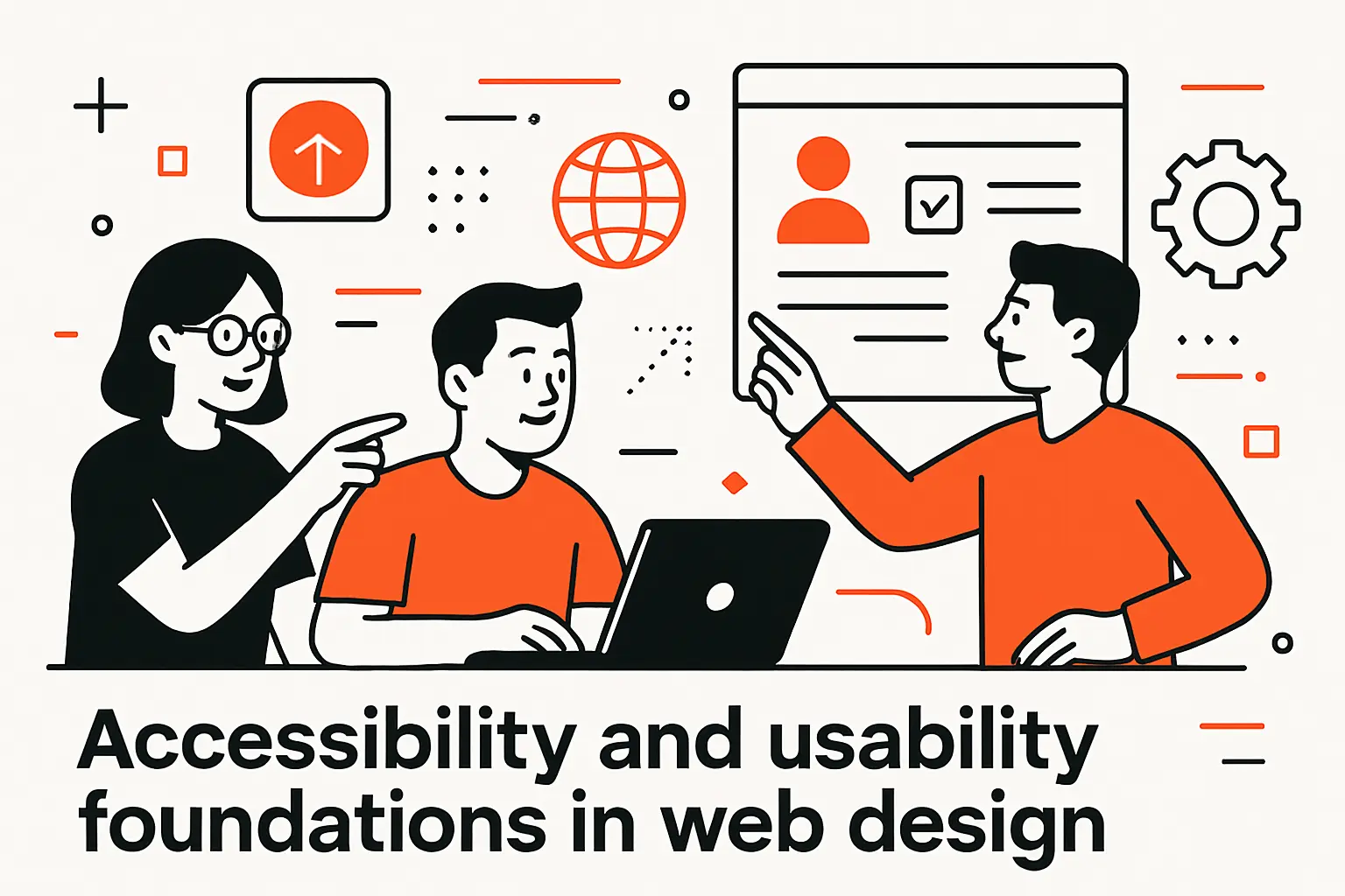
Market overview: independent audits still find systemic barriers across the public web, with one large-scale analysis reporting that 95.9% of home pages had detected WCAG 2 failures. That’s not a flaw to be patched later; it is a strategic risk and a missed growth channel. Our practice treats inclusive design as a baseline for quality, not a compliance checkbox.
1. Sufficient contrast and non-color indicators; clearly identifiable interactive elements
Design should be interpretable without perfect vision, color perception, or motor precision. We test contrast across states and modes, and we always pair color with other cues: icons, labels, patterns, and motion. For interactive elements, we emphasize discoverability: links look like links, buttons look like buttons, and both have focus states that are visually obvious. Ghostly, ambiguous affordances look elegant in a mood board and behave like landmines in real life.
Universal signals
We include icons with labels rather than relying on icons alone, offer persistent skip links, and avoid relying on hover to reveal critical information. Tooltips can enrich meaning but should never be the sole carrier of instructions. When the interaction is time-sensitive or destructive, we give the user ways to confirm and recover—obvious feedback, helpful undo, and gentle guardrails.
2. Consistent navigation and labels; accessible forms and clear feedback
Consistency is kindness. Users read labels as contracts; if “Support” means one thing in navigation and another in the footer, trust frays. Forms deserve special care: each input announces purpose and constraints; error messages tell the user how to fix things in plain language; and progress indicators reduce anxiety. We prefill where appropriate, accept reasonable variations in data formatting, and design validation to teach, not punish.
Feedback that teaches
Interface feedback should answer the question “what just happened?” and “what can I do next?” A successful form submission should not drop a user into limbo; a warning should not imply failure; an error should never feel like an accusation. We draft microcopy for those states the way we draft headlines—with care, humor where appropriate, and a bias for actionable clarity.
3. Headings, spacing, media alternatives and user controls; design for different viewport sizes
Structure is accessibility. Meaningful headings, legible spacing, and descriptive labels help every user scan, not just screen reader users. Media alternatives ensure that critical content reaches people who can’t perceive or play the original assets. Controls for captions, transcripts, and playback settings give users agency, which is the essence of a humane interface. When we plan flexible layouts, we treat headings and lists as the skeleton; the muscles and skin—imagery and embellishment—never obscure the bones.
Designing across sizes then becomes a question of expressing the same intent at different scales. We test with real copy, not lorem ipsum, so that truncation rules and wrapping behavior are decisions, not accidents. The goal is not perfect sameness; it is equivalent clarity.
Tools and workflows for creating and maintaining websites
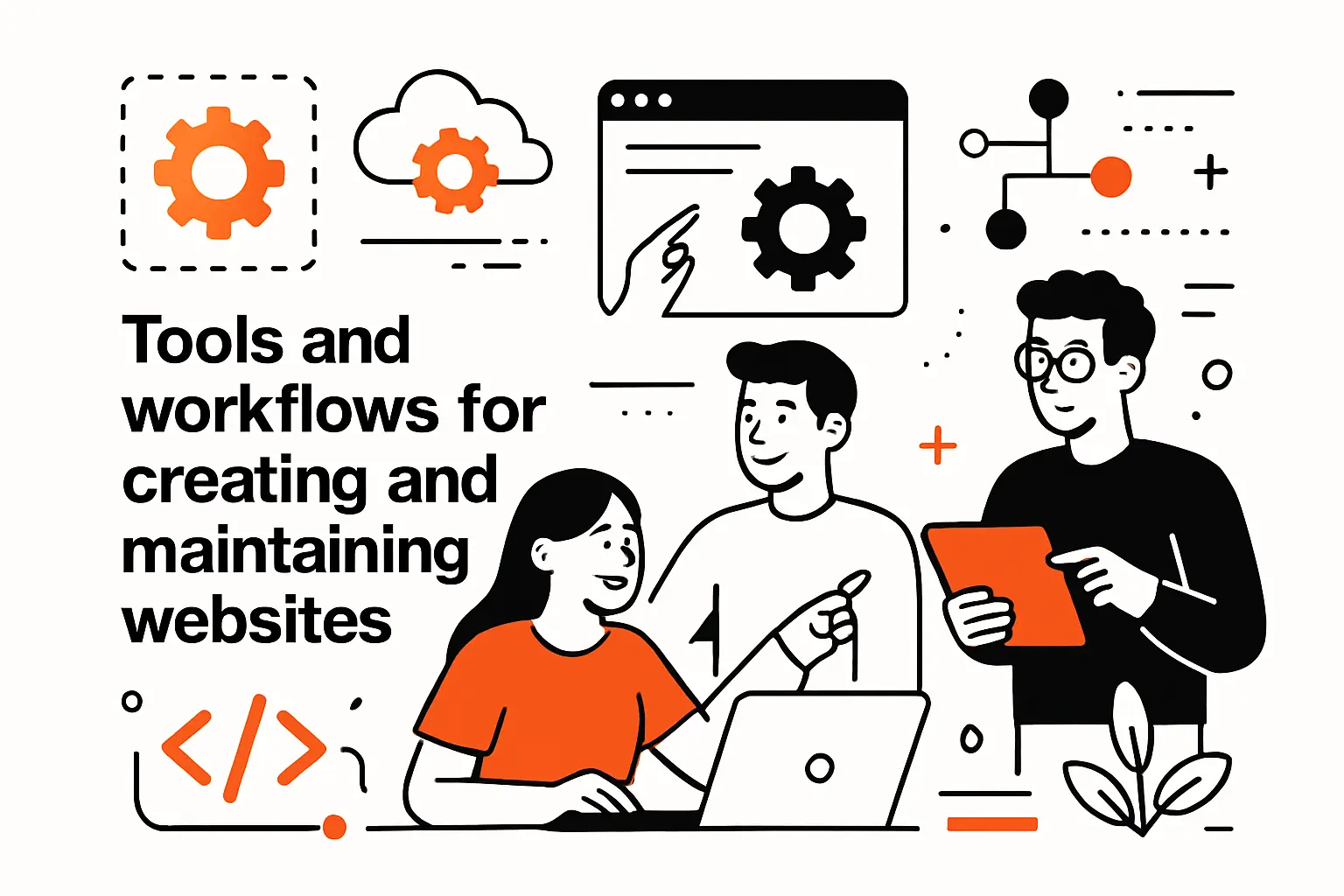
Market overview: design and development tools are being transformed by generative techniques, with private AI funding reaching $100.4B in 2024. We’ve woven these capabilities into our stack carefully—automation assists exploration and QA, but judgment still determines fit and finish. Our litmus test for any tool remains constant: does it reduce ambiguity and help the team ship learning faster?
1. Design and prototyping tools such as Figma, Photoshop and Sketch
Design tools are studios, not just canvases. We use them to explore divergent options, to test copy in situ, to animate the verbs of the interface, and to codify decisions into repeatable systems. Components and styles turn craft into infrastructure; when combined with content and research libraries, they let teams reason about the product as a living organism rather than a stack of pages.
Prototyping as research
Prototypes are not theater—they are instruments. We wire them to collect qualitative signals, script usability sessions, and snip away friction. If a prototype can’t be narrated by a user in their own words, we assume our design is the problem. The hard part is not getting from zero to a first draft; it’s converging on a design that is legible, lovable, and maintainable.
2. Website builders, CMS and hand-coded pages including WYSIWYG editors
The web rewards the right level of abstraction. Builders are great for speed and constrained scenarios; full CMSs shine when content operations matter; hand-coded front ends maximize control over semantics and performance. Our rule of thumb: pick the tool that preserves the most future optionality with the least present overhead. Above all, keep content models simple enough to guide authors and flexible enough to adapt to new channels.
Design systems across platforms
We share design tokens across builders and frameworks so the interface remains coherent no matter where it’s rendered. Documentation lives with code, not in slide decks, and authors see the same rules that engineers do. The goal is to make the desired path the easiest path—for contributors and for users.
3. Validation and accessibility testing plus website maintenance
Quality is a process, not an event. Our test matrix covers browsers and devices that reflect real traffic, and our checklists integrate inclusive design, performance, and resilience. We treat regression tests as design tests: if an animation reduces clarity, if a copy tweak clouds an intent cue, that’s a regression even if the build is “green.”
Operational excellence
Maintenance plans should be as intentional as launch plans. We schedule content health checks, component audits, and dependency updates. Observability is baked in so the team sees how design decisions behave in the wild. Most importantly, we instrument for learning: click maps are less useful than task completion; ad hoc A/B tests are less useful than designed experiments aligned to strategy. Good design improves with feedback loops.
Roles, skills and how to start a career in web design
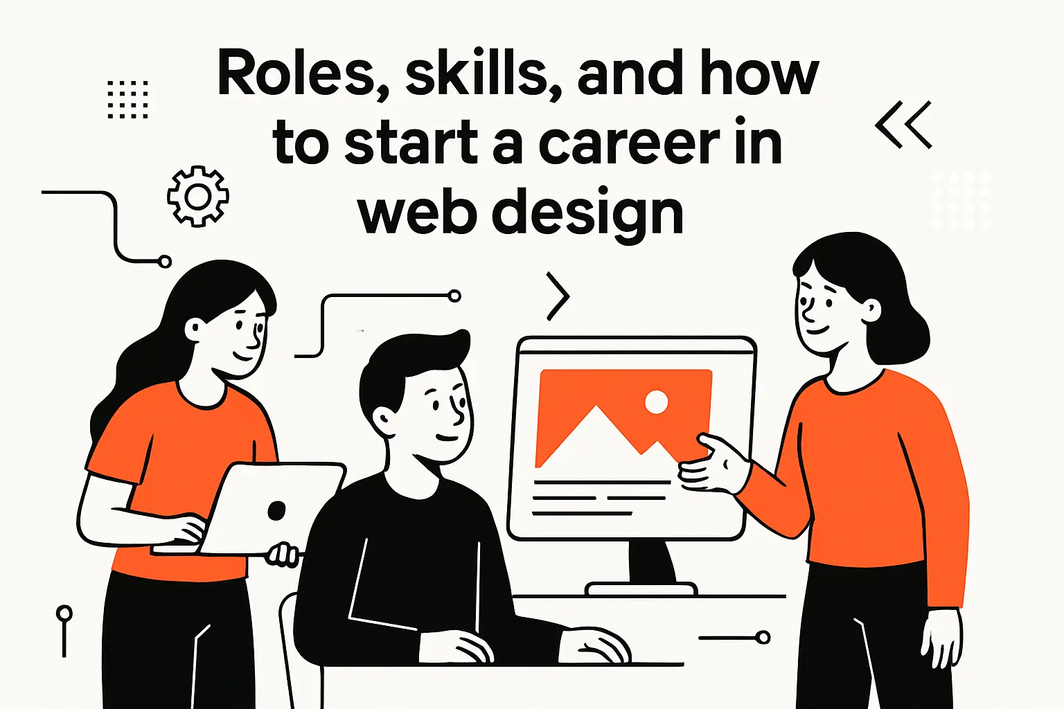
Market overview: the profession remains sturdy and evolving; in the United States, employment for web developers and digital designers is projected to grow 7 percent from 2024 to 2034, reflecting durable demand for people who can blend aesthetics with systems thinking. The best careers we’ve seen are built on curiosity, humility, and a knack for turning vague problems into clear, testable hypotheses.
1. What a web designer does: layout, navigation, text and images; optimizing for evolving devices and UX
Web designers translate intention into interface. On any given day, that means annotating flows, sketching system states, pairing with a developer to refine a component, wordsmithing a microcopy decision, or aligning stakeholders around outcomes instead of deliverables. Great designers also treat UX operations as part of the craft: versioning assets, naming layers and tokens clearly, and creating templates that scale beyond a single project.
Continuous learning
The field is animated by constant change in browsers, frameworks, and user expectations. We encourage apprentices to keep a lab notebook: capture patterns you admire, oddities you encounter, and questions you want to test. Over time, that habit becomes a personal library of principles in action. The most valuable trait isn’t mastery of a tool; it’s the ability to reason about trade-offs with evidence and empathy.
2. Collaboration between designers and developers to ensure feasibility and smooth handoffs
Handoffs work best when they’re more like pair programming than like package delivery. We kick off with shared problem statements, not just wireframes; we annotate decisions that will impact DOM structure and performance; and we keep open channels between content, design, and engineering so surprises surface early. Designers attend implementation standups; developers comment directly in design files. The message is “we are solving the same problem from two angles.”
Bridging language and intent
We maintain a living glossary that translates design-speak to code-speak and vice versa. When everyone agrees on what “primary action” means, or which states a “card” must support, ambiguity evaporates. This is also where our design API mindset pays dividends: tokens and components become shared primitives instead of bespoke one-offs, and the surface of the product becomes easier to maintain with confidence.
3. How to start: build design foundations, stay open to UX, seek feedback and internships, keep learning
Start with fundamentals: composition, contrast, rhythm, and copy that respects readers. Then practice translating those fundamentals to the medium—HTML semantics, CSS layout strategies, and progressively enhanced behaviors. Seek feedback from people unlike you, and from the intended users of what you’re making. Internships and apprenticeships should expose you to the whole lifecycle, not just pixels; the secret is to learn how decisions travel from a brief to a browser and then to business results.
We also recommend teaching what you learn as soon as you learn it. A short internal talk on how you solved a thorny state or a write-up of a user test forces you to clarify your reasoning and makes you a better collaborator. The web rewards people who shine light for others.
TechTide Solutions: custom web design for your goals
Market overview: toolchains are democratizing execution; forecasts note that low-code approaches will account for 75% of new application development by 2026, which we interpret as pressure to raise the bar on clarity, governance, and performance. Our edge is not the template—it’s the way we align strategy, craft, and engineering to your outcomes.
1. Discovery and strategy aligned to customer needs and user journeys
We begin with listening. Stakeholder interviews expose ambition; user interviews expose jobs to be done and anxieties to soothe. We map the current journey and the ideal one, identify needle-moving moments, and define measures that connect the interface to the business model. From there we write a north-star narrative: what a new visitor should feel, what a repeat user should discover, and what a power user should accomplish with less friction than yesterday.
From insight to information architecture
Strategy becomes structure through information architecture. We trim overlapping categories, reduce jargon, and restructure navigation around intents. This editorial work is where many redesigns succeed or fail; the prettiest components can’t rescue an incoherent taxonomy. The output is a system that makes finding and doing natural.
2. Custom responsive, accessible builds that reflect brand and UX best practices
Our builds bring design intentions to life with semantic structure, resilient layout techniques, and inclusive patterns. We ship with strong defaults for contrast, focus management, and keyboard support. We tune critical rendering paths and trim what the browser must fetch on first load. Brand expression rides on top of those foundations, never in place of them.
Design systems you can trust
We deliver a documented component library and style dictionary so your team can build confidently. The system encodes states, usage notes, and content guidelines. The payoff: new pages assemble quickly, and the interface feels coherent as you grow. When unusual needs arise, the system expands without breaking because the principles are explicit.
3. Iterative collaboration, testing and launch support with training and handoff
Launch is a milestone, not a finish line. We plan phased rollouts, draft support playbooks, and train authors and marketers on the content model and analytics. Our test plans include moderated sessions, unmoderated tasks, and instrumented experiments. By the time you “launch,” the system has already learned a lot—and is set up to learn more with minimal friction.
We also commit to being good partners to your future self. That means clear repos, readable docs, and agreed-upon processes for change. When other teams pick up the work, they should feel they’re inheriting a well-kept garden, not a maze.
Conclusion: key takeaways on web design
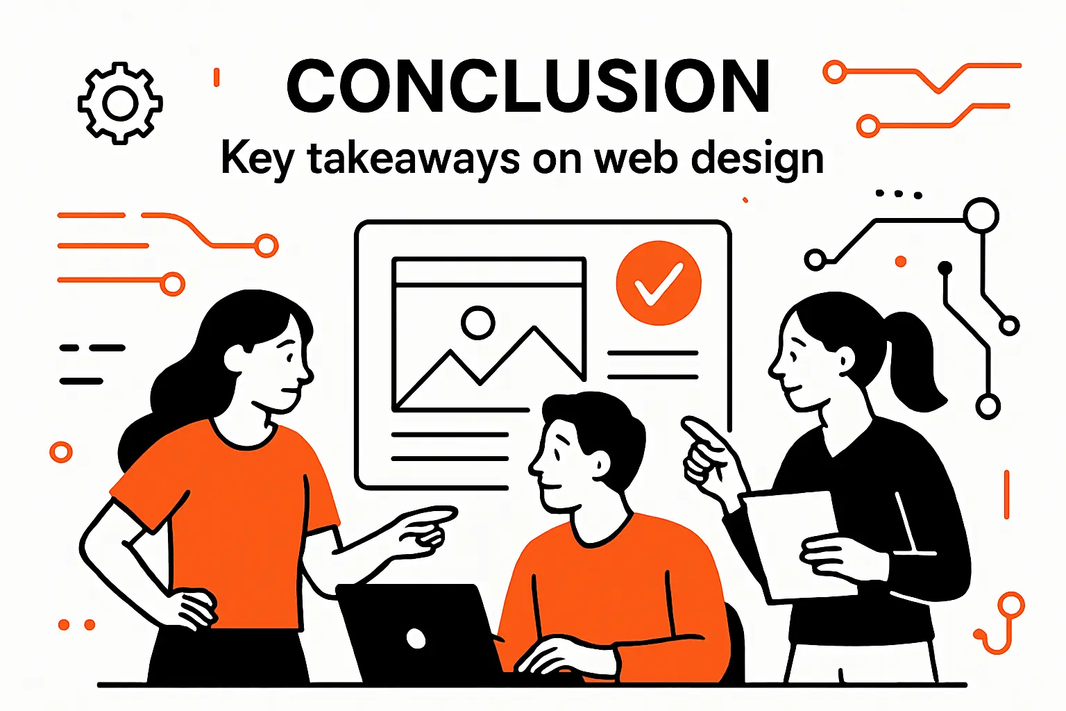
Market overview: leadership conversations increasingly treat design as leverage, not ornament, and the external signals above—from the shift to mobile access to the maturing toolchain—reinforce that posture. The most valuable lesson we draw from those signals is simple: a disciplined, user-centered process is the highest-yield investment you can make in your digital surface.
1. Web design blends aesthetics, functionality and UX across devices
The web is a living medium. Effective design is the choreography of visuals, interactions, and content into a single, legible story that works across the many contexts in which people show up. If you think of your site as a conversation, you’ll notice where your language confuses, where your timing rushes, and where your tone reassures—and you’ll fix those places sooner.
2. Principles and accessibility guide decisions; tools and testing sustain quality
Principles are shortcuts to good decisions; accessibility is empathy formalized. Tools help you explore, but tests help you learn. The teams that win treat system states and content as first-class citizens, not afterthoughts, and they invest in reusable patterns that encode what they’ve learned so every new page benefits from every past mistake.
3. Choose responsive or adaptive strategies based on context and goals
Responsive design gives you elasticity; adaptive techniques let you tune for the moment. The right blend depends on your audience, your content, and your constraints. Start with the job to be done, then let that job tell you which patterns you need, which enhancements earn their keep, and which choices can wait. If you’d like, we can turn that into a brief: what outcome should your site tune for first?