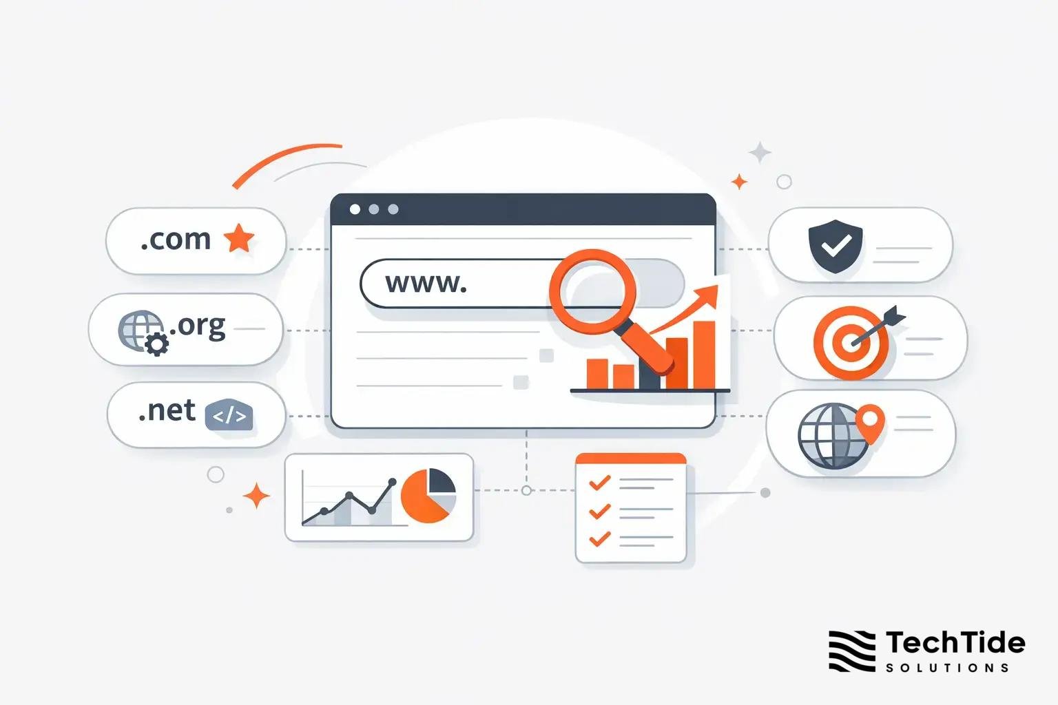
We at Techtide Solutions have learned to separate noise from signal in the app economy by triangulating store charts, usage-based rankings, and growth telemetry from our own launch work. The backdrop matters: global consumer spending on in‑app purchases and subscriptions reached $150 billion, a reminder that “trending” is not a parlor game but a real pipeline into revenue when teams capitalize on momentum.
Ranking Dimensions for Trending Apps Across Stores
Before we benchmark leaders, we need to align on definitions. The same report we cited above underscores that the center of gravity is shifting toward higher-value engagement, and that’s visible in how charts compress around apps with clear retention loops. In our work, “trending” becomes actionable only when we can map store-exposed ranks to usage and revenue signals that product and go‑to‑market teams actually control.
1. App Store iPhone Top Free and Top Paid Charts
Apple’s iPhone Top Free and Top Paid charts are cousins, not twins. Top Free captures install velocity—often juiced by creative refreshes, cross‑promotions, or timely PR—while Top Paid crystallizes immediate willingness to pay. We’ve watched utilities shoot up Top Free on the back of simple benefits (e.g., a camera cleanup feature with a crisp, one‑line value proposition) and then stall when the first session fails to unlock delight. Conversely, Top Paid leaders typically reflect category‑defining utility or a fan base that treats the purchase as a foregone conclusion. The practical implication for us as builders: if you are optimizing for Top Free, front‑load your aha moment and make the first two taps reduce friction instead of asking for sign‑in, and if you are aiming for Top Paid, tune copy and video to answer the only question that matters—“will this replace something I already trust?”
We’ve also seen what we call “laminar growth”: an app climbs Top Free over several days without overt UA spend because its share sheet intent or Siri Shortcuts slot meshes with daily habits. On paid charts, the pattern is different: pricing tests can add or subtract mobility. A small price nudge can either unlock a new cohort or flatten conversion if the audience perceives commoditization. That’s why we bundle price experimentation with messaging updates and a clear “what’s new” change log, so the perception of value rises alongside cost.
2. App Store Top Free Games and Top Paid Games
Games live by different physics. Top Free Games are momentum machines, responding to tiny deltas in creatives, tutorial drop‑off, and live‑ops cadence. When a game plants an early meta—say, a collection mechanic that gives you something to protect—it elevates retention and compresses CPI by priming players to return. Top Paid Games, meanwhile, signal brand power and the promise of a complete experience without micro‑transactions. In our release playbooks, we treat these as distinct audiences: Top Free gamers respond to frequent events and incremental novelty, while Top Paid gamers look for polish, confidence, and credible replayability. The two worlds intersect during holiday breaks or content creator highlights; that’s when a paid title can feel “event‑like,” lifting conversions even without heavy discounting.
We like to examine iconography and names in Top Game lists because they’re a proxy for decision speed. High‑contrast icons with a single focal element support pre‑intent browsing on small screens. Similarly, short, phonetic names travel across languages and make creators more likely to mention the title on streams without mispronunciation. That may sound soft, but we’ve shipped updates where a micro icon tweak improved browse‑driven installs in measurable ways.
3. Google Play Free, Paid, Grossing, and Top Overall Categories
On Google Play, the Free, Paid, Grossing, and “Top Overall” surfaces pull from related but differently weighted inputs. Free and Paid behave similarly to iOS, but “Grossing” is its own weather system, revealing how subscriptions and in‑app purchases convert attention into cash flow. “Top Overall” often functions as a normalization layer—big brands, system utilities, and network‑effect apps form a spine that is difficult to dislodge. We advise clients to forecast scenarios across these four views: for example, a health app may not spike on Free but can climb Grossing with a trial‑to‑sub path tied to onboarding milestones; a creativity tool may see seasonal Paid rank upticks during back‑to‑school if the description speaks to assignment workflows.
One caveat we’ve learned the hard way: Store merchandising experiments can change category traffic without warning. When a “Featured” carousels shifts the above‑the‑fold glass, “Top Overall” funnels more impressions into stalwart social and communications apps. To withstand this, your discoverability strategy needs redundancy—think of search, category browse, editorial pitches, and creator partnerships as four legs under one table.
4. Usage Rank and Store Rank on Android Rankings
Usage rank and store rank are complementary, not interchangeable. A store rank concentrates on install or purchase velocity; usage rank looks at real engagement. Similarweb’s methodology defines usage rank as an algorithmic blend of current installs and daily active users, where usage rank weighs more towards engagement, which is why it’s our preferred compass when we need to know whether a “trending” app is truly earning a spot on a user’s home screen. That distinction matters when planning capacity, support staffing, and retention experiments.
In our dashboards, we place the two curves side by side. If store rank spikes but usage rank barely moves, we warn teams to expect a hangover—support queues fill with unqualified users, reviews skew to setup friction, and return cohorts look anemic. When both curves rise in tandem, we bring forward experiments that exploit habit formation (calendar hooks, notification scaffolding, and first‑party integrations). The circle closes when revenue signals also follow usage: that’s when we prioritize more aggressive paid spend or bundle new SKUs while the iron is hot.
5. Updated Hourly Rankings on Appfigures
Store ranks are mercurial, which is why we augment first‑party analytics with third‑party crawls that refresh fast enough to capture micro‑trends. Appfigures’ ranking interface is our go‑to here because its ranks are Updated every hour, letting us tie ASO changes and campaign pulses to observable chart movement with minimal lag. This rhythm is perfect for “micro‑sprints” in which the copywriter, UA buyer, and product owner iterate in tight loops.
Practically, hourly updates help us distinguish signal from volatility. If a localization pushes you up during EU daytime but you fall back overnight, that’s a hint about language coverage rather than category fit. Hourly deltas also make it easier to catch algorithmic shifts—when the curve changes shape across many apps simultaneously, we plan for a different week than the one we had on the calendar.
iPhone App Store Top Charts for Trending Apps
Within Apple’s ecosystem, momentum travels quickly but sustainably only when onboarding meets the promise of the listing. The same market context we cited earlier shows a rising willingness to spend on features that collapse steps in daily tasks, and that preference shows up in the iPhone Top Charts. When we evaluate leaders here, we ask: does the product’s first minute make the value obvious without explanation? If yes, the chart position can become a flywheel rather than a flare.
1. Top Free Apps: Sora by OpenAI, ChatGPT, Google Gemini
AI‑forward brands change the gravity of the Top Free list. When a launch like “Sora by OpenAI” lands—or even when the name circulates through news and creators—our experience is that attention swells beyond early adopters to a wider curiosity cohort. ChatGPT’s mobile client demonstrates how to convert that curiosity into daily use with sensible defaults: quick start, instant history sync, and a share sheet extension that actually saves time. Google Gemini’s presence on iOS carries a different lesson: pack powerful capability into a low‑friction container. If the entry point is familiar and the handoff into search or productivity is seamless, you recruit users who would otherwise have stayed in the browser.
What do we do with this as builders? First, we shape narratives around specific, repeatable tasks rather than abstract potential. Second, we front‑load a showcase: one tap that makes the assistant do something delightful for this device—using the camera roll, mail, or the clipboard. Third, we route early power users into artifacts they can share (templates, prompts, quick actions). That gives your listing and your social mentions fresh oxygen beyond the announcement window.
Signals That Predict Staying Power
We look for three patterns: a short path to the first “wow,” a default that reduces cognitive load (e.g., capturing context automatically), and a routine hook that feels like a superpower rather than overhead. When all three are present, Top Free placement transitions from a spike into a plateau. When one is missing, we prepare for churn and build education into the first session.
Developer Notes From Our Launch Rooms
We’ve seen AI apps expand retention by bundling tiny utilities: a text‑to‑image helper in the share sheet, a voice capture that auto‑labels, or a quick translate widget that just works. These aren’t headline features, but they solve micro‑problems and bring the assistant into muscle memory. That’s how Top Free becomes a habit rather than a one‑time tryout.
2. Top Paid Apps: HotSchedules, Shadowrocket, AnkiMobile Flashcards
The paid chart on iPhone has a pragmatic pulse. Apps like HotSchedules and AnkiMobile speak to professionals and students who will not blink if the tool clears a real hurdle: scheduling shifts, studying spaced repetition, or exporting content into a course flow. Shadowrocket tells a different story: when network control is the job, users want a precise, predictable instrument. For this chart, our product lens is unforgiving—can the app replace an existing tool without ceremony? The listing has to telegraph competence and stability, not just novelty.
From an engineering standpoint, the road to Top Paid often runs through rigorous offline behavior, keyboard shortcuts, and robust import/export. And from a growth standpoint, traditional UA barely moves this cohort; credibility does. Crisp docs, transparent permissions, and responsive issue resolution in reviews act as compound interest. This is the chart where a single friction point—a quirky login, an unreliable sync—sinks momentum faster than a thousand flamboyant screenshots can patch.
Pricing and Perception
On Top Paid, pricing signals identity. Too low, and you trigger “toy” classification; too high, and you invite comparisons to desktop incumbents. We aim for a price anchored by the savings against the old workflow and then mark that price in the listing with use‑case examples, not adjectives. The result is fewer tire‑kickers and more committed users who will write reviews in plain language that persuade others like them.
3. Top Free Games: Clash Royale, Block Blast, Magic Sort
Games that anchor themselves on Top Free tend to excel at compressing the first session into a fun decision loop. Clash Royale’s duel‑centric format, for instance, invites immediate mastery moments that are easy to share and stream. Casual hits like Block Blast and Magic Sort succeed with ultra‑low cognitive load; they turn waiting time into a quick flow state. What unites these titles is generosity in the first session: they reward exploration and lower the risk of trying “one more time.”
When we partner with teams in this tier, we reserve a large chunk of energy for the loading screen, tutorial pacing, and early monetization cues that feel like tips rather than tolls. Even small adjustments—simplifying tooltips, trimming animation delays, choreographing the first power‑ups—cascade into better day‑one rhythm. The chart position is only the surface; the real lift happens in that choreographed minute when the game teaches your fingers what to expect.
Creator Ecosystems and Cross‑Promotion
We’ve seen free games build durable chart gravity by embedding formats that creators love to clip—head‑to‑head wins, combos that look impossible, or puzzles solved in audacious ways. Then they cross‑promote into their own portfolio, inviting players into a world where each title borrows momentum from the others. That soft power compounds in ways marketers often underestimate.
4. Top Paid Games: Minecraft, Plague Inc, Heads Up
Paid game leaders usually bundle three rare ingredients: replayability without grind, a visual identity that reads as “quality” at glance, and a promise that the purchase contains the fun. Minecraft is the gold standard here—it isn’t selling content as much as it sells a canvas. Plague Inc’s clever premise and Heads Up’s delightful social loop show another path: a single, well‑tuned mechanic that stays fresh because players bring their own context. The takeaway for teams: if you can articulate the core loop in one sentence and demonstrate it in your listing video without narration, you are closer to earning a spot on this chart than you think.
From a technical angle, performance budgets matter for paid titles. Players equate stutter with sloppiness; we treat frame pacing and haptic feedback as features, not afterthoughts. And from a support angle, we front‑load platform quirks in FAQs to avoid refund‑inducing surprises. The store page is not just a poster; it’s part of the service design.
Google Play U.S. Top Overall: Trending Apps Highlights
The U.S. “Top Overall” view on Google Play tends to stabilize around essentials and network‑effect juggernauts, with bursts from commerce, food, and AI. The context for this stickiness is behavior, not hype. A Deloitte survey across one national market found that 70% say they spend too much time on their device, a sober cue that attention budgets are saturated; to trend, an app has to replace a habit, not just add to the clutter.
1. Top Free Apps: ChatGPT, Temu, McDonald’s, WhatsApp, TikTok, Instagram
The names that recur in Top Overall read like a cross‑section of daily life: AI assistance, bargain discovery, food ordering, messaging, short‑form video, and social identity. We’ve engineered launches inside these categories and the playbooks diverge. For a marketplace app, we optimize the listing for trust and selection (inventory density, returns policy clarity); for a quick‑service restaurant, we tune location permissions and wallet integration so the first order is frictionless; for AI, we narrow the promise to tasks that feel magical on mobile. If you’re competing with incumbents like WhatsApp or Instagram, your wedge must be painfully specific—privacy guarantees, shared calendars that actually sync, or visual tools creators can’t get elsewhere.
Top Overall will also amplify emotion. Commerce apps ascend when savings narratives feel real to budget‑conscious users. Messaging and social move as creators launch new challenges or hashtags. AI spikes when a model preview drops or a feature showcases a before‑and‑after transformation. In each case, growth teams must be ready to meet the moment with tailored in‑app experiences: a first‑order coupon ready at open, a quick‑join link for friends, or a one‑tap demo that matches the announcement’s claims.
2. Paid Leaders: Minecraft, Balatro, Stardew Valley, Geometry Dash, Bloons TD 6
On Android, the Paid Leaders list echoes iOS in one way and flips it in another. It echoes in the dominance of beloved brands with depth; it flips in the ecosystem nuances that make controller support and device fragmentation more salient. We design accordingly: robust save systems that survive OS kills, graphics settings that don’t drown players in jargon, and storefront text that avoids platform‑specific confusion. We also find that update cadence is a differentiator here—players reward studios that treat Android as a first‑class citizen rather than a deferred port.
When a breakout like Balatro appears, we lean into discovery aids players trust: community‑driven guides, run‑sharing formats, and bite‑sized clips that showcase the “aha” without spoilers. For evergreen titles like Stardew Valley, the roadmap communication matters as much as content drops; when the promise of care is credible, price sensitivity fades and fans do the evangelism for you.
3. Grossing Category Is Available on Appfigures
To make sense of Top Overall on Google Play, we overlay a monetization lens. Appfigures tracks “Top Grossing” across storefronts, which turns a popularity snapshot into a revenue‑adjacent view we can plan around. We rarely rely on a single surface; Grossing helps us prioritize SKU development and experiment sequencing in categories where subscriptions or consumables drive the business. When a client sees positive movement here, we translate it into backlog actions—price testing, bundles, and promotional calendars—so the spike becomes trajectory.
4. Updated Every Hour and Available for Every Country and Category
The same platform also makes country and category pivots practical inside a single working day. Because the ranks refresh on an hourly cadence, our teams can run “follow‑the‑sun” optimizations: a creative refresh targeting one language cluster in the morning, an onboarding adjustment for another in the afternoon, and a localized promo aligned to evening prime time. Country coverage matters for pre‑launch, too; soft launches work best when we validate both store rank sensitivity and early revenue signals before opening the floodgates.
Android Usage-Based Rankings in the United States on October 11, 2025
Usage‑based views help us answer a different question: what do people actually open each day? Methodology matters here, which is why we lean on a definition where the metric weighs more towards engagement than raw install footprint. For teams making resource bets—support staffing, backend capacity, moderation coverage—this is the sober counterweight to the excitement of a store spike.
1. Usage Rank Leaders: Google Chrome, Google, Facebook, Messenger, Instagram
When we audited the U.S. landscape around that date, familiar home‑screen anchors led usage: the default browser, the meta‑search/news feed gateway, and the social/messaging suite that knits contact graphs together. The lesson isn’t that “you can’t win”—it’s that your path to durable engagement likely runs through complementarity. Apps that trend and stay tend to integrate with these leaders rather than imagine a world where users abandon them. We build share extensions, custom tabs, and login bridges so an app rides the habits people already have.
We also model the “replace/augment” question rigorously. If your product replaces a default (e.g., a browser or dialer), expect a higher switching cost and design onboarding accordingly with importers and reassurance. If you augment a default (e.g., a focused reader mode or performance overlay), your adoption curve will look more like a companion graph—lower ceiling, steadier slope. Both can trend; they just need different narratives and retention scaffolding.
2. Communication and Social Apps Shape the Top 20
Communication and social have a gravitational pull on usage rankings because their value scales with your network. As builders, we respect that gravity rather than fight it. For a productivity client, we anchored notifications to messaging triggers users already watch, turning passive alerts into context‑aware actions. For a creator tool, we made export formats that nest neatly inside short‑form video editors. These are not afterthoughts; they’re critical to making your graph adjacency a strength. When clients try to trend by brute force in categories adjacent to social without these bridges, retention curves fall back to earth fast.
Another pragmatic note: moderation and trust signals determine whether a social‑adjacent app rides a wave or gets sandbagged by platforms. We urge teams to invest early in reporting flows, human‑in‑the‑loop review for sensitive content, and transparent policy updates. Store reviews and usage share both respond to the sense that the team is present and principled when things get messy.
3. Store Rank Change Versus Usage Rank Change Indicators
We forecast chart moves using a two‑axis grid: store rank on one axis, usage rank on the other.
- Both rising, means it’s time to press the gas: scale spend, expand capacity, and seed new features.
- Store up, usage flat, means your promise outpaces your product; fix the first‑session narrative, compress setup, or trim permissions.
- Quadrant three—usage up, store flat—often hints at a subculture discovery; consider creator partnerships and search optimization.
- Quadrant four—both dropping—calls for ruthless triage. Teams that ritualize this grid weekly avoid thrash because disagreements anchor to a shared picture rather than gut feel.
On Android specifically, pre‑installs can distort the picture. A device maker deal might put your app on millions of phones, but without engagement, usage rank will not budge. We design post‑install nudges that earn attention rather than beg for it: contextual tips when the device is idle, value‑add widgets, and in‑app education that respects time. Trend lines improve when the app solves a friction users encounter daily, not when it shouts louder.
How to Monitor Trending Apps Using Public Charts
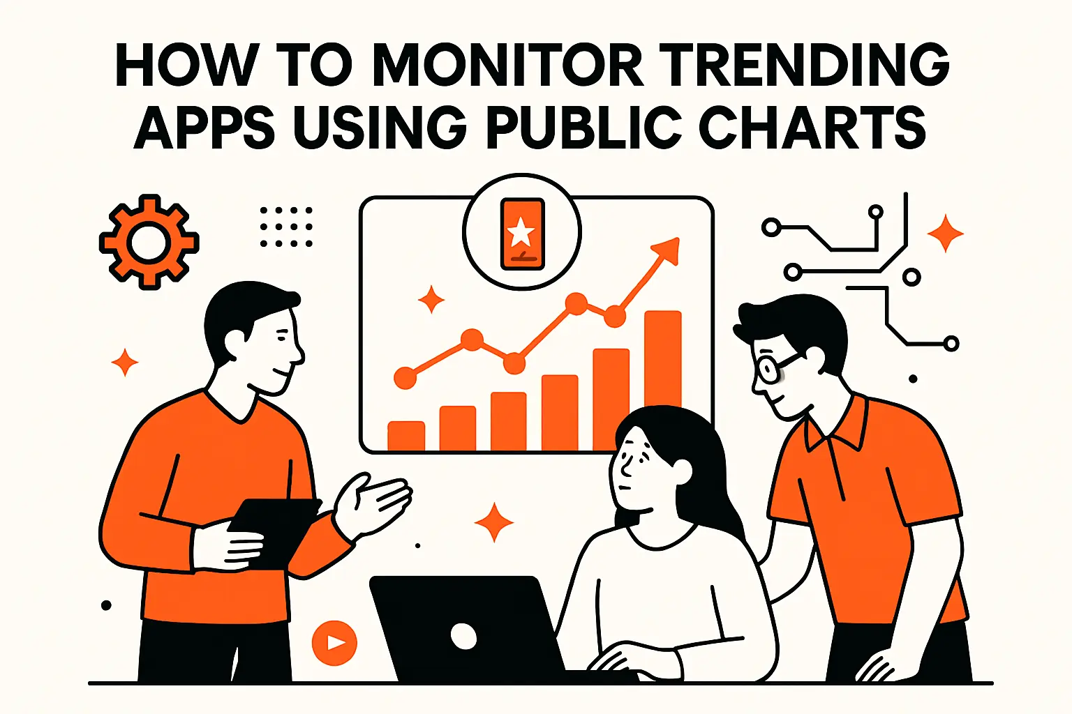
We track the market with a triad: Apple’s public facing charts for instant heat, hourly third‑party crawls for fine‑grained deltas, and usage‑based leaderboards for real engagement. The same market context we introduced earlier explains why this mix works: the Appetite for genuinely helpful mobile experiences is climbing, but attention is finite, so measurement has to be multidimensional.
1. Apple App Store: iPhone and iPad Top Charts
For Apple, we begin with the Top Charts visible inside the App Store app. The win here is immediacy—no setup required. We advise teams to screenshot the chart nightly during launch week, annotate the cohort of neighbors in your category, and then tailor your listing to stand out against that specific background. If screenshot carousels look same‑ish in your lane, consider an alternate crops strategy that foregrounds the task outcome, not the UI. Editorial features and search suggestions also act like macro currents; pair chart watching with a weekly pitch cadence for features that overlap Apple’s seasonal themes.
Teams should treat App Store Optimization as creative strategy, not metadata housekeeping. The table stakes—title, subtitle, keywords—matter, but the delight lever is storytelling: a first screenshot that resolves an anxiety users carry, a description that answers the exact question a skeptical friend will ask, and localized text that reads like it was written by a neighbor. These are the touches that convert browse into installs when you ride a trend.
2. Appfigures: Top Overall and Category Lists Updated Hourly
When we need resolution finer than a day, we open Appfigures’ Top Overall, category, and country lists, which refresh on an hourly cadence. We organize “micro‑sprints” around these pulses: push a new icon in a small test country, monitor the wiggle within a few refreshes, and decide whether to roll out globally. That discipline prevents argument by anecdote and gives growth and product a consistent tempo. In soft launches, hourly pulses are especially powerful; they alert us when even a small listing tweak breaks through.
We also encourage teams to pair the hourly rank view with a simple checklist: did creative change, did pricing change, did editorial presence change, did we get creator coverage, did we adjust onboarding? When one box is checked and the curve moves, causality is more than a hunch. Over time, your team’s instincts sharpen because the feedback loop is tight and visible.
3. Similarweb: Ranking and Trending Tabs with Usage Rank
To separate install surges from lasting traction, we consult usage‑ranked leaderboards and category trending views. The value is perspective: when a “viral” tool barely nudges usage rank, we guard engineering time against knee‑jerk pivots. When usage and store ranks move together, we prioritize scale and stability. We’ve also had success correlating creator bursts with usage spikes; when a breakout video aligns with a usage uptick rather than a store pop alone, we consider that validation to deepen the integration that made the video possible in the first place.
Practically speaking, usage‑rank views help us choose integrations that compound: build deep links where the leaders live, offer importers from their data, and arrange cross‑posting so your app rides rather than resists the gravity of the home‑screen staples. And because the methodology weights engagement, internal teams align around DAU‑oriented goals instead of vanity install counts.
TechTide Solutions: Building Custom App Solutions Around Customer Needs
Everything we’ve shared above is only useful if it folds into the way you build. Our perspective is shaped by dozens of launches and rebuilds where trending moments became durable businesses because the product and growth teams worked as one. We take to heart the behavioral context we noted earlier: screen time is abundant but contested, which means we win only when we replace an existing habit or compress a workflow in a way users can feel in the first session.
1. Discovery and Product Roadmapping
We begin with evidence. That means diary studies for job‑to‑be‑done clarity, UX “paper prototypes” that elicit real reactions, and instrumentation plans that bridge the promise on the store page to the first three screens. On the market side, we chart where demand actually pools—search queries, creator segments, and category neighbors—so we don’t fight uphill. We treat store positioning as a product problem: value proposition, icon, name, and screenshots are artifacts of the same promise you’re going to keep in the app.
In our discovery workshops, we map trend sensitivity explicitly. If you aim for a seasonal run (fitness around the new‑year window, for example), we design content drops that hit right when interest crests. If your plan is to piggyback on model or platform announcements (AI, camera APIs, payments), we scaffold a release that feels timely and tailored rather than opportunistic.
Artifacts You Can Use Tomorrow
We leave discovery with a single‑page thesis (the “why us” statement), a launch storyboard (what the first minute looks and feels like), and a measurement plan focused on the moment of truth (the tap that proves value). Those artifacts align engineering, design, and growth around the same north star so trending opportunities are not squandered by mismatched expectations.
2. MVP Development and Iterative Releases
Our MVPs earn their name the old‑fashioned way: they minimize the time to deliver unmistakable value. We prefer thin slices that travel end‑to‑end—one core loop built to production standards—over broad prototypes that impress in demos and crumble in real usage. Release trains follow a rhythm that also fits external cycles—store review times, editorial calendars, and creator content timelines. Each small release adds a visible improvement, which keeps store reviews fresh and the chart position defensible after the initial wave.
For teams chasing Top Free momentum, we place outsized attention on install size, cold‑start time, and first‑session guardrails that prevent users from bouncing on permission requests. For teams aiming at Top Paid, we optimize confidence: clear offline behavior, transparent data handling, and smooth importers for legacy data so switching doesn’t feel like a leap of faith. The code is only half the story; the perception of care is the other half.
Engineering Patterns That Help You Trend
We build for graceful degradation (feature toggles when services hiccup), progressive permissions (ask when the value is obvious), and instrumentation that flags friction in near real‑time. That’s how you catch a rank wobble before it becomes a slide. We also keep a “listing lab” where marketing can test iconography, video, and copy without waiting on app updates—speed wins arguments.
3. Integrations, Scalability, and Performance
Trending is fun until the backend falls over. We provision capacity like an S‑curve is coming: database connections sized ahead of a spike, caches tuned for hot paths, and fallbacks that keep core functions alive under duress. Where usage rank leaders are relevant, we integrate with them natively—deep links, share extensions, autofill, and account kit bridges—so your app feels like part of the phone, not an intruder. The payoff is not only smoother onboarding but also better retention because the app participates in workflows users already trust.
Performance is often the unglamorous hero of chart stability. We chase smoothness rather than synthetic benchmarks—the sensation of speed, not just raw numbers. Every transition is an opportunity to confirm that the app respects the user’s time. We budget for the fabric of responsiveness—touch latency, predictable animation, short‑lived spinners—because we’ve watched poor pacing turn promising first days into spirals of refunds and reviews that scare away the next wave.
Security and Trust as Growth Levers
For categories adjacent to finance, communications, or health, trust signals are not optional. We work with clients to surface plainly worded security practices, highlight permission rationales at the moment they matter, and ensure support channels are human and responsive. These choices do not merely avoid harm; they translate to chart resilience when a rough patch comes. Review readers are humans; they respond to teams that plainly show up.
4. Analytics and Optimization for Growth
We run a two‑layer analytics stack: high‑fidelity product telemetry for behavior and a chart/usage monitor for market position. The alchemy is in the join. When a listing change lights up an hourly rank curve, we look for the fingerprint in activation flows. When a usage‑rank uptick arrives, we validate that it’s distributed across cohorts rather than a single campaign artifact. Over time, this loop turns opinions into evidence.
The optimization cadence runs on weekly retros. We use a rank/usage matrix to decide whether to scale spend, rework onboarding, run creator pilots, or pause and harden. The goal is not to win every day; it’s to avoid unforced errors and to seize windows when they open. Trending is neither random nor fully controllable; it’s a craft of preparedness.
What We Do When You Trend
When your app jumps, we ship: a support plan with extra hands, a content pack that refreshes the story, and a hardening sprint to sand down rough edges new users will find. We then schedule a “truth session” two weeks later to decide which parts of the spike are earned and which are luck. That honesty keeps the team focused on the levers that matter.
Conclusion: Key Takeaways on Trending Apps
Trending apps sit at the intersection of visibility, engagement, and credibility. Store charts tell you who arrived quickly; usage‑based rankings tell you who stayed; revenue‑adjacent views reveal who turned attention into a business. The trick is to connect these lenses to specific, do‑able choices: show one undeniable benefit on the store page, design the first minute to deliver it, and instrument the loop so you can see what’s working fast enough to act. We’ve built that muscle across launches that rode spikes into enduring growth and across turnarounds that turned anemic listings into working funnels.
If you’re preparing a launch or wondering how to convert a recent pop into a durable trajectory, let’s run a working session together—one hour to map your current position across charts and usage, identify the most leverageful experiments, and define the first iteration to ship next week. Where should we start: store page, onboarding, or integrations with the leaders that already live on your users’ home screens?