At Techtide Solutions, we think of user interface as the meeting point between intent and execution—where human goals become computable actions. That meeting point now sits at the center of enormous investment: worldwide IT spending is forecast to total $5.43 trillion in 2025, a reminder that the “front door” of products has strategic weight that reaches far beyond pixels. In our practice, the best UI work blends craft, behavioral insight, and systems thinking so the interface doesn’t just look right—it helps people do the right things, faster and with more confidence.
What is UI explained: the human–machine interaction space

Before we debate shapes, shadows, or typography, it helps to acknowledge how broad the interface landscape has become. People now talk to appliances and cars, and they wave at cameras as often as they click icons; it’s no accident that digital voice assistants in use reached 8.4 billion in 2024, which illustrates how UI has grown well beyond screens into ears, microphones, and ambient contexts. As designers and engineers, we read that macro signal as a mandate: build for eyes, hands, and voices—sometimes all at once.
1. The user interface is the space where people and machines interact
We define UI as the tangible layer that mediates intent and system capability. It is less a single artifact and more a contract: the product promises clarity about what’s possible, while the person promises to provide inputs the system can interpret. In practical terms, the UI is that contract made visible (or audible or haptic). When the contract is well written, novices feel oriented, experts feel efficient, and the organization earns trust. When it’s poorly written, people cope, guess, and abandon. We’ve observed this across industries—from banking and healthcare to field operations—where the first encounter with a screen or voice prompt sets the tone for the entire relationship.
In our engagements, we start by mapping the moment immediately before and after an interaction, because UI quality often hinges on those edges. A hospital intake terminal that clearly signals what documents are required reduces anxiety upstream; a delivery driver’s route screen that hands off to reliable offline behavior avoids a dead end in patchy coverage. UI is the bridge; the approaches to and exits from that bridge shape the whole journey.
2. UI design focuses on look, feel, and behavior to make products easy and pleasurable to use
Three ingredients govern our interface work. First, visual language: type, color, spacing, and hierarchy communicate priority and pattern. Second, interaction grammar: how elements respond, how states change, and how the system reveals cause and effect. Third, microcopy: the helpful sentence that clarifies terminology, anticipates objections, or reduces the fear of committing an irreversible action. These aren’t cosmetics; they are cognition aids. We often remind teams that a product’s “feel” emerges from a consistent, observable relationship between what a person does and what the system does next.
Consider an insurance claims portal. Design that telegraphs the next step—say, a clear summary card that previews what follows a click—cuts uncertainty. Likewise, a “Send” interaction that animates like dispatch—a subtle slide out followed by a status confirmation—lets the brain register progress without parsing dense text. Finally, confirmations written in humane microcopy—plain language, not legalese—earn credibility. The look frames expectation; the feel proves responsiveness; the behavior cements trust.
3. UI spans graphical interfaces and other forms such as voice and gestures
Interfaces now inhabit an ecosystem, not a single surface. Graphical interfaces excel when precision and density matter; voice shines when hands and eyes are busy or when speed beats precision; gestures and spatial input unlock tasks where physical orientation or depth are the point. We’ve built maintenance tools for technicians whose hands are gloved and whose attention is divided; in those settings, a multimodal pattern—large tap targets, natural voice shortcuts, and forgiving error recovery—is not a luxury. The lesson is to design UI as a choreography of modalities rather than a monoculture of screens.
Recommended reading: CSS Text Outline Techniques for the Web
UI vs UX: distinct roles that work together

In product conversations, people often conflate the “how it looks” with the “how it works.” A more productive framing is to treat UI and UX as complementary disciplines. The business value case is clear: companies that excel at design increase revenues and shareholder returns at nearly twice the rate of their industry peers, reminding us that getting the surface and the system right is not mere polish—it is performance. We use that lens to align teams around outcomes rather than artifacts.
1. UI handles visual and interactive elements while UX covers the end‑to‑end experience
UX asks, “What problem are we solving, for whom, and in what context?” UI asks, “How do we render that solution in a way that people can perceive and control?” UX is journey maps, service blueprints, and evidence from discovery. UI is the tangible expression of those decisions: screens, states, flows, and voice prompts. Together, they form a loop: research informs interface choices; interface behavior generates telemetry; telemetry reshapes the experience. When teams split them apart, products degrade into disconnected features; when teams weave them together, the product reads like a coherent story.
We’ve seen this synergy in high‑stakes environments. For a logistics client, experience mapping revealed that drivers were triaging jobs mentally before touching any system. That insight drove an interface change: a job list that pre-visualized workload and risk, paired with a one‑gesture assignment. The result wasn’t just prettier screens; it was a flow that mirrored real work, reducing cognitive translation.
2. UI sits within the broader UX umbrella as an essential part of the experience
Placing UI “inside” UX keeps the work honest. It forces us to trace every pixel or prompt to a job to be done, a capability boundary, and a measurable outcome. The umbrella metaphor also inoculates against the trap of chasing trends for their own sake. Glassy effects may be fashionable; the right choice is what supports comprehension and control in context. A finance dashboard, for example, benefits more from well‑paced information disclosure and clear units than it does from ornamental flair. Within the UX umbrella, UI becomes the proof of strategy, not a veneer on top of it.
In highly regulated sectors, this framing helps reconcile compliance with usability. UI patterns that make rules legible—stateful buttons that “explain themselves,” tooltips that translate policy into purpose—turn constraints into guidance. People appreciate an interface that respects rules without making them feel policed.
3. Architecture versus interior design analogy clarifies responsibilities
We sometimes borrow an analogy from the built environment. Experience architecture defines the structure: where walls, doors, and circulation should go to serve the activities inside. Interface design is the interior: surfaces, fixtures, and cues that make the space navigable and welcoming. The two disciplines inform one another; designers should “walk the building” before choosing materials, and architects should imagine what it feels like to reach for a handle in the dark. In software and services, we treat these as iterative passes rather than handoffs—because real users change how the “building” wants to be used once they move in.
Recommended reading: Responsive Web Design Principles: A Practical Guide to Building for Every Screen
Major interface types in practice
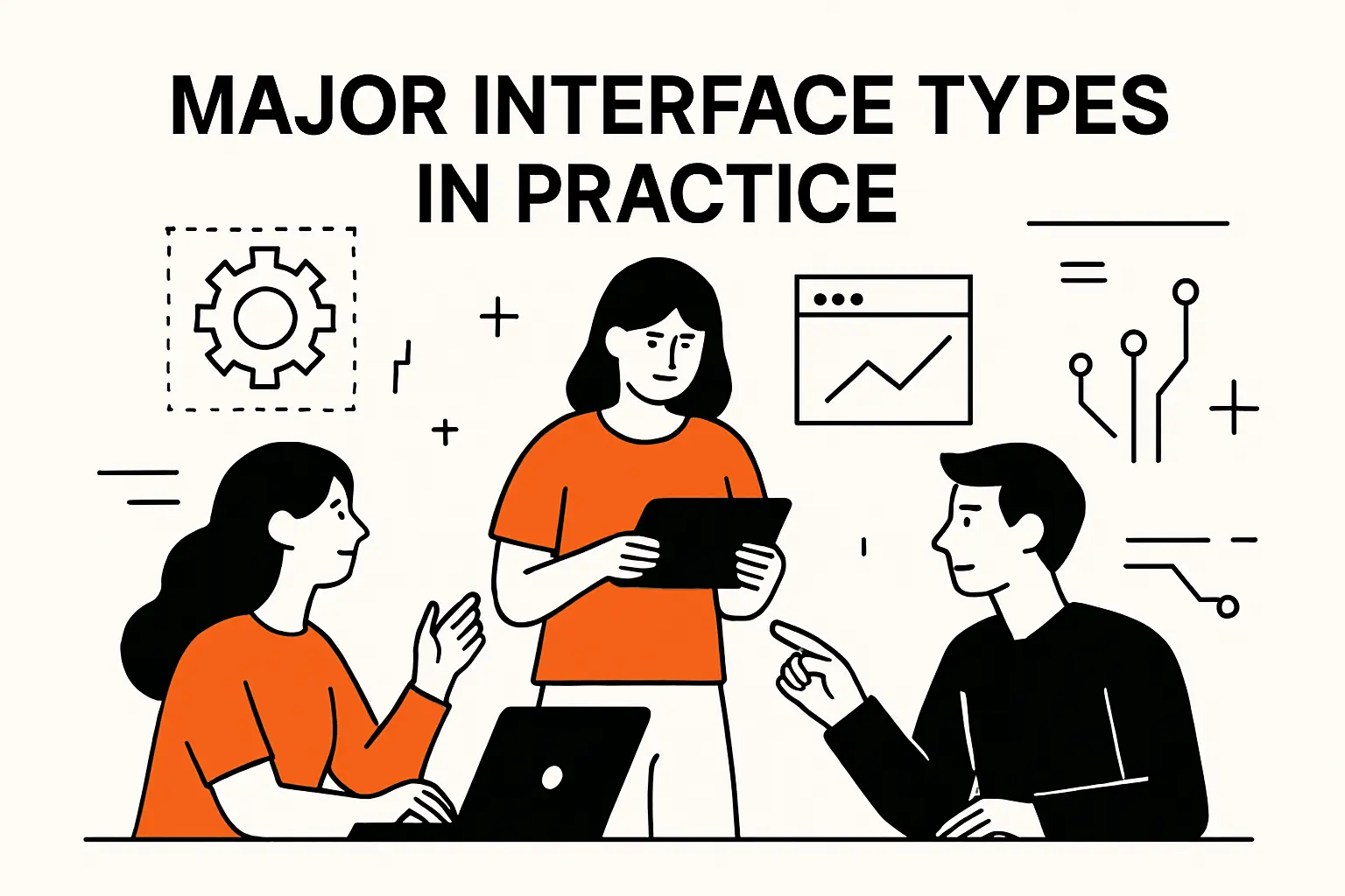
Market signals point toward a pluralistic interface future. Visual, voice, and spatial modes are converging as hardware and software mature together; you can see this in the outlook for head‑mounted and glasses‑based computing, where shipments are projected to grow by 41.4%, catalyzed by improving comfort, price curves, and on‑device intelligence. For product leaders, the takeaway is not to chase novelty but to pick the modality that best matches environment and task, then knit them into a cohesive whole.
1. Graphical user interfaces with icons, widgets, and direct manipulation
GUIs remain the most versatile and information‑dense interface class. Their strength is direct manipulation: people can select, drag, and edit on the same surface where output is displayed. That immediacy supports learning by doing; the system demonstrates what it can do as you try to do it. In our enterprise work, we lean on a few durable strategies. First, ladder information with obvious hierarchy, so the eye lands where it should. Second, keep controls proximate to content, so actions feel local and undo feels safe. Third, signal state changes through motion and color shifts that are meaningful rather than decorative.
One practical example: a manufacturing analytics dashboard where operators must triage anomalies. Instead of shipping a sea of charts, we concentrated on a “workbench” pattern: compact cards with clear affordances, quick filters that match the language of the floor, and a details drawer that keeps context visible. This avoided context‑switching—operators never felt forced to “leave” their workspace to investigate. Over time, telemetry confirmed that people were diagnosing issues earlier in the cycle, not because the math changed, but because the UI made the math graspable.
2. Voice‑controlled interfaces using spoken commands via assistants
Voice UI is at its best when attention is scarce, hands are occupied, or accessibility is the priority. The trick is not to overestimate what people will memorize. We design voice patterns as discoverable conversations: prompts that teach capabilities, confirmation that reduces anxiety, and graceful fallbacks when phrasing is unexpected. The strategic value of voice is not just convenience; it is new reach. For organizations serving customers who are driving, cooking, or moving between tasks, voice becomes the bridge that screens can’t be. Given adoption trends toward ambient assistants, we treat voice not as a novelty add‑on but as a first‑class citizen in multimodal systems.
In the field, we’ve built service flows where voice shortcuts trigger the same business logic as buttons, so a worker can speak or tap depending on context. Consistency matters: the command “mark complete” should mean the same thing and yield the same state whether it’s spoken or clicked. That’s how trust in the interface deepens.
3. Gesture‑based interfaces mapping motion in 3D spaces including VR
Spatial and gesture interfaces are about embodiment—letting hands, gaze, and posture control the system. The design challenge is to keep that expressiveness within interpretable bounds. We’ve found value in “semantic gestures,” where each action maps to a recognizable real‑world intent. For instance, a subtle push to bring content forward, a pinch‑and‑hold to select, or a anchored grab to reposition. When gestures align with embodied metaphors, fatigue drops and delight rises.
We’ve also seen success in hybrid setups: a physical controller or trackpad for precision, complemented by free‑space gestures for coarse moves. This kind of layered control respects constraints like muscle memory and accessibility. Designing for spatial contexts forces a return to fundamentals: depth cues, occlusion, and perspective all become interaction variables. The UI is no longer a rectangle; it’s a room you furnish for comprehension.
Essential UI components and patterns

Component libraries are strategic assets, not just developer conveniences. As agentic capabilities move from prototypes into production, organizations are preparing for orchestration between classic UI pieces and autonomous helpers—Deloitte expects adoption of AI agents among enterprises using generative AI to reach 50% by 2027, a shift that will shape how components behave and hand off work. We design systems with this in mind: every control has to communicate state, intent, and ownership, whether a person or an agent is in the driver’s seat.
1. Input controls including buttons, checkboxes, text fields, toggles
Inputs are contracts. A button says, “I will do this.” A checkbox says, “This is true.” A text field says, “Tell me in your words.” The UI should make those contracts legible. We like high‑contrast labels, inline hints that vanish at the moment of confidence, and error messages that explain what to do next rather than what went wrong. When appropriate, we add “smart defaults” that respect prior choices, but we avoid mysterious auto‑fill that takes control away. The line between help and hijack is thin; clarity keeps us on the right side of it.
Microcopy and validation that reduce friction
Short, purposeful phrases outperform jargon. “Use the name on your card” beats “Enter cardholder details.” For validation, we prefer anticipatory patterns that flag likely pitfalls early, not after submission. One caution: helpfulness should feel optional. If guidance pops up too aggressively, people feel surveilled rather than supported.
2. Navigational components such as menus, breadcrumbs, search, sliders
Navigation is how people build a mental map of your product. Menus declare the terrain; breadcrumbs show the path; search lets people tunnel to what they need; sliders provide quick calibration where granularity matters. The most common failure we encounter is over‑segmentation: carving the product into categories that mirror the org chart rather than the user’s goals. We fight that by anchoring navigation to tasks, not teams, and by keeping names in the language of the user, not the system.
Wayfinding as a narrative device
A good interface narrates where you are, what just happened, and what you can do next. We use progressive highlights to orient the eye, and we pair search with “did you mean” style suggestions that teach the system’s vocabulary without scolding. When navigation tells a coherent story, people are willing to explore; when it reads like a puzzle, they shrink their usage to only what they already know.
3. Informational components like icons, notifications, progress bars, tooltips
Information components are how the system whispers. Icons compress meaning into delightful shorthand—so long as they’re tested for shared understanding. Notifications should be respectful and reversible; nothing erodes goodwill faster than interruptions that feel unearned. Progress indicators matter more than organizations assume; they create the felt sense that the system is alive, not stuck. Tooltips and helpers should feel like attentive guides, not rulebooks. We calibrate tone and timing carefully so information components enrich rather than overwhelm.
Designing for attention and memory
Attention is a scarce resource; memory decays quickly. We lean on spatial stability (things don’t jump around), cautious motion (movement means meaning), and consistent iconography so people can offload memory onto the interface. The less a person has to remember, the more they can accomplish.
4. Containers that organize content including headers, tabs, accordion menus
Containers do cognitive work. A good header sets context and exposes key actions. Tabs partition complexity into digestible views. Accordions let details be there when needed and absent when not. The risk is treating containers as styling choices rather than thinking tools. We define a “container contract” for each: What belongs here? What never belongs here? What happens on overflow? That discipline yields interfaces where everything has a home and nothing feels homeless.
From components to systems
Components are only as good as the system that governs them. We establish tokens and rules that express brand and intent consistently across surfaces. That way, when the product evolves—new modules, new devices, new agents—the components don’t fracture into look‑alikes with subtle, costly differences. Consistency is liberation: it frees teams to focus on the hard problems instead of reinventing buttons.
Design principles and process for effective UI

Principles give teams a north star, and process turns that north star into shippable software. The stakes are rising as budgets shift toward modern, AI‑enhanced experiences; even macro forecasts show momentum, with worldwide IT spending projected as exceeding $6 trillion for the first time, which echoes what we see on the ground: demand for faster iteration, stronger design‑engineering alignment, and tighter governance around components and data.
1. Clarity, discoverability, and affordances guide perception and action
Clear interfaces let people predict outcomes. We make affordances explicit: clickable looks clickable; draggable looks draggable; editable looks editable. Discoverability means that first‑time users can find essential capabilities without a tour. The underlying discipline is to show only what’s necessary and reveal the rest at the moment it becomes useful. When affordances are honest and discoverability is high, people can build accurate mental models quickly.
Why this matters for business
Clarity reduces support burden and training time; discoverability expands feature adoption beyond the narrow band of power users. We’ve watched organizations mistake complexity for capability. In reality, the most capable products are the ones whose complexity is harnessed by coherent affordances and discoverable pathways.
2. Feedback and responsiveness keep users informed about system status
Interfaces should narrate their status without requiring interpretation. We build consistency between action and feedback: tap leads to animation that confirms receipt, then a visible status that confirms progress, then a final state change that confirms completion. If something fails, the interface should propose a next step rather than announce doom. Responsiveness isn’t just about speed; it’s about feeling attended to. Even in slow operations, smart feedback keeps trust intact.
Patterns that build trust
We favor reversible actions, visible undo, and non‑destructive previews. Where operations have consequences, we use confirmation that repeats the user’s words back to them, not the system’s codes. That tiny act of translation sends a signal: “We heard you correctly.”
3. Simplicity and progressive disclosure reduce effort and cognitive load
Simplicity is what remains when you remove what doesn’t help. Progressive disclosure organizes information so that the right amount is always at hand—no more, no less. In complex domains like clinical systems or procurement, we move details out of the primary path and let people pull them in when context demands. The aim is not ascetic minimalism; it is functional minimalism, where every element earns its place by enabling comprehension or control.
Designing for focus
Simplicity thrives on whitespace, consistent alignment, and restrained color. We also write to be read: short sentences, concrete nouns, and verbs that match user intent. When the words are clean, the visuals don’t have to shout to be heard.
4. Consistency and familiarity build confidence and ease learning
Consistency makes experiences transferable: once someone learns a pattern in one part of the product, they can reuse it elsewhere without friction. Familiarity leverages conventions people already know, reducing the need for instruction. We formalize both through design systems that define tokens (for color, type, spacing), component APIs, and usage rules. Consistency is not sameness; it’s the reliable application of rules that help people form and test expectations.
Guardrails over gatekeeping
We give teams strong defaults and examples rather than strict bans. Designers can deviate when there’s a good reason, but they have to demonstrate how a deviation still honors the system’s principles. This governance model keeps creativity alive without letting variance undermine learnability.
5. Accessibility and inclusive design ensure broad usability
Accessibility is both a moral imperative and a commercial one. An interface that flexes for diverse needs reaches more people and creates better outcomes for everyone. We embed inclusive patterns—contrast options, flexible typography, motion controls, and keyboard and voice parity—into our component libraries so they spread across products. Beyond compliance, we design for autonomy: users can choose the mode that works for them, and the system remembers those preferences respectfully. We also pay attention to social accessibility: plain language, supportive tone, and error‑proof processes reduce the fear of getting something “wrong.”
Evidence that pushes teams to do more
The workplace side of inclusion underscores the urgency: research from Deloitte found that many employees who request accommodations encounter resistance, with a significant share reporting rejected requests. That gap between need and support is a signal for product leaders that accessible defaults are the safer path, because the product itself can close part of the inclusion gap when organizational processes lag behind.
6. Understand the context of use and target users before designing
Context makes or breaks UI. We investigate environment, device constraints, connectivity, literacy, and emotional state. Field observations and diary studies surface realities that lab sessions miss: glare on screens, gloves on hands, interruptions mid‑task, or the stress that comes with a critical form. We translate those observations into interface requirements: larger targets, offline resilience, more forgiving timeouts, or voice alternatives. Without context, the nicest interface can still be the wrong one.
Jobs to be done, rendered as UI
We align UI to tasks people are actually trying to accomplish, not to features the team is proud of. That often means reframing scope: remove entire sections that don’t help, or elevate a flow that was buried because organizational ownership was unclear. UI that fits the job feels almost invisible; people get to done and remember the outcome, not the interface.
7. Conduct competitor analysis to align with user expectations
Competitor analysis isn’t about copying; it’s about calibrating expectations. People arrive with mental models shaped by other products. If your patterns diverge without a good reason, you impose cost. We catalogue industry conventions, then deliberately choose when to align and when to differentiate. We also study adjacent domains, because expectations leak across categories: someone’s comfort with a ride‑hailing app informs how they expect to manage deliveries, even if the domain is different.
Design as differentiation
When we choose to diverge from norms, we make the benefit obvious. If a new pattern saves effort or reduces risk, the interface should demonstrate that value instantly—through preview, smart defaults, or comparative affordances. Differentiation succeeds when it pays back the learning cost quickly.
8. Design screens, visual systems, and interactions to communicate importance
Visual hierarchy is not decoration; it is prioritization. We elevate what matters through size, position, color, and contrast, then we downplay the rest. Interaction patterns should echo that same hierarchy. Primary actions get the clearest affordances; secondary options recede but remain discoverable. We treat empty states as first‑class surfaces, using them to teach and to invite action rather than leaving them blank.
Motion with meaning
Motion should always explain, never distract. A panel that slides from the side should originate where it belongs in the mental model. A transition should convey relationships, not just style. In analytics interfaces, we use subtle motion to connect filters to results, reinforcing causality and reducing uncertainty.
9. Create high‑fidelity prototypes and iterate with usability testing
Prototypes let teams learn fast without paying the cost of full builds. We prototype at the fidelity required to test the question at hand: structure, flow, content tone, or visual polish. Then we observe. Testing isn’t about defending decisions; it’s about discovering how people actually behave. We look for moments of hesitation, backtracking, or apology—those are the clues that the UI isn’t aligning with intent. Iteration closes the loop, and telemetry from real use validates that lab insights survive in the wild.
Testing as culture
Healthy teams treat testing as habit, not heroics. We embed quick feedback into sprints and maintain a backlog of unanswered questions. That rhythm keeps debate grounded in evidence and helps executives see design as an investment that manages risk, not as a bottleneck.
10. Handoff to development and refine based on feedback
Handoff is the start of a new collaboration, not the end of design. We ship comprehensive specs, tokens, and component definitions, then sit with engineers to walk through edge cases. As real data hits the interface, small misalignments surface—text stretches, uncommon states, or performance constraints. We resolve them together and update the system so improvements persist. The goal is living documentation, not static files: a shared language that lets teams move quickly without eroding coherence.
Design operations that scale
We bake governance into the process: component proposals, naming conventions, versioning, and change logs. When everyone can see what changed and why, the system earns trust internally just as the UI earns trust with users.
How UI evolved and connects to its context

History explains why contemporary patterns feel natural—or not. As budgets expand and as research underscores design’s impact, we see renewed appetite for investing in interfaces that borrow the best of the past while embracing new modalities. That perspective helps teams avoid fads and root their choices in durable human factors instead of surface‑level fashion.
1. WIMP GUIs and the desktop metaphor shaped modern interactions
Windows, icons, menus, and pointers taught people that digital environments could borrow spatial metaphors from the physical world. Files lived in folders; trash lived in a bin; menus pulled down like a shade. Those metaphors were never perfect, but they formed bridges for novices and established a grammar that persists even in pocket‑sized screens. Today, we still lean on those patterns when they serve comprehension, while shedding them where they add complexity. A mobile app has no need for a “file cabinet,” but it benefits from the idea that groups of information belong together and actions relate to those groups.
We encourage teams to ask what the metaphor buys them. If it adds predictability and reduces explanation, keep it. If it forces awkward contortions—like mimicking physical behaviors that don’t translate—drop it. Evolution in UI is less about a clean break with history and more about pruning metaphors that have outlived their usefulness.
2. GUIs emerged to counter the steep learning curve of command lines with direct manipulation
Command lines privileged power and precision but demanded recall and syntax. GUIs opened computing to many more people by moving from recall to recognition and from exact text to spatial and visual cues. That democratization still matters. Not every task benefits from pictures; some are faster with structured prompts. But the central lesson endures: UI succeeds when it respects the limits and strengths of human memory, attention, and perception. Direct manipulation, previews, and visible state are the enduring gifts of that shift.
Interestingly, the rise of conversational interfaces reintroduces some command‑line dynamics—expressive, terse inputs with deeply capable responses. The design opportunity is to blend the strengths of both: visible guidance and recoverability paired with the power of language. In practice, this means offering example prompts, keeping actions reversible, and maintaining a clear “escape hatch” back to familiar controls.
3. Human–machine interfaces link software to keyboards, mice, displays, and other hardware
No UI exists in isolation. Keyboards, pointing devices, touch surfaces, microphones, cameras, speakers, and haptics shape what’s possible. Hardware constraints become design constraints; hardware possibilities become design possibilities. For a wearable app, battery life dictates animation choices; for a rugged tablet on a job site, glare and gloves dictate contrast and target size. We treat hardware as part of the design problem, not a downstream detail. When we do, performance and comfort improve in lockstep.
This is also where modality orchestration pays off. If a sensor detects low light, the UI shifts contrast; if the device is docked, layout adjusts; if ambient noise rises, the system favors visual confirmation over voice. The goal is not to wow with tricks but to quietly adapt in ways that make the product feel attentive.
4. Industrial design and ergonomics influence form, function, and user focus
Good UI is ergonomic at every scale: the angle of a screen, the travel of a switch, the spacing of tappable regions, the strain of gaze over long sessions. Industrial design decisions ripple into software comfort. We collaborate with hardware teams to align on grip, balance, and materials because those choices change how people hold and therefore how they interact. The richer the physical context, the more UI must respect energy, posture, and situational constraints. When teams align across disciplines, products feel cohesive—comfortable to hold, legible to scan, and easy to steer.
TechTide Solutions: custom UI for your product

We build interfaces that respect real‑world constraints and deliver measurable outcomes in the domains that matter most to you. The macro picture—rising technology investment, expanding multimodal adoption, and growing evidence for design’s business impact—reinforces a simple truth we see daily: thoughtful UI is a competitive lever, not a cosmetic afterthought. Our approach is rigorous, collaborative, and outcome‑obsessed.
1. Discovery and UI strategy tailored to your goals and users
Discovery starts with listening and observing. We run focused interviews with users and stakeholders, shadow work in the field, and review your analytics to identify gaps between intention and behavior. Then we translate findings into UI strategy: the principles we will honor, the tasks we will privilege, and the trade‑offs we will make explicit. We also surface constraints—regulatory, technical, organizational—early so the interface doesn’t promise what the system cannot deliver.
Because discovery is where empathy meets economics, we quantify the cost of confusion and the value of clarity. For a fintech platform, that meant reframing onboarding around outcomes rather than features; for a healthcare tool, it meant choosing a tone that reduced anxiety and using progressive disclosure to protect focus. Each context asks different questions; a good UI strategy provides answers the whole team can act on.
2. Custom interface components and patterns aligned to real workflows
We don’t start by sketching pretty screens. We start by designing a system of parts that can stretch across scenarios gracefully. Our component libraries include purposeful defaults, accessibility baked in, and the right extension points so product teams can assemble flows without re‑inventing. We document behavior in plain language and show components in use, not just in isolation. That turns the library into a coach, not just a catalog.
When we build for specialized domains—claims operations, field service, clinical care—we align components to the rhythm of the work. In a field‑service app, that meant fast capture and resilient sync; in a clinical context, it meant read‑first screens with unambiguous actions and a strong audit trail. The result is a product that feels like it belongs in the environment it serves.
3. Prototyping, accessibility, and developer handoff to ship usable products
Prototyping gives stakeholders something real to react to. We use it to de‑risk decisions, validate language, and test accessibility choices with people who have diverse needs. Our accessibility checks cover color and contrast, keyboard and screen‑reader behavior, motion sensitivity, and alternatives for audio cues. When it’s time to build, we deliver tokens, component code, and clear specifications so engineering can move fast without losing fidelity. Then we stay close after launch, refining flows based on telemetry and feedback, and folding lessons back into the system so the product gets better with use.
Our goal is to leave teams stronger than we found them: a shared language for UI, operational rhythms that bake usability into delivery, and components that carry your brand and intent consistently across channels and modalities.
Conclusion
UI is the handshake between people and technology. It turns capabilities into confidence and intentions into outcomes. The market context favors teams that treat UI as a strategic discipline rather than a finishing touch; the organizations that do so are the ones we see turning complexity into clarity, and turning clarity into momentum.
1. Recap what is UI and why it matters to usability and satisfaction
User interface is the active space where humans and machines work together. It matters because it is where trust is built or eroded with every interaction. When UI honors clarity, feedback, simplicity, consistency, and inclusion, products become legible and controllable. That legibility pays off in fewer errors, wider adoption, and experiences people want to return to. The craft of UI is not merely about taste; it is about aligning perception and action so the product earns its place in someone’s day.
2. Next steps explore interface types, components, and principles in your context
If you’re deciding where to start, pick one high‑value flow and apply the principles here end‑to‑end: articulate the job, refactor the UI to fit the job, prototype the new flow, and test with real users in realistic conditions. Use that win to seed a design system that captures what worked. Then expand: adopt additional modalities where they truly help, and treat components and tokens as living assets that accelerate your roadmap rather than slow it down with one‑offs.
3. Keep asking how to make things simpler and clearer for the user
Every interface choice whispers a message about who matters. When in doubt, let the interface answer a few practical questions: Does the next action feel obvious? Does the system speak my language? Can I recover from a mistake without fear? If you’d like a second set of eyes—or hands—Techtide Solutions would be glad to audit a critical flow, prototype alternatives, and help you build the UI muscle that turns insight into sustained delivery. Where should we begin together?
