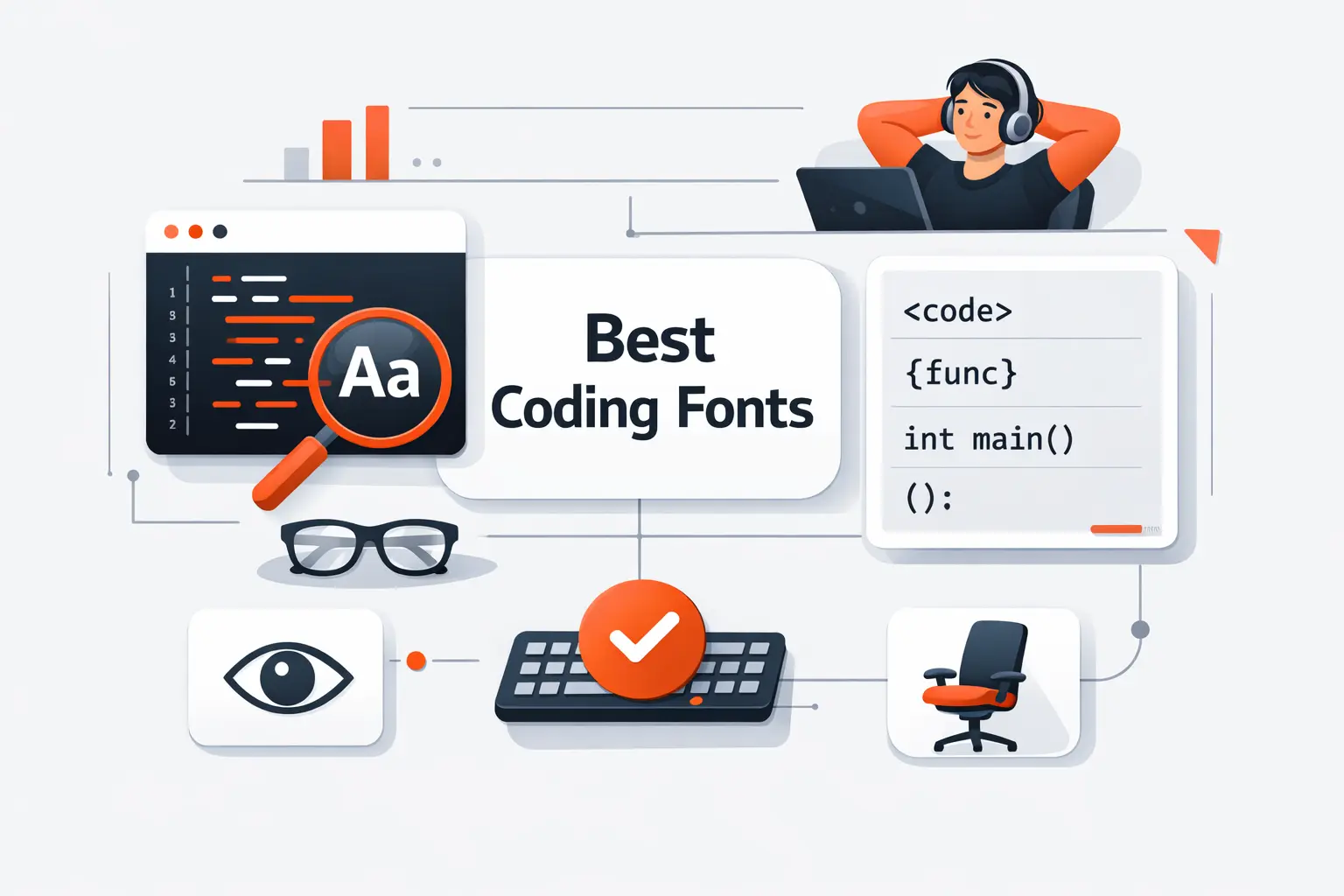
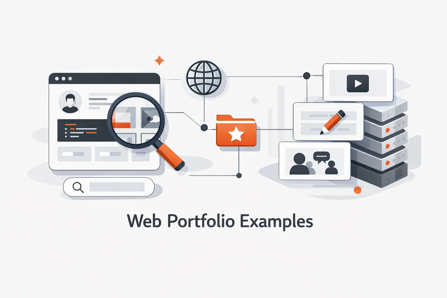
At Techtide Solutions, we think the best web developer portfolio examples do one job above all else. They make it obvious what kind of work you should trust that person with. We reviewed these sites for clarity, proof of skill, ease of navigation, and whether motion helped the story or got in the way.
That is why Bruno Simon’s portfolio works for one goal and Brittany Chiang’s works for another. Bruno turns navigation into a playable demo, while Brittany strips the experience down to sharp positioning, accessible structure, and clean project proof. Both are excellent. They just solve different hiring problems.
Quick Comparison of Web Developer Portfolio Examples
That bar matters because the field is crowded. Statista projected the global developer population would reach 28.7 million in 2024, so a portfolio now has to do more than list tools. It has to frame judgment.
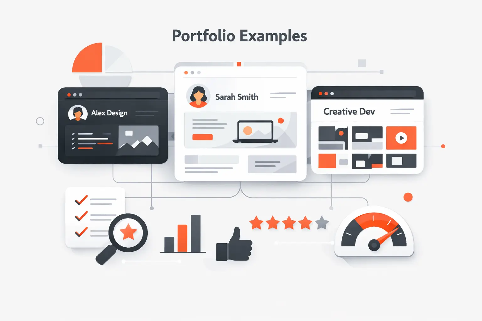
We would not copy any of these sites whole. We would borrow the pattern that matches the work we want. This table is the fastest way to sort the first ten examples by style, audience, and likely trade-offs.
| Tool | Best for | From price | Trial/Free | Key limits |
|---|---|---|---|---|
| Bruno Simon | Creative developers | Free | Free to view | Heavy 3D, slower scan |
| Brittany Chiang | Front-end roles | Free | Free to view | Visually restrained |
| Jesse Zhou | 3D portfolio inspiration | Free | Free to view | Load-first experience |
| Charles Bruyerre | Hybrid creatives | Free | Free to view | Lighter case-study depth |
| Cassie Codes | Motion specialists | Free | Free to view | More hub than portfolio |
| Jhey Tompkins | Design engineers | Free | Free to view | Lean project depth |
| Monica Dinculescu | Creative engineers | Free | Free to view | Less corporate polish |
| Lynn Fisher | Brand-led portfolios | Free | Free to view | Depth hides in archive |
| Adham Dannaway | Designers who code | Free | Free to view | More design-led |
| Dustin Brett | Experimental builders | Free | Free to view | Not a quick skim |
Top 20 Web Developer Portfolio Examples to Learn From
Below, we break down what each example actually teaches. We focus on outcomes, not just looks, because a great portfolio should help a recruiter, client, or collaborator say “I get it” fast.
1. Bruno Simon
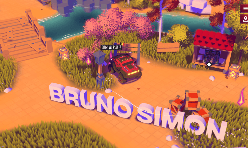
We see Bruno Simon’s site as a solo creative-developer portfolio built like a small game world. The homepage asks visitors to drive around to discover his work, which instantly tells us what kind of browser craft he wants to be known for.
Best for: creative developers aiming at interactive agencies, and front-end engineers who want to show serious 3D range.
- Drivable 3D world and signposted scenes → visitors grasp the style before they read a bio.
- Play-first navigation → the portfolio itself becomes the proof, not just a container for screenshots.
- Controls, map cues, and playful interactions → people understand the core idea quickly.
Pricing & limits: Free to browse. No trial, because this is a public portfolio. The limit is the public slice of the work and whatever depth the visitor chooses to explore.
Honest drawbacks: The same thing that makes this site famous also makes it risky. It asks for time, motion tolerance, and a decent device. If we were applying for a plain enterprise dashboard role, we would not copy this format.
Verdict: If you want to prove creative coding depth, this helps you do it upfront. It beats almost any portfolio on memorability, but trails minimalist sites on scan speed.
2. Brittany Chiang
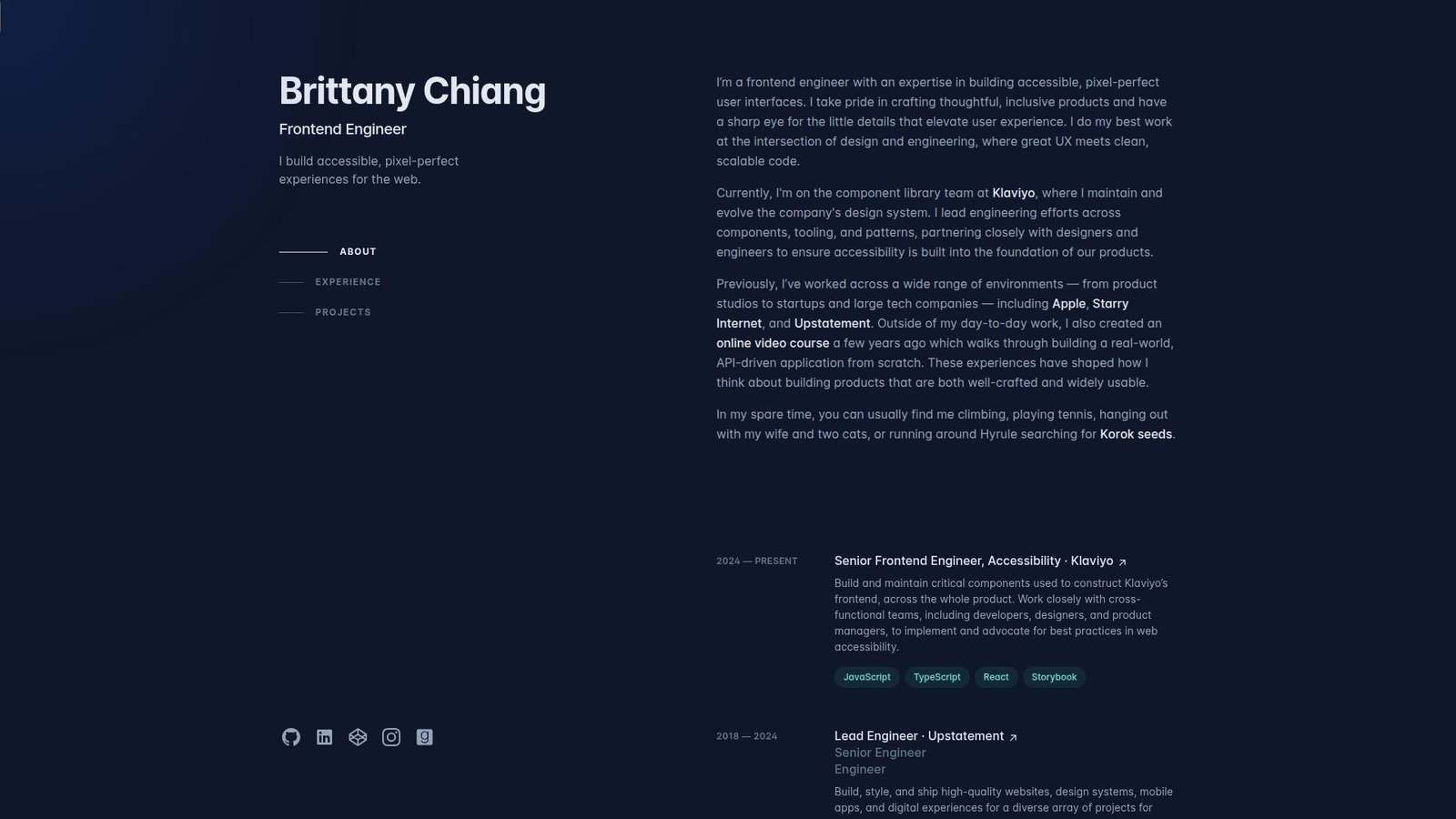
We read Brittany Chiang’s site as a mature front-end portfolio built around accessible structure, crisp project proof, and clean hierarchy. Nothing feels wasted. That restraint is the point.
Best for: front-end engineers pursuing product teams, and hiring managers who want clean evidence fast.
- Single-page structure with About, Experience, and Projects → a reviewer can scan the story in one pass.
- Clear project archive and outward proof paths → claims turn into proof without friction.
- Lean layout and strong typography → the value lands almost immediately.
Pricing & limits: Free to browse. No trial. The limit is that you only see selected public work, not every detail behind past roles or private projects.
Honest drawbacks: This portfolio is more restrained than flashy. If you need to sell motion, gaming, or experimental browser work, this style can undersell that side of you.
Verdict: If you want recruiters to understand your front-end strength without delay, this helps you do it in a short scroll. We would copy this structure before we copied its color palette.
3. Jesse Zhou
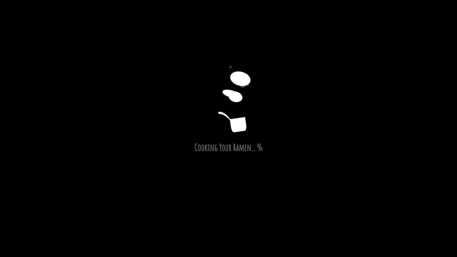
Jesse Zhou’s portfolio goes the immersive route. The site frames itself like a ramen-shop experience, which gives it far more personality than a standard gallery page. It is strange in a good way.
Best for: creative technologists chasing immersive work, and students who want to learn how a metaphor-driven portfolio can stick.
- Ramen-shop world building → the setting makes the site memorable before any project text appears.
- In-world project browsing → visitors explore the work instead of reading a flat project grid.
- Themed entry flow and strong visual idea → the portfolio feels authored, not assembled.
Pricing & limits: Free to browse. No trial. The limit is that the experience asks visitors to enter the world before they reach the facts.
Honest drawbacks: If a hiring manager wants your stack, role, and contact details in seconds, this approach can hide them behind the concept. That is the trade-off.
Verdict: If you want people to remember you after a stack of bland portfolios, this helps you do it in one visit. It beats plain sites on personality and trails them on speed.
4. Charles Bruyerre
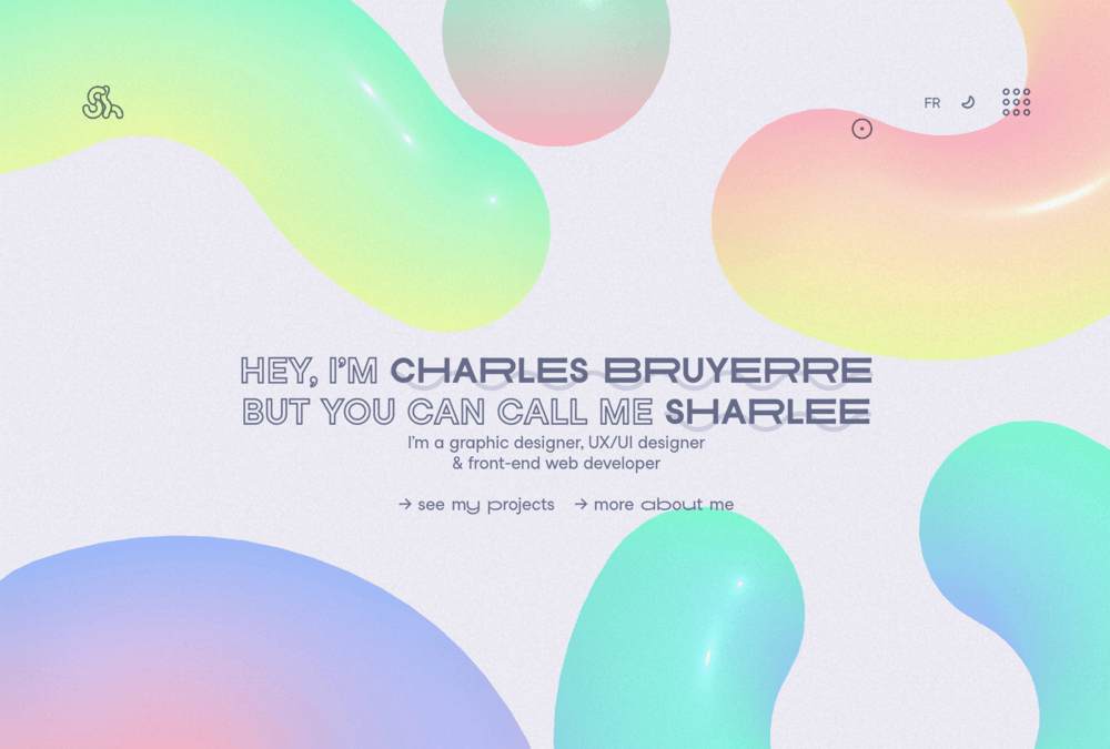
Charles Bruyerre, also known as Sharlee, presents himself as a graphic designer, UX/UI designer, and front-end web developer. We like that the site tells us he is a hybrid creative right away, then gives us clean paths to work, about, and contact.
Best for: hybrid designer-developers, and freelancers who need to show both visual taste and front-end ability.
- Clear identity stack across design and development → visitors understand the mixed skill set at once.
- Bilingual toggle and simple menu → the site removes friction for a broader audience.
- Direct project and about links from the hero → people reach the next step fast.
Pricing & limits: Free to browse. No trial. The limit is case-study depth. The homepage sells the person well, but it gives less immediate project detail than the strongest archives on this list.
Honest drawbacks: The site leans on presence more than proof on the first screen. If we were hiring for a very technical role, we would still want deeper build stories.
Verdict: If you want a creative portfolio that stays understandable, this helps you frame a hybrid brand quickly. We think it is a smart middle ground between plain and theatrical.
5. Cassie Codes
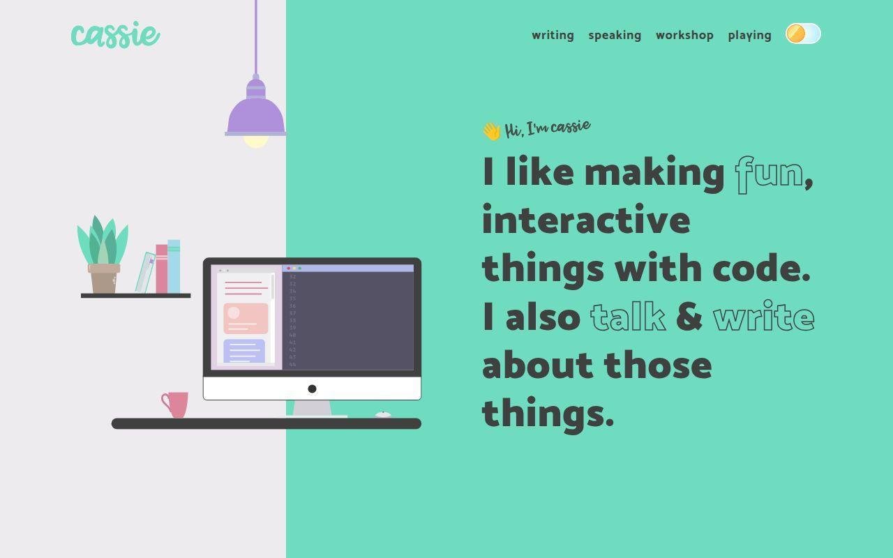
Cassie Codes feels less like a formal portfolio and more like a living home base for a front-end educator. The site routes visitors into writing, speaking, workshops, and playful code work, which is a strong signal if thought leadership is part of your brand.
Best for: SVG and animation specialists, and developer advocates who want authority more than agency polish.
- Writing, speaking, and workshop sections → visitors see proof of expertise from several angles.
- Playful demo trail → the site proves curiosity instead of just claiming it.
- Friendly copy and direct contact language → the tone feels approachable right away.
Pricing & limits: Free to browse. No trial. The limit is that it behaves more like an expert hub than a classic case-study portfolio.
Honest drawbacks: If you need to sell enterprise product work or large app delivery, the emphasis on talks and articles may tilt the story toward education.
Verdict: If you want to build trust as a front-end specialist, this helps you do it within a few clicks. It beats many portfolios on voice, and trails the best case-study sites on project framing.
6. Jhey Tompkins
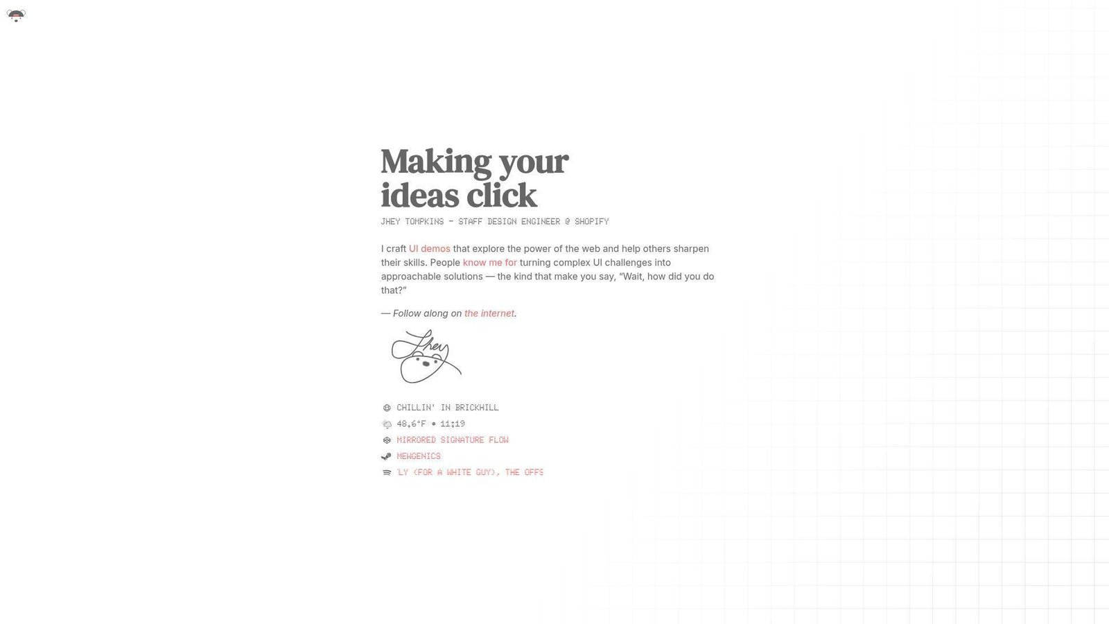
Jhey Tompkins keeps his site sharp and compact. The hero tells us what he does in a few words, which is excellent positioning. We know the lane before we scroll.
Best for: design engineers, and front-end developers who want a strong personal brand without a long scroll.
- Instant role statement and value proposition → visitors know what he does at a glance.
- Demo-led identity → the portfolio points toward proof instead of padding.
- Minimal landing experience → time-to-first-value is almost immediate.
Pricing & limits: Free to browse. No trial. The limit is depth on the landing page. If you want long case studies, you have to follow the trail outward.
Honest drawbacks: This format favors reputation and demos. Someone earlier in their career may need more project context and less mystique.
Verdict: If you already know your niche, this helps you plant a flag fast. We like it more as a positioning lesson than as a template for beginners.
7. Monica Dinculescu
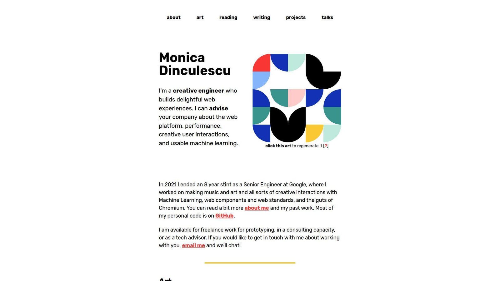
Monica Dinculescu’s site blends consulting, art, writing, and side projects in a way only a seasoned creative engineer can pull off. It feels personal, curious, and technically confident without trying too hard.
Best for: creative engineers, and senior consultants who want a portfolio with real personality.
- Generative art on the homepage → the site demonstrates experimentation before the pitch starts.
- Clear routes to projects, talks, writing, and consulting → visitors can self-sort with ease.
- Direct availability language → prospects can answer “can I hire this person?” very quickly.
Pricing & limits: Free to browse. No trial. The limit is that the experience is intentionally personal and unconventional, so it may not map neatly to a standard recruiter checklist.
Honest drawbacks: If we were applying to a conservative in-house role, we would pair a site like this with a more explicit résumé or project summary.
Verdict: If you want to signal taste, depth, and range, this helps you do it in one session. It beats corporate-safe portfolios on character and trails them on predictability.
8. Lynn Fisher
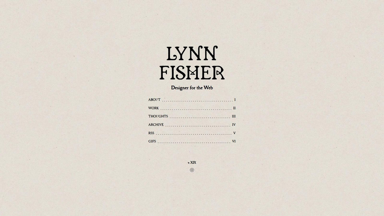
Lynn Fisher’s portfolio works because it feels authored. The homepage is lean, the archive adds depth, and the overall brand feels like a body of work rather than a static business card.
Best for: designer-developers, and personal-brand builders who want the site itself to be part of the portfolio.
- Archive-first thinking → older versions of the site become proof of range, not clutter.
- About, Work, Thoughts, and Archive structure → visitors can move from current taste to deeper history.
- Strong voice and memorable domain → the brand lands almost instantly.
Pricing & limits: Free to browse. No trial. The limit is that some of the richest context lives in the archive, so a fast skimmer may miss how much range is there.
Honest drawbacks: This model asks for upkeep. If we copied the yearly-refresh idea and then abandoned it, it would backfire.
Verdict: If you want your portfolio to age like a body of work instead of a frozen page, this helps you build that pattern over time. We think it is one of the best lessons in long-term personal branding.
9. Adham Dannaway
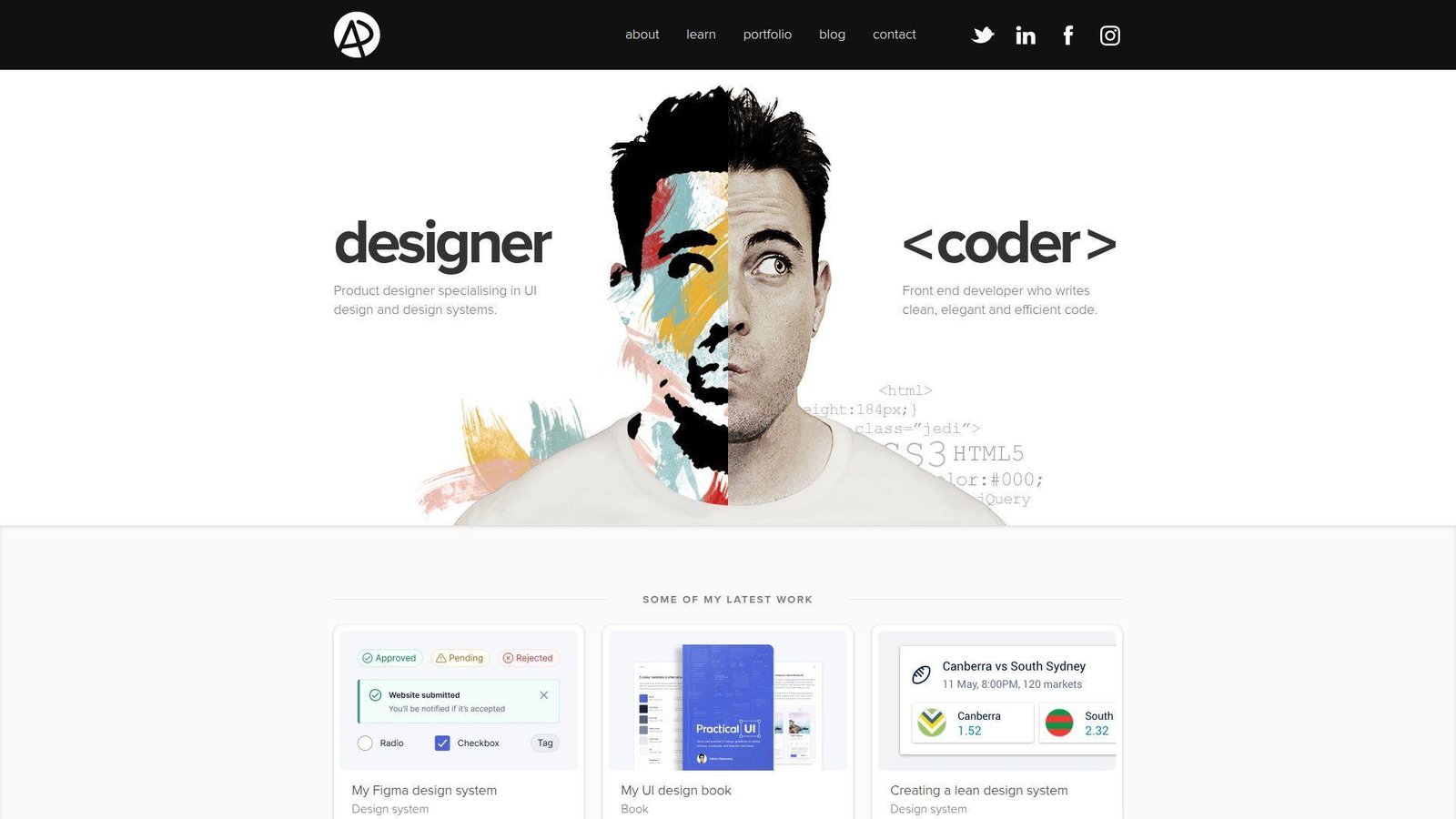
Adham Dannaway’s site is one of the clearest positioning plays in this list. The hero splits him into designer and coder, which answers a common hiring question very fast. That is still smart.
Best for: product designers who code, and freelancers who need to sell dual strengths.
- Split-screen designer-versus-coder framing → buyers understand the offer without reading a long bio.
- Latest work, learning content, and contact paths → the site supports both leads and credibility.
- Simple information architecture → visitors understand the structure right away.
Pricing & limits: Free to browse. No trial. The limit is that the site leads with positioning more than deep technical proof.
Honest drawbacks: The famous split concept can feel familiar now. If we copied it directly in 2026, we would risk looking derivative.
Verdict: If you need to explain a hybrid design-and-build offer, this helps you do it on the first screen. It beats most portfolios on clarity and trails the best developer-first sites on technical proof.
10. Dustin Brett

Dustin Brett’s site is not really a site in the normal sense. It behaves like a browser desktop, which makes it unforgettable as an engineering flex. We remember the concept long after we leave it.
Best for: systems-minded engineers, and experimental front-end builders who want one flagship project to carry the story.
- Full desktop metaphor in the browser → visitors understand the ambition before they open anything.
- Project-as-platform approach → the site proves engineering range instead of listing it.
- Familiar windows and menu patterns → the unusual concept still feels usable.
Pricing & limits: Free to browse. No trial. The limit is obvious. This is a huge concept piece, not a quick recruiter skim.
Honest drawbacks: If we wanted to highlight consulting, collaboration, or shipped client outcomes, a browser desktop would not do that job by itself.
Verdict: If you want one project to prove deep front-end ambition, this helps you do it in a single session. It beats almost everyone here on audacity and trails simple portfolios on clarity.
11. Tamal Sen
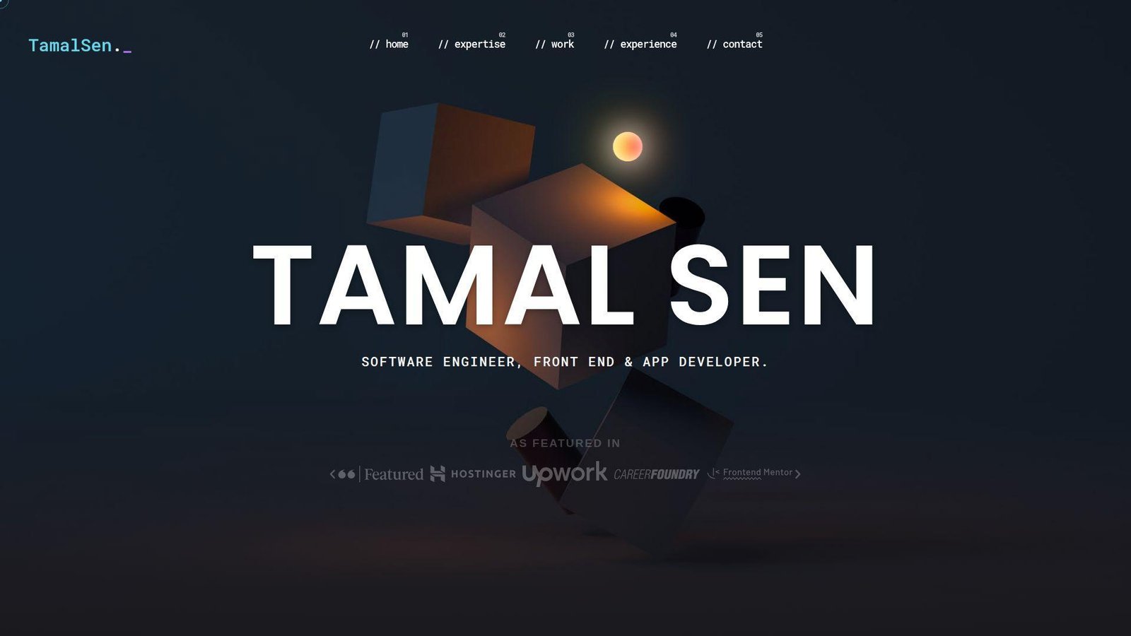
Tamal Sen’s site reads like a serious freelancer portfolio with strong delivery proof. It covers expertise, work, experience, testimonials, and a clear contact path without hiding the business angle.
Best for: freelance front-end developers, and clients who want proof that a solo builder can ship across web and mobile.
- Expertise, work, experience, and contact sections → buyers can move from claim to proof in one scroll.
- Featured projects plus testimonials → trust builds before the call starts.
- Visible availability and direct contact options → prospects can act fast when ready.
Pricing & limits: Free to browse. No trial. The limit is that the site leans more toward lead generation than editorial storytelling.
Honest drawbacks: There is a lot on the page, and the presentation feels more service-led than sharply curated.
Verdict: If you want a portfolio that can also sell freelance work, this helps you do it quickly. We would borrow its trust signals, then tighten the project curation.
12. Olaolu Olawuyi
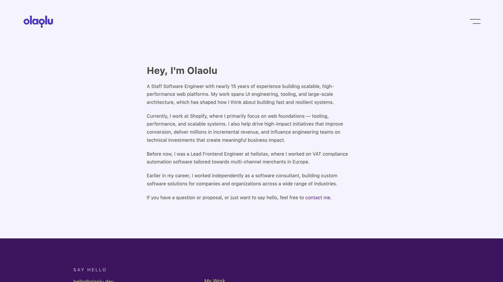
Olaolu Olawuyi’s site is a good example of senior positioning without noise. The message is focused, the navigation is spare, and the tone says confidence instead of performance.
Best for: senior and staff engineers, and performance-minded web specialists who do not need visual theater.
- Direct statement of seniority and focus → the right audience qualifies him almost immediately.
- Work, résumé, and contact paths → reviewers can verify background with little effort.
- Minimal interface → the value lands very fast.
Pricing & limits: Free to browse. No trial. The limit is visual depth. If you want motion design, brand play, or dense case-study visuals, this site is intentionally spare.
Honest drawbacks: Junior developers cannot borrow this formula blindly. Senior credibility is doing a lot of the work here.
Verdict: If you want to look experienced, focused, and low-drama, this helps you do it in seconds. It beats flashy portfolios on authority and trails them on spectacle.
13. Matt Farley
Matt Farley’s site is one of the clearest all-around examples for people who do more than one thing. It balances design, front-end work, mentorship, client projects, and startup energy without turning messy.
Best for: early-to-mid career designer-developers, and freelancers who also sell guidance or mentoring.
- Three-role structure across design, code, and mentorship → visitors understand the full offer clearly.
- Client work and self-started products → the site shows both paid delivery and initiative.
- Strong contact prompt and simple layout → people can act quickly once convinced.
Pricing & limits: Free to browse. No trial. The limit is that the presentation is broad rather than ultra-specialized.
Honest drawbacks: The visuals are calmer than the creative-heavy sites in this list. If you want wow-factor, this is not that template.
Verdict: If you need a dependable portfolio that can appeal to clients and recruiters, this helps you do it in one scroll. We think it is one of the safest examples to learn from.
14. Keita Yamada

Keita Yamada’s site is a portfolio for people who treat the web as a creative medium, not just a delivery channel. It feels deliberate, experimental, and protective of original craft.
Best for: creative developers targeting fashion, culture, or studio work, and anyone building a strong visual identity.
- Project-heavy presentation → the work feels like a gallery, not a résumé grid.
- FAQ on tools and code policy → common questions get answered without extra messages.
- Theme controls and polished interaction choices → the craft is obvious from the first visit.
Pricing & limits: Free to browse. No trial. The limit is that the site is more guarded than open-source-friendly, which will not suit every audience.
Honest drawbacks: The style can overpower the hiring basics. Some visitors will remember the mood before they remember the service offer.
Verdict: If you want to show distinct taste and protect original work, this helps you do it right away. It beats safer portfolios on identity and trails open-source portfolios on transparency.
15. Cyd Stumpel
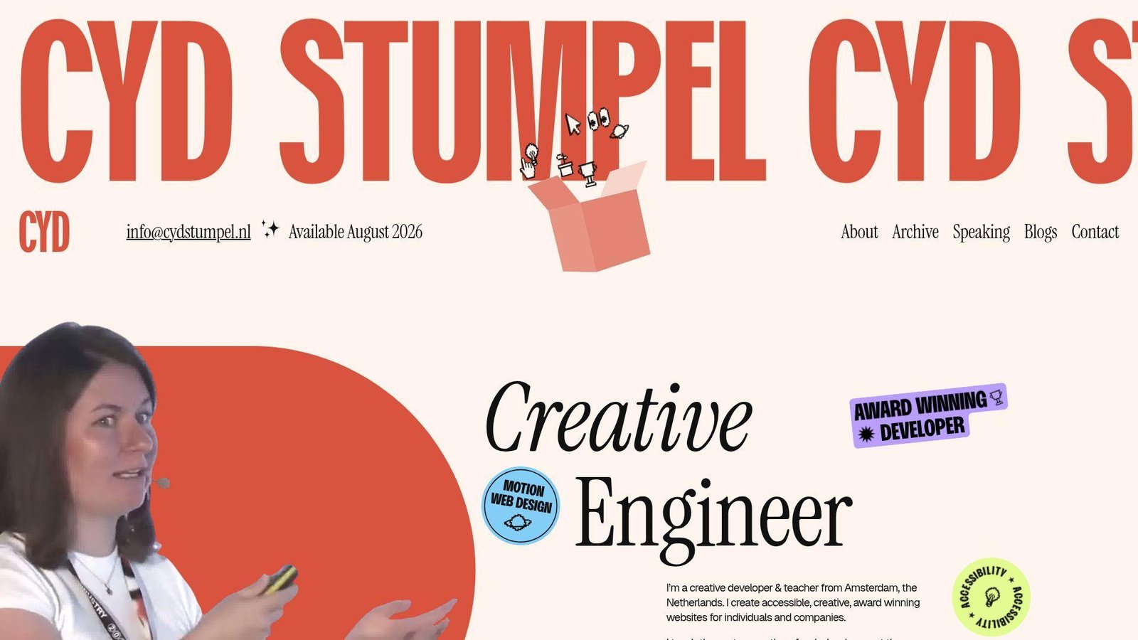
Cyd Stumpel’s portfolio blends creative-development credibility with teaching, speaking, and accessibility work without feeling scattered. That balance is harder than it looks.
Best for: accessibility-minded creative developers, and speakers or educators who still want a strong client-facing site.
- About, work, speaking, blogs, and contact routes → different audiences can find their lane fast.
- Teaching and speaking alongside client work → authority builds beyond project screenshots alone.
- Availability note and clear contact path → prospects can qualify fit very quickly.
Pricing & limits: Free to browse. No trial. The limit is visual density. A fast-moving recruiter may need more than one pass to absorb it.
Honest drawbacks: This structure works best when you truly have several public dimensions. If we were still junior, it would feel like overkill.
Verdict: If you want a portfolio that sells skill, thought leadership, and accessibility values together, this helps you do it in one visit. We rate it highly for breadth with purpose.
16. Seán Halpin
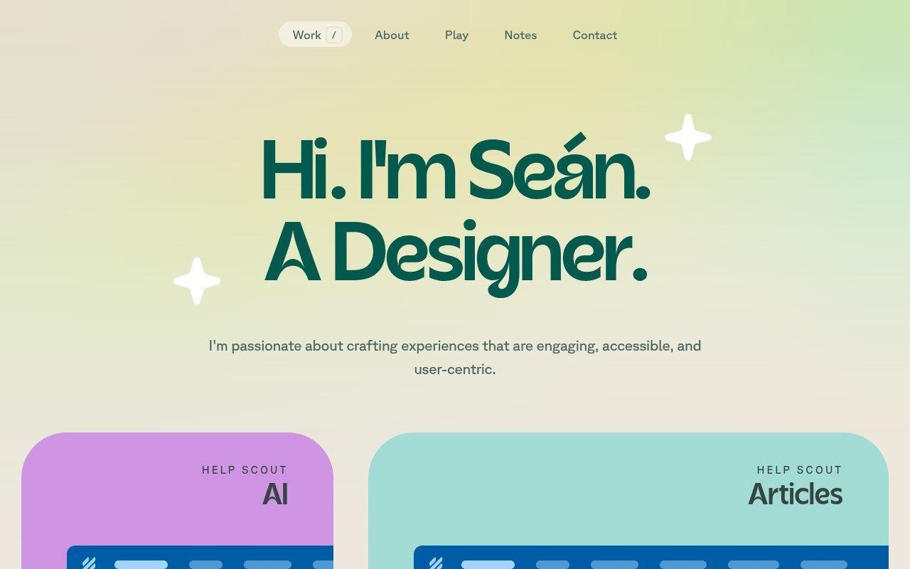
Seán Halpin’s portfolio footprint feels refined and product-minded. The site identity is clear, the taste level is high, and the overall impression is that of a designer who also likes building useful tools.
Best for: product designers, and indie builders who want side projects to strengthen the main narrative.
- Portfolio plus tool-builder energy → visitors see employed craft and self-directed making in the same brand.
- Side-project flavor around design tools and experiments → the site answers “what do you build on your own?”
- Minimal presentation → the story feels polished very quickly.
Pricing & limits: Free to browse. No trial. The limit is engineering detail. If you are judging raw front-end implementation depth, the story leans more toward product design.
Honest drawbacks: Some of the best context sits in the wider project footprint, not only in the homepage impression. That means the portfolio relies on taste and trust more than explicit explanation.
Verdict: If you want a portfolio that feels refined and product-minded, this helps you make that case fast. We would study its mix of portfolio work and side tools.
17. Ram Maheshwari
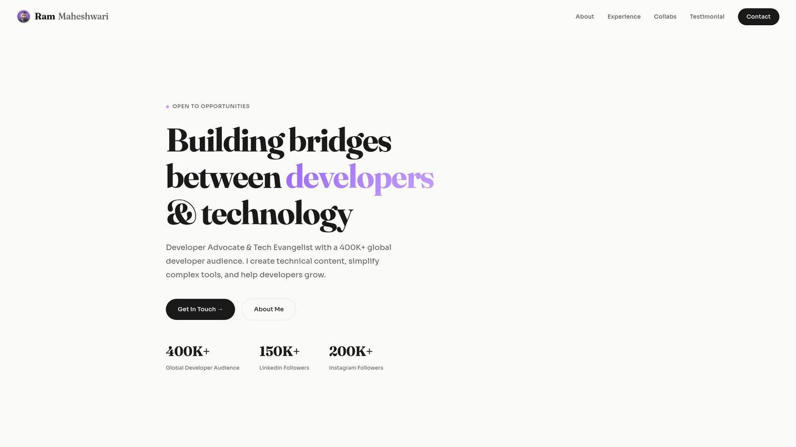
Ram Maheshwari’s site is a portfolio built for the developer-education era. It combines collaborations, testimonials, technical content, and hand-coded projects in a way that feels commercially aware.
Best for: developer advocates, and front-end creators who want content and code to reinforce each other.
- About, experience, collaborations, testimonials, and projects → the site gives multiple proof layers.
- Featured content plus hand-coded work → visitors can judge teaching ability and implementation skill together.
- Strong contact cue and simple navigation → the main value is clear in a short scroll.
Pricing & limits: Free to browse. No trial. The limit is that the site can read more like a creator-business portfolio than a pure engineering portfolio.
Honest drawbacks: Audience growth and brand work can overshadow deeper project case studies if you let them. We would keep the coding proof close to the top.
Verdict: If you want to show that you can teach, build, and partner with brands, this helps you do it fast. It beats many portfolios on commercial clarity.
18. Adam Hartwig
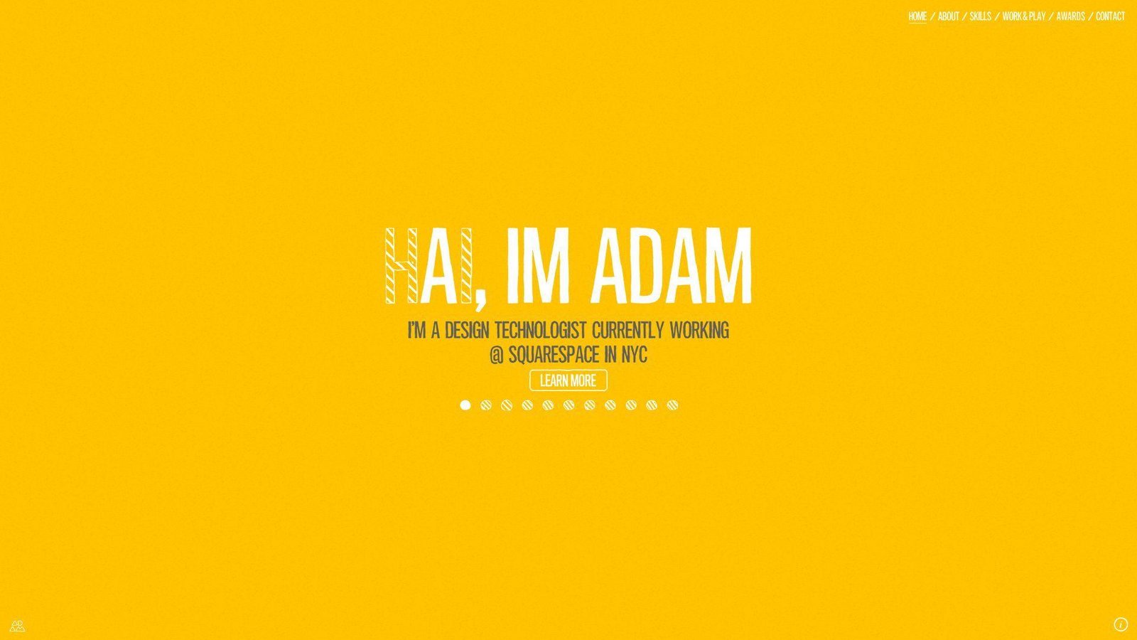
Adam Hartwig’s site feels like the portfolio of a design technologist who enjoys rich interactions and cross-device ideas. It sells experience work, not just page layouts.
Best for: design technologists, and agency creatives pitching immersive marketing or interaction-heavy work.
- Featured projects and interactive presentation → the site signals motion and interface ambition right away.
- Cross-device thinking → visitors understand that the work is meant for more than one context.
- Visible collaboration prompt → prospects reach the next step quickly.
Pricing & limits: Free to browse. No trial. The limit is freshness. Some patterns feel more like a classic award-site portfolio than a modern product case study.
Honest drawbacks: An immersive style can look dated if not maintained. We would borrow the confidence, not every interaction pattern.
Verdict: If you want to sell rich interactive craft, this helps you do it early in the visit. It beats minimalist portfolios on atmosphere and trails them on speed and simplicity.
19. Maxime Bonhomme
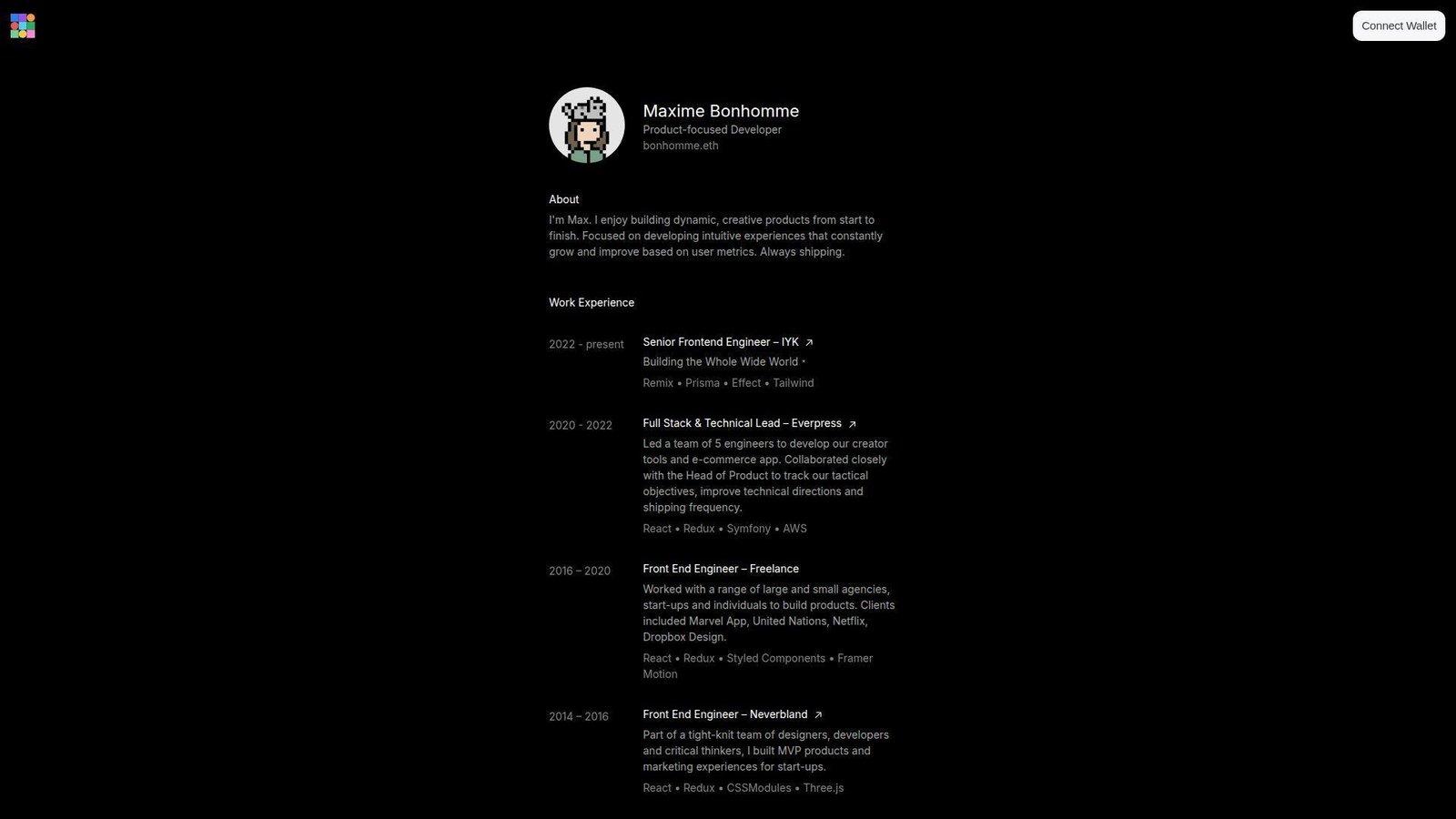
Maxime Bonhomme’s portfolio is stripped down but still distinctive. The copy is product-focused, the work history is clear, and the side projects make the whole thing feel current instead of sterile.
Best for: startup product engineers, and developers whose side projects are a real part of their brand.
- Product-focused opening copy → the site frames him as outcome-oriented, not framework-oriented.
- Work history plus side builds → visitors can compare paid product work with self-directed experimentation.
- Compact layout and strong link-out structure → the value lands fast.
Pricing & limits: Free to browse. No trial. The limit is narrative depth. The site gives strong signals, but less explicit storytelling than the best recruiter-first portfolios.
Honest drawbacks: If we wanted steady inbound leads, we would add a stronger direct CTA and more explanation around selected wins.
Verdict: If you want a concise site that still feels modern and product-minded, this helps you do it in a few scrolls. We like it best as a lesson in selective restraint.
20. Brice Clain
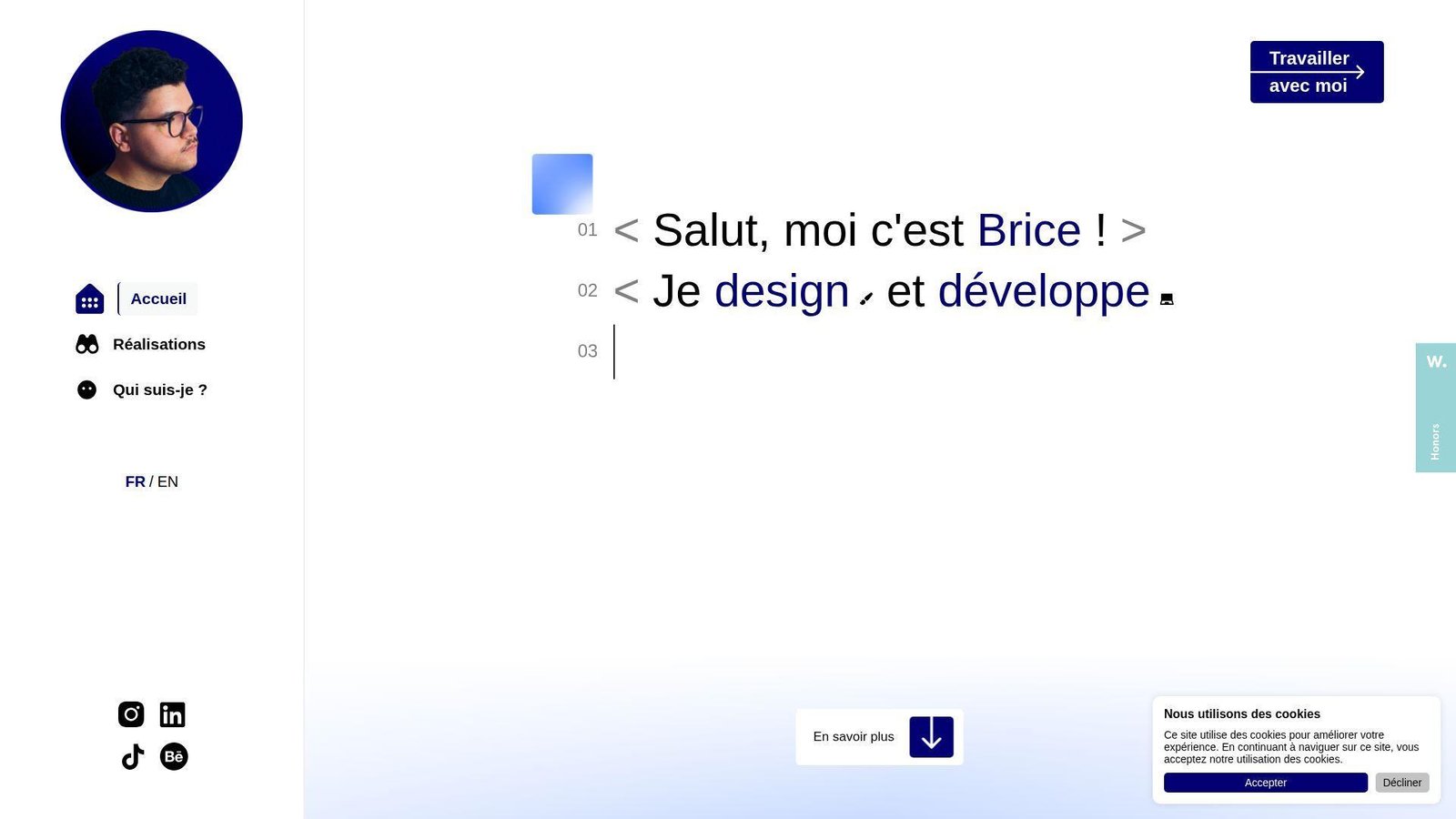
Brice Clain’s portfolio is refreshingly client-facing. It explains process, shows work, adds testimonial proof, and answers practical buying questions. That makes it unusually useful for real-world lead generation.
Best for: freelance web designers and developers, and small businesses comparing service providers.
- Process-led storytelling from idea to launch → clients can picture how a project would move, not just how it would look.
- Pricing, CMS handoff, and support language → common buying questions get answered before the call.
- Bilingual option and visible contact details → the site becomes useful very quickly for a broad audience.
Pricing & limits: Free to browse. No trial. The limit is that the experience is closer to a freelance-service showcase than a pure developer portfolio.
Honest drawbacks: The presentation is more agency-style and more text-led. Developers applying to in-house engineering teams may want a clearer code or GitHub layer.
Verdict: If you want a portfolio that also acts like a sales page, this helps you move prospects toward contact fast. We think it is one of the most commercially useful examples here.
What Strong Web Developer Portfolio Examples Get Right
McKinsey’s 2024 technology analysis looked at 4.3 million job postings and still found broad shortages in experienced tech talent. Our read is simple. Good employers are scanning for signal, not noise.
After reviewing all 20, we kept seeing the same patterns. Strong web developer portfolio examples do not just look polished. They reduce doubt.
Show, Not Tell, With Real Work
We trust portfolios more when the site itself proves the claim. Bruno Simon and Jesse Zhou turn navigation into the work sample, while Brittany Chiang and Matt Farley use calmer layouts with clear project proof. Different styles, same lesson. Make the proof visible early.
Our rule is simple. If we cannot tell what you are good at without reading a long bio, the portfolio is underperforming.
Clear Navigation, Contact Paths, and Calls to Action
Strong sites make next steps obvious. Brittany, Charles, Matt, and Ram all give visitors a visible route to projects, background, or contact, which lowers friction for both recruiters and clients.
We would rather see one clear contact path than three stylish but vague buttons.
Specific Skill Positioning for Front-End, Back-End, or Full-Stack Work
The best examples claim a lane. Adham splits design and code, Olaolu states senior web-engineering depth, and Tamal flags front-end plus app work right in the opening section. That specificity helps the right buyer self-select.
Generic labels like “full-stack developer” are fine, but they are not enough on their own. Add context, domain, or type of outcome.
Clear Personal Branding Through Color, Typography, and Domain Names
Names, domains, and visual voice carry more weight than many developers think. Domains like meowni.ca, lynnandtonic.com, bonhomme.lol, and p5aholic.me feel memorable because they sound like people, not placeholder brands.
We do not mean everyone needs a quirky domain. We mean the brand should feel intentional.
Motion and Interactivity That Support the Experience
Motion works when it reveals skill or structure. Bruno, Jhey, Cyd, and Dustin use interaction as part of the story, while Adham uses it more as framing. In each case, the better examples keep motion tied to the job they want.
When animation slows discovery or hides the CTA, we think it has crossed the line from support to distraction.
Personal Projects, Blogs, and Side Experiments That Add Depth
Side projects add depth because they show taste without client constraints. Cassie’s writing and demos, Monica’s small projects, Seán Halpin’s tool-builder footprint, and Maxime Bonhomme’s side builds all show how these people think when nobody hands them a brief.
If we had to choose between ten weak client thumbnails and two thoughtful side projects, we would take the side projects every time.
How to Build a Web Developer Portfolio That Works
Inspiration is useful, but only if you translate it into choices. If we were building a new portfolio from scratch this week, here is the order we would follow.
Choose Reliable Hosting and a Memorable Domain Name
We would buy a short, memorable domain first and choose hosting we trust to stay fast. A name like lynnandtonic.com or bonhomme.lol does part of the branding work before the page even loads. Then we would keep deployment boring and stable. Fancy animation cannot rescue slow hosting.
Keep the Site Fast, Responsive, and Easy to Scan
We would optimize for scan speed before touching animation. Compress images, lazy-load heavy media, keep headings short, and make the first screen obvious on mobile. Even the most experimental sites here work best when the visitor can understand the offer quickly.
List Specialized Skills, Experience, and Certifications
We would write one sharp positioning line near the top. “Frontend engineer,” “creative developer,” or “product-focused developer” works when it is followed by context. A vague tool dump does not. Buyers want to know where to place you.
Curate Your Best Projects, Open-Source Work, and Side Projects
We would show fewer projects and explain them better. Pick the work that proves the kind of job you want next, not every job you have ever touched. A focused archive beats a cluttered gallery every time.
Add Testimonials, Social Proof, and a Clear Contact Form
We would add social proof only if it reduces doubt. A short testimonial, a recognizable client, or a visible collaboration can help. Tamal and Brice do this well because the proof is tied to real buying questions.
Include GitHub Links, Live Demos, and a Downloadable Resume
We would link live demos, public code, and a downloadable résumé when possible. Brittany, Ram, and Bruno all make it easier to move from claim to proof, even though they do it in very different styles.
How to Present Projects With Case Studies, Screenshots, and Code Samples
Project presentation is where many decent portfolios fall apart. The build may be strong, but the explanation is weak. We recommend treating every featured project like a tiny case study.
Turn Projects Into Short Case Studies
We would give each project a short story arc. A tight summary, a few visuals, your role, and the outcome usually beat a wall of tools. Brittany’s archive and Brice’s process-led examples point in the right direction.
Lead With the Goal, Problem, and Outcome
Start with why the project existed. Was the goal to drive leads, test a 3D interaction, ship a marketing site, or improve internal UX? If we have to dig for the problem, the work feels less credible.
Clarify Your Role in Design, Development, and Delivery
Be blunt about ownership. Say whether you handled design, front-end, back-end, motion, deployment, or team coordination. This matters most on agency work, collaborative products, and proprietary client projects.
Use Live Links, Screenshots, and Screencasts Strategically
We use live demos when the experience is the point, screenshots when the flow matters, and short screencasts when motion tells the story better than stills. Jesse, Bruno, and Dustin are strong reminders that some work has to be experienced, not merely described.
Share Public Code Samples and Explain Private Work Limits
If code is public, say so and link it. If it is private, explain why and show what you can. Keita handles this directly, and that honesty is better than pretending nothing is missing.
Focus on Results, Not Just Tools
We care less about whether you used React or Svelte and more about what changed. Did you sharpen the brand, improve usability, prove an animation skill, or make a service easier to buy? Tools matter, but outcomes close the loop.
Where to Find More Web Developer Portfolio Examples
Once you study a dozen strong portfolios, patterns show up fast. The trick is keeping your inspiration pool wide enough that you do not accidentally clone one trend.
Start With Curated List Articles
We still start broad when we want to spot current patterns, and a useful shortcut is this March 2025 portfolio inspiration roundup because it mixes clean engineering portfolios with louder creative ones.
Browse Community Portfolio Collections
After that, we like a community-fed gallery such as a curated collection of the best portfolio websites because it lets us scan across roles instead of staying trapped in one visual niche.
Study Award-Winning Portfolio Galleries
If we want to see where motion, storytelling, and unusual navigation are heading, we browse Developer Award entries and portfolio honors. The key is to study the ideas, not copy the surface treatment.
Save Layout and Interface Ideas From Design Galleries
For calmer layout inspiration, we use portfolio website inspiration galleries to compare grids, menus, copy density, and visual tone without the pressure of an awards score.
Compare Personal Sites With Agency and Studio Portfolios
We also recommend comparing solo portfolios with agency and studio sites. Personal portfolios teach voice. Studio portfolios teach structure, hierarchy, and how to package work for buyers who are in a hurry.
Web Developer Portfolio FAQ

These are the questions we hear most when clients ask us to review or rebuild a developer portfolio.
What Is a Web Development Portfolio?
We think of a web development portfolio as a small proof system. It should show what you build, how you think, and what kind of work you want next. A résumé lists experience. A portfolio makes that experience believable.
What Should a Web Developer Portfolio Include?
We would include a sharp intro, a few strong projects, clear role descriptions, some proof of credibility, and an easy contact path. If code or demos are public, include them. If they are private, explain the limits plainly.
What Does a Strong Coding Portfolio Look Like?
To us, a strong coding portfolio feels specific. It does not try to impress everyone. It helps the right reader understand your niche, see real work, and take the next step without friction.
How Many Projects Should a Web Developer Portfolio Show?
We prefer a small set of strong projects over a long list of average ones. Once the reader sees a pattern in your skills, more thumbnails rarely help. Depth usually beats volume.
Should a Web Developer Portfolio Include Source Code?
Yes, when it strengthens trust and does not create legal trouble. Public code is helpful for product builders and open-source contributors. It is less critical if the job you want depends more on outcomes than repo polish.
How Can Developers Present Proprietary Client Work?
We recommend describing the goal, your role, the constraints, and what changed, even if you cannot show code or raw data. Screenshots, process notes, and sanitized visuals can still tell a strong story.
Do Personal Projects Belong in a Web Developer Portfolio?
Absolutely. Personal projects often show taste, curiosity, and initiative better than client work. Just make sure the project proves a relevant skill instead of existing only as filler.
How TechTide Solutions Helps Build Custom Portfolio and Web App Solutions
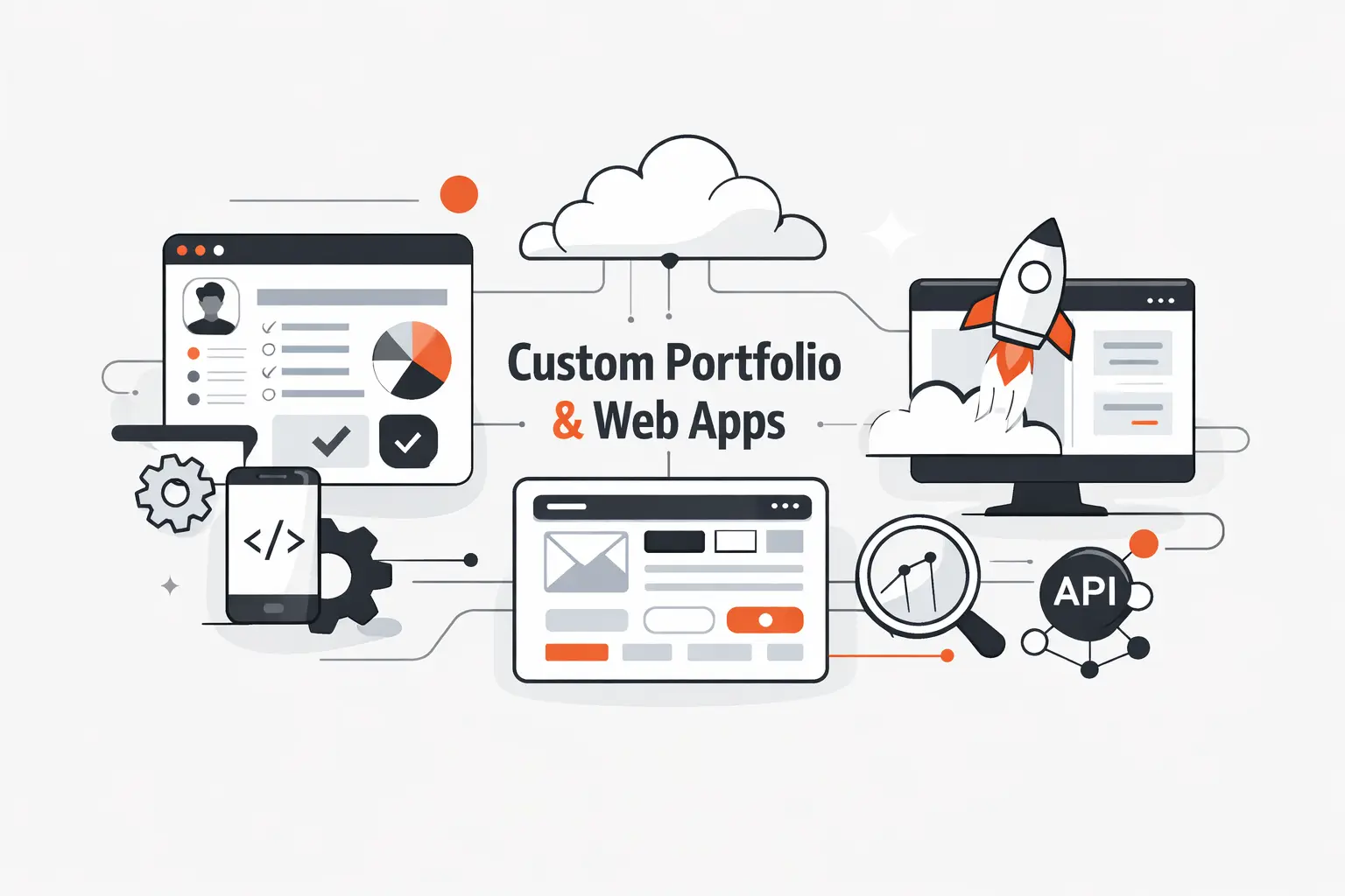
Sometimes the right answer is not a template tweak. It is a custom build that matches your brand, your workflow, and the kind of clients or employers you want to attract.
Custom Portfolio Websites Built Around Your Brand and Goals
At Techtide Solutions, we design and build portfolio sites around the story you actually need to tell. That may mean a restrained engineer portfolio, a design-engineering hybrid, or a richer interactive showcase. We start with positioning, then choose structure, copy, visuals, and motion to fit that goal.
Custom Software and Web App Features Tailored to Your Workflow
We also build the features that generic themes usually fake. That can include filtered case studies, gated client views, CMS-driven project publishing, résumé downloads, booking flows, or custom demo environments that show your product work in context.
Ongoing Development Support as Your Needs Change
Portfolios age fast. We help clients update project pages, refine copy, improve performance, and add new features as their needs change. That way the site stays useful after launch instead of turning into a frozen snapshot.
Conclusion: What to Take From These Web Developer Portfolio Examples
The biggest lesson from these web developer portfolio examples is simple. The best sites do not chase one style. They match format to goal. Brittany Chiang wins with clarity. Bruno Simon wins with immersion. Brice Clain wins with commercial usefulness. Each one knows who it is for.
If we were rebuilding our own portfolio tomorrow, we would pick one lane, cut the filler, and make the next step obvious. Are you trying to land interviews, win freelance leads, or prove creative range? Your answer should shape the site before you touch the homepage design.