Impact cycle data analytics is the discipline of taking an organization’s raw signals—transactions, events, support tickets, sensor readings, marketing touches, product telemetry—and turning them into decisions that change outcomes. At Techtide Solutions, we treat it less like a linear “reporting project” and more like an operating rhythm: Identify the question, Plan and master the data, Analyze and provide meaning, Communicate insights, and Track outcomes—then repeat with sharper questions.
What impact cycle data analytics is and why organizations struggle to act on data
1. From “drowning in data” to understanding and action
Market reality check: Gartner reports the overall data and analytics software market grew by 13.9% to $175.17 billion in 2024, while Statista forecasts the global big data market is forecasted to grow to 103 billion U.S. dollars by 2027. In other words, plenty of money is moving, tools are proliferating, and yet “why don’t we act?” is still the most common question we hear after a dashboard rollout.
Operationally, the struggle rarely comes from missing data alone. Bottlenecks usually show up in translation (what does the business truly want?), trust (do people believe the numbers?), and follow-through (who changes what, by when, and how do we know it worked?). Without a cycle that forces decisions, analytics becomes a museum: polished artifacts, low foot traffic, no measurable impact.
Why Tooling Growth Doesn’t Automatically Create Business Value
In our experience, analytics tooling scales faster than organizational clarity. New platforms make it easy to capture events, store logs, and spin up visualizations; far fewer organizations invest at the same rate in data contracts, ownership, and decision rights. When nobody can answer “who is accountable for this metric,” teams default to arguing definitions instead of improving operations.
2. The analyst as an analytical consultant and translator for the business
High-performing analytics teams behave less like “a ticket-fulfillment center” and more like internal consultants. Translation is the core skill: turning stakeholder language (“customers are upset”) into analytical language (“support contacts per active account increased and sentiment shifted after a workflow change”) and then back again into business action (“roll back the change, update the help center, instrument a new friction metric”).
Across projects, we notice an uncomfortable truth: stakeholders often ask for what they think analytics can do, not what they actually need. A sales leader may request “a churn model,” but the real need could be a tighter renewal workflow, faster escalation for at-risk accounts, or pricing clarity. Analytical consultants don’t just deliver outputs; they pressure-test whether the output is the lever.
Practically, that translator role requires fluency in systems and incentives. A data analyst who understands how CRM stages are manipulated for quota credit will ask different questions than someone who only sees the spreadsheet. Similarly, a product analyst who knows how event tracking breaks during mobile releases will design a more robust funnel definition than someone who assumes telemetry is pristine.
What “Consulting Mindset” Looks Like in Daily Work
- Framing conversations around decisions and trade-offs rather than charts and filters.
- Documenting assumptions explicitly, so debates become testable instead of political.
- Designing deliverables that survive handoff, because a living metric beats a heroic presentation.
3. Why “data is necessary but not sufficient” for business value
Data is necessary because modern operations are too complex to manage by gut feel alone. Data is not sufficient because value is created only when behavior changes: a pricing rule is updated, a workflow is redesigned, a feature is re-scoped, a supply plan is adjusted, or a risk control is strengthened. Without that last mile, the highest-quality analysis still behaves like an academic exercise.
Under the hood, the “not sufficient” part is often about system friction. If acting on insight requires a multi-team release, a procurement cycle, or a governance committee, insight decays while approvals accumulate. On the other side, when the action is easy—flip a feature flag, adjust a routing rule, update an onboarding email—analytics can become a compounding advantage.
From our vantage point, impact cycle analytics forces sufficiency by design: each loop ends with an action plan and an outcomes check. As soon as teams adopt that cadence, analytics stops being a passive mirror and becomes a steering wheel.
Recommended reading: What Is Big Data Analytics? Definition, How It Works, Tools, and Use Cases
Identify the question: define the business problem, scope, and hypotheses
1. SMART questions to avoid vague analytics and wasted effort
SMART questions are the antidote to analytics theater. Specificity matters because ambiguous questions produce ambiguous answers, and ambiguity gives organizations an excuse to do nothing. Measurability matters because action without measurement is just activity. Achievability and relevance matter because analytics can illuminate reality, but it cannot override constraints like staffing, procurement, compliance, and customer expectations. Time-bounding matters because open-ended analysis drifts into perfectionism.
Instead of “How do we improve retention?”, we prefer questions like: “Which onboarding steps correlate with activation, and where does the drop-off happen?” Rather than “What’s going on with revenue?”, we ask: “Which segment’s conversion changed after the latest pricing page update?” Notably, these are not merely narrower; they imply what action could look like if we find a pattern.
In our own delivery work, we treat the question as a product requirement. If the question cannot be stated in a way that implies a decision, we push back—politely, repeatedly, and with examples of how vague questions turn into months of unreconciled dashboards.
Question Design Heuristic We Reuse Constantly
One internal heuristic has saved us from countless dead ends: “If the analysis confirms the hypothesis, what will change on Monday?” If nobody can answer, the question is not ready. Another heuristic follows immediately: “If the analysis disproves the hypothesis, what will change on Monday?” When both paths lead to action, the analysis is worth the compute.
2. Clarifying stakeholder requests and setting expectations early
Stakeholder clarification is where trust is won or lost. Early in an engagement, we run a short discovery that captures the request in the stakeholder’s own words, then rewrites it as a decision statement and a measurement plan. Misalignment at this stage is expensive later, especially once people have emotionally committed to a narrative.
During expectation setting, scope is the pressure valve. Teams often want “the full picture,” but the full picture usually means integrating more systems than the timeline allows. A tighter scope, executed well, tends to unlock a repeatable cycle; a broad scope, executed partially, tends to create skepticism that analytics is “always late and never definitive.”
In practice, we also define what the analysis will not do. For example, a churn model will not replace customer success playbooks, and a dashboard will not resolve conflicting incentive structures. Clarity here prevents analytics from being blamed for organizational design problems.
Common Expectation Traps We Call Out Explicitly
- Assuming the dataset exists because the UI shows the field.
- Expecting prediction when the operational process is still unstable.
- Treating “real-time” as a requirement when daily cadence is enough for action.
3. Co-creating hypotheses with business partners to focus the analysis
Hypotheses are a focusing device, not a constraint. Co-creating them with business partners matters because the business holds context that data rarely captures: seasonality, policy changes, channel shifts, product releases, competitive pressure, or internal process updates. When hypotheses are built jointly, the analysis becomes a shared investigation rather than a verdict delivered from a statistical ivory tower.
From our perspective, hypothesis co-creation also reduces defensiveness. If a leader participates in forming the “what might be happening” list, they are less likely to reject the findings as “not what we expected.” Ownership shifts from the analyst to the group, and that shift is often the difference between action and debate.
Technically, hypotheses push teams to define variables precisely. “Support quality is down” becomes: response-time distribution shifted, resolution rate changed, or customer sentiment declined after a routing logic update. Once defined, these become testable, and testable questions are the fuel of the IMPACT cycle.
Recommended reading: What Is Data Structure? Meaning, Types, and Why It Matters in Programming
Plan and master the data: collection, preparation, and simple visualization
1. Planning what data you need and where it will come from
Planning is where analytics either becomes disciplined engineering or stays as spreadsheet improvisation. Before we touch a warehouse, we map the decision to the minimum viable dataset: which entities matter (customers, accounts, orders, sessions), which events define the process (signup, activation, purchase, refund), and which dimensions provide segmentation (channel, region, plan type). That mapping turns “we need data” into a specific extraction plan.
Architecturally, we pay special attention to identifiers. The fastest way to break analysis is to assume that user IDs, account IDs, and device IDs are interchangeable. A careful plan defines which ID is canonical for each use case and how identity resolution should work when records disagree.
On the sourcing side, we separate systems of record from systems of engagement. Financial ledgers and ERP systems tend to be authoritative for revenue and cost. Product analytics tools are authoritative for behavioral event streams. Support platforms capture operational friction. The plan’s job is to reconcile these realities without pretending everything is equally reliable.
Data “Bills of Materials” Beat Loose Requirements
Our favorite planning artifact is a data bill of materials: each field, its source, how it’s computed, its grain, and who owns it. That document looks boring, yet it prevents the more expensive boredom of endless metric-reconciliation meetings later.
2. Data collection from systems, tools, and feedback sources
Collection is where technical debt and organizational debt collide. APIs rate-limit, webhooks drop, exports truncate, and manual uploads drift. Meanwhile, operational teams create workaround fields, rename dropdown options, and backfill dates when management asks for retroactive reporting. Unless collection is designed to tolerate reality, the analytics stack becomes fragile.
From a systems standpoint, we typically categorize ingestion into batch pulls, event streams, and file-based feeds. Batch pulls are pragmatic for CRM and finance data. Event streams are essential for product telemetry and time-sensitive operations. File feeds persist in the real world because partners, legacy vendors, and regulated environments still exchange data that way.
Feedback sources deserve equal respect. Text-based feedback—tickets, call transcripts, survey responses, app reviews—often explains the “why” behind the “what.” When we build impact-cycle programs, we design pipelines that can join structured and unstructured data at the entity level, because mixed methods tend to produce the most actionable insights.
When We Blend Feedback with Operations, Insight Gets Sharper
Consider an e-commerce returns spike. Transaction data shows the lift; support tickets reveal that a sizing chart changed; warehouse scans show processing delays; and product reviews confirm confusion. None of these sources alone is definitive, but together they form a story sturdy enough to justify action.
3. Cleaning, transformation, and validation to protect data quality
Data cleaning is not glamorous, and it is also where most analytic credibility is earned. Missing values, duplicated entities, inconsistent time zones, and shifting schemas are normal. What separates mature teams is whether they handle these issues systematically, with tests and transparent rules, rather than ad hoc edits that nobody can reproduce.
Transformation deserves the same rigor as application code. A business metric is essentially a function; if the function is undocumented, untested, and changed silently, the organization will stop trusting it. For that reason, we push transformations into version-controlled pipelines, attach owners to key models, and treat semantic layers as products with release notes.
Validation is where we prevent embarrassment. Reconciling totals to finance, sampling raw records against transformed tables, and verifying joins against known counts are routine disciplines. When validation is skipped, teams may still ship dashboards, but those dashboards become liabilities during executive reviews, audits, and board conversations.
Quality Controls That Pay for Themselves
- Schema change detection that flags unexpected columns or types.
- Freshness checks that alert when a critical pipeline stalls.
- Anomaly detection on core measures to catch upstream breaks early.
Recommended reading: Stacks and Queues Data Structures: Concepts, Operations, Implementations, and Use Cases
Analyze and provide the meaning: uncover patterns, relationships, and context
1. Quantitative and qualitative analysis approaches for different data types
Analysis is not synonymous with math; it is synonymous with reasoning. Quantitative methods excel when we can measure behavior consistently: conversion flows, operational throughput, pricing response, inventory turns, fraud patterns, or usage cohorts. Qualitative methods excel when human intent matters: why customers abandon onboarding, why agents override rules, why clinicians resist a new workflow, or why sales teams avoid a feature.
In our projects, mixed-method analysis is often the most persuasive. A cohort chart may show that customers who complete a certain setup step retain longer, while interviews reveal the step feels “optional” due to unclear copy. That pairing leads to a concrete fix: rewrite copy, add in-product guidance, and retest. Without qualitative context, teams might wrongly assume the step itself is inherently valuable rather than simply correlated with motivation.
On the technical side, we encourage analysts to treat text as data without turning every problem into a deep learning project. Topic modeling, sentiment tagging, and structured coding of themes can provide enough signal to prioritize, especially when combined with quantitative measures like volume and downstream impact.
Choosing Methods Based on Decision Risk
Low-risk decisions can rely on descriptive analytics and light validation. High-risk decisions—policy changes, pricing moves, safety controls—deserve stronger causal inference, careful bias checks, and clearer documentation of limitations.
2. Statistical calculations and models to support interpretation
Statistical calculations are scaffolding: they hold interpretations up so stakeholders can safely climb. In impact-cycle work, we use the simplest method that can credibly support the decision. Sometimes that’s segmentation and trend analysis. Sometimes it’s regression with careful feature engineering and confounder checks. And sometimes it’s survival analysis for churn timing, or hierarchical models when we need to borrow strength across groups with sparse observations.
Modeling decisions should be driven by how the output will be used. A ranking model that flags accounts for outreach has different requirements than a forecasting model used for staffing. In the first case, precision at the top of the list matters; in the second, calibration and interval estimates matter because operations need buffers and risk awareness.
Equally important, we resist “model worship.” A sophisticated model that cannot be explained and cannot be operationalized is usually less valuable than a simpler model that product and operations teams will actually adopt. When we do deploy complex models, we pair them with explainability artifacts and monitoring, because models drift as behavior, channels, and incentives evolve.
Interpretation Requires Humility About Causality
Correlation is often enough to generate a hypothesis-driven action, yet it is rarely enough to justify irreversible change. Whenever possible, we design the next step as an experiment or phased rollout so the organization learns, rather than bets the business on a single analytic interpretation.
3. Making interpretations clear, concise, and audience-friendly
Meaning is the product, not the chart. Clarity comes from ruthless editing: one primary takeaway, a short list of supporting evidence, and explicit caveats. Concision is not about oversimplifying; it’s about removing everything that does not help the decision-maker decide.
Audience-friendly interpretation also means matching language to incentives. Finance teams want reconciliation and assumptions. Product teams want levers, trade-offs, and implementation detail. Executives want decision options and risk. Operations wants SOP-level changes and monitoring. When the same analysis is delivered in the same format to every audience, nobody feels truly served.
At Techtide Solutions, we often use a “so-what ladder.” The first rung is the observation. The next rung is why it matters operationally. Another rung is what could be changed. The final rung is how we will measure whether the change worked. That ladder is our antidote to analysis that is technically correct and practically inert.
Recommended reading: Data Driven Decision Making: Benefits, Process, and Tools to Implement It
Actionable recommendations: make changes that are specific, measurable, and feasible
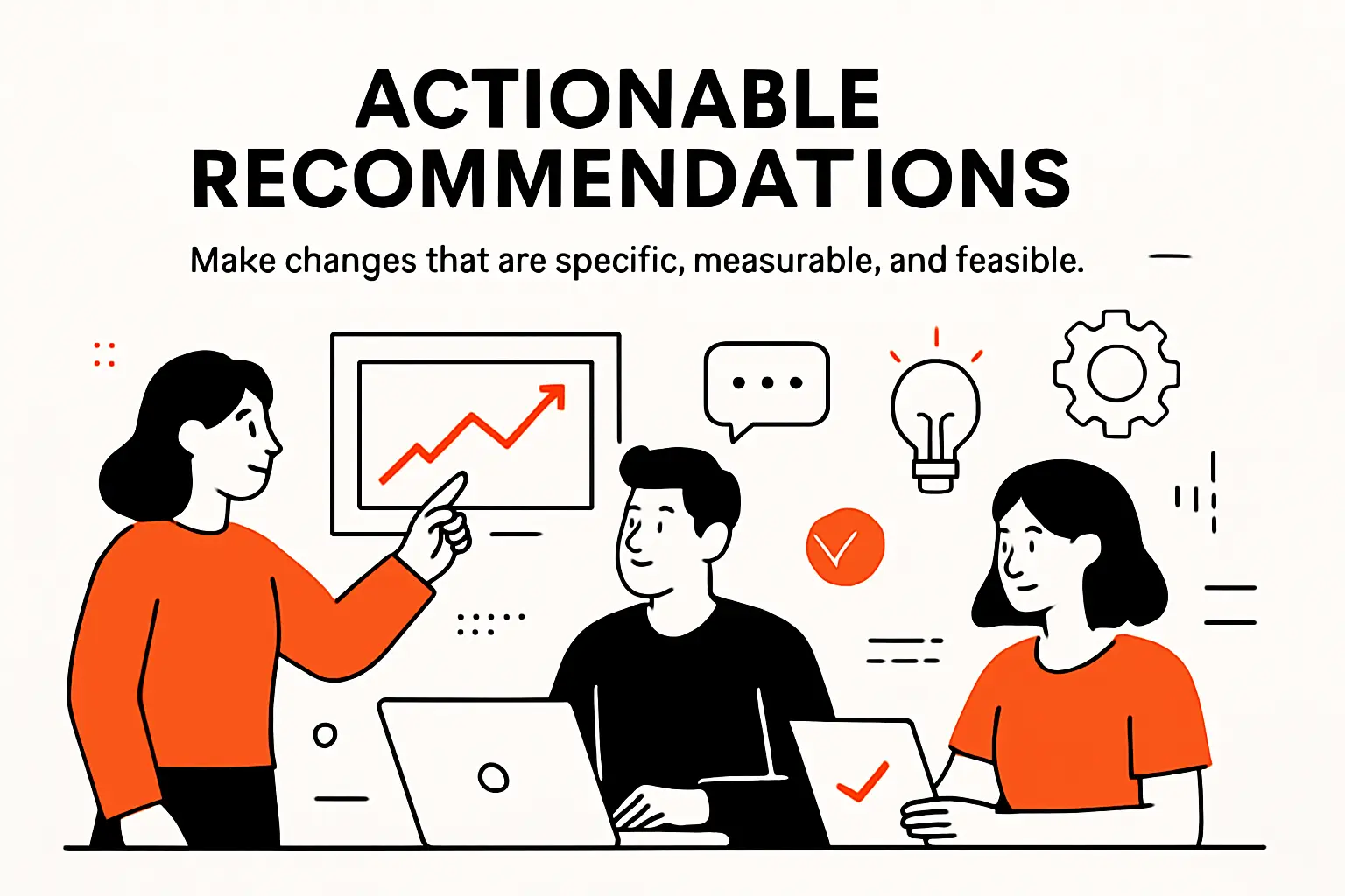
1. Turning insights into concrete, business-oriented recommendations
Recommendations are where analytics becomes management. An insight like “customers who do X retain longer” is not a recommendation until it specifies what the organization should change. Concrete recommendations include an owner, a mechanism, and a measurable target outcome. They also acknowledge constraints, because a recommendation that ignores operational reality is just a wish dressed up as strategy.
In implementation terms, we write recommendations in the language of systems. “Reduce time-to-resolution” becomes: adjust triage rules in the support platform, add a macro for a common issue, and create a routing exception for high-value accounts. “Improve activation” becomes: change onboarding screens, update lifecycle messaging, and add in-product prompts keyed to missing setup events.
Business orientation means linking actions to value drivers. For some organizations, the driver is margin. For others, it is throughput, risk reduction, customer satisfaction, or regulatory compliance. When recommendations are framed as “here’s how this moves the driver,” prioritization becomes easier and political resistance tends to soften.
Recommendation Templates We Reuse
- “Change [process/system] by [specific adjustment] so that [measurable behavior] improves, monitored via [metric].”
- “If [hypothesis] is correct, implement [intervention] for [segment] and compare outcomes against [control].”
- “To reduce risk, add [guardrail] and alert when [leading indicator] shifts.”
2. Evaluating and prioritizing recommendations by feasibility and potential impact
Prioritization is the bridge between insight and a roadmap. Feasibility is not just engineering effort; it includes policy constraints, training load, vendor contracts, and organizational readiness. Potential impact is not just upside; it includes risk, confidence, and how quickly benefits accrue. When we evaluate recommendations, we explicitly separate what is hard from what is politically hard, because the mitigation strategies differ.
In many organizations, the best early wins are operationally simple but culturally meaningful. A small automation that removes repetitive work can build trust in analytics faster than a sophisticated model. Momentum matters because impact cycles compound: the faster teams see measurable improvement, the more willing they become to invest in data quality and instrumentation.
Decision-makers also need a “do nothing” baseline. If the status quo costs are invisible, action feels optional. Once teams see how friction, churn, or delays accumulate, prioritization becomes less about persuasion and more about stewardship.
How We Keep Prioritization Honest
Rather than ranking ideas in a vacuum, we tie each recommendation to a known bottleneck in the value chain. That constraint-based view prevents teams from optimizing what is easiest to measure while ignoring what is actually limiting growth.
3. Using validation approaches like A/B testing and cost-benefit analysis
Validation protects organizations from confident mistakes. A/B testing is the gold standard when the intervention can be randomized and measured cleanly. In digital products, it can be straightforward: roll out an onboarding change to a subset of users and track downstream activation. In operations, experiments can still happen via phased rollouts, staggered deployments, or quasi-experimental designs that compare similar regions or teams.
Cost-benefit analysis keeps recommendations grounded. Engineering time, vendor spend, training, and ongoing maintenance must be compared against expected upside, risk reduction, or customer impact. When stakeholders see explicit trade-offs, they make better decisions and are less likely to treat analytics as a magic wand.
Importantly, validation should be designed before implementation starts. If measurement is an afterthought, teams will ship changes that cannot be evaluated, and the impact cycle breaks. When validation is built into the plan, every intervention becomes a learning opportunity, even if the result is “no meaningful change.”
Recommended reading: Tree Data Structure: Types, Terminology, Operations, and Applications
Communicate insights: multi-channel delivery, storytelling, and accessibility
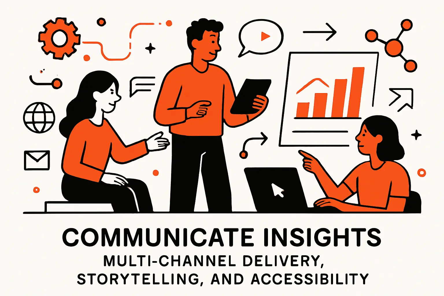
1. Multi-pronged communication strategies for different stakeholder needs
Communication is not a single presentation; it is a strategy. Different stakeholders consume information differently: some want a dashboard they can explore, some want a narrative memo, and some want a short verbal briefing with clear asks. If analytics is delivered in only one format, adoption becomes accidental rather than designed.
In our engagements, we design a communication plan the way we design a software release. There is an announcement, onboarding, documentation, office hours, and a feedback channel. That may sound heavy, yet it is lightweight compared to the cost of building analytics that sits unused because nobody knew how to interpret it.
Accessibility matters as well. Color choices, mobile-friendly layouts, plain language labels, and definitions embedded near charts can determine whether a dashboard is usable outside the analytics team. When stakeholders can self-serve without fear of misreading, the organization becomes faster and less dependent on a small set of analysts.
Meet Stakeholders Where They Already Work
Instead of forcing leaders to log into a separate tool, we often push key insights into existing workflows: a weekly email summary, a Slack alert for anomalies, or a link inside a ticketing system where a frontline manager already lives.
2. Formats that drive action: interactive dashboards, presentations, and executive memos
Formats shape behavior. Dashboards drive ongoing monitoring and operational decisions, especially when paired with alerts and clear thresholds. Presentations are useful for alignment moments—kickoffs, quarterly reviews, cross-functional readouts—where teams need shared context and debate. Executive memos are powerful for decisions, because they force crisp writing, explicit assumptions, and clear asks.
At Techtide Solutions, we think of dashboards as products, not posters. A product has users, a job to be done, a release cycle, and a backlog. When a dashboard is treated that way, adoption rises because the artifact evolves with the business rather than freezing at the moment it was built.
Meanwhile, memos often outperform slide decks when stakes are high. Writing slows thinking just enough to expose gaps: missing definitions, weak evidence, unclear ownership, or vague next steps. Once a decision memo exists, accountability becomes easier because the record of “what we believed” is preserved.
Choosing the Right Format by Decision Type
- For operational control: a dashboard with alerts and drill-down paths.
- For cross-team alignment: a presentation that surfaces trade-offs and dependencies.
- For executive commitment: a memo that names risks, owners, and expected outcomes.
3. Plain language, visual storytelling, and anticipating stakeholder questions
Plain language is not dumbing down; it is respect for time. If a chart requires an analyst to interpret every time, it will not scale. We prefer labels like “New users who completed setup” over internal event names, and we embed definitions near the metric so stakeholders do not need to hunt through a wiki.
Visual storytelling matters because humans reason with patterns. A well-designed sequence—context, baseline, change, segmentation, implication—can make a complex finding feel intuitive. When visuals are cluttered, audiences focus on the clutter rather than the conclusion, and skepticism grows.
Anticipating questions is the mark of maturity. Stakeholders will ask: “Compared to what?”, “Is this seasonal?”, “Did we change anything else?”, “How confident are we?”, and “What do we do now?” When those answers are prepared, communication shifts from reactive defense to proactive leadership.
Track outcomes in impact cycle data analytics: metrics, follow-up loops, and pitfalls
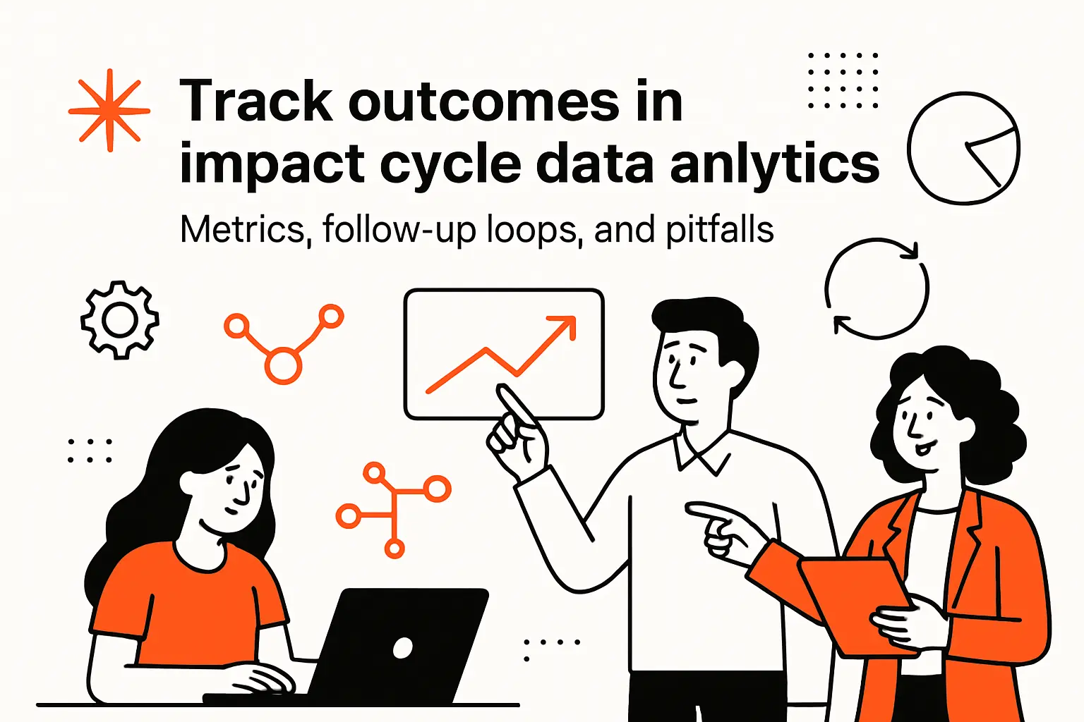
1. Establishing tracking mechanisms and selecting the right success metrics
Tracking outcomes is where impact cycle analytics earns its name. Without follow-up measurement, teams can claim success based on effort, not results. Establishing tracking mechanisms means instrumenting the intervention and the outcome, then ensuring the measurement is trustworthy and timely enough to guide iteration.
Metric selection is delicate. A success metric should reflect the value driver, yet it should not be so lagging that the team learns too slowly. For that reason, we pair outcome metrics with leading indicators. In a subscription product, renewal rate is an outcome metric, while activation behavior and support friction can be leading indicators. In an operations setting, cost and throughput are outcomes, while queue lengths and cycle times can warn earlier.
Mechanisms matter as much as metrics. If tracking lives only in a dashboard that nobody reviews, it will not influence behavior. Operationalizing tracking often means building alerts, establishing review cadences, and assigning an owner who is responsible for noticing when reality diverges from expectations.
We Prefer “Decision Cadence” Over “Reporting Cadence”
A weekly metric review is valuable only if it reliably produces decisions: continue, adjust, roll back, or expand. When reviews devolve into status updates, the cycle loses momentum and teams begin to see measurement as bureaucracy rather than learning.
2. Sharing outcomes, learning what worked, and generating the next questions
Sharing outcomes is not about bragging; it is about institutional memory. When a team learns that a change improved results, the organization should understand what changed, why it likely worked, and how it can be repeated. When a change fails, the organization should learn just as much, because negative results prevent repeated mistakes and refine future hypotheses.
In our own practice, we treat every completed loop as a seed for the next question. If an onboarding change improved activation for one segment but not another, the next cycle asks why. If a routing rule reduced support delays but increased escalations, the next cycle explores trade-offs and guardrails. This is how analytics becomes a compounding engine rather than a series of disconnected projects.
Importantly, the act of publishing outcomes builds credibility. Stakeholders trust analytics more when they see that the team reports results even when results are inconvenient. Transparency is not a moral stance alone; it is a pragmatic strategy for adoption.
Outcome Narratives We Encourage Teams to Write
- What we changed, stated concretely and without jargon.
- What we expected, including assumptions and risks.
- What happened, including surprises and limitations.
3. Common adoption challenges and skills: time investment, sample size limits, data governance, and the 4Cs
Adoption challenges are predictable, which means they are manageable if named early. Time investment is the first: analytics requires time from domain experts, and domain experts are always busy. Sample size limits appear next, especially in B2B contexts where the number of accounts is modest and randomization is difficult. Data governance then enters the chat, often late, when teams realize that “metric ownership” and “definition control” are not optional if executives depend on the numbers.
Skills gaps amplify those challenges. Analysts may be strong technically but weak in facilitation. Business partners may be decisive but uncomfortable with uncertainty. Engineering teams may be capable but overloaded. Because these realities persist, we teach and reinforce what we call the 4Cs: clarity (tight questions and definitions), credibility (validated data and transparent methods), collaboration (shared hypotheses and shared ownership), and continuity (a recurring cadence that survives org changes).
From the trenches, the biggest pitfall is letting analytics become a side quest. When impact work is treated as “extra” rather than integrated into planning and operations, outcomes tracking becomes sporadic and trust erodes. Conversely, when the cycle is embedded into how teams plan, build, and review, analytics becomes part of the organizational metabolism.
TechTide Solutions: custom software that operationalizes the IMPACT cycle end to end
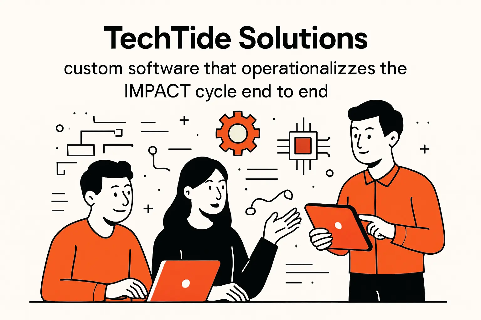
1. Building tailored web apps and dashboards to communicate insights to every stakeholder
Off-the-shelf dashboards can be useful, yet many organizations need delivery that fits their operating model. At Techtide Solutions, we build tailored web apps that make insight reachable: role-based views for executives, drill-down workflows for operators, and diagnostic detail for analysts. The goal is not aesthetic novelty; it is reducing the friction between “I see the issue” and “I can do something about it.”
Instead of forcing stakeholders into a generic BI interaction model, we often embed domain workflows directly into the interface. For example, a support operations console might show workload and backlog alongside the controls to adjust routing rules. A revenue health app might pair leading indicators with the ability to trigger playbooks for at-risk accounts. When insight and action coexist in the same experience, the impact cycle accelerates.
Accessibility is part of the build, not an afterthought. Consistent metric definitions, inline documentation, and carefully designed navigation reduce misinterpretation and increase self-service. Over time, the app becomes a shared language: teams argue less about what is happening and spend more time deciding what to do.
Our Bias: Decision Interfaces, Not Just Reporting Interfaces
Dashboards that only describe the world are useful. Interfaces that help teams change the world are better. For that reason, we frequently add approvals, annotations, and guided next steps so stakeholders can move from insight to execution without context switching.
2. Developing reliable data pipelines and quality automation to master the data at scale
Impact cycles fail when the data is late, inconsistent, or opaque. Building reliable pipelines means engineering for observability: lineage, freshness, and automated checks that catch breaks before stakeholders do. Our teams typically implement modular ingestion, transformation layers with clear ownership, and testing that treats data models like production code.
Automation is the quiet multiplier. When schema changes are detected automatically, analysts stop wasting time debugging missing fields. When reconciliation checks run on schedule, finance and analytics stop arguing about whose numbers are “right.” And when lineage is visible, teams understand downstream blast radius before making upstream changes. These are not luxuries; they are the prerequisites for trust at scale.
From a platform standpoint, we also design for change. Organizations add tools, merge systems, and shift definitions. A pipeline architecture that assumes stability will collapse under that reality. By contrast, an architecture built around contracts, versioning, and clear semantic layers can evolve without breaking every report each time the business changes direction.
Engineering Choices That Protect Analytics Credibility
- Contract-driven ingestion to prevent silent schema drift.
- Environment separation so changes can be validated before release.
- Documentation generated from code, not maintained as stale prose.
3. Implementing outcome-tracking features and analytics instrumentation to measure impact over time
Instrumentation is the foundation of measurable impact. If an organization cannot reliably observe behavior changes after an intervention, it cannot learn quickly. For that reason, we implement event tracking strategies that reflect real user and operational journeys, then validate those events through automated tests and monitoring.
Outcome tracking features turn analytics into a closed loop. Within custom apps, we add experiment registries, intervention logs, and annotation layers so teams can correlate metric shifts with real changes in the world. We also build mechanisms for follow-up: reminders to review outcomes, alerts when metrics regress, and lightweight retrospectives that capture what was learned.
Over time, this becomes more than measurement; it becomes organizational memory. Teams stop repeating the same debates because the record of what worked, what didn’t, and under what conditions is accessible. When leadership asks, “Are we getting value from analytics?”, the answer is no longer a story—it is a measurable trail of decisions and outcomes.
Conclusion: make the IMPACT cycle a repeatable, business-aligned analytics workflow
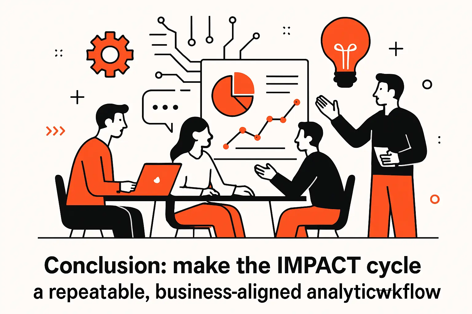
Impact cycle data analytics works when organizations stop treating analytics as a one-time deliverable and start treating it as a repeatable workflow that produces decisions. The IMPACT framework gives that workflow a backbone: identify a decision-worthy question, plan and master the necessary data, analyze with context and rigor, communicate in formats that drive action, and track outcomes so learning compounds rather than evaporates.
From Techtide Solutions’ perspective, the technical and human layers must be built together. Data pipelines and semantic layers create credibility, while stakeholder translation and clear recommendations create adoption. Communication turns insight into shared understanding, and outcome tracking turns understanding into measurable improvement. Once those pieces reinforce each other, analytics becomes less about “reports” and more about steering the organization through uncertainty with discipline.
If we were to suggest a next step, it would be simple: pick one high-leverage business decision, run a full IMPACT cycle end to end, and document what changed—then ask yourselves, which part of the cycle is currently slowing you down the most?
