At TechTide Solutions, we have learned sometimes the hard way. hat responsive design is not something you bolt on at sprint’s end. It is a discipline. It lives in layout, media, typography, performance, and accessibility choices. Those choices either compound into a calm, predictable experience or unravel into a UI that only works on the designer’s device. Modern products live across phones, tablets, laptops, ultrawide monitors, embedded webviews, and assistive technology. So our stance is simple: responsive web design is where engineering pragmatism meets human reality. The goal is not identical visuals everywhere. The goal is to make the same intent understandable and usable everywhere.
Why responsive web design matters in a multi-device world

1. Designing for device-switching across desktop, tablet, and mobile
Market overview: mobile devices (excluding tablets) accounted for 62.54 percent of global website traffic in that measurement, which means “desktop-first” is now a business bet that needs explicit justification rather than tradition.
In our client work, device-switching rarely looks like a clean funnel where someone discovers on mobile and converts on desktop. Instead, people move between contexts. A commuter checks order status on a phone. Later, a manager reviews the same data on a laptop. Then a support agent opens it again on a large monitor while screen sharing.
From a systems viewpoint, responsive design is how we keep the product’s mental model stable while the viewport changes. When layouts shift intelligently, users don’t need to relearn the UI on each device, and that continuity quietly builds trust.
2. Supporting accessibility requirements like reflow-friendly layouts
Accessibility is often framed as compliance. We treat it as a resilience strategy. If a UI survives zoom, reflow, high contrast, and keyboard navigation, it usually survives real device chaos too. In other words, a well-reflowing layout can handle tiny phones, split-screen tablets, and narrow desktop windows without breaking.
Human impact is not hypothetical. According to the World Health Organization, 16% of the world’s population experiences significant disability, so reflow-friendly design choices are not “edge cases”; they are mainstream quality.
Practically speaking, responsive accessibility means avoiding brittle UI patterns. Fixed heights can clip text. Absolute-positioned labels can overlap during zoom. Dense interface clusters can become unusable when users increase text size or rely on magnifiers.
3. Improving usability expectations and SEO outcomes with responsive experiences
Search visibility, conversion, and retention are all downstream of usability. When pages force horizontal scrolling, hide key actions behind awkward tap targets, or shift content unexpectedly, users feel friction. Search engines increasingly read that friction as poor experience.
Speed plays a starring role in that perception. Google’s own research has reported that 53% of mobile site visitors leave a page that takes longer than three seconds to load, and while the exact threshold varies by audience, the message is consistent: responsiveness without performance is a false victory.
In our view, SEO gains often come from coherent responsive architecture. It reduces duplicate pages, redirect chains, mobile-only compromises, and inconsistent structured content.
Recommended reading: CSS Text Outline Techniques for the Web
What responsive web design is and how it differs from related approaches
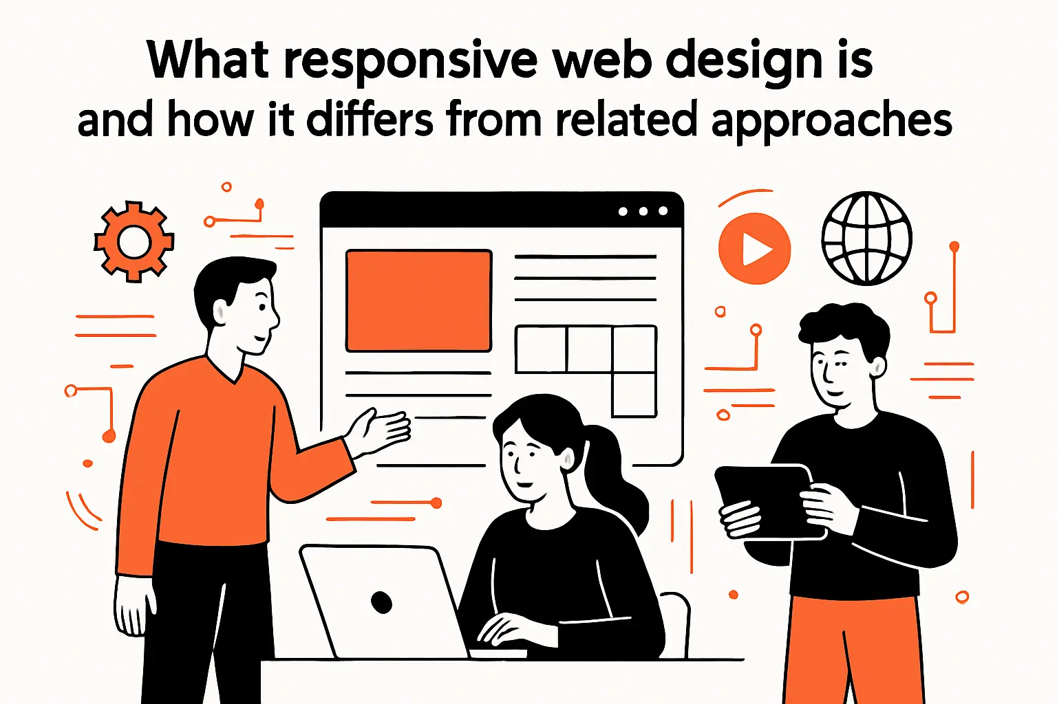
1. Responsive web design as an approach and set of best practices, not a single technology
Responsive web design is not “using a framework,” and it is not “adding a couple of breakpoints.” Conceptually, it’s an approach to building interfaces that adapt to available space, input modes, and user preferences without sacrificing clarity or control.
In our engineering rooms, responsiveness appears in small decisions. We choose flexible containers over fixed widths. Components wrap instead of overflowing. Images scale without distortion, and typography stays readable across many screen densities.
What makes it a practice rather than a tool is that it spans disciplines. Design establishes hierarchy and intent; frontend engineering encodes that intent in layout constraints; QA validates it across real devices; and product leadership protects it from “just ship it” regressions.
2. How responsive layouts adapt when browser width and available space change
A responsive layout adapts by negotiating constraints. When space narrows, the UI should decide what stacks, wraps, collapses, and stays pinned for task completion.
In our builds, we aim for predictable rearrangement. Cards can become lists. Sidebars can become drawers. Multi-column grids can become single-column flows. Dense tables can become simple summaries with drill-down interactions. But the underlying information architecture stays intact.
Equally important, responsive behavior must consider more than width. Reduced-motion settings, larger text, and different pointer precision all change usable space in practice. Resilient components therefore treat layout as a negotiation, not a fixed sketch.
3. Responsive vs adaptive design and when each may fit best
Responsive design typically means one flexible UI that continuously adjusts across sizes. Adaptive design usually means distinct layouts targeted to certain ranges or device classes, often switching between predefined templates.
From our perspective, adaptive approaches can make sense when the product truly changes mode. A dispatch dashboard might need a dense, keyboard-driven desktop experience, while the field counterpart needs a simplified, touch-first workflow that is not just a rearrangement but a different interaction model.
On the other hand, we prefer responsive-first when content parity matters and long-term maintenance matters even more. Maintaining multiple templates can accelerate early delivery, yet it also multiplies QA surfaces, increases regression risk, and often leads to “feature drift” where one experience quietly falls behind.
Recommended reading: What Is UI: A Complete Guide to Definition, Types, Principles, and Process
Core responsive web design principles for layouts: fluid grids and flexible structure
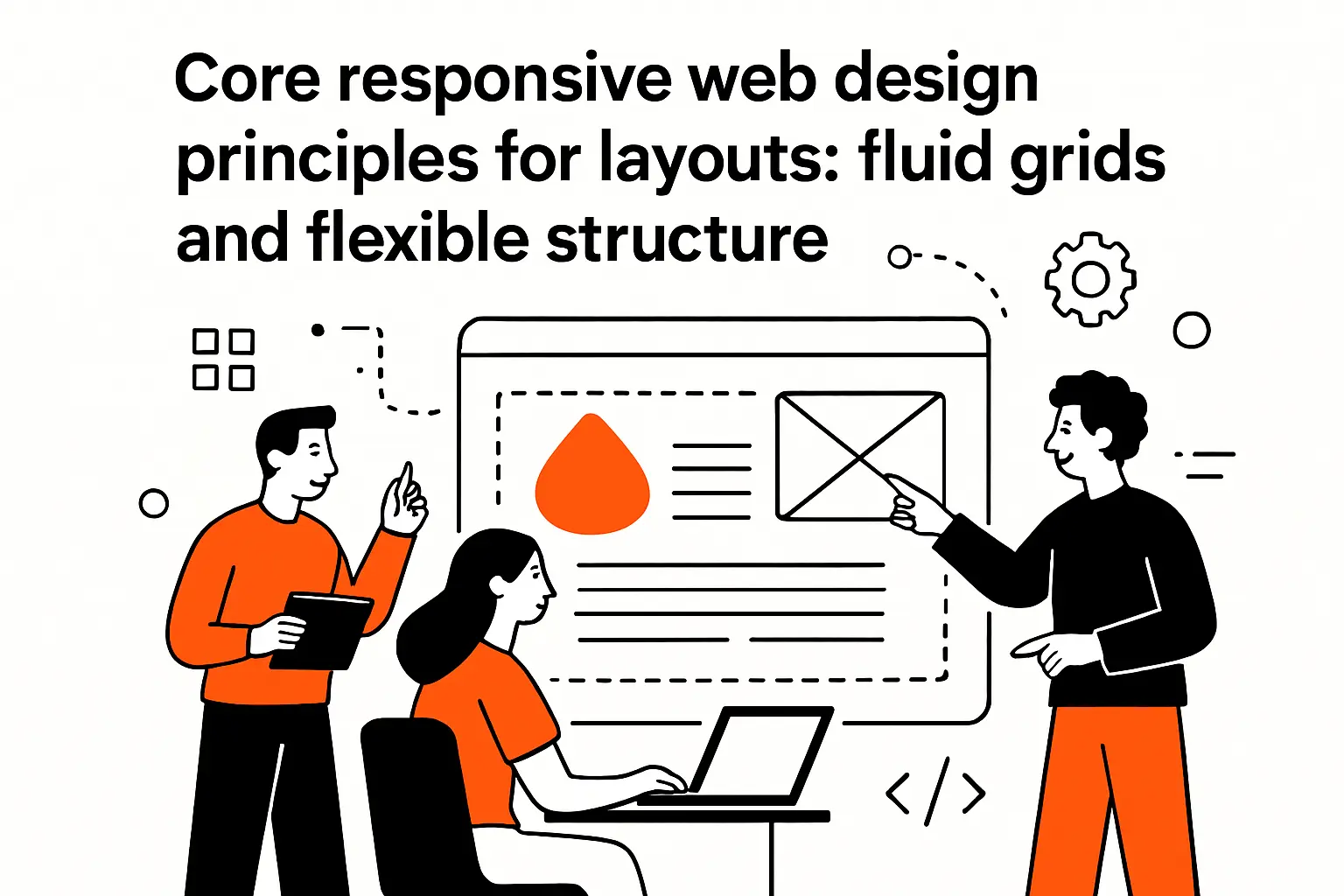
1. Fluid grid systems that replace fixed pixel layouts with relative sizing
Fluid grids are where responsive thinking becomes tangible. Rather than anchoring a layout to specific pixel widths, we use relative sizing so containers grow and shrink with the viewport, and spacing scales proportionally.
In practice, that means designing with relationships: columns that share space, gutters that remain breathable, and modules that can reflow into new configurations without breaking alignment. When a component is defined by how it behaves under pressure, it becomes portable across pages and products.
At TechTide Solutions, we often treat the grid as a contract between design and engineering. Once the contract is encoded, features ship faster because teams are assembling known building blocks rather than inventing a new layout every time a new screen appears.
2. Flexible layout tools that are responsive by default: Flexbox behavior under changing space
Flexbox shines when UI elements need to distribute space intelligently: toolbars, navigation clusters, form rows, and card headers where content length is unpredictable. Instead of guessing widths, we let elements grow, shrink, and wrap according to priorities we define.
One pattern we use frequently is “intentional wrapping.” Buttons wrap into multiple rows only when necessary, and alignment rules keep primary actions visually stable while secondary actions tuck away gracefully.
From a product standpoint, flex layouts reduce the risk of localization bugs. When translated labels expand, the system can reflow rather than clipping text or forcing awkward truncation that undermines comprehension in non-English markets.
3. CSS Grid for responsive tracks using fr units and layout shifts at breakpoints
Grid becomes the right tool when the page needs two-dimensional control: both rows and columns, and a consistent spatial rhythm across modules. For dashboards, marketing pages, and complex content layouts, grid provides a language for structure that stays understandable months later.
Our favorite grid outcome is not “a complicated layout.” The real win is that components can declare where they belong in a structured system, which makes refactoring safer and collaboration cleaner when multiple teams touch the same page.
Breakpoints still matter with grid, but we try to let content drive the shifts. When a card layout starts to look cramped, we adjust the structure, not because “tablet breakpoint says so,” but because the UI is showing stress signals.
Recommended reading: What Is Web Design? Definition, Principles, Responsive vs. Adaptive, Tools and Careers
Responsive images and media that scale cleanly across devices

1. Fluid images and media that stay inside their containers with max-width controls
Images are often the first thing that breaks a layout, because their intrinsic dimensions don’t automatically respect container constraints. The basic principle we apply is containment: media should scale down to fit, preserve aspect ratio, and avoid forcing overflow that triggers horizontal scrolling.
In product UI, we treat images as part of the layout system rather than decorative afterthoughts. A user-uploaded profile photo, a product thumbnail, or a report chart should behave consistently even when its source dimensions are unpredictable.
Video deserves the same discipline. Responsive video containers prevent awkward cropping and ensure controls remain usable, especially when the page shifts from a multi-column layout into a stacked flow.
2. Serving the right image for the context using picture, srcset, and sizes
Responsive images are about avoiding waste without sacrificing clarity. When the browser can choose the best resource for the current layout and screen density, users get crisp visuals without paying unnecessary bandwidth costs.
In our builds, the “right image” is not always the highest-resolution image. The right image is the one that matches the rendered size and the user’s context, including network conditions and data-saving preferences where available.
Art direction matters too. A hero image that looks great on desktop may hide the subject on mobile if it’s simply scaled down, so a responsive media strategy sometimes requires alternate crops, not just alternate resolutions.
3. Choosing formats wisely: SVG for scalable icons vs bitmap images, plus file-size optimization
Format choice is a technical decision with direct UX consequences. SVG icons tend to scale cleanly across densities, remain sharp on zoom, and integrate well with theming because color can be controlled via CSS.
Photography and complex imagery still belong to bitmap formats, but optimization must be part of the delivery pipeline. When teams postpone optimization, they usually end up shipping oversized assets “temporarily,” and temporary becomes permanent faster than anyone wants to admit.
Evidence of media and script weight dominating real pages is widespread. The HTTP Archive Web Almanac reports 97.8% of all mobile home pages using JavaScript, which is a reminder that media strategy and script strategy are linked: heavy pages compound quickly when both code and imagery are unrestrained.
Media queries, breakpoints, and mobile-first strategy in responsive web design principles
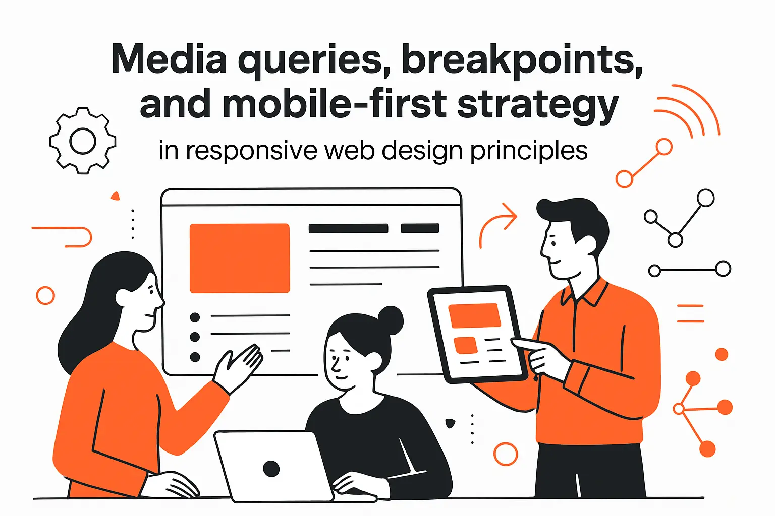
1. What media queries do and how they selectively apply CSS based on conditions
Media queries let us apply CSS conditionally, based on characteristics of the user’s environment. While most teams associate them with viewport width, the deeper value is that they help the UI respond to user preferences and device capabilities.
In our approach, media queries are guardrails rather than the main engine. A well-structured layout should already be flexible; queries then refine the experience where the design intent truly changes, such as shifting navigation patterns or increasing density on larger screens.
When queries become the primary layout mechanism, complexity balloons. The stylesheet turns into a patchwork of exceptions, and future changes become risky because one tweak can cascade into unintended breakage across ranges.
2. Breakpoints that follow content needs and layout stress points
We prefer breakpoints that follow the content, not devices. Devices change constantly, and the moment a team chases specific screen models, the UI becomes a museum of assumptions.
A practical technique is to build the page, then shrink and expand it slowly while watching for stress. When text lines become too long, when cards become too narrow for their content, or when navigation becomes crowded, the UI is telling you where a breakpoint earns its keep.
That mindset also reduces “breakpoint cargo cults.” Instead of inheriting arbitrary sizes from older projects, teams develop a responsive vocabulary grounded in their actual product, which makes future components easier to integrate without additional exceptions.
3. Mobile-first workflow: start single-column, then enhance for larger screens with relative-unit breakpoints
Mobile first is not a slogan. It is a risk reduction strategy. Starting with one column forces teams to set content priorities clearly. That usually creates a cleaner hierarchy, even on desktop.
In our process, enhancement becomes additive instead of corrective. Larger screens gain extra columns, richer navigation, and denser data views. Meanwhile, the core journey stays intact because it was designed under the tightest constraints first.
Relative units keep this workflow sane. They help breakpoints and spacing respond to font size and layout context. As a result, the UI behaves better under accessibility zoom and user preference changes. Those conditions are part of real use, whether teams plan for them or not.
Responsive typography for readable content on any viewport
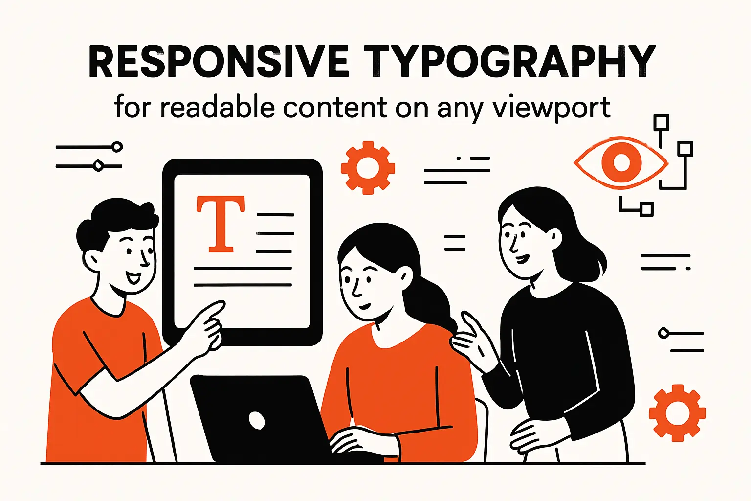
1. Using media queries to scale typography for larger screens without harming mobile readability
Typography is often treated as pure aesthetics, yet it is one of the strongest determinants of perceived quality. When text is too small on mobile, users pinch-zoom; when lines are too long on desktop, users skim poorly and comprehension drops.
Media queries can scale type responsibly, but restraint matters. We prefer a small set of type steps with consistent line-height rules, because a proliferation of one-off sizes creates visual noise and makes component reuse harder.
In our experience, responsive typography succeeds when it is tied to layout roles: headings signal structure, body text signals reading flow, and UI labels remain scannable without dominating the screen.
2. Using viewport units and calc for fluid type that grows gradually with screen width
Fluid typography can provide a more natural reading experience than hard jumps. Instead of stepping from one size to another at a breakpoint, type can grow gradually as the viewport expands, keeping proportions stable and reducing “sudden” layout shifts.
That technique works best with strong boundaries. Without minimum and maximum constraints, fluid type can become absurd on extreme screens, either shrinking into illegibility or growing into billboard territory.
We also watch the ripple effects. A type change can shift line breaks, which then changes card heights and the rhythm of the grid. So when typography becomes responsive, the layout around it must stay flexible enough to absorb those shifts without looking accidental.
3. Applying relative units to keep text and UI sizing consistent across layouts
Relative units help maintain proportionality. When spacing, type, and component dimensions are tied to a consistent scale, the interface tends to “feel” cohesive across devices rather than like separate designs stitched together.
For product teams, this is where design systems earn their reputation. A tokenized scale for spacing and type means components can be composed confidently, and engineers can implement new screens without inventing new magic numbers that drift away from the system.
From an accessibility standpoint, relative sizing is also a courtesy. When users adjust text size at the system or browser level, the UI should respond as a system rather than breaking into mismatched fragments where some elements scale and others stubbornly refuse.
Best practices checklist for responsive web design principles

1. Content prioritization and progressive disclosure: visual hierarchy, hiding nonessential content, and navigation drawers
Responsive design forces prioritization, and we view that as a gift. When everything cannot fit, teams must decide what matters most, what can be deferred, and what can be collapsed behind a secondary interaction without harming task completion.
Progressive disclosure is the practical mechanism. A summary view presents the essential information, while details remain available via expansion, drill-down, or secondary screens that preserve context.
Navigation is the common battleground. Drawers, bottom navigation, and collapsible menus can all work, yet our rule is consistent: the user should never wonder where the core actions went just because the screen got smaller.
Practical Signs We Look For in Review
During UX and engineering review, we ask whether primary actions remain visible, whether labels remain understandable without hover, and whether content hierarchy is still obvious when the layout collapses.
2. Balancing flexibility with control: min and max values, containers, and layout flow
Pure flexibility can become chaos, particularly on very large screens. When a layout expands indefinitely, content lines get too long, cards stretch into awkward proportions, and the interface loses its sense of intentional composition.
Containers are a quiet solution. By constraining reading widths and grouping related content, containers preserve hierarchy and keep the UI legible on ultrawide monitors without wasting space on meaningless whitespace.
At the same time, minimum constraints prevent collapse. A form field should not shrink until its label becomes unreadable, and a data table should not compress until columns become a jumble. Thoughtful min and max values are how we encode those boundaries so the UI stays calm under pressure.
Why We Prefer Flow Over Absolute Positioning
When elements participate in normal layout flow, they reflow naturally under zoom and content changes. Absolute positioning can still be useful for specific effects, but it tends to be fragile when content length, font scaling, or localization shifts occur.
3. Performance and mobile usability: webfont tradeoffs, responsive media optimization, lazy loading, and touch-friendly targets
Performance is a responsive feature. If the UI technically “fits” on a phone but loads slowly, janks on scroll, or shifts as assets arrive, the experience is still broken in the user’s eyes.
Webfonts are a classic tradeoff. Brand typography can differentiate a product, yet heavy font files can delay text rendering and cause layout shift when fallback fonts swap. Our general preference is to ship fewer font variants, subset when possible, and prioritize stable rendering over typographic perfection.
Media optimization and lazy loading are equally important, but they must be implemented with empathy. Images that load late should not break the reading flow, and lazy-loaded components should still be reachable by keyboard and assistive technology without creating invisible traps.
How TechTide Solutions helps teams implement responsive web design principles with custom software

1. Discovery and UX alignment: translating customer needs into responsive requirements and breakpoints
Discovery is where responsive design either becomes deliberate or becomes improvisation. Before we write UI code, we map the real contexts: where users are, what they’re trying to accomplish, how long tasks take, and what failure looks like when the screen is small or connectivity is weak.
From there, we translate needs into responsive requirements. That includes defining which elements must remain visible, which interactions must be touch-friendly, and which workflows must support keyboard and assistive technology without exceptions.
Breakpoints then emerge from the product’s content stress points rather than habit. When the dashboard becomes unreadable at narrow widths, we decide whether the right response is reflow, summarization, or a mode change into a different interaction pattern.
2. Custom web app development: building flexible layouts, responsive media pipelines, and scalable UI systems
In implementation, responsive success depends on component design. Each component should have clear constraints, predictable wrapping behavior, and a “small-space” mode that does not feel like a degraded afterthought.
A scalable UI system is what keeps responsiveness sustainable. When spacing, typography, and layout primitives are standardized, new pages inherit responsiveness rather than reinventing it, which is how teams avoid the slow drift into one-off fixes.
Business value is not theoretical here. McKinsey has reported that top design performers saw 32 percentage points higher revenue growth in their research context, and while design performance depends on more than responsiveness alone, our experience is that responsive consistency is one of the easiest “compound interest” wins a product team can bank early.
3. Testing and iteration: validating responsiveness across devices and optimizing performance over time
Testing is where responsive claims meet reality. We validate across real devices, emulators, and assistive technology, because responsive bugs often hide in the gaps: uncommon aspect ratios, unusual font settings, split-screen modes, or embedded webviews.
Iteration matters because responsive regressions are easy to introduce. A new badge added to a card header can break wrapping; a longer translation can push buttons out of view; a new chart library can overflow its container under zoom.
Over time, we encourage teams to treat responsiveness like uptime: monitored, reviewed, and protected by automated checks where feasible. When the responsive system is part of CI quality gates, it becomes much harder for “small” changes to quietly degrade the experience.
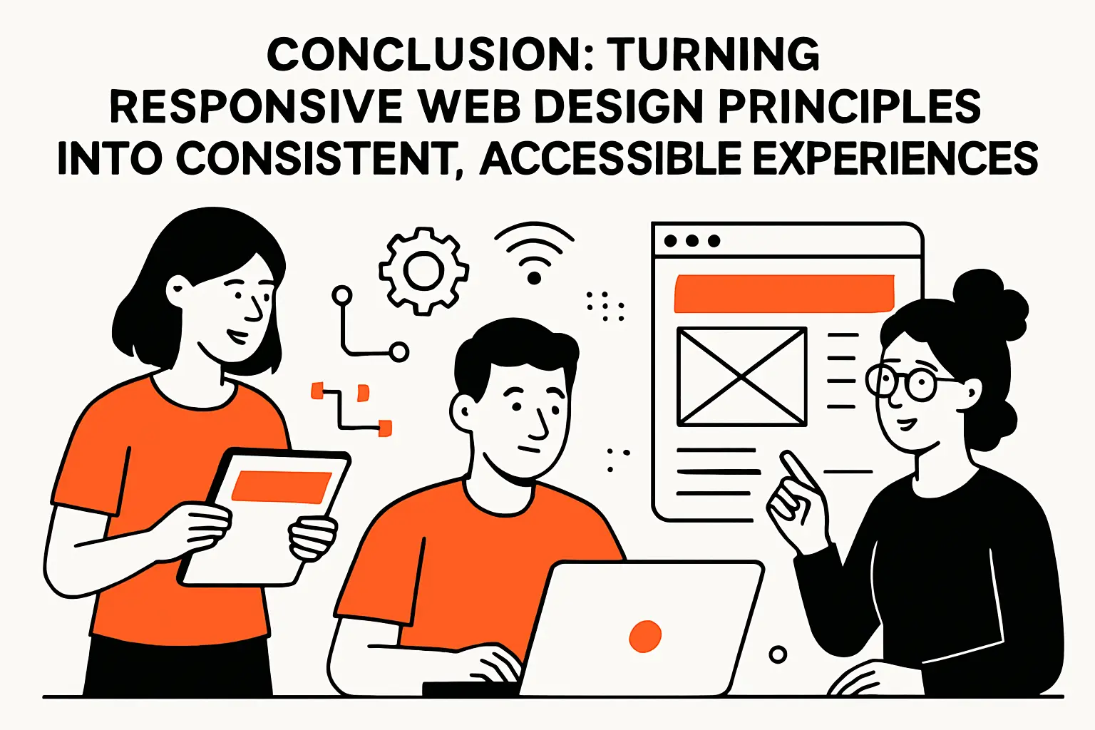
Conclusion: turning responsive web design principles into consistent, accessible experiences
1. Combine fluid layouts, flexible media, and thoughtful breakpoints to support every screen
Responsive design works when the core pieces reinforce each other. Fluid layouts prevent brittle overflow, flexible media prevents visual breakage, and thoughtful breakpoints prevent the interface from feeling like it’s constantly on the verge of collapse.
In our view, the real milestone is not “it looks good on mobile.” The milestone is that the UI remains understandable and operable even when the user changes conditions mid-task, because that’s what real life looks like.
If your team already has a design system, responsiveness becomes an architectural concern: the system must encode reflow behavior as a first-class principle, not as a set of ad hoc exceptions per component.
2. Keep typography, performance, and accessibility central to responsive decision-making
Typography is the voice of the product, and a responsive layout that ignores type will still feel broken. Performance is the pacing of the product, and a responsive layout that ignores pacing will still feel frustrating.
Accessibility is the credibility test. When a UI works under zoom, keyboard navigation, and assistive technology, it typically works better for everyone, including users on small screens or under temporary constraints like glare, injury, or one-handed use.
At TechTide Solutions, we treat these as one conversation rather than separate checklists. A “responsive win” that introduces layout shift or reduces text contrast is not a win; it’s a trade that will show up later as churn, support tickets, or lost conversions.
3. Treat responsive work as an ongoing practice of testing, refinement, and user-first prioritization
Responsive design is never finished, because products evolve. New features add UI weight, new content stretches layouts, and new devices expose assumptions that used to be invisible.
Ongoing practice means building feedback loops. Analytics should reveal device patterns. QA routines should include reflow and zoom checks. Design reviews should treat layout resilience as part of the definition of done.
As a next step, ask which screen and context create the most friction today. Then ask what changes if that pain point becomes the first responsive redesign target, not the last.
