We’re Techtide Solutions, and we build serious software for serious businesses. Still, we keep a private folder of “weird links” for one practical reason. Strange websites are compact lessons in attention, feedback, and delight. They also remind us what the web feels like when nobody is optimizing for quarterly reports.
Quick Comparison of weird links
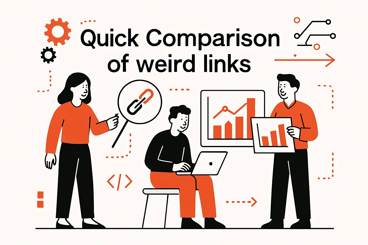
We keep this shortlist for demos and team inspiration.
Each pick is lightweight, instantly understandable, and memorable after one visit.
Concise Comparison Table
| Tool | Best for | From price | Trial/Free | Key limits |
|---|---|---|---|---|
| The Useless Web | Random discovery | Free | Free | Quality varies per jump |
| Pointer Pointer | Playful surprise | Free | Free | Mouse-centric |
| Koalas to the Max | Click-to-reveal joy | Free | Free | Needs scripts enabled |
| Cat Bounce | Chaotic stress relief | Free | Free | Sound can surprise |
| Patatap | Audio-visual play | Free | Free | Flashing visuals possible |
| Rainy Mood | Ambient focus | Free | Free | Single mood by design |
| Do Nothing for Two Minutes | Forced pause | Free | Free | Strict input rules |
| The Evolution of Trust | Interactive learning | Free | Free | Reading required |
| ZType | Typing challenge | Free | Free | Keyboard needed |
| MapCrunch | Travel randomness | Free | Free | Street imagery depends on coverage |
We treat this table like a tasting menu, not a definitive ranking. The real value shows up when we ask, “What emotion did that interaction produce?”
Top 30 weird links to click when you want something strange
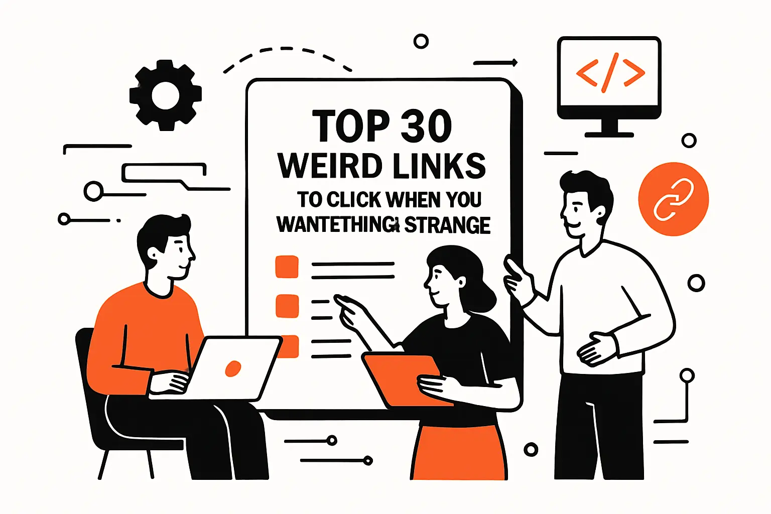
These aren’t “tools” in the enterprise sense. They’re tiny web experiences that do one odd job well. Think of them as palate cleansers for your brain. We picked links that load fast, deliver a clear weird outcome, and don’t demand a manual. Each mini-review focuses on what you get in the first minute.
To keep it fair, we score every site on the same weighted rubric. Value-for-money (20%) rewards free, repeatable delight. Feature depth (20%) rewards surprising layers, not long menus. Ease of setup & learning (15%) favors instant play. Integrations & ecosystem (15%) checks whether sharing or remixing is frictionless. UX & performance (10%) covers speed and smoothness. Security & trust (10%) favors minimal data exposure. Support & community (10%) credits active creators, FAQs, or a living fanbase. Scores are subjective, but the math is consistent.
1. Endless Horse
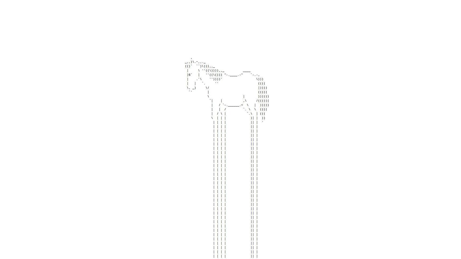
Endless Horse presents itself like a micro-project, not a product company. No roadmap vibe shows up. The “team” is basically the page and your scroll wheel. That simplicity is the point.
Outcome: get a clean, absurd mental reset in under a minute.
Best for: burnt-out knowledge workers and curious students on a browser.
- Infinite scroll gag → replaces doomscrolling with a harmless loop.
- Copy-paste sharing → saves 3 minutes of explaining “just trust me.”
- Zero setup interaction → first laugh in about 5 seconds.
Pricing & limits: From $0/mo for the core experience. Trial: N/A (it’s the trial). Caps: one joke, one interaction, and no built-in “save.”
Honest drawbacks: Depth is intentionally thin, so repeat visits can feel identical. Also, accessibility can be mixed for keyboard-only users.
Verdict: If you want a fast brain break, this delivers a grin in seconds. Beats random meme hunting for speed; trails richer toyboxes on variety.
Score: 3.3/5
2. Falling Falling

Falling Falling reads like a single-purpose web experiment. No company framing stands out. The “team” is the code that keeps dropping you downward. It feels built for vibes, not features.
Outcome: trigger a simple, floaty sense of motion without effort.
Best for: anxious scrollers and designers needing a motion palate cleanse.
- Continuous falling loop → gives your attention one soft thing to follow.
- Link-only distribution → saves 4 steps versus finding a similar animation.
- Instant load interaction → first value in roughly 10 seconds.
Pricing & limits: From $0/mo for basic use. Trial: N/A (always-on). Caps: minimal controls, and little customization for speed or style.
Honest drawbacks: The novelty wears off quickly on repeat sessions. Also, motion-heavy visuals can bother some users.
Verdict: If you want a quick sensory detour, this gives it immediately. Beats busy “relaxation” sites for simplicity; trails interactive art on depth.
Score: 3.1/5
3. Paper Toilet
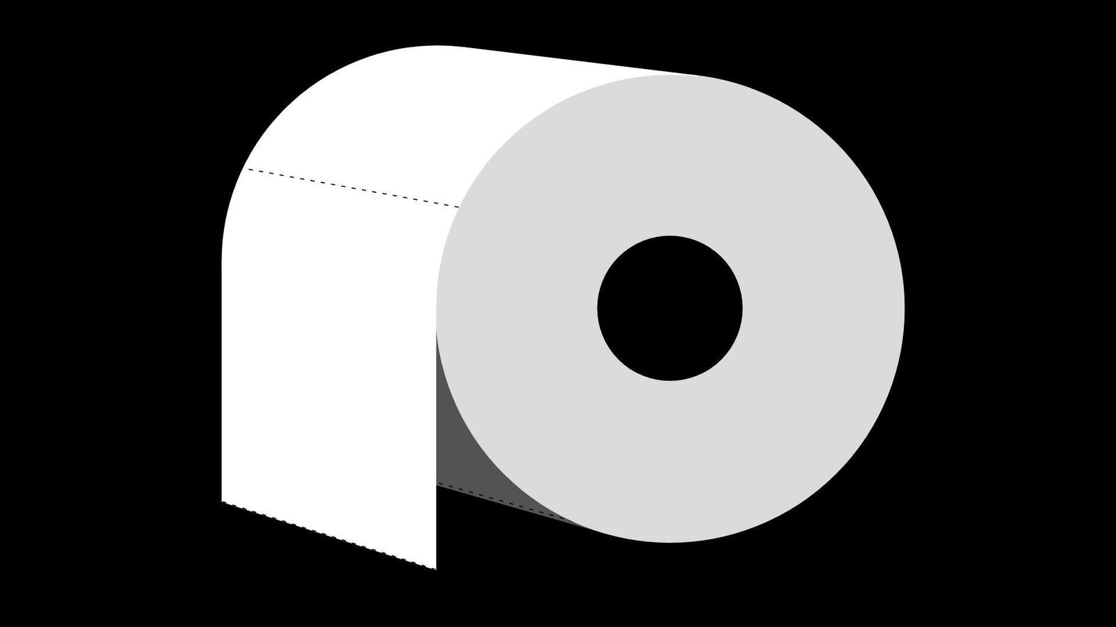
Paper Toilet has the energy of a handmade internet prank. No formal company presence is the vibe. The “team” feels like one person saying, “I built a joke.” That bluntness is weirdly refreshing.
Outcome: turn a few seconds of boredom into a dumb, tactile laugh.
Best for: office slackers and friends competing to find the strangest link.
- Single gag interaction → gives you a clean laugh without context.
- Shareable absurdity → saves 2 minutes of setup for group chat chaos.
- Low learning curve → first value in about 5–15 seconds.
Pricing & limits: From $0/mo for the main experience. Trial: N/A (click and go). Caps: one-page content, and minimal replay variation.
Honest drawbacks: The humor is narrow, so it can miss for some audiences. Also, it’s not built for productivity-minded “break timers.”
Verdict: If you want weird-on-demand, this delivers a fast hit. Beats long comedy feeds for speed; trails curated humor lists for range.
Score: 3.0/5
4. Is It Christmas?

Is It Christmas? acts like a minimalist utility, dressed as a joke. No company story is needed. The “team” is whoever decided one question deserved a whole site. That restraint is the charm.
Outcome: settle the seasonal question instantly, with comedic certainty.
Best for: office jokesters and anyone craving tiny, predictable delight.
- Binary answer page → removes all decision fatigue in one glance.
- Bookmark-friendly “integration” → saves 5 clicks versus checking calendars.
- No learning curve → first value in under 3 seconds.
Pricing & limits: From $0/mo for the core check. Trial: N/A (it’s perpetual). Caps: one question, one answer, and no personalization.
Honest drawbacks: The joke is one-note outside December. Also, there’s nothing to explore if you want more whimsy.
Verdict: If you want a clean micro-laugh, this delivers every time. Beats social feeds for clarity; trails interactive toys for replay value.
Score: 3.4/5
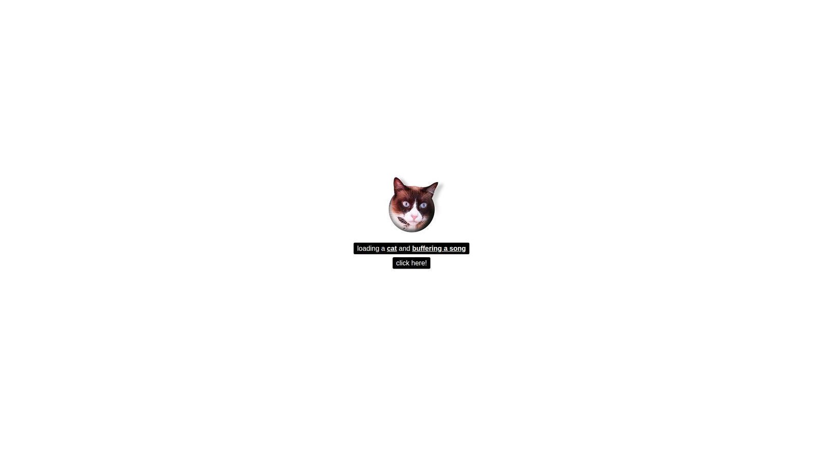
5. Zombo.com
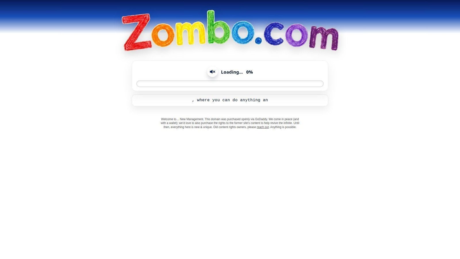
Zombo.com feels like an early-internet performance piece. No conventional product team is in sight. The “company” is the voice, the vibe, and the commitment to nonsense. It’s more ritual than website.
Outcome: surrender to a looping hype message and feel oddly reset.
Best for: nostalgia nerds and teams needing a shared “what did I just hear?” moment.
- Audio-forward mantra → gives instant mood shift without scrolling.
- One-link share factor → saves 3 minutes of context building.
- Click-to-experience flow → first value in about 10 seconds.
Pricing & limits: From $0/mo to experience the core loop. Trial: N/A (it starts immediately). Caps: limited controls, and sound is a big part.
Honest drawbacks: The joke can feel repetitive fast. Also, audio can be awkward in public spaces.
Verdict: If you want a weird reset button, this gives it fast. Beats many “random” sites for iconic delivery; trails visual toys on interactivity.
Score: 3.2/5
6. Electric Boogie-Woogie
Electric Boogie-Woogie comes off like a tiny art toy. No corporate polish shows up. The “team” presence is basically the animation’s confidence. It’s a page that insists you watch.
Outcome: get a quick dopamine pop from pure motion and sound.
Best for: playlist-adjacent procrastinators and friends swapping oddities.
- Looping audiovisual hook → gives you a fast mood bump.
- Zero-account sharing → saves 4 steps versus sending a video file.
- Immediate playback feel → first value in about 5–10 seconds.
Pricing & limits: From $0/mo for the core loop. Trial: N/A (instant). Caps: limited controls, and the joke depends on repetition.
Honest drawbacks: Sensory intensity may be too much for some viewers. Also, there’s little depth beyond the loop.
Verdict: If you want a quick sensory jolt, this delivers it promptly. Beats searching “weird animation” for speed; trails interactive music toys for control.
Score: 3.1/5
7. Koala to the Max

Koala to the Max feels like a classic web demo turned delight. No big company framing dominates the page. The “team” energy shows in how smooth the interaction feels. It’s simple, but surprisingly satisfying.
Outcome: reveal an image through tiny clicks that feel like peeling reality.
Best for: fidgety brains and creative teams warming up before ideation.
- Progressive reveal mechanic → turns idle clicking into a mini achievement.
- Easy share and replay → saves 2 minutes versus explaining the puzzle vibe.
- Intuitive interaction → first value in about 15–30 seconds.
Pricing & limits: From $0/mo for the core experience. Trial: N/A (always accessible). Caps: one main flow, and limited customization without code.
Honest drawbacks: Replays can feel similar once you know the reveal. Also, it can be tedious if you dislike repetitive clicking.
Verdict: If you want calm, tactile weirdness, this pays off within a minute. Beats pure-random sites on satisfaction; trails deeper puzzle games on variety.
Score: 3.6/5
8. That’s The Finger

That’s The Finger presents as a blunt, single-joke page. No company credibility is trying to win you over. The “team” is basically the punchline and its timing. It’s internet id in one click.
Outcome: vent a tiny bit of spite, safely, in seconds.
Best for: stressed coworkers and friends who speak fluent sarcasm.
- One-click punchline → releases tension without starting a rant.
- Link-as-integration → saves 3 steps versus screenshotting a meme.
- Immediate payoff → first value in about 3–5 seconds.
Pricing & limits: From $0/mo for the core gag. Trial: N/A (it’s instant). Caps: one note, and not suited for mixed-age audiences.
Honest drawbacks: The humor is crude and can be a deal-breaker. Also, it’s not “weird” so much as aggressive.
Verdict: If you want a fast, rude chuckle, this delivers instantly. Beats subtle humor for blunt relief; trails playful sites on broad appeal.
Score: 2.9/5
9. Cat Bounce
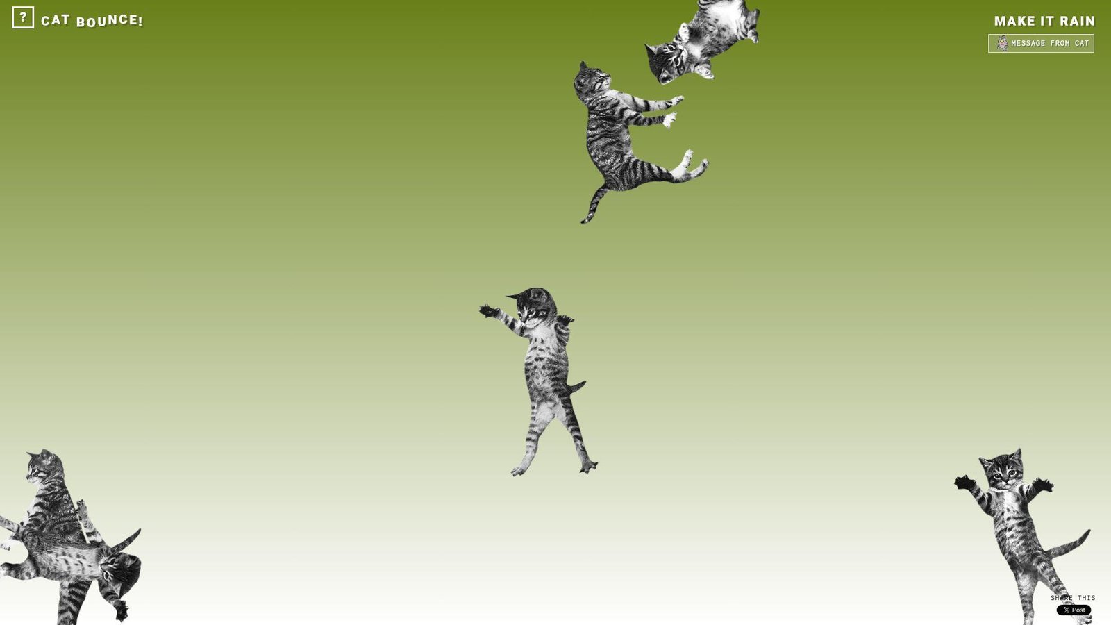
Cat Bounce feels like a lightweight toy built for instant chaos. No formal team or brand story takes center stage. The “company” is basically the physics engine and the cats. It knows its job and does it loudly.
Outcome: turn your screen into a bouncing-cat stress toy.
Best for: remote teams on break and anyone who needs silly motion now.
- Physics-driven cat mayhem → swaps stress for laughter in one click.
- Easy tab sharing → saves 2 minutes versus hunting a “funny cat” clip.
- Instant interaction → first value in about 5–10 seconds.
Pricing & limits: From $0/mo for the core bounce. Trial: N/A (play immediately). Caps: limited goals, and the novelty is the whole point.
Honest drawbacks: Motion can be distracting if you’re light-sensitive. Also, it’s not built for accessibility-first control schemes.
Verdict: If you want a quick mood lift, this delivers in under a minute. Beats static memes on kinetic joy; trails curated games on objectives.
Score: 3.5/5
10. RGB
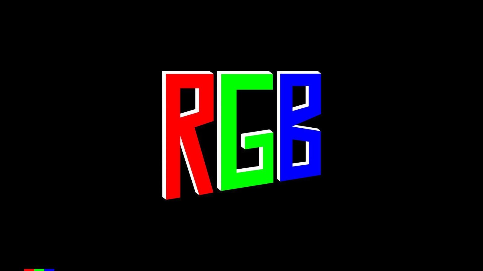
RGB reads like a minimal demo, not a staffed product. No “about” story competes with the experience. The “team” shows up as crisp responsiveness. It’s a clean little color trip.
Outcome: use color and motion to reboot your attention fast.
Best for: designers, bored commuters, and anyone craving a visual reset.
- Full-screen color play → gives a sensory break without scrolling feeds.
- Shareable single URL → saves 3 clicks versus finding a similar generator.
- Immediate responsiveness → first value in about 5 seconds.
Pricing & limits: From $0/mo for the core experience. Trial: N/A (always live). Caps: minimal controls, and limited depth beyond the effect.
Honest drawbacks: It can feel repetitive quickly. Also, intense colors may not suit everyone.
Verdict: If you want quick visual weirdness, this delivers with zero friction. Beats heavier art sites on speed; trails interactive canvases on customization.
Score: 3.2/5
11. Zoomquilt
Zoomquilt feels like a collaborative art artifact more than a startup. No sales copy interrupts the spell. The “team” presence is the craft in every transition. It’s internet surrealism that keeps unfolding.
Outcome: sink into an endless zoom and forget time briefly.
Best for: artists, writers, and anyone needing a gentle creative trance.
- Continuous zoom narrative → turns a break into a mini dream sequence.
- Link-based “distribution” → saves 5 minutes versus curating a moodboard.
- Press play and watch → first value in about 10–20 seconds.
Pricing & limits: From $0/mo for core viewing. Trial: N/A (it’s ready). Caps: passive experience, and interaction is limited by design.
Honest drawbacks: It’s more watch than play, so fidgety users may bounce. Also, performance can depend on your device and browser.
Verdict: If you want surreal calm, this delivers a steady drift within minutes. Beats random-link roulette on artistry; trails games on agency.
Score: 3.7/5
12. You Should Have Seen This
You Should Have Seen This is built like a punchline with a URL. No company structure is obvious. The “team” shows up as timing and restraint. It’s a tiny comedy device.
Outcome: create a quick, self-aware laugh about missing the moment.
Best for: group chats and coworkers who love anti-humor.
- Meta joke delivery → gives you a laugh without any setup.
- Perfect for sharing → saves 2 minutes versus explaining the bit.
- One-screen experience → first value in about 3–8 seconds.
Pricing & limits: From $0/mo for the core gag. Trial: N/A (it is the trial). Caps: minimal replay, and the joke depends on surprise.
Honest drawbacks: Once you know it, the effect drops. Also, it can feel too small for people wanting “more weird.”
Verdict: If you want a quick wink at internet culture, this lands fast. Beats long comedy threads on speed; trails interactive toys on longevity.
Score: 3.0/5
13. Please Like

Please Like feels like an art-school critique disguised as a site. No corporate team tries to retain you. The “company” is the uncomfortable honesty about attention. It’s weird because it’s true.
Outcome: get a sharp little reminder about approval addiction.
Best for: social media managers and anyone needing a craving interrupt.
- Single-message experience → replaces mindless scrolling with a self-check.
- Shareable commentary → saves 4 clicks versus finding a relevant quote.
- Instant comprehension → first value in about 5 seconds.
Pricing & limits: From $0/mo for the core point. Trial: N/A (always available). Caps: no depth layers, and no personalization.
Honest drawbacks: It can feel preachy if you’re not in the mood. Also, it’s more statement than playground.
Verdict: If you want a fast perspective shift, this does it in seconds. Beats motivational posters on bite; trails interactive art on engagement.
Score: 3.1/5
14. Ever Dream This Man?
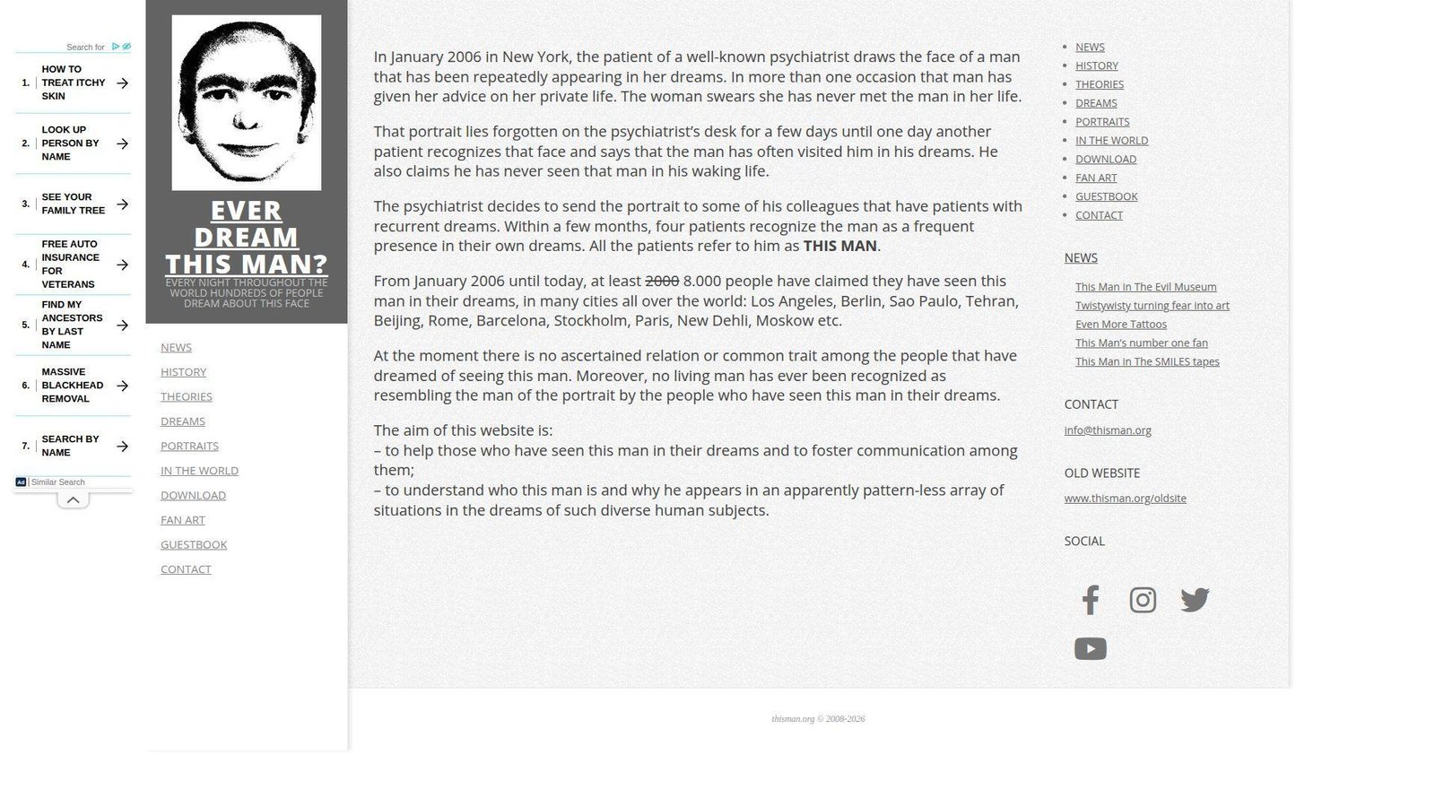
Ever Dream This Man? is packaged like an urban legend on purpose. No typical company identity is the focus. The “team” is the myth-making voice and the eerie framing. It’s designed to stick in your head.
Outcome: drop yourself into a creepy meme and see if it echoes.
Best for: horror-curious readers and friends who like unsettling internet lore.
- Myth-story presentation → creates instant atmosphere without a long read.
- Easy link sharing → saves 3 minutes versus summarizing the premise.
- Immediate hook → first value in about 20–40 seconds.
Pricing & limits: From $0/mo for the core story. Trial: N/A (read it now). Caps: mostly static content, and limited interactivity.
Honest drawbacks: The vibe can be too creepy for some viewers. Also, it’s not a “toy,” so it may not scratch the playful itch.
Verdict: If you want strange with a chill, this delivers in under five minutes. Beats jump-scare sites on mood; trails games on replay.
Score: 3.3/5
15. The Useless Web
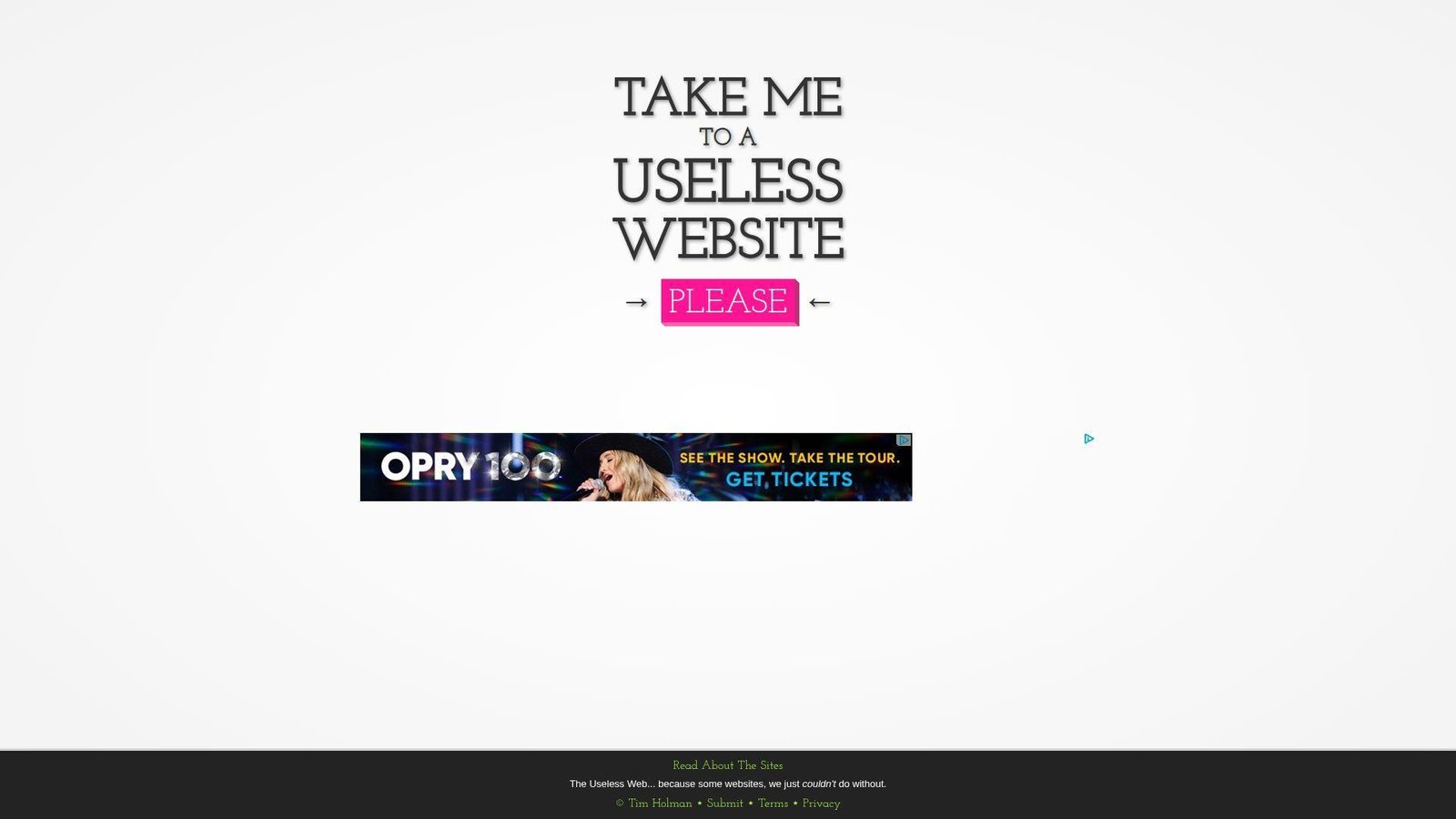
The Useless Web feels like a curator with a roulette wheel. No big team is required, but the list implies ongoing maintenance. The “company” is the promise of randomness with a wink. It’s a gateway drug to weird internet.
Outcome: get a new strange site instantly, without decision fatigue.
Best for: bored teams and teachers needing a quick “internet is odd” moment.
- Random-site launcher → replaces searching with instant surprise.
- One-click discovery flow → saves 5–10 minutes of browsing.
- Fast time-to-weird → first value in about 5 seconds.
Pricing & limits: From $0/mo for the core spinner. Trial: N/A (always on). Caps: quality varies by destination, and randomness can misfire.
Honest drawbacks: You can’t fully control what you’ll get. Also, some results may be loud, bright, or not your taste.
Verdict: If you want surprise on demand, this delivers in a single click. Beats manual “weird site” lists on speed; trails curated guides on consistency.
Score: 3.6/5
16. Pointer Pointer

Pointer Pointer feels like a small, clever internet trick. No company page distracts from the magic. The “team” shows up in the dataset-like breadth of results. It’s simple, yet reliably surprising.
Outcome: make your cursor feel seen, in the strangest way.
Best for: curious coworkers and anyone who wants a low-stakes “wow” moment.
- Cursor-targeted reveal → turns idle mouse movement into a quick surprise.
- Shareable demo link → saves 3 minutes versus explaining the gimmick.
- Zero learning curve → first value in about 10 seconds.
Pricing & limits: From $0/mo for the core effect. Trial: N/A (instant). Caps: desktop-first feel, and the trick is the whole product.
Honest drawbacks: Mobile use can be less satisfying than a mouse. Also, repeats can feel similar after a few rounds.
Verdict: If you want quick, clean weirdness, this delivers within seconds. Beats many one-joke sites on repeatability; trails deeper toys on variation.
Score: 3.4/5
17. The Pug In A Rug
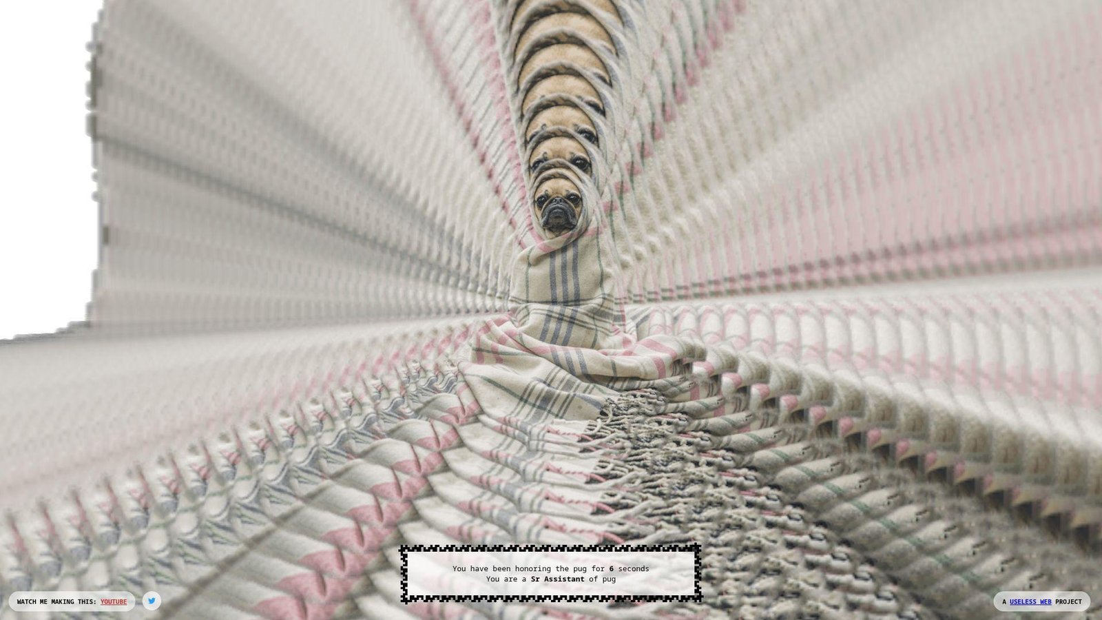
The Pug In A Rug reads like a tiny interactive doodle. No big company structure is obvious. The “team” energy feels playful and unbothered by “usefulness.” It’s cute weirdness, not edgy weirdness.
Outcome: get a soft, silly interaction that lowers your shoulders.
Best for: pet lovers and anyone needing a gentle break between tasks.
- Simple interactive gag → gives quick comfort without scrolling feeds.
- Easy share with friends → saves 2 minutes versus sending a heavy video.
- Click-and-play start → first value in about 10–20 seconds.
Pricing & limits: From $0/mo for core interaction. Trial: N/A (always available). Caps: minimal depth, and it’s mostly a single loop.
Honest drawbacks: If you don’t like cutesy humor, it won’t land. Also, it’s not built to keep you engaged long.
Verdict: If you want a quick, warm weird, this helps in under a minute. Beats harsher prank sites on vibe; trails richer pet games on content.
Score: 3.0/5
18. Staggering Beauty
Staggering Beauty feels like a web art prank with sharp edges. No conventional company wrapper appears. The “team” intent is clear: surprise you, then escalate. It’s memorable, but not subtle.
Outcome: jolt yourself awake with interactive absurdity.
Best for: late-night internet explorers and friends who enjoy chaotic surprises.
- Mouse-driven creature motion → turns fidget energy into instant spectacle.
- Shareable shock factor → saves 5 minutes versus finding a comparable “what.”
- Immediate responsiveness → first value in about 10 seconds.
Pricing & limits: From $0/mo for the core experience. Trial: N/A (it starts now). Caps: intensity can spike, and it’s not a productivity-safe break.
Honest drawbacks: Flashy, rapid visuals can be a deal-breaker for some users. Also, it’s not great for quiet public settings.
Verdict: If you want strange with a punch, this delivers within a minute. Beats gentle toys on intensity; trails calmer sites on accessibility.
Score: 3.2/5
19. Quick, Draw!
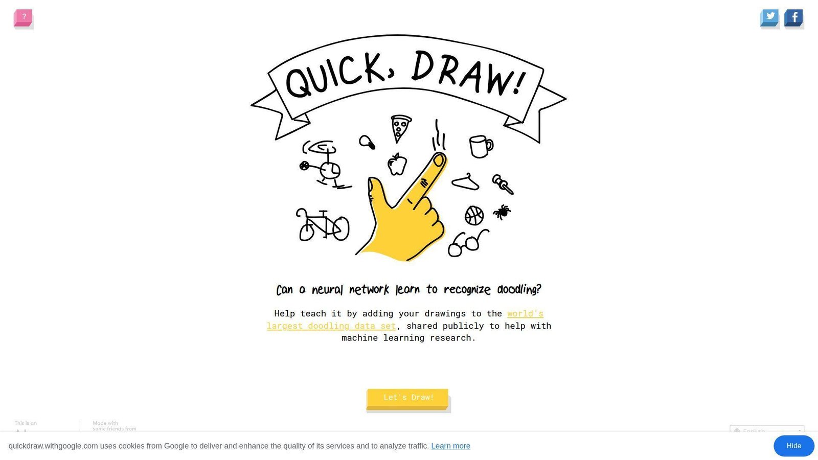
Quick, Draw! comes from a real organization, not a lone prankster. Google’s footprint is visible in the polish and scale. The “team” vibe feels research-adjacent and playful. It’s weird, but also engineered.
Outcome: draw fast, get guessed, and feel your brain light up.
Best for: teachers and creative teams wanting a quick, structured game.
- Timed drawing rounds → turns a break into a mini skill sprint.
- AI-style guessing loop → saves 6 steps versus running a manual drawing game.
- Instant start gameplay → first value in about 20 seconds.
Pricing & limits: From $0/mo for core play. Trial: N/A (play immediately). Caps: short rounds, and you can’t fully control prompts.
Honest drawbacks: The timer can feel stressful for slower drawers. Also, it’s less fun if your device input is clunky.
Verdict: If you want a playful challenge, this delivers repeat fun in minutes. Beats one-joke sites on depth; trails full art apps on creative control.
Score: 3.9/5
20. Patience Is a Virtue

Patience Is a Virtue feels like an internet dare disguised as a site. No company ambitions show up. The “team” is the constraint itself: wait, and see. It’s weird because it refuses to entertain you.
Outcome: practice doing nothing, with a page as your witness.
Best for: attention-training experimenters and anyone trying to break refresh habits.
- Waiting-based flow → replaces compulsive clicking with one deliberate pause.
- No integrations needed → saves 5 minutes versus setting up a timer app.
- Start by doing less → first value in about 30–60 seconds.
Pricing & limits: From $0/mo for the core challenge. Trial: N/A (it is the exercise). Caps: the payoff is slow, and impatience is the failure mode.
Honest drawbacks: Many users will bounce before the point lands. Also, it’s not “fun weird” if you want sensory novelty.
Verdict: If you want a tiny discipline drill, this helps within minutes. Beats flashy distractions on intent; trails meditation apps on guidance.
Score: 2.8/5
21. Zombie Passions
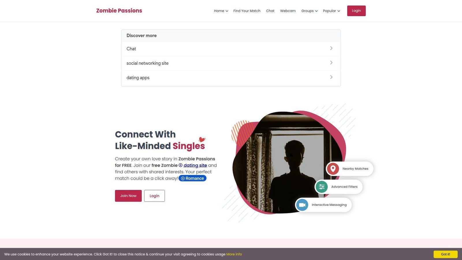
Zombie Passions presents as a niche community, not a minimalist prank. A larger network vibe is implied by the “Passions” framing. The “team” energy feels moderation-and-membership oriented. It’s weird because it takes the premise seriously.
Outcome: find people who will actually talk zombies with commitment.
Best for: niche-dating curious folks and fandom community lurkers.
- Theme-first community framing → turns a joke interest into actual connection attempts.
- Profile-and-message workflow → saves 6 steps versus searching scattered forums.
- Familiar site patterns → first value in about 5–10 minutes.
Pricing & limits: From $0/mo for basic exploration. Trial: N/A (access depends on how you use it). Caps: messaging and discovery can hinge on account actions.
Honest drawbacks: Niche communities can feel quiet, depending on your area. Also, UX may feel dated compared with modern social apps.
Verdict: If you want a themed community rabbit hole, this can deliver in an evening. Beats generic apps on specificity; trails mainstream platforms on active volume.
Score: 3.0/5
22. The Long Doge Challenge
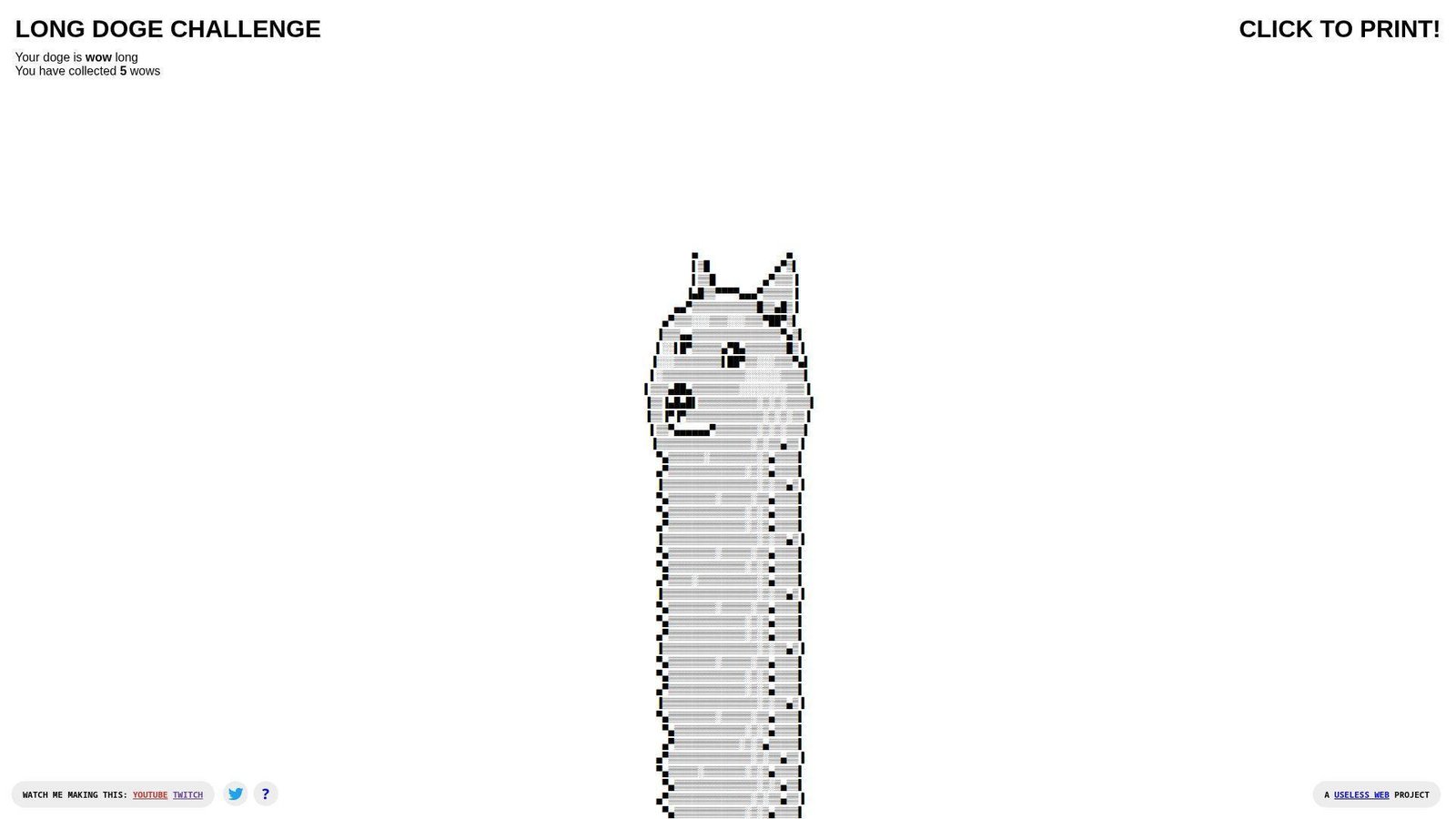
The Long Doge Challenge feels like meme craft turned into a page. No company structure is front and center. The “team” is the joke’s endurance and your willingness to keep going. It’s a scroll quest for the internet-brained.
Outcome: commit to a ridiculous long-form meme and finish it.
Best for: nostalgia meme fans and coworkers who love micro-challenges.
- Length-as-game mechanic → turns idle scrolling into a clear “finish line.”
- Easy link sharing → saves 3 minutes versus hunting the meme elsewhere.
- Start instantly → first value in about 10–20 seconds.
Pricing & limits: From $0/mo for the core challenge. Trial: N/A (always live). Caps: it’s mainly one gag, and the payoff depends on persistence.
Honest drawbacks: If you don’t care about the meme, it’s dead on arrival. Also, it can feel like “just scrolling,” because it is.
Verdict: If you want a silly endurance task, this pays off in minutes. Beats random lists on focus; trails interactive games on mechanics.
Score: 3.1/5
23. Binary Music Player
Binary Music Player looks like a small maker project with a clever hook. No big company story is required here. The “team” presence is the clarity of the interface. It’s weird in a nerdy, musical way.
Outcome: make sound patterns from bits, fast, without music theory.
Best for: STEM educators and curious tinkerers who like audible feedback.
- Binary-to-sound mapping → turns abstract bits into something you can hear.
- No export workflow needed → saves 5 steps versus building a synth patch.
- Clickable interface → first value in about 1–2 minutes.
Pricing & limits: From $0/mo for core play. Trial: N/A (it’s ready). Caps: limited composition depth, and results can feel samey fast.
Honest drawbacks: Serious musicians may find it too constrained. Also, mobile interaction can be fiddly for precise toggles.
Verdict: If you want playful learning, this helps you “get” binary in minutes. Beats reading explanations on engagement; trails full sequencers on control.
Score: 3.3/5
24. Eel Slap!

Eel Slap! is the definition of a single gag done confidently. No company ambitions clutter the frame. The “team” energy is comedic timing and shameless repetition. It’s dumb, and that’s the gift.
Outcome: replace frustration with slapstick in one rapid gesture.
Best for: stressed students and friends who want instant, shareable nonsense.
- Interactive slap motion → turns irritation into a quick laugh.
- Simple link share → saves 2 minutes versus sending a heavy clip.
- One-gesture learning → first value in about 5 seconds.
Pricing & limits: From $0/mo for the core slap. Trial: N/A (always on). Caps: one joke, and it can get old fast.
Honest drawbacks: The humor is juvenile, which won’t fit every room. Also, it’s not great if you want quiet, subtle weird.
Verdict: If you want a fast laugh, this delivers in seconds. Beats many one-liners on interaction; trails multi-mode toys on longevity.
Score: 3.4/5
25. Can’t Not Tweet This

Can’t Not Tweet This feels like a social-media prank with a thesis. No big company wrapper stands out. The “team” intention is friction as comedy. It weaponizes the interface against you.
Outcome: experience how hard it is to stop yourself from posting.
Best for: social media managers and anyone curious about impulse design.
- Constraint-based typing gag → turns habit loops into a visible struggle.
- Built around a share outcome → saves 4 steps versus staging the joke manually.
- Immediate interaction → first value in about 20–40 seconds.
Pricing & limits: From $0/mo for the core experience. Trial: N/A (instant). Caps: it’s platform-dependent in spirit, and outcomes vary by user.
Honest drawbacks: If you don’t use social platforms, the joke lands softer. Also, it can feel stressful rather than funny.
Verdict: If you want weird with a point, this delivers in a minute. Beats generic “fun” sites on commentary; trails pure games on relaxation.
Score: 3.2/5
26. Find The Invisible Cow
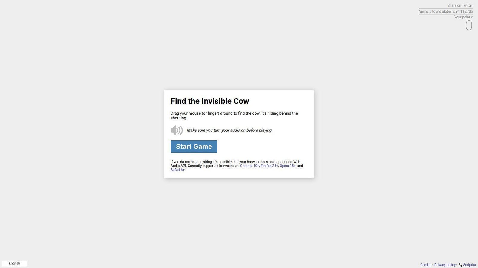
Find The Invisible Cow feels like a simple party game, stripped down. No company identity is necessary. The “team” vibe shows in the clean feedback loop. It’s weird because it turns your ears into a cursor.
Outcome: hunt an invisible target using sound, then celebrate like a kid.
Best for: families and teams wanting a quick, wholesome competition.
- Hot-and-cold audio mechanic → turns wandering into a satisfying find.
- No setup beyond sound → saves 5 minutes versus installing a game.
- Instant start loop → first value in about 30–60 seconds.
Pricing & limits: From $0/mo for core play. Trial: N/A (play now). Caps: sound required, and shared spaces can make it awkward.
Honest drawbacks: Quiet environments and open offices are a bad fit. Also, accessibility varies for users with hearing limitations.
Verdict: If you want a fast game, this delivers a win within minutes. Beats random links on replay; trails full games on modes and depth.
Score: 3.6/5
27. Noooooo!
Noooooo! feels like a button you keep around for emotional punctuation. No company structure is important here. The “team” is the commitment to one sound and one moment. It’s a tiny release valve.
Outcome: express dramatic despair instantly, without writing a paragraph.
Best for: group chats and coworkers who need comic relief on demand.
- One-click reaction → replaces a rant with a clean, funny signal.
- Share the page fast → saves 2 minutes versus hunting reaction clips.
- Immediate payoff → first value in about 3–5 seconds.
Pricing & limits: From $0/mo for the core reaction. Trial: N/A (always available). Caps: one note, and novelty can fade quickly.
Honest drawbacks: Audio-first humor won’t fit quiet settings. Also, it’s thin if you want interactive weirdness.
Verdict: If you want a fast reaction tool, this helps in seconds. Beats typing on speed; trails soundboards on variety.
Score: 3.1/5
28. Procatinator
Procatinator reads like a joke made by someone who knows the enemy. No corporate team tries to convert you. The “company” is the voice in your head, externalized. It’s weirdly comforting.
Outcome: feel seen in your procrastination, then maybe laugh and return.
Best for: students and solo workers stuck in avoidance spirals.
- Random procrastination prompts → turns guilt into a quick, harmless chuckle.
- Low-friction refresh loop → saves 3 minutes versus wandering social feeds.
- Instant engagement → first value in about 10 seconds.
Pricing & limits: From $0/mo for core use. Trial: N/A (it’s live). Caps: content can repeat, and there’s little personalization.
Honest drawbacks: It can enable avoidance if you linger. Also, the humor may feel dated depending on your taste.
Verdict: If you want a small interruption, this helps you reset within a minute. Beats endless feeds on containment; trails focus apps on actual behavior change.
Score: 3.3/5
29. Cornify
Cornify feels like a relic from the sparkly-web era, still grinning. No formal team story is required. The “company” energy is unapologetic whimsy at maximum volume. It’s weird, loud, and proud.
Outcome: flood your screen with ridiculous joy on command.
Best for: party hosts and anyone who wants instant glittery chaos.
- One-click visual overload → turns a dull tab into a celebration.
- Easy share for groups → saves 4 steps versus setting up a silly slideshow.
- Instant gratification → first value in about 5–10 seconds.
Pricing & limits: From $0/mo for core fun. Trial: N/A (always on). Caps: it’s intentionally chaotic, and subtlety is not available.
Honest drawbacks: Visual noise can be a deal-breaker for some viewers. Also, it’s not great on low-power devices or small screens.
Verdict: If you want maximal silly, this delivers in seconds. Beats muted “cute” sites on impact; trails interactive art on craft and nuance.
Score: 3.4/5
30. Nyan Cat
Nyan Cat is a recognizable internet artifact, not a hidden indie page. The “team” presence feels like ongoing stewardship of a meme. Its identity is music, looping, and pure sugar energy. It’s weird because it refuses to end.
Outcome: get a bright, nostalgic hit that resets your mood fast.
Best for: millennial nostalgia fans and teams needing a quick shared laugh.
- Iconic loop experience → replaces a slump with instant brightness.
- Shareable cultural shorthand → saves 5 minutes versus explaining the meme.
- Immediate start → first value in about 5–10 seconds.
Pricing & limits: From $0/mo for core viewing. Trial: N/A (it’s already running). Caps: the loop is the feature, and control options are limited.
Honest drawbacks: Audio can be a hard no in quiet places. Also, repeated looping can become grating fast.
Verdict: If you want instant nostalgic weird, this delivers in seconds. Beats obscure sites on recognizability; trails newer toys on novelty.
Score: 3.5/5
What makes “weird links” worth clicking: the core traits of a weird website
In our day-to-day work, we ship dashboards, workflows, and integrations. Underneath that utility, every product still competes with boredom and friction. Oddly enough, “useless” websites are often better at reducing friction than “useful” ones. They load fast, they explain nothing, and they still persuade us to interact. That persuasion matters in the real economy. Gartner forecasts worldwide IT spending totaling $6.15 trillion, so even tiny experiences sit inside massive budgets.
Meanwhile, Statista counts 5.56 billion internet users, which makes “quirky corners” a mainstream phenomenon in practice. McKinsey found leaders in personalization generate 40 percent more revenue from those activities, and weird links teach personalization’s cousin: immediacy. We see the same principle in polished campaigns too. Spotify Wrapped and Google Doodles work because they feel like playful interruptions. Weird websites simply do it with fewer approvals and more audacity. So, we study them as compressed product strategy, not guilty pleasures.
1. Weird links with unique content that feels oddly specific
Specificity is the first tell.
A weird site rarely tries to be “for everyone,” and that’s precisely why it works.
Instead, it commits to a narrow joke, a micro-ritual, or a single obsession.
From our perspective, that narrowness reduces cognitive load.
Users do not ask, “What can I do here?” for very long.
They ask, “How far does this go?” which is a better question for engagement.
2. Unconventional web design that breaks standard layouts and aesthetics
Weird design is often a refusal to be a template.
That refusal can look messy, but it can also be carefully engineered chaos.
Either way, it signals intention, not accident.
In product work, we translate that lesson into contrast and hierarchy.
A strong interface can be conventional and still feel surprising.
Sometimes one unexpected interaction does more than a full redesign.
3. Weird links with an unusual purpose or no practical function at all
Purpose is optional in weird-land.
Some sites exist to do nothing, loudly, and they do it well.
That “nothing” becomes a relief valve for overstimulated users.
We treat that as a signal about modern software fatigue.
Users are not always chasing features.
Often, they are chasing permission to pause without commitment.
4. Quirky interactive elements that make you click, drag, type, and play
Weird sites teach muscle-memory UX.
They invite the hand first, then the mind follows.
Clicks, drags, and keystrokes become narrative beats.
In business apps, we borrow this carefully.
Micro-feedback can confirm an action without a modal or a toast.
A small “response” can feel like the product is alive.
5. Minimalist weird links built around one bizarre idea
Minimalism is not always “clean.”
In weird sites, minimalism means ruthless scope control.
One concept gets the full spotlight, and everything else disappears.
That discipline maps directly to MVP thinking.
When we prototype, we try to preserve a single “core loop.”
Extra settings can wait until the loop proves itself.
6. Weird links as artistic expression and browser-based digital art
Some weird sites are galleries that happen to run in a tab.
They use motion, sound, and repetition like paint.
The browser becomes a stage, not a document viewer.
We love this because it reframes front-end work.
Design systems matter, yet so does taste.
Artful interactions can make a brand feel human, not just consistent.
7. A sense of humor, absurdity, and intentional confusion
Absurdity is a feature when it is intentional.
Confusion can be playful when stakes are low and exit is easy.
That is a key boundary we keep repeating to clients.
Humor also functions as trust-building, oddly enough.
A product that can laugh at itself often feels less predatory.
That vibe matters when users fear dark patterns.
8. Niche appeal: weird links made for hyper-specific interests and communities
Niche communities keep weird sites alive.
They share them like inside jokes and return for comfort.
Community is the retention engine, not features.
In our consulting, we often ask a blunt question.
Who is your product’s “tiny cult,” and what do they celebrate?
Weird links answer that by existing for the cult first.
Weird links safety checklist: what to do before you click
1. Don’t download anything from random weird links
Our rule is boring, but it keeps machines clean.
If a weird site asks for a download, we usually close the tab.
Plenty of delightful experiences run entirely in the browser.
On client machines, we also enforce this at the platform level.
Endpoint policies and locked-down browsers reduce “curiosity risk.”
That is especially important in shared offices and classrooms.
2. Don’t enter passwords or payment information on untrusted pages
Weird links are not the place for credentials.
Even a harmless site can be compromised later.
So, we avoid logging in, and we avoid “just to see” purchases.
For teams, password managers help catch suspicious domains.
Auto-fill should fail when the origin is unfamiliar.
That tiny friction is a security win.
3. Use a private window when you’re clicking lots of weird links
A private window is a practical boundary.
It reduces cookie carryover and keeps experiments contained.
It also prevents weird sites from polluting your daily browsing state.
When we run research sessions, we go one step further.
Disposable browser profiles keep extensions and history isolated.
That isolation makes behavior easier to debug too.
4. Start with volume low to avoid loud audio surprises
Some weird sites use sound as the punchline.
That is funny at home and terrible in an open office.
So we mute first, then opt into audio.
On our side, we also appreciate sites that respect autoplay policies.
Those constraints push creators toward consent-based sound design.
Consent makes surprises feel safe.
5. Watch for flashing visuals and respect epilepsy-related warnings
Flash can be art, but flash can also be dangerous.
If a site warns about strobing, we take it seriously.
We also avoid demoing those experiences in group settings.
In product work, that caution becomes a design requirement.
We prefer motion that is optional, gradual, and user-controlled.
Accessibility is not a legal checkbox to us.
6. Treat community-sourced weird links cautiously, especially obscure or hidden-network links
Community lists are fun, and they are also uncurated attack surfaces.
When a link is shared without context, we assume nothing.
We look for reputation signals and basic transparency.
For higher-risk exploration, we recommend sandboxing.
A virtual machine or a cloud browser can reduce consequences.
Curiosity should not cost a breach.
7. If a weird link is dead, try an archived version instead of hunting shady mirrors
Dead links are common in weird-web culture.
Domains lapse, hosting bills arrive, and art disappears overnight.
Mirrors can be useful, yet they can also be malicious clones.
When we need a historical page, we try the Internet Archive’s Wayback Machine first and keep our guard up.
That approach preserves curiosity while reducing the chance of a booby-trapped copy.
Types of weird links by vibe: what kind of strange experience do you want?
1. Random weird links that act like “boredom roulette” buttons
This vibe is pure exploration.
We click because we want the next surprise to choose us.
For teams, this is also a fast way to spark ideation.
During internal workshops, we use roulette sites as warm-ups.
A single odd page can unlock better metaphors for product storytelling.
Then we translate “weird delight” into “useful delight.”
Links to Try
- Press The Useless Web button and let randomness do the curating for us.
- Jump through The Useless Web Clone when the original mood needs a remix.
- Teleport via MapCrunch to a random street scene and follow curiosity.
- Browse Neal.fun when we want a cabinet of interactive oddities.
- Refresh Random Colour for a single-shot jolt of palette-based randomness.
2. Pointless-but-satisfying weird links built around one committed action
This vibe is “one gesture, fully committed.”
It can be scrolling, hovering, or simply waiting.
That commitment often feels meditative, even when it is silly.
We like these sites for a product reason.
They demonstrate clear affordances without instructions.
The interaction itself becomes the documentation.
Links to Try
- Sink into Endless Horse when we want scrolling to become the entire joke.
- Open HEEEEEEEY for an aggressively simple greeting that refuses to evolve.
- Shout silently at HOOOOOOOOO and let the page match the mood.
- Stare at Bury Me With My Money for looping, maximal commitment to a single bit.
- Visit Zombo when we want a page that promises everything and explains nothing.
3. Interactive art weird links powered by cursor movement and visual feedback
This is the “your hand is the brush” category.
Cursor movement becomes input, and feedback becomes the reward.
We often use these as proof that interfaces can feel tactile.
For business, the translation is straightforward.
Responsive feedback reduces support tickets and increases confidence.
People trust software that reacts like a well-tuned instrument.
Links to Try
- Wiggle over Pointer Pointer and watch the web point back at us.
- Click patiently in Koalas to the Max and reveal an image through persistence.
- Bounce chaos around Cat Bounce when we need physics-driven nonsense.
- Draw symmetry on WeaveSilk and let mirroring do half the artistry.
- Play keys on Patatap if we want sound, shapes, and rapid feedback.
4. Calming weird links with relaxing visuals, ambient loops, and mood resets
Calm weirdness is underrated.
Not every strange page has to shout for attention.
Some simply create a small, safe loop for the nervous system.
We recommend these before stressful work, not after.
A quick reset can change how a meeting feels.
In our own teams, calm links reduce context-switch friction.
Links to Try
- Let Rainy Mood fill the room with a steady, low-stakes atmosphere.
- Type a worry into Pixel Thoughts and watch it shrink in perspective.
- Mix ambience on A Soft Murmur when silence feels too sharp.
- Hold still with Do Nothing for Two Minutes and accept the constraint as the point.
- Drift through Infinite Flowers for an endless zoom that feels like breathing.
5. Mini-game weird links and browser challenges that are strangely addictive
Some weird links are games, but not “game industry” games.
They are small challenges that fit inside a coffee break.
We respect them because they teach onboarding without tutorials.
In product design, that same lesson is gold.
If a user needs training, we have already lost momentum.
Good interaction design teaches itself through consequences.
Links to Try
- Solve obsessively on Sliding Toys when spatial reasoning needs a workout.
- Type to survive on ZType for a keyboard-driven adrenaline loop.
- Learn strategy with The Evolution of Trust and notice your own instincts.
- Pretend loudly with Hacker Typer while remembering it is theater, not tooling.
- Hunt by sound on Find the Invisible Cow and keep your volume polite.
6. Nostalgia weird links that feel like early-internet time capsules
Nostalgia is not only aesthetic.
It is a reminder that constraints can create character.
Older sites often feel direct because they had fewer options.
We use nostalgia links as design palate cleansers.
They help us question whether modern complexity is actually necessary.
Sometimes the best UI is a confident, simple page.
Links to Try
- Time travel through Space Jam’s classic site and enjoy the unfiltered web-era vibe.
- Let OMFGDOGS flood your screen with pure pixelated insistence.
- Get slapped by Eel Slap when you want comedy with one repeatable gesture.
- Fall forever in Zoomquilt and treat the browser like a tunnel.
- Keep zooming in Zoomquilt Two when the first trip still feels unfinished.
How weird-link websites are built: common patterns behind the nonsense
1. Single-page interactions: one idea, one page, heavy JavaScript
Many weird sites are one-page apps in the purest form.
They ship one interaction loop, then stay out of the way.
That focus keeps performance predictable and behavior legible.
In our builds, we treat that as a pattern for product moments.
A “micro-experience” can live beside a larger platform safely.
It becomes an experiment, not a rewrite.
2. Generative art experiences using Canvas or WebGL
Generative visuals love the browser because pixels are cheap and immediate.
Canvas-style rendering also makes input feel continuous.
Mouse movement becomes a stream, not a click.
Business teams can use this pattern responsibly.
We apply it to data storytelling, onboarding, and brand reveal moments.
The key is keeping it optional and accessible.
3. WebAudio toys: synthesized sounds, loops, and reactive audio design
Audio is a shortcut to emotion.
A simple loop can turn a page into a room.
That is why ambient sites feel sticky without being complex.
From an engineering view, audio demands restraint.
We gate sound behind interaction and provide clear controls.
Consent is part of the design, not a legal footnote.
4. API mashups that turn everyday data into playful weird links
Some weird links remix ordinary data into playful output.
Maps become roulette, lists become games, and facts become animation.
The delight comes from reframing what we already know.
We apply the same pattern in enterprise contexts.
Operational data can be turned into narratives people understand.
That reduces training and improves decision confidence.
5. Static hosting done right: simple HTML plus assets, fast by design
Static hosting is an underrated weird-web enabler.
It keeps costs low and uptime high for small art projects.
It also encourages simplicity, because complexity has nowhere to hide.
For brands, static hosting can be a strategic choice too.
Campaign microsites often benefit from fewer moving parts.
Reliability becomes a creative constraint.
6. Interaction mechanics that power weird links: infinite scroll, hover, and reveal loops
Mechanics are the real content on many weird pages.
Infinite scroll becomes the joke, and hover becomes the instrument.
Reveal loops turn time into a reward system.
In product work, we treat mechanics as a design language.
A consistent mechanic can unify a complex workflow.
It can also reduce documentation needs dramatically.
7. Behavior-tracking as a theme: weird links that comment on clicks and mouse movement
Some sites make the user feel observed, on purpose.
That self-awareness can be funny or unsettling.
Either way, it exposes how often the web tracks us invisibly.
We handle behavior analytics with extra care.
Transparency and minimal collection are the only sustainable approach.
Trust is hard to win and easy to lose.
8. Performance still matters: if it loads slowly, the weird link stops being fun
Weird sites succeed because they respect impatience.
They often load quickly and respond instantly.
That speed is part of the charm, not an engineering bonus.
For businesses, performance is still an emotional feature.
Fast systems feel competent and safe.
Slow systems feel expensive, even when they are free.
TechTide Solutions: building custom experiences inspired by weird links
1. Custom web apps that recreate the delight of weird links with real product goals
We do not copy weird sites verbatim.
Instead, we extract their “delight mechanics” and aim them at real outcomes.
That might be higher trial activation, clearer onboarding, or better internal adoption.
For one client, we built a playful configuration flow.
It behaved like a toy, yet it produced a correct setup every time.
Users stopped fearing the settings screen, which was the real win.
2. Interactive prototypes and experiments tailored to customer needs, branding, and audiences
Weird links are prototypes with confidence.
So we prototype the same way: fast, visual, and testable.
The goal is learning, not polishing.
In workshops, we often build two versions of the same idea.
One is “sensible,” and the other is “slightly weird.”
Clients are usually shocked by which one users remember.
3. End-to-end software development for custom solutions: secure builds, scalable backends, and smooth deployments
Delight does not excuse security, and we never trade one for the other.
We build experiences with sane defaults, tight permissions, and careful dependency choices.
Then we deploy with repeatable automation, not heroic manual steps.
When a playful feature succeeds, it becomes a product feature.
That means it needs observability, monitoring, and real support paths.
We plan for that maturity from the first sprint.
Conclusion: what weird links reveal about creativity on the web
Weird links are not a distraction from “real” software.
They are proof that the web still rewards bold constraints and clear feedback.
They also remind us that users crave agency, even in tiny doses.
At Techtide Solutions, we keep returning to a simple belief.
Utility earns adoption, but delight earns advocacy.
So we treat weird websites as field research for human attention.
If your product feels competent but forgettable, a weird-link mindset can help.
Which single interaction in your app could become a tiny, joyful ritual next?